


纯CSS实现超真实的动态云朵效果
这是一款效果非常炫酷的纯CSS3逼真的多层云彩动画特效。该特效使用多张透明的云彩图片作为背景图片,使用CSS animation动画来制作云彩水平飘动的动画效果。
- 效果展示:

- 代码实现:
-
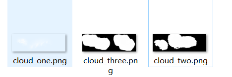
目录结构:

-
HTML:
<!doctype html> <html lang="zh"> <!-- author: ghp date: 2022/10/12 description: 纯CSS实现的超真实的动态云朵效果 --> <head> <meta charset="UTF-8"> <meta http-equiv="X-UA-Compatible" content="IE=edge,chrome=1"> <meta name="viewport" content="width=device-width, initial-scale=1.0"> <title>纯CSS3打造超真实的多层云彩动画特效</title> <link rel="stylesheet" href="./css/cloud.css"> </head> <body> <div class="htmleaf-container"> <div class="sky"> <div class="clouds_one"></div> <div class="clouds_two"></div> <div class="clouds_three"></div> </div> </div> </body> </html> -
CSS:
html,
body {
    margin: 0;
    height: 100%
}

.sky {
    height: 100vh;
    background: #007fd5;
    position: relative;
    overflow: hidden;
    -webkit-animation: sky_background 50s ease-out infinite;
    -moz-animation: sky_background 50s ease-out infinite;
    -o-animation: sky_background 50s ease-out infinite;
    animation: sky_background 50s ease-out infinite;
    -webkit-transform: translate3d(0, 0, 0);
    -ms-transform: translate3d(0, 0, 0);
    -o-transform: translate3d(0, 0, 0);
    transform: translate3d(0, 0, 0);
}

.clouds_one {
    background: url("../img/cloud_one.png");
    position: absolute;
    left: 0;
    top: 0;
    height: 100%;
    width: 300%;
    -webkit-animation: cloud_one 50s linear infinite;
    -moz-animation: cloud_one 50s linear infinite;
    -o-animation: cloud_one 50s linear infinite;
    animation: cloud_one 50s linear infinite;
    -webkit-transform: translate3d(0, 0, 0);
    -ms-transform: translate3d(0, 0, 0);
    -o-transform: translate3d(0, 0, 0);
    transform: translate3d(0, 0, 0);
}

.clouds_two {
    background: url("../img/cloud_two.png");
    position: absolute;
    left: 0;
    top: 0;
    height: 100%;
    width: 300%;
    -webkit-animation: cloud_two 75s linear infinite;
    -moz-animation: cloud_two 75s linear infinite;
    -o-animation: cloud_two 75s linear infinite;
    animation: cloud_two 75s linear infinite;
    -webkit-transform: translate3d(0, 0, 0);
    -ms-transform: translate3d(0, 0, 0);
    -o-transform: translate3d(0, 0, 0);
    transform: translate3d(0, 0, 0);
}

.clouds_three {
    background: url("../img/cloud_three.png");
    position: absolute;
    left: 0;
    top: 0;
    height: 100%;
    width: 300%;
    -webkit-animation: cloud_three 100s linear infinite;
    -moz-animation: cloud_three 100s linear infinite;
    -o-animation: cloud_three 100s linear infinite;
    animation: cloud_three 100s linear infinite;
    -webkit-transform: translate3d(0, 0, 0);
    -ms-transform: translate3d(0, 0, 0);
    -o-transform: translate3d(0, 0, 0);
    transform: translate3d(0, 0, 0);
}

@-webkit-keyframes sky_background {
    0% {
        background: #007fd5;
        color: #007fd5
    }

    50% {
        background: #000;
        color: #a3d9ff
    }

    100% {
        background: #007fd5;
        color: #007fd5
    }
}

@-moz-keyframes sky_background {
    0% {
        background: #007fd5;
        color: #007fd5
    }

    50% {
        background: #000;
        color: #a3d9ff
    }

    100% {
        background: #007fd5;
        color: #007fd5
    }
}

@keyframes sky_background {
    0% {
        background: #007fd5;
        color: #007fd5
    }

    50% {
        background: #000;
        color: #a3d9ff
    }

    100% {
        background: #007fd5;
        color: #007fd5
    }
}

@-webkit-keyframes cloud_one {
    0% {
        left: 0
    }

    100% {
        left: -200%
    }
}

@-moz-keyframes cloud_one {
    0% {
        left: 0
    }

    100% {
        left: -200%
    }
}

@keyframes cloud_one {
    0% {
        left: 0
    }

    100% {
        left: -200%
    }
}

@-webkit-keyframes cloud_two {
    0% {
        left: 0
    }

    100% {
        left: -200%
    }
}

@-moz-keyframes cloud_two {
    0% {
        left: 0
    }

    100% {
        left: -200%
    }
}

@keyframes cloud_two {
    0% {
        left: 0
    }

    100% {
        left: -200%
    }
}

@-webkit-keyframes cloud_three {
    0% {
        left: 0
    }

    100% {
        left: -200%
    }
}

@-moz-keyframes cloud_three {
    0% {
        left: 0
    }

    100% {
        left: -200%
    }
}

@keyframes cloud_three {
    0% {
        left: 0
    }

    100% {
        left: -200%
    }
}
-
附赠img图片:


PS: 如果对您有帮助,欢迎三连(关注💖、点赞👍、收藏⭐)


 318
318


 被折叠的 条评论
为什么被折叠?
被折叠的 条评论
为什么被折叠?
 到【灌水乐园】发言


