


一.知识目录
- css动画实现
- 伪元素 ::before & ::after 的生效
- js封装动画
- js向样式表中追加样式
二.css动画实现
1.简要说明
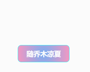
(ฅ´ω`ฅ)简单说明一下,咱们这里以一个灯笼浮动的动画作为示例,录了两个不同效果:
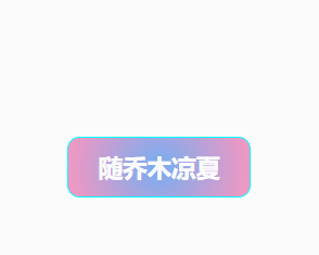

从咱们的演示gif中可以看到,动画中主要有两个效果:
①呼吸灯效果
②浮动效果
2.html、css代码展示
( ˘ ³˘)♥划重点 ⇨ css部分是我们用js封装动画的参照对象,一般我们的动画效果都是先通过css实现后再进行封装移动!!!
先来看演示一实现的代码部分:
HTML
<!DOCTYPE html>
<html>
	<head>
		<meta charset="utf-8">
		<title></title>
		<style>
            /* 前面这一部分样式是我们定义的按钮样式 */
			#container {
				width: 150px;
				height: 50px;
				line-height: 50px;
				border-radius: 10px;
				font-size: 20px;
				font-weight: bold;
				position: relative;
				color: #fff;
                /* 设置径向渐变背景颜色 -- 渐变色在CSS中被定义成了 image 类型,不能使用background-color */
				background: radial-gradient(circle, rgba(118, 174, 241, 1) 0%, rgba(247, 150, 192, 1) 100%);
				cursor: pointer;
				margin: 300px 200px;
				border: 1px solid aqua;
			}

            #container:hover {
				font-size: 20px;
				color: #f71;
				background: radial-gradient(circle, rgba(247, 150, 192, 1) 0%, rgba(118, 174, 241, 1) 100%);
			}

            /* 后面是我们要添加的css样式包含动画部分 */

		</style>
	</head>
	<body>
		<button id="container">随乔木凉夏
            <!-- 这个span标签将作为灯笼的载体 -->
			<span class="particle"></span>
		</button>
	</body>
</html>
CSS(包含动画部分)
/* 设置span标签样式 */
.particle {
	opacity: 1;
	width: 25px;
	height: 25px;
	display: block;
	top: -25px;
	left: -5px;
	border-radius: 100px;
	position: absolute;
    /* 设置径向渐变背景颜色 -- 渐变色在CSS中被定义成了 image 类型,不能使用background-color */
	background: radial-gradient(rgba(255, 255, 0, 0.5) 50%, transparent 70%);
	background-size: cover;
	background-repeat: no-repeat;

	/* 设置多个动画时 -- 不同动画属性之间用逗号隔开 */
	animation-name: breathe, shiver;
	/* 动画名称 */
	animation-duration: 1s, 12s;
	/* 持续时间 */
	animation-iteration-count: infinite, infinite;
	/* 循环次数 */
	animation-direction: alternate, alternate;
	/* 动画方向 */
	animation-fill-mode: backwards, backwards;
	/* 填充模式 */
	animation-play-state: running, running;
	/* 播放状态 */

	/* 简化写法 --  动画名称 | 持续时间 | 定时函数 | 循环次数 | 播放状态 */
	/* animation: hearts 8s ease-in infinite paused; */
}

/* hover效果可以实现动画播放状态切换  paused-暂停 running-运动 */
#container:hover .particle {
	display: block;
	animation-play-state: running, running;
}

/* 伪元素 ::before & ::after 的生效,必须要有 content 属性 */
/* ::before -- 在元素前插入内容 */
/* ::after -- 在元素后插入内容 */
/* 双冒号 CSS3 语法 */
/*(单冒号)CSS2 过时语法 (仅用来支持 IE8) */
.particle:after {
	position: absolute;
	content: "";
	background-image: url(./lantern.png);
	background-size: 100% 100%;
	border-radius: 100px;
	top: 0px;
	right: 0px;
	width: 25px;
	height: 25px;
	/* background-color: #f71; */
}

/* 浮动动画效果 */
@keyframes shiver {
	0% {
		opacity: 0;
		transform: translate(2px, -2px);
	}

	10% {
		transform: translate(2px, -2px);
	}

	20% {
		opacity: 1;
		transform: translate(1px, -1px);
	}

	30% {
		transform: translate(2px, -2px);
	}

	40% {
		transform: translate(2px, -1px);
	}

	50% {
		transform: translate(2px, 2px);
	}

	60% {
		transform: translate(-1px, -1px);
	}

	70% {
		transform: translate(2px, -2px);
	}

	80% {
		transform: translate(1px, -1px);
	}

	90% {
		transform: translate(2px, -1px);
	}

	100% {
		transform: translate(2px, -2px);
	}
}

/* 呼吸灯动画效果 */
@keyframes breathe {
	0% {
		box-shadow: 0 1px 10px rgba(255, 255, 0, 0.4), 0 1px 5px rgba(255, 255, 0, 0.1) inset;
	}

	100% {
		box-shadow: 0 1px 10px #ffff00, 0 1px 5px #ffff00 inset;
	}
}
演示二实现的代码部分(HTML与演示一一致):
CSS(包含动画部分)
/* 设置span标签样式 */
.particle {
	opacity: 1;
	width: 25px;
	height: 25px;
	display: block;
	top: -25px;
	left: -5px;
	border-radius: 100px;
	position: absolute;
	/* 设置径向渐变背景颜色 -- 渐变色在CSS中被定义成了 image 类型,不能使用background-color */
	background: radial-gradient(rgba(255, 255, 0, 0.5) 50%, transparent 70%);
	background-size: cover;
	background-repeat: no-repeat;

	/* 设置多个动画时 -- 不同动画属性之间用逗号隔开 */
	/* 动画名称 */
	animation-name: float, breathe;
	/* 持续时间 */
	animation-duration: 8s, 1s;
	/* 循环次数 */
	animation-iteration-count: infinite, infinite;
	/* 动画方向 */
	animation-direction: alternate, alternate;
	/* 填充模式 */
	animation-fill-mode: backwards, backwards;
	/* 播放状态 */
	animation-play-state: running, running;

	/* 简化写法 --  动画名称 | 持续时间 | 定时函数 | 循环次数 | 播放状态 */
	/* animation: hearts 8s ease-in infinite paused; */
}

/* hover效果可以实现动画播放状态切换  paused-暂停 running-运动 */
#container:hover .particle {
	display: block;
	animation-play-state: running, running;
}

/* 伪元素 ::before & ::after 的生效,必须要有 content 属性 */
/* ::before -- 在元素前插入内容 */
/* ::after -- 在元素后插入内容 */
/* 双冒号 CSS3 语法 */
/*(单冒号)CSS2 过时语法 (仅用来支持 IE8) */
.particle:after {
	position: absolute;
	content: "";
	background-image: url(./lantern.png);
	background-size: 100% 100%;
	border-radius: 100px;
	top: 0px;
	right: 0px;
	width: 25px;
	height: 25px;
	/* background-color: #f71; */
}

/* 浮动动画效果 */
@keyframes float {
	0% {
		opacity: 0;
		transform: scale(1) translate(0, 0%);
	}

	20% {
		opacity: 0.8;
		transform: scale(0.7) translate(20%, -20%);
	}

	100% {
		opacity: 1;
		transform: scale(0.4) translate(800%, -800%);
	}
}

/* 呼吸灯动画效果 */
@keyframes breathe {
	0% {
		box-shadow: 0 1px 10px rgba(255, 255, 0, 0.4), 0 1px 5px rgba(255, 255, 0, 0.1) inset;
	}

	100% {
		box-shadow: 0 1px 10px #ffff00, 0 1px 5px #ffff00 inset;
	}
}
三.伪元素 ::before & ::after 的生效
我这里再把::before & ::after 这两个伪元素拎出来单独强调一下:
/* 伪元素 ::before & ::after 的生效,必须要有 content 属性 */
/* ::before -- 在元素前插入内容 */
/* ::after -- 在元素后插入内容 */
/* 双冒号 CSS3 语法 */
/*(单冒号)CSS2 过时语法 (仅用来支持 IE8) */
(它们两个可以实现同样的效果 -- 很多按钮特效就是通过它们两实现的)
更多具体的用法可以自行查看官方文档:
代码中涉及的background背景渐变颜色,文档链接我也放这,大家可以自行查看:
四.js封装动画
( ͡° ͜ʖ ͡°)✧敲黑板,重点来啦~
先贴上完整js代码(lantern.js),用魔法打败魔法 ⇩
function Animate_options(duration) {
	// 定义动画配置项
	const options = {
	    // 动画执行次数 Infinity-一直循环  CSS中使用infinite
	    iterations: Infinity,
	    // 动画开始时间点
	    iterationStart: 0,
	    // 动画开始之前的延迟
	    delay: 0,
	    // 动画结束之后的延迟
	    endDelay: 0,
	    // 动画运行方向 normal-正向播放 reverse-反向播放 alternate-正向和反向之间交替播放 alternate-reverse-反向和正向之间交替播放
	    direction: 'alternate',
	    // 动画时长  --  在 CSS 中更常使用 s 也就是秒,而在 JS 中更倾向使用 ms 毫秒,在 Web Animation API 中使用的也是毫秒单位
	    duration: duration,
	    // 动画填充模式 none-动画未执行时不应用任何样式 backwards- 动画结束恢复到原始状态(这是默认状态)  forwards- 动画结束保持最终状态
	    fill: 'backwards',
	    // 动画缓动类型  --  CSS3 默认的缓动类型是 ease ,.animate() 默认的缓动类型是 linear 线性的
	    easing: 'ease-in-out',
		// 多个animate调用同时执行 -- 不进入队列,立刻执行
		queue:false,
	};
	return options
}

// 呼吸灯动画效果配置项
const Streamer_options = Animate_options(1000)
// 演示一浮动动画效果配置项
const Lantern_options = Animate_options(12000)
// 演示二浮动动画效果配置项
const Lantern_options_2 = Animate_options(8000)

// 定义呼吸灯动画关键帧   offset -- 设置时间轴(0~1)
const Streamer_keyframes = [
    { 'box-shadow': '0 1px 20px rgba(255, 255, 0, 0.4), 0 1px 10px rgba(255, 255, 0, 0.1) inset', offset: 0  },
    { 'box-shadow': '0 1px 20px #ffff00, 0 1px 10px #ffff00 inset', offset: 1  },
];

// 定义演示一浮动动画关键帧   offset -- 设置时间轴(0~1)
const Lantern_keyframes = [
    { opacity: 0, transform: 'translate(2px, -2px)',offset: 0  },
    { transform: 'translate(2px, -2px)', offset: 0.1  },
	{ opacity: 1, transform: 'translate(1px, -1px)',offset: 0.2  },
	{ transform: 'translate(2px, -2px)', offset: 0.3  },
	{ transform: 'translate(2px, -1px)', offset: 0.4  },
	{ transform: 'translate(2px, 2px)', offset: 0.5  },
	{ transform: 'translate(-1px, -1px)', offset: 0.6  },
	{ transform: 'translate(2px, -2px)', offset: 0.7  },
	{ transform: 'translate(1px, -1px)', offset: 0.8  },
	{ transform: 'translate(2px, -1px)', offset: 0.9  },
	{ transform: 'translate(2px, -2px)', offset: 1  },
];

// 定义演示二浮动动画关键帧   offset -- 设置时间轴(0~1)
const Lantern_keyframes_2 = [
    { opacity: 0, transform: 'scale(1) translate(0, 0%)',offset: 0  },
	{ opacity: 0.8, transform: 'scale(0.7) translate(20%, -20%)',offset: 0.2  },
	{ opacity: 1, transform: 'scale(0.4) translate(800%, -800%)',offset: 1  },
];


// 外部调用该函数并传参 idname-父元素id名 num-灯笼个数(默认为2,相关参数值需要具体修改,不做具体演示)
function addLanternStreamer(idname,num) {
	var num = num || 2;
	var idname = idname || '.container';
	// 通过元素id获取父元素
	let container = document.getElementById(idname);
	// 给父元素添加css样式 -- 用于框住子元素
	container.style.position = 'relative';
	// 给父元素添加子节点
	for (var i=0;i<num;i++) {
		// 创建子元素
		let particle = document.createElement("span");
		particle.className = "particle";
		// 设置css样式
		particle.style.display = 'block';  // 转换为块元素
		particle.style.position = 'absolute';
		particle.style.width = '25px';
		particle.style.height = '25px';
		particle.style.top = '-25px';
		particle.style.left = '-5px';
		particle.style.borderRadius = '100px';  // 相当于100%
		particle.style.background = 'radial-gradient(rgba(255, 255, 0, 0.5) 50%, transparent 70%)';
		particle.style.backgroundSize = 'cover';
		particle.style.backgroundRepeat = 'no-repeat';
		// 通过animate()函数设置动画
		particle.animate(Streamer_keyframes, Streamer_options);
		// 多个动画 -- 多次调用animate()函数可以将多个动画链接在一起
		// particle.animate(Lantern_keyframes,Lantern_options);
		particle.animate(Lantern_keyframes_2,Lantern_options_2);
		// 将子节点追加到父元素
		container.append(particle);
	}
	// 获取style样式表
	var style = document.getElementsByTagName("style")[0];
	// 设置::after伪元素样式
	var afterStyle = '.particle::after{position: absolute;content:"";background-image: url(./lantern.png);background-size: 100% 100%;border-radius: 100px;top: 0px;right: 0px;width: 25px;height: 25px;}';
	// 创建文本节点
	afterStyle = document.createTextNode(afterStyle);
	// 往样式表中追加样式
	style.appendChild(afterStyle);

}
animate 方法接收两个参数:keyframes 和 options ,其中 keyframes 对应CSS3中@keyframes中的声明块,options 对应 animation-* 属性及属性值。
大家可以先看这篇文章,有详细的参数讲解,内容嘎嘎香:
(。・∀・)ノ然后,我再补充一点 ⇲
当我们要同时调用多个动画的时候,可以这样写:
// 多个动画 -- 多次调用animate()函数可以将多个动画链接在一起
particle.animate(Streamer_keyframes, Streamer_options);
particle.animate(Lantern_keyframes,Lantern_options);
默认情况下animate会将动画注册到内部的queue队列里依次执行,如果希望多个animate调用同时执行,而不是依次执行,只需要在第二个参数中将queue设置为false。
也就是说,同时调用多个动画,我们需要在定义动画配置项的时候将queue设置为false
// 定义动画配置项
const options = {
	// 动画执行次数 Infinity-一直循环  CSS中使用infinite
	iterations: Infinity,
	// 动画开始时间点
	iterationStart: 0,
	// 动画开始之前的延迟
	delay: 0,
	// 动画结束之后的延迟
	endDelay: 0,
	// 动画运行方向 normal-正向播放 reverse-反向播放 alternate-正向和反向之间交替播放 alternate-reverse-反向和正向之间交替播放
	direction: 'alternate',
	// 动画时长  --  在 CSS 中更常使用 s 也就是秒,而在 JS 中更倾向使用 ms 毫秒,在 Web Animation API 中使用的也是毫秒单位
	duration: duration,
	// 动画填充模式 none-动画未执行时不应用任何样式 backwards- 动画结束恢复到原始状态(这是默认状态)  forwards- 动画结束保持最终状态
	fill: 'backwards',
	// 动画缓动类型  --  CSS3 默认的缓动类型是 ease ,.animate() 默认的缓动类型是 linear 线性的
	easing: 'ease-in-out',
	// 多个animate调用同时执行 -- 不进入队列,立刻执行
	queue: false,
};
怎么调用咱们的js文件(HTML)
<!DOCTYPE html>
<html>
	<head>
		<meta charset="utf-8">
		<title></title>
		<style>
			#container {
				width: 150px;
				height: 50px;
				line-height: 50px;
				border-radius: 10px;
				font-size: 20px;
				font-weight: bold;
				position: relative;
				color: #fff;
				background: radial-gradient(circle, rgba(118, 174, 241, 1) 0%, rgba(247, 150, 192, 1) 100%);
				cursor: pointer;
				margin: 300px 200px;
				border: 1px solid aqua;
			}

            #container:hover {
				font-size: 20px;
				color: #f71;
				background: radial-gradient(circle, rgba(247, 150, 192, 1) 0%, rgba(118, 174, 241, 1) 100%);
			}
		</style>
	</head>
	<body>
		<button id="container">随乔木凉夏</button>
	</body>
	<script type="text/javascript" src="lantern.js"></script>
	<script>
		addLanternStreamer('container')
	</script>
</html>
引用完成后,直接在一个新的<script></script>中调用函数即可~
五.js向样式表中追加样式
// 获取style样式表
var style = document.getElementsByTagName("style")[0];
// 设置::after伪元素样式
var afterStyle =
	'.particle::after{position: absolute;content:"";background-image: url(./lantern.png);background-size: 100% 100%;border-radius: 100px;top: 0px;right: 0px;width: 25px;height: 25px;}';
// 创建文本节点
afterStyle = document.createTextNode(afterStyle);
// 往样式表中追加样式
style.appendChild(afterStyle);
HTML元素通常是由元素节点和文本节点组成。
document.createTextNode(afterStyle);
创建一个新的文本 (en-US)节点。这个方法可以用来转义 HTML 字符。
通俗点说,就是在标签内容后面追加文本内容~
具体的用法大家可以点下面链接看看官方文档:


 369
369


 被折叠的 条评论
为什么被折叠?
被折叠的 条评论
为什么被折叠?
 到【灌水乐园】发言


