


- 1、基本数据模型定义
//使用枚举的方式定义数据
enum TabBarItem: Hashable {
	case home, favorites, profile, messages
	//图标
	var iconName: String {
		switch self {
		case .home: return "house"
		case .favorites: return "heart"
		case .profile: return "person"
		case .messages: return "message"
		}
	}
	//标题
	var title: String {
		switch self {
		case .home: return "Home"
		case .favorites: return "Favorites"
		case .profile: return "Profile"
		case .messages: return "Messages"
		}
	}
	//颜色
	var color: Color {
		switch self {
		case .home: return Color.blue
		case .favorites: return Color.red
		case .profile: return Color.green
		case .messages: return Color.orange
		}
	}
}
- 2、抽象tabbar全屏内容容器(两种样式)
//自定义Tabbr全屏内容容器
struct CustomTabBarContainerView<Content:View>: View {
    //选中的tabbar模块
	@Binding var selection: TabBarItem
	//tabbar选项内容
	let content: Content
	//tabbar具体选项个数
	@State private var tabs: [TabBarItem] = []

	init(selection: Binding<TabBarItem>, @ViewBuilder content: () -> Content) {
		self._selection = selection
		self.content = content()
	}

	var body: some View {
		ZStack(alignment: .bottom) {
		      //全屏内容
				content
				.ignoresSafeArea()
			//Tabbar选项容器
			CustomTabBarView(tabs: tabs, selection: $selection, localSelection: selection)
			} //: ZSTACK
		//通过preferenceKey和tabBarItem方法联动方式动态变化tabbar个数
		.onPreferenceChange(TabBarItemsPreferenceKey.self) { value in
			self.tabs = value
		}
	}
}

//预览代码
struct CustomTabBarContainerView_Previews: PreviewProvider {

	static let tabs: [TabBarItem] = [
		.home, .favorites, .profile, .messages
	]

	static var previews: some View {
		CustomTabBarContainerView(selection: .constant(tabs.first!)) {
			Color.red
		}
	}
}
- 3、抽象tabbar选项内容容器
struct CustomTabBarView: View {
	// MARK: -  属性
	let tabs: [TabBarItem]
	@Binding  var selection: TabBarItem
	@Namespace private var namespace
	//用于动画
	@State var localSelection: TabBarItem

	// MARK: -  内容
	var body: some View {
		// tabBarVersionOne
		tabBarVersionTwo
			.onChange(of: selection) { newValue in
				withAnimation(.easeInOut) {
					localSelection = newValue
				}
			}
	}
}

//预览代码
struct CustomTabBarView_Previews: PreviewProvider {
	static let tabs: [TabBarItem] = [
		.home, .favorites, .profile
	]
	static var previews: some View {
		VStack {
			Spacer()
			CustomTabBarView(tabs: tabs, selection: .constant(tabs.first!), localSelection: tabs.first!)
		}
	}
}

// MARK: -  扩展
//样式1
extension CustomTabBarView {
	private func tabView(tab: TabBarItem) -> some View {
		VStack {
			Image(systemName: tab.iconName)
				.font(.subheadline)
			Text(tab.title)
				.font(.system(size: 10, weight: .semibold, design: .rounded))
		} //: VSTACK
		.foregroundColor(selection == tab ? tab.color : Color.gray)
		.padding(.vertical, 8)
		.frame(maxWidth: .infinity)
		.background(selection == tab ? tab.color.opacity(0.2) : Color.clear)
		.cornerRadius(10)
	}

	private var tabBarVersionOne: some View {
		HStack {
			ForEach(tabs, id: \.self) { tab in
				tabView(tab: tab)
					.onTapGesture {
						switchToTab(tab: tab)
					}
			}
		} //: HSTACK
		.padding(6)
		.background(Color.white.ignoresSafeArea(edges: .bottom))
	}

	private func switchToTab(tab: TabBarItem) {
			selection = tab
	}
}

// 样式2
extension CustomTabBarView {
	private func tabView2(tab: TabBarItem) -> some View {
		VStack {
			Image(systemName: tab.iconName)
				.font(.subheadline)
			Text(tab.title)
				.font(.system(size: 10, weight: .semibold, design: .rounded))
		} //: VSTACK
		.foregroundColor(localSelection == tab ? tab.color : Color.gray)
		.padding(.vertical, 8)
		.frame(maxWidth: .infinity)
		.background(
			ZStack {
				if localSelection == tab {
					RoundedRectangle(cornerRadius: 10)
						.fill(tab.color.opacity(0.2))
						.matchedGeometryEffect(id: "background_rectangle", in: namespace)
				}
			} //: ZSTACK
		)
	}

	private var tabBarVersionTwo: some View {
		HStack {
			ForEach(tabs, id: \.self) { tab in
				tabView2(tab: tab)
					.onTapGesture {
						switchToTab(tab: tab)
					}
			}
		} //: HSTACK
		.padding(6)
		.background(Color.white.ignoresSafeArea(edges: .bottom))
		.cornerRadius(10)
		.shadow(color: Color.black.opacity(0.3), radius: 10, x: 0, y: 5)
		.padding(.horizontal)
	}

}
- 4、使用preferenceKey累计记录tabberItem
// MARK: -  创建 PreferenceKey
struct TabBarItemsPreferenceKey: PreferenceKey {

	static var defaultValue: [TabBarItem] = []

	static func reduce(value: inout [TabBarItem], nextValue: () -> [TabBarItem]) {
		value += nextValue()
	}
}

// MARK: -  创建Modifier
struct TabBarItemViewModifier: ViewModifier {
	let tab: TabBarItem
	@Binding var selection: TabBarItem

	func body(content: Content) -> some View {
		content
			.opacity(selection == tab ? 1.0 : 0.0)
			.preference(key: TabBarItemsPreferenceKey.self, value: [tab])
	}
}

// MARK: -  扩展添加tabbar选项的方式
extension View {
	func tabBarItem(tab: TabBarItem, selection: Binding<TabBarItem>) -> some View {
		self
			.modifier(TabBarItemViewModifier(tab: tab, selection: selection))
	}
}
- 5、使用例子
struct AppTabBarView: View {
	// MARK: -  属性
	@State private var selection: String = "home"
	@State private var tabSelection: TabBarItem = .home
	// MARK: -  内容
	var body: some View {
		CustomTabBarContainerView(selection: $tabSelection) {
			Color.blue
				.tabBarItem(tab: .home, selection: $tabSelection)

			Color.red
				.tabBarItem(tab: .favorites, selection: $tabSelection)

			Color.green
				.tabBarItem(tab: .profile, selection: $tabSelection)

			Color.orange
				.tabBarItem(tab: .messages, selection: $tabSelection)
		}
	}
}
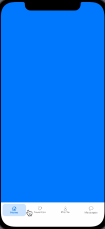
- 6、效果图
样式1
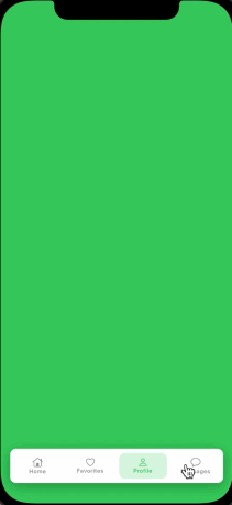
样式2
github例子:https://github.com/dennie-lee/SwiftUICustomTabBar
说明:未经许可不可转载


 491
491


 被折叠的 条评论
为什么被折叠?
被折叠的 条评论
为什么被折叠?
 到【灌水乐园】发言


