


4. 侧轴子元素排列方式
侧轴对齐方式-单行对齐(重点)
1. 默认的对齐方式 stretch 拉伸
2. 顶对齐 flex-start
3. align-items: center; (重点)
<!DOCTYPE html>
<html lang="en">

<head>
    <meta charset="UTF-8">
    <meta http-equiv="X-UA-Compatible" content="IE=edge">
    <meta name="viewport" content="width=device-width, initial-scale=1.0">
    <title>Document</title>
    <style>
        div {
            display: flex;
            width: 1200px;
            height: 600px;
            background-color: gray;
            margin: 0 auto;
            /* 单行侧轴对齐方式 */
            align-items: center;
        }

        div span {
            width: 200px;
            height: 200px;
            background-color: pink;
            margin-right: 10px;
        }
    </style>
</head>

<body>
    <div>
        <span>111</span>
        <span>222</span>
        <span>333</span>
        <span>444</span>
    </div>
</body>

</html>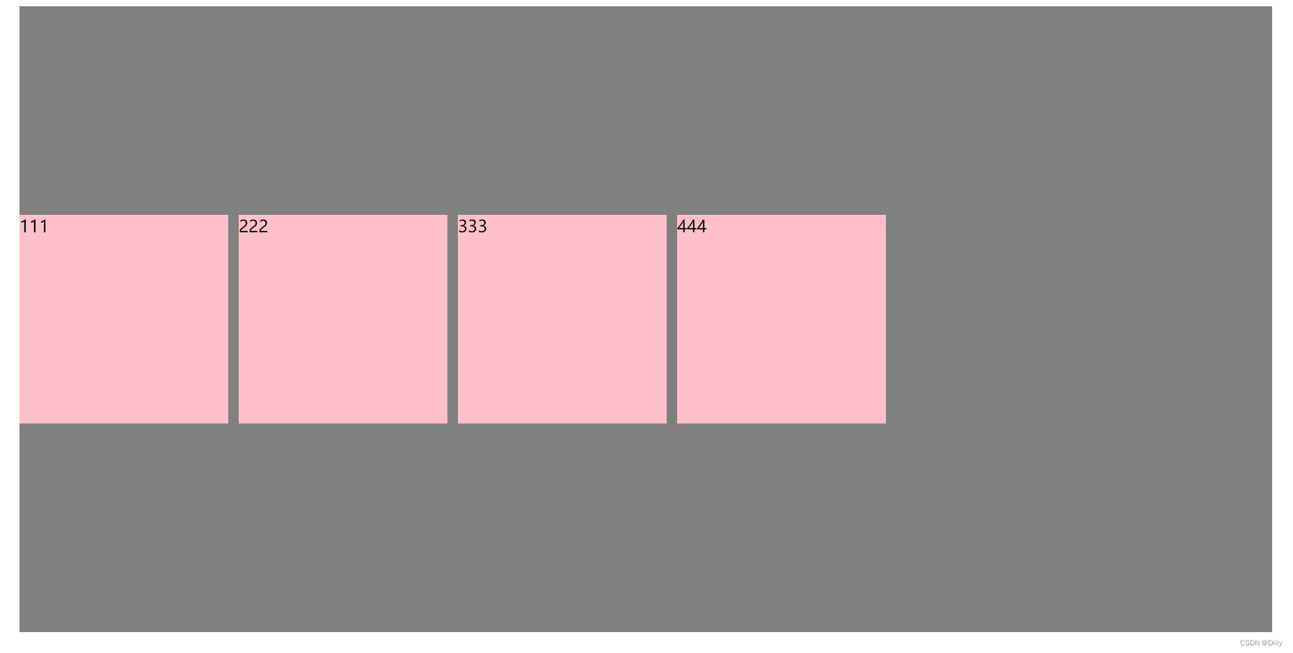
弹性盒子换行(重点)
特别是多行的情况下,我们需要给弹性盒子换行,给 父盒子 弹性容器加。
flex-wrap: wrap;
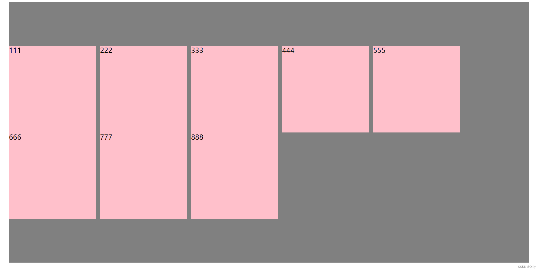
侧轴对齐方式-多行
1. align-content: space-between;
<!DOCTYPE html>
<html lang="en">

<head>
    <meta charset="UTF-8">
    <meta http-equiv="X-UA-Compatible" content="IE=edge">
    <meta name="viewport" content="width=device-width, initial-scale=1.0">
    <title>Document</title>
    <style>
        div {
            display: flex;
            width: 1200px;
            height: 600px;
            background-color: gray;
            margin: 0 auto;
            /* 弹性盒子换行 */
            flex-wrap: wrap;
            /* 多行侧轴盒子靠边对齐 */
            align-content: space-between;
        }

        div span {
            width: 200px;
            height: 200px;
            background-color: pink;
            margin-right: 10px;
        }
    </style>
</head>

<body>
    <div>
        <span>111</span>
        <span>222</span>
        <span>333</span>
        <span>444</span>
        <span>555</span>
        <span>666</span>
        <span>777</span>
        <span>888</span>
    </div>
</body>

</html>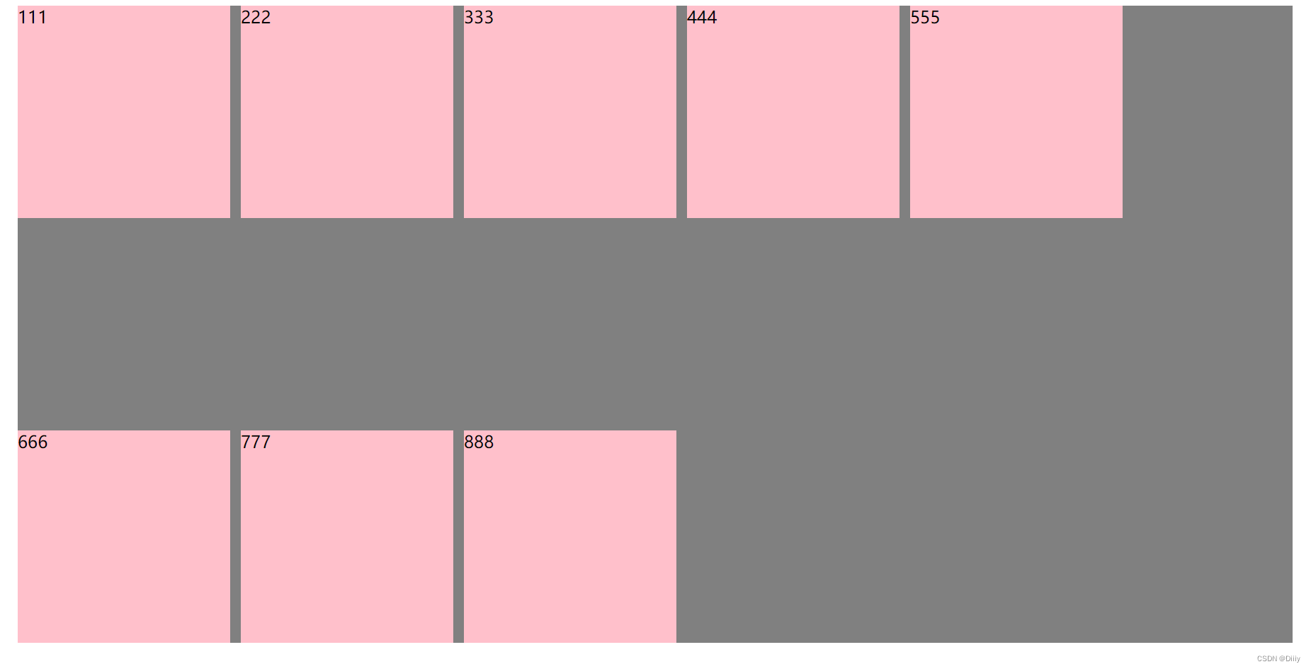
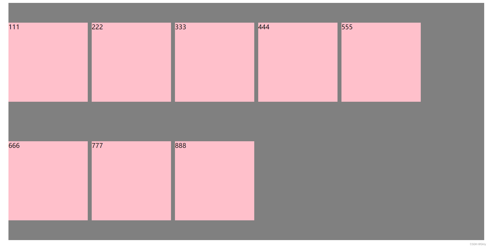
2. align-content: space-around;
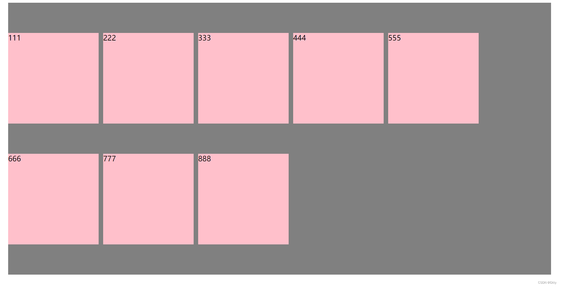
3. align-content: space-evenly;
4. align-content: center;
圣杯布局
所谓的圣杯布局就是左右两边大小固定不变,中间宽度自适应。
一般这种布局方式适用于各种移动端顶部搜索部分,这是最常见的,如京东手机版主页面顶部搜索
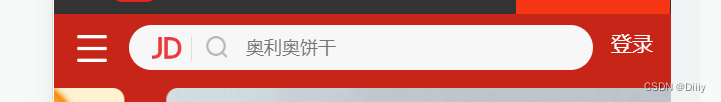
核心思路:
两侧盒子写固定大小
中间盒子 flex: 1; 占满剩余空间
.top {
    display: flex;
    justify-content: c;
}

.top div:first-child {
    width: 50px;
    height: 50px;
    background-color: red;
}

.top div:last-child {
    width: 50px;
    height: 50px;
    background-color: red;
}

.top div:nth-child(2) {
    flex: 1;
    height: 50px;
    background-color: pink;
}
注意:中间flex: 1; 和 width 有冲突。 优先执行 flex:1;


 137
137


 被折叠的 条评论
为什么被折叠?
被折叠的 条评论
为什么被折叠?
 到【灌水乐园】发言


