


文章目录
01-相对定位
<!DOCTYPE html>
<html lang="en">
<head>
    <meta charset="UTF-8">
    <meta name="viewport" content="width=device-width, initial-scale=1.0">
    <title>Document</title>
    <style>
        /* 一般不使用相对定位 */
        *{
            margin: 0;
            padding: 0;
        }
        /*
            1.改变位置的参照物是自己原来的位置。
            2.不脱标,占位。
            3.标签显示特点不发生改变。
        */
        div{
            position: relative;
            top: 100px;
            left: 200px;
        }
    </style>
</head>
<body>
    <p>河马优化算法(Hippopotamus Optimization Algorithm,HO)是一种新型的元启发式算法(智能优化算法),灵感来源于河马的固有行为。该成果由Mohammad Hussein Amiri等人于2024年2月发表在Nature旗下子刊《Scientific Reports》上。</p>
    <div><img src="./20.jpg" alt=""></div>
    <p>河马优化算法(Hippopotamus Optimization Algorithm,HO)是一种新型的元启发式算法(智能优化算法),灵感来源于河马的固有行为。该成果由Mohammad Hussein Amiri等人于2024年2月发表在Nature旗下子刊《Scientific Reports》上。</p>

</body>
</html>

02-绝对定位
<!DOCTYPE html>
<html lang="en">
<head>
    <meta charset="UTF-8">
    <meta name="viewport" content="width=device-width, initial-scale=1.0">
    <title>Document</title>
    <style>
        /* 子绝父相 */
        *{
            margin: 0;
            padding: 0;
        }
        img{
            width: 400px;
        }
        .news{
            position: relative;
            margin: 100px auto;
            width: 400px;
            height: 350px;
            background-color: #fff;
        }
        /*
            1.脱标,不占位置
            2.参照物:先找最近的已定位的祖先元素,如果所有祖先元素都没有定位,
                参照浏览器窗口改位置
            3.显示模块特点改变:具备行内块的特点
        */
        .news span{
            position: absolute;
            top: 0px;
            right: 0px;

            display: block;
            width: 92px;
            height: 32px;
            background-color: rgba(0,0,0,0.6);
            text-align: center;
            line-height: 32px;
            color: #fff;
        }
    </style>
</head>
<body>
    <div class="news">
        <!-- 300*266 -->
        <img src="./20.jpg" alt="">
        <span>展会活动</span>
        <h4>djnj </h4>
    </div>
</body>
</html>

03-绝对定位居中
<!DOCTYPE html>
<html lang="en">
<head>
    <meta charset="UTF-8">
    <meta name="viewport" content="width=device-width, initial-scale=1.0">
    <title>Document</title>
    <style>
        img{
            position: absolute;
            left: 50%;
            top: 50%;
            /*上述代码会让图片的左上角出现在页面中心。下面的代码是需要对他进行移动  */


            /* margin-left: -150px; */
            /* margin-top: -133px; */
            transform: translate(-50%,-50%);
        }
    </style>
</head>
<body>
    <img src="./20.jpg" alt="">
</body>
</html>
04-固定定位
<!DOCTYPE html>
<html lang="en">
<head>
    <meta charset="UTF-8">
    <meta name="viewport" content="width=device-width, initial-scale=1.0">
    <title>Document</title>
    <style>
        /* 一般不使用相对定位 */
        *{
            margin: 0;
            padding: 0;
        }
        body{
            width: 100%;
        }
        /*
            1.脱标:不占位
            2.参照物:浏览器窗口
            3.具备行内块的特点(但是我这里修改之后没生效)
        */
        div{
            position: fixed;
            top: 0;
            left: 0;


            width: 20px;
        }
    </style>
</head>
<body>
    <p>河马优化算法(Hippopotamus Optimization Algorithm,HO)是一种新型的元启发式算法(智能优化算法),灵感来源于河马的固有行为。该成果由Mohammad Hussein Amiri等人于2024年2月发表在Nature旗下子刊《Scientific Reports》上。</p>
    <div><img src="./20.jpg" alt=""></div>
    <p>河马优化算法(Hippopotamus Optimization Algorithm,HO)是一种新型的元启发式算法(智能优化算法),灵感来源于河马的固有行为。该成果由Mohammad Hussein Amiri等人于2024年2月发表在Nature旗下子刊《Scientific Reports》上。</p>
    <p>河马优化算法(Hippopotamus Optimization Algorithm,HO)是一种新型的元启发式算法(智能优化算法),灵感来源于河马的固有行为。该成果由Mohammad Hussein Amiri等人于2024年2月发表在Nature旗下子刊《Scientific Reports》上。</p>
    <p>河马优化算法(Hippopotamus Optimization Algorithm,HO)是一种新型的元启发式算法(智能优化算法),灵感来源于河马的固有行为。该成果由Mohammad Hussein Amiri等人于2024年2月发表在Nature旗下子刊《Scientific Reports》上。</p>
    <p>河马优化算法(Hippopotamus Optimization Algorithm,HO)是一种新型的元启发式算法(智能优化算法),灵感来源于河马的固有行为。该成果由Mohammad Hussein Amiri等人于2024年2月发表在Nature旗下子刊《Scientific Reports》上。</p>
    <p>河马优化算法(Hippopotamus Optimization Algorithm,HO)是一种新型的元启发式算法(智能优化算法),灵感来源于河马的固有行为。该成果由Mohammad Hussein Amiri等人于2024年2月发表在Nature旗下子刊《Scientific Reports》上。</p>
    <p>河马优化算法(Hippopotamus Optimization Algorithm,HO)是一种新型的元启发式算法(智能优化算法),灵感来源于河马的固有行为。该成果由Mohammad Hussein Amiri等人于2024年2月发表在Nature旗下子刊《Scientific Reports》上。</p>
    <p>河马优化算法(Hippopotamus Optimization Algorithm,HO)是一种新型的元启发式算法(智能优化算法),灵感来源于河马的固有行为。该成果由Mohammad Hussein Amiri等人于2024年2月发表在Nature旗下子刊《Scientific Reports》上。</p>
    <p>河马优化算法(Hippopotamus Optimization Algorithm,HO)是一种新型的元启发式算法(智能优化算法),灵感来源于河马的固有行为。该成果由Mohammad Hussein Amiri等人于2024年2月发表在Nature旗下子刊《Scientific Reports》上。</p>
    <p>河马优化算法(Hippopotamus Optimization Algorithm,HO)是一种新型的元启发式算法(智能优化算法),灵感来源于河马的固有行为。该成果由Mohammad Hussein Amiri等人于2024年2月发表在Nature旗下子刊《Scientific Reports》上。</p>
    <p>河马优化算法(Hippopotamus Optimization Algorithm,HO)是一种新型的元启发式算法(智能优化算法),灵感来源于河马的固有行为。该成果由Mohammad Hussein Amiri等人于2024年2月发表在Nature旗下子刊《Scientific Reports》上。</p>
    <p>河马优化算法(Hippopotamus Optimization Algorithm,HO)是一种新型的元启发式算法(智能优化算法),灵感来源于河马的固有行为。该成果由Mohammad Hussein Amiri等人于2024年2月发表在Nature旗下子刊《Scientific Reports》上。</p>
    <p>河马优化算法(Hippopotamus Optimization Algorithm,HO)是一种新型的元启发式算法(智能优化算法),灵感来源于河马的固有行为。该成果由Mohammad Hussein Amiri等人于2024年2月发表在Nature旗下子刊《Scientific Reports》上。</p>
    <p>河马优化算法(Hippopotamus Optimization Algorithm,HO)是一种新型的元启发式算法(智能优化算法),灵感来源于河马的固有行为。该成果由Mohammad Hussein Amiri等人于2024年2月发表在Nature旗下子刊《Scientific Reports》上。</p>

</body>
</html>

05-堆叠顺序
<!DOCTYPE html>
<html lang="en">
<head>
    <meta charset="UTF-8">
    <meta name="viewport" content="width=device-width, initial-scale=1.0">
    <title>Document</title>
    <style>
        div{
            position: absolute;
            /* 如果不修改,这个蓝色会把粉色覆盖掉,这就叫后来者居上 */
            width: 200px;
            height: 200px;
        }
        .box1{
            background-color: pink;
            z-index: 1;
            /* 谁的index属性值大,就不会被盖住 */
        }
        .box2{
            background-color: skyblue;
            left: 100px;
            top: 100px;
            z-index: 2;
        }
    </style>
</head>
<body>
    <div class="box1">box1</div>
    <div class="box2">box2</div>
</body>
</html>

06-CSS精灵-基本使用
<!DOCTYPE html>
<html lang="en">
<head>
<meta charset="UTF-8">
<meta name="viewport" content="width=device-width, initial-scale=1.0">
<title>Document</title>
<style>
div{
width: 102px;
height: 118px;
background-color: pink;
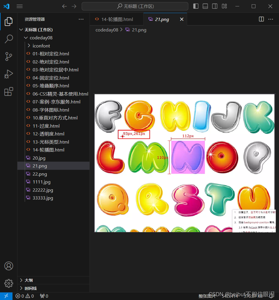
background-image: url(./21.png);
/* 231 142 */
background-position: -231px -142px;
}
</style>
</head>
<body>
<!--
1.创建盒子:盒子尺寸和想要显示的小图一样大
2.给盒子设置背景图为精灵图
3.调整位置
-->
<div></div>
</body>
</html>

07-案例-京东服务
<!DOCTYPE html>
<html lang="en">
<head>
<meta charset="UTF-8">
<meta name="viewport" content="width=device-width, initial-scale=1.0">
<title>Document</title>
<style>
*{
margin: 0;
padding: 0;
box-sizing: border-box;
}
li{
list-style: none;
}
.service{
margin: 50px auto;
width: 1190px;
height: 42px;
/* background-color: pink; */
}
.service ul{
display: flex;
}
.service li{
display: flex;
padding-left: 40px;
width: 297px;
height: 42px;
/* background-color: skyblue; */
}
.service li h5{
margin-right: 10px;
width: 36px;
height: 42px;
/* background-color: pink; */
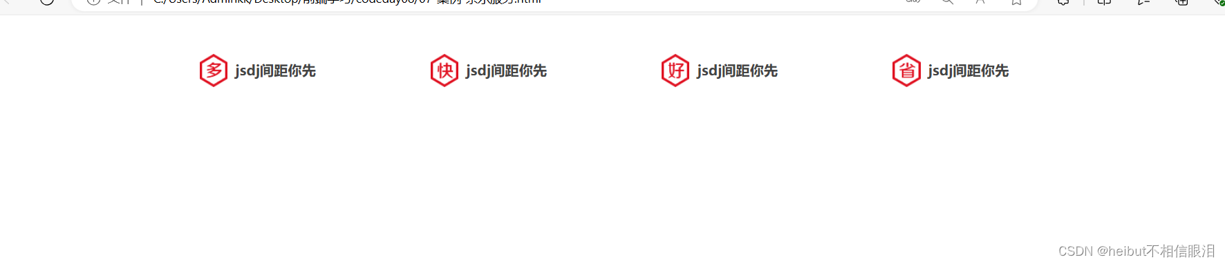
background: url(./22.png) 0 -192px;
}
.service li:nth-child(2) h5{
background-position: -41px -192px;
}
.service li:nth-child(3) h5{
background-position: -82px -192px;
}
.service li:nth-child(4) h5{
background-position: -123px -192px;
}
.service li p{
font-size: 18px;
color: #444;
font-weight: 700;
line-height: 42px;
}
</style>
</head>
<body>
<div class="service">
<ul>
<li>
<h5></h5>
<p>jsdj间距你先</p>
</li>
<li>
<h5></h5>
<p>jsdj间距你先</p>
</li>
<li>
<h5></h5>
<p>jsdj间距你先</p>
</li>
<li>
<h5></h5>
<p>jsdj间距你先</p>
</li>
</ul>
</div>
</body>
</html>
08-字体图标
<!DOCTYPE html>
<html lang="en">
<head>
    <meta charset="UTF-8">
    <meta name="viewport" content="width=device-width, initial-scale=1.0">
    <title>Document</title>
    <link rel="stylesheet" href="./iconfont/iconfont.css">
    <style>
        /* 注意:
            如果要调整字体大小,选择器的优先级要高于iconfontlei
        */
        .iconfont{
            font-size: 200px;
            color: red;
        }
    </style>
</head>
<body>
    <span class="iconfont icon-xihuan"></span>
</body>
</html>
10.垂直对齐方式
<!DOCTYPE html>
<html lang="en">
<head>
    <meta charset="UTF-8">
    <meta name="viewport" content="width=device-width, initial-scale=1.0">
    <title>Document</title>
    <style>
        div{
            border: 1px solid #000;
        }
        img{
            /* 这一步可以使得字体垂直居中,消除img下的空隙 */
            /* vertical-align: middle; */

            /* vertical-align: top; */

            /* vertical-align: bottom; */

            /* 为什么改变display就可以把下面的空隙删除:img是行内块,浏览器会把行内块(行内标签)当成字处理,会按照基线处理,所以有缝隙 */
            display: block;
        }

    </style>
</head>
<body>
    <div>
        <img src="./20.jpg" alt="">
        <!-- Hhbh笔记本举报B接纳你尽快的解决农村的 -->
    </div>
</body>
</html>

11-过度
<!DOCTYPE html>
<html lang="en">
<head>
    <meta charset="UTF-8">
    <meta name="viewport" content="width=device-width, initial-scale=1.0">
    <title>Document</title>
    <style>
        img{
            width: 200px;
            height: 300px;
            transition: all 1s;
        }
        img:hover{
            width: 300px;
            height: 500px;
        }
    </style>
</head>
<body>
    <img src="./20.jpg" alt="">
</body>
</html>

12-透明度
<!DOCTYPE html>
<html lang="en">
<head>
    <meta charset="UTF-8">
    <meta name="viewport" content="width=device-width, initial-scale=1.0">
    <title>Document</title>
    <style>
        div{
            width: 500px;
            height: 500px;
            background-color: pink;

            opacity: 0;
            opacity: 1;
            opacity: 0.5;
        }
    </style>
</head>
<body>
    <div>
        <img src="./20.jpg" alt="">
    </div>
</body>
</html>
13-光标类型
<!DOCTYPE html>
<html lang="en">
<head>
    <meta charset="UTF-8">
    <meta name="viewport" content="width=device-width, initial-scale=1.0">
    <title>Document</title>
    <style>
        div{
            width: 200px;
            height: 200px;
            background-color: pink;
            /* 小手-提升可点击 */
            cursor: pointer;
            /* 工字型-提示可选择文字 */
            cursor: text;
            /* 十字光标-提示可移动 */
            cursor: move;
        }
    </style>
</head>
<body>
    <div></div>
</body>
</html>
14-轮播图
<!DOCTYPE html>
<html lang="en">
<head>
    <meta charset="UTF-8">
    <meta name="viewport" content="width=device-width, initial-scale=1.0">
    <title>Document</title>
    <link rel="stylesheet" href="./iconfont/iconfont.css">
    <style>
        *{
            padding: 0;
            margin: 0;
            box-sizing: border-box;
        }
        li{
            list-style: none;
        }

        /* 图 */
        .banner{
            position: relative;
            margin: 100px auto;
            width: 564px;
            /* height: 315px; */
            /* background-color: pink; */

            /* 进行溢出隐藏 */
            overflow: hidden;
        }
        .banner img{
            width: 564px;
            border-radius: 12px;
            vertical-align: middle;
        }
        .banner ul{
            display: flex;
        }

        /* 箭头 */
        .banner .prev,
        .banner .next{
            display: none;
            position: absolute;
            top: 50%;
            transform: translateY(-50%);
            width: 20px;
            height: 30px;
            background-color: rgba(0,0,0,0.3);

            /* 给a标签设置样式 */
            text-decoration: none;
            color: white;
            line-height: 30px;
        }
        .banner:hover .prev,
        .banner:hover .next{
            display: block;
        }
        .banner .prev{
            left: 0;
            border-radius: 0 15px 15px 0;
        }
        .banner .next{
            right: 0;
            border-radius: 15px 0 0 15px;

            /* 设置小箭头水平方向居中 */
            text-align: center;
        }

        /* 圆点 */
        .banner ol{
            position: absolute;
            bottom: 20px;
            left: 50%;
            transform: translateX(-50%);
            height: 13px;
            background-color: rgba(255,255,255,0.3);
            display: flex;
            border-radius: 10px;
        }
        .banner ol li{
            width: 8px;
            height: 8px;
            background-color: #fff;
            border-radius: 50%;
            margin: 3px;
            cursor: pointer;
        }
        .banner ol .active{
            background-color: #ff5000;
        }

    </style>
</head>
<body>
    <div class="banner">
        <!-- 图 -->
        <ul>
            <li><a href="#"><img src="./1111.jpg" alt=""></a></li>
            <li><a href="#"><img src="./22222.jpg" alt=""></a></li>
            <li><a href="#"><img src="./33333.jpg" alt=""></a></li>
        </ul>
        <!-- 箭头 -->
        <a href="#" class="prev">
            <i class="iconfont icon-fanhui"></i>
        </a>
        <a href="#" class="next">
            <i class="iconfont icon-jinru"></i>
        </a>
        <!-- 圆点 -->
        <ol>
            <li></li>
            <li class="active"></li>
            <li></li>
        </ol>
    </div>
</body>
</html>


 862
862


 被折叠的 条评论
为什么被折叠?
被折叠的 条评论
为什么被折叠?
 到【灌水乐园】发言


