


最近发现一个有意思的python绘图库,试着玩一玩
随机生成点数据
import random

def generate_data(length):
    data = []
    for i in range(length):
        longitude = random.uniform(120, 121)
        latitude = random.uniform(36, 37)
        sensor = i
        data.append([longitude, latitude, sensor])
    return data

l = generate_data(30)
绘图
import plotly.graph_objects as go

def drawPic(dots):
    # Convert the list of dots into a DataFrame
    df = pd.DataFrame(dots, columns=['Longitude', 'Latitude', 'Sensor'])

    # Create a scatter plot
    scatter = px.scatter(df, x='Longitude', y='Latitude', text='Sensor')

    # Create a line plot
    line = px.line(df, x='Longitude', y='Latitude')

    # Combine scatter plot and line plot
    fig = go.Figure(data=scatter.data + line.data)

    # Update layout properties
    fig.update_traces(textposition='top center')
    fig.update_layout(title_text='Sensor Locations', title_x=0.5)
    fig.show()

drawPic(l)
效果

更美观一点
def drawPic(dots):
    # Convert the list of dots into a DataFrame
    df = pd.DataFrame(dots, columns=['Longitude', 'Latitude', 'Sensor'])

    # Create a scatter plot
    scatter = go.Scatter(x=df['Longitude'], y=df['Latitude'], mode='markers+text', text=df['Sensor'], textposition='top center', marker=dict(size=10, color='LightSkyBlue', line=dict(width=2, color='DarkSlateGrey')))

    # Create a line plot
    line = go.Scatter(x=df['Longitude'], y=df['Latitude'], mode='lines', line=dict(color='RoyalBlue', width=2))

    # Combine scatter plot and line plot
    fig = go.Figure(data=[line, scatter])

    # Update layout properties
    fig.update_layout(title_text='Sensor Locations', title_x=0.5, title_font=dict(size=24, color='DarkSlateGrey'), plot_bgcolor='aliceblue', xaxis_title='Longitude', yaxis_title='Latitude', font=dict(family='Courier New, monospace', size=18, color='DarkSlateGrey'))

    fig.show()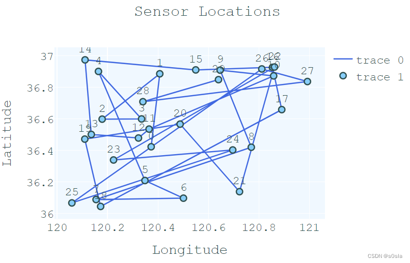


 195
195

 被折叠的 条评论
为什么被折叠?
被折叠的 条评论
为什么被折叠?
 到【灌水乐园】发言


