


WPF 使用 CommunityToolkit.Mvvm 实现级联选择器
控件名:CascadePicker
作 者:WPFDevelopersOrg - 驚鏵
原文链接[1]:https://github.com/yanjinhuagood/WPFCascade
码云链接[2]:https://gitee.com/yanjinhua/WPFCascade
框架使用
.NET5;Visual Studio 2022;
1)CascadePicker.cs 代码如下:
Text获取或设置级联选择器的文本值。IsDropDownOpen级联选择器的下拉菜单是否打开。MaxDropDownHeight级联选择器下拉菜单的最大高度。OnApplyTemplate重写了基类的模板应用方法。MenuItem_Click菜单项点击事件,根据用户选择的菜单项更新级联选择器的文本值,并关闭下拉菜单。GetHierarchicalPath菜单项的层次结构获取完整的路径字符串。GetParentHierarchy菜单项的父级层次结构。
using System;
using System.Collections.Generic;
using System.Windows;
using System.Windows.Controls;
using System.Windows.Controls.Primitives;
using System.Windows.Media;

namespace WpfCascadePicker.Controls
{
    public class CascadePicker : MenuBase
    {
        private static readonly Type _typeofSelf = typeof(CascadePicker);
        static CascadePicker()
        {
            DefaultStyleKeyProperty.OverrideMetadata(_typeofSelf, new FrameworkPropertyMetadata(_typeofSelf));
        }

        public string Text
        {
            get { return (string)GetValue(TextProperty); }
            set { SetValue(TextProperty, value); }
        }

        public static readonly DependencyProperty TextProperty =
            DependencyProperty.Register("Text", typeof(string), typeof(CascadePicker), new PropertyMetadata(string.Empty));


        public static readonly DependencyProperty IsDropDownOpenProperty = DependencyProperty.Register(
            "IsDropDownOpen", typeof(bool), typeof(CascadePicker), new PropertyMetadata(false));

        public bool IsDropDownOpen
        {
            get { return (bool)GetValue(IsDropDownOpenProperty); }
            set { SetValue(IsDropDownOpenProperty, value); }
        }

        public static readonly DependencyProperty MaxDropDownHeightProperty = DependencyProperty.Register(
            "MaxDropDownHeight", typeof(double), typeof(CascadePicker), new PropertyMetadata(SystemParameters.PrimaryScreenHeight / 3.0));
        public double MaxDropDownHeight
        {
            get
            {
                return (double)GetValue(MaxDropDownHeightProperty);
            }
            set
            {
                SetValue(MaxDropDownHeightProperty, value);
            }
        }

        public override void OnApplyTemplate()
        {
            base.OnApplyTemplate();
        }
        public CascadePicker()
        {
            AddHandler(MenuItem.ClickEvent, new RoutedEventHandler(MenuItem_Click));
        }
        private void MenuItem_Click(object sender, RoutedEventArgs e)
        {
            var clickedMenuItem = e.OriginalSource as MenuItem;
            if (clickedMenuItem != null)
            {
                List<string> hierarchy = GetParentHierarchy(clickedMenuItem);
                Text = GetHierarchicalPath(hierarchy);
            }
            IsDropDownOpen = false;
        }
        private string GetHierarchicalPath(List<string> hierarchy)
        {
            hierarchy.Reverse();
            return string.Join(" / ", hierarchy);
        }
        private List<string> GetParentHierarchy(MenuItem item)
        {
            var hierarchy = new List<string>();

            var headerObject = item.Header;
            var propertyInfo = headerObject.GetType().GetProperty(DisplayMemberPath);
            if (propertyInfo != null)
            {
                var displayValue = propertyInfo.GetValue(headerObject, null) as string;
                if (!string.IsNullOrEmpty(displayValue))
                    hierarchy.Add(displayValue);
            }
            var parent = VisualTreeHelper.GetParent(item);
            if (parent != null)
            {
                var stackPanel = parent as StackPanel;
                if (stackPanel != null)
                {
                    var menuItemParent = stackPanel.TemplatedParent as MenuItem;
                    if (menuItemParent != null)
                    {
                        var parentHierarchy = GetParentHierarchy(menuItemParent);
                        hierarchy.AddRange(parentHierarchy);
                    }
                }
            }
            return hierarchy;
        }
    }
}2)CascadePicker.xaml 代码如下:
子菜单项的样式使用了
WD.DefaultMenuItem样式,并绑定了ItemsSource属性。定义了控件的外观和行为,包括边框、文本框、下拉箭头、下拉弹出窗口等元素。
触发器定义了控件的交互行为,例如鼠标悬停、下拉弹出窗口的打开和关闭等。
<Application
x:Class="WpfCascade.App"
xmlns="http://schemas.microsoft.com/winfx/2006/xaml/presentation"
xmlns:x="http://schemas.microsoft.com/winfx/2006/xaml"
xmlns:controls="clr-namespace:WpfCascadePicker.Controls"
xmlns:local="clr-namespace:WpfCascade"
xmlns:wd="https://github.com/WPFDevelopersOrg/WPFDevelopers"
StartupUri="MainWindow.xaml">
<Application.Resources>
<ResourceDictionary>
<ResourceDictionary.MergedDictionaries>
<ResourceDictionary Source="pack://application:,,,/WPFDevelopers;component/Themes/Light.Blue.xaml" />
<!-- 需要注意 wd:Resources 必须在配色主题后,Theme="Dark" 为黑色皮肤 -->
<wd:Resources Theme="Light" />
<ResourceDictionary Source="pack://application:,,,/WPFDevelopers;component/Themes/Theme.xaml" />
</ResourceDictionary.MergedDictionaries>
<Style BasedOn="{StaticResource WD.ControlBasicStyle}" TargetType="{x:Type controls:CascadePicker}">
<Setter Property="HorizontalContentAlignment" Value="Left" />
<Setter Property="VerticalContentAlignment" Value="Center" />
<Setter Property="BorderBrush" Value="{DynamicResource WD.BaseSolidColorBrush}" />
<Setter Property="BorderThickness" Value="1" />
<Setter Property="Background" Value="{DynamicResource WD.BackgroundSolidColorBrush}" />
<Setter Property="Padding" Value="{StaticResource WD.DefaultPadding}" />
<Setter Property="ItemContainerStyle">
<Setter.Value>
<Style BasedOn="{StaticResource WD.DefaultMenuItem}" TargetType="MenuItem">
<Setter Property="ItemsSource" Value="{Binding ItemsSource}" />
<Setter Property="ItemContainerStyle">
<Setter.Value>
<Style BasedOn="{StaticResource WD.DefaultMenuItem}" TargetType="MenuItem">
<Setter Property="ItemsSource" Value="{Binding ItemsSource}" />
</Style>
</Setter.Value>
</Setter>
</Style>
</Setter.Value>
</Setter>
<Setter Property="Template">
<Setter.Value>
<ControlTemplate TargetType="{x:Type controls:CascadePicker}">
<ControlTemplate.Resources>
<Storyboard x:Key="OpenStoryboard">
<DoubleAnimation
EasingFunction="{StaticResource WD.ExponentialEaseOut}"
Storyboard.TargetName="PART_DropDown"
Storyboard.TargetProperty="(Grid.RenderTransform).(ScaleTransform.ScaleY)"
To="1"
Duration="00:00:.2" />
</Storyboard>
<Storyboard x:Key="CloseStoryboard">
<DoubleAnimation
EasingFunction="{StaticResource WD.ExponentialEaseOut}"
Storyboard.TargetName="PART_DropDown"
Storyboard.TargetProperty="(Grid.RenderTransform).(ScaleTransform.ScaleY)"
To="0"
Duration="00:00:.2" />
</Storyboard>
</ControlTemplate.Resources>
<wd:SmallPanel SnapsToDevicePixels="True">
<Border
Name="PART_Border"
Background="{TemplateBinding Background}"
BorderBrush="{TemplateBinding BorderBrush}"
BorderThickness="{TemplateBinding BorderThickness}"
CornerRadius="{Binding Path=(wd:ElementHelper.CornerRadius), RelativeSource={RelativeSource TemplatedParent}}"
SnapsToDevicePixels="True" />
<TextBox
Name="PART_EditableTextBox"
Margin="{TemplateBinding Padding}"
HorizontalAlignment="{TemplateBinding HorizontalContentAlignment}"
VerticalAlignment="{TemplateBinding VerticalContentAlignment}"
Background="{TemplateBinding Background}"
Focusable="True"
Foreground="{DynamicResource WD.PrimaryTextSolidColorBrush}"
IsReadOnly="True"
SelectionBrush="{DynamicResource WD.WindowBorderBrushSolidColorBrush}"
Style="{x:Null}"
Template="{StaticResource WD.ComboBoxTextBox}"
Text="{Binding Text, RelativeSource={RelativeSource TemplatedParent}, Mode=TwoWay}" />
<TextBlock
Name="PART_Watermark"
Margin="{TemplateBinding Padding}"
Padding="1,0"
HorizontalAlignment="{TemplateBinding HorizontalContentAlignment}"
VerticalAlignment="{TemplateBinding VerticalContentAlignment}"
Background="Transparent"
Foreground="{DynamicResource WD.RegularTextSolidColorBrush}"
IsHitTestVisible="False"
Text="{Binding Path=(wd:ElementHelper.Watermark), RelativeSource={RelativeSource TemplatedParent}}"
TextBlock.FontSize="{StaticResource WD.NormalFontSize}"
TextTrimming="CharacterEllipsis"
Visibility="Collapsed" />
<ToggleButton
Name="PART_ToggleButton"
Background="{TemplateBinding Background}"
ClickMode="Release"
Focusable="False"
IsChecked="{Binding IsDropDownOpen, Mode=TwoWay, RelativeSource={RelativeSource TemplatedParent}}"
Style="{x:Null}"
Template="{StaticResource WD.ComboBoxToggleButton}" />
<Popup
Name="PART_Popup"
AllowsTransparency="True"
IsOpen="{Binding IsDropDownOpen, RelativeSource={RelativeSource TemplatedParent}, Mode=TwoWay}"
Placement="Bottom"
PlacementTarget="{Binding ElementName=PART_ToggleButton}"
StaysOpen="False">
<wd:SmallPanel
Name="PART_DropDown"
MinWidth="{TemplateBinding FrameworkElement.ActualWidth}"
MaxHeight="{TemplateBinding MaxDropDownHeight}"
Margin="24,2,24,24"
RenderTransformOrigin=".5,0"
SnapsToDevicePixels="True">
<wd:SmallPanel.RenderTransform>
<ScaleTransform ScaleY="0" />
</wd:SmallPanel.RenderTransform>
<Border
Name="PART_DropDownBorder"
Background="{TemplateBinding Background}"
BorderBrush="{TemplateBinding BorderBrush}"
BorderThickness="{TemplateBinding BorderThickness}"
CornerRadius="{Binding Path=(wd:ElementHelper.CornerRadius), RelativeSource={RelativeSource TemplatedParent}}"
Effect="{StaticResource WD.PopupShadowDepth}"
SnapsToDevicePixels="True"
UseLayoutRounding="True">
<ItemsPresenter />
</Border>
</wd:SmallPanel>
</Popup>
</wd:SmallPanel>
<ControlTemplate.Triggers>
<Trigger SourceName="PART_ToggleButton" Property="IsChecked" Value="True">
<Trigger.EnterActions>
<BeginStoryboard x:Name="BeginStoryboardOpenStoryboard" Storyboard="{StaticResource OpenStoryboard}" />
</Trigger.EnterActions>
<Trigger.ExitActions>
<StopStoryboard BeginStoryboardName="BeginStoryboardOpenStoryboard" />
</Trigger.ExitActions>
</Trigger>
<Trigger SourceName="PART_ToggleButton" Property="IsChecked" Value="False">
<Trigger.EnterActions>
<BeginStoryboard x:Name="BeginStoryboardCloseStoryboard" Storyboard="{StaticResource CloseStoryboard}" />
</Trigger.EnterActions>
<Trigger.ExitActions>
<StopStoryboard BeginStoryboardName="BeginStoryboardCloseStoryboard" />
</Trigger.ExitActions>
</Trigger>
<Trigger Property="UIElement.IsMouseOver" Value="True">
<Setter TargetName="PART_Border" Property="BorderBrush" Value="{DynamicResource WD.PrimaryNormalSolidColorBrush}" />
</Trigger>
<Trigger SourceName="PART_EditableTextBox" Property="Text" Value="">
<Setter TargetName="PART_Watermark" Property="Visibility" Value="Visible" />
</Trigger>
<Trigger SourceName="PART_EditableTextBox" Property="Text" Value="{x:Null}">
<Setter TargetName="PART_Watermark" Property="Visibility" Value="Visible" />
</Trigger>
</ControlTemplate.Triggers>
</ControlTemplate>
</Setter.Value>
</Setter>
</Style>
</ResourceDictionary>
</Application.Resources>
</Application>3)CascadePickerExample.xaml 示例代码如下:
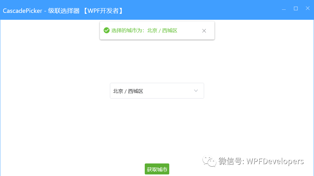
<controls:CascadePicker
            Width="240"
            Height="40"
            wd:ElementHelper.Watermark="请选择内容"
            DisplayMemberPath="Name"
            Text="{Binding City, Mode=TwoWay, UpdateSourceTrigger=PropertyChanged}"
            ItemsSource="{Binding CityInfos}" />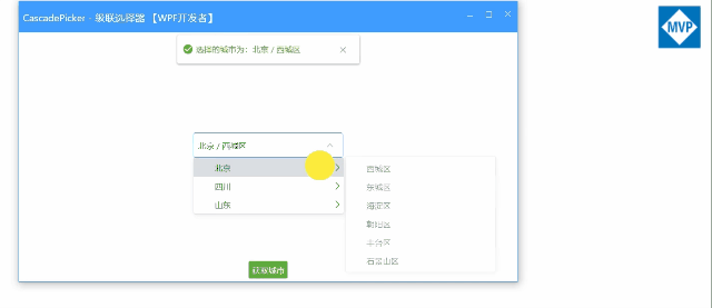
更多源码请下载源码
参考资料
[1]
原文链接: https://github.com/yanjinhuagood/WPFCascade
[2]码云链接: https://gitee.com/yanjinhua/WPFCascade


 696
696


 被折叠的 条评论
为什么被折叠?
被折叠的 条评论
为什么被折叠?
 到【灌水乐园】发言


