


处理数据既是艺术也是科学,我们总是讨论科学部分,但是在这一章节中我们会讨论艺术部分。
探索数据(Exploring Your Data)
在你发现问题后,你会尝试回答并且处理数据,你可能被诱惑并且立刻开始建立模型,但是请抵抗这种欲望,你首先第一步要探索你的数据。
探索一维数据(Exploring One-Dimensional Data)
最简单的例子就是你拥有一维数据集,它有数字组成。例如,每个用户在你的网站上每天花费的平均时间;每个数据科学教程视频被看的次数;在你的书籍里每本关于数据科学的书有多少页。
很显然第一步是计算一些概述统计。你想要知道数据点的数量;最大值;最小值;均值;标准差。
但是上面这些统计没有给你更好的理解。下一步是创建直方图,在这里,你能把数据分组到离散的桶中并计算每个桶中有多少数据点:
def bucketize(point, bucket_size):
    """floor the point to the next lower multiple of bucket_size"""
    return bucket_size * math.floor(point / bucket_size)
def make_histogram(points, bucket_size):
    """buckets the points and counts how many in each bucket"""
    return Counter(bucketize(point, bucket_size) for point in points)
def plot_histogram(points, bucket_size, title=""):
    histogram = make_histogram(points, bucket_size)
    plt.bar(histogram.keys(), histogram.values(), width=bucket_size)
    plt.title(title)
    plt.show()
例如,考虑下面2组数据集:
random.seed(0)

# uniform between -100 and 100
uniform = [200 * random.random() - 100 for _ in range(10000)]

# normal distribution with mean 0, standard deviation 57
normal = [57 * inverse_normal_cdf(random.random())
for _ in range(10000)]
两个数据集(uniform和normal)均值都接近0并且标准差接近58,然而他们有不同的分布:
plot_histogram(uniform, 10, "Uniform Histogram")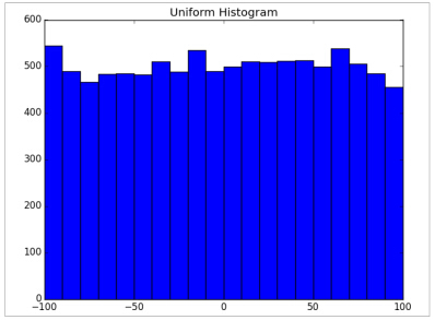
正态分布:
plot_histogram(normal, 10, "Normal Histogram")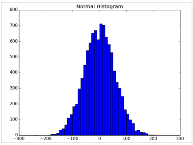
在这种情况下,2个分布有极不同的最大值和最小值,但是虽然知道这个也不能足够理解他们是怎样的不同。
二维数据(Two Dimensions)
现在设想你有二维数据集,也许附加数据科学经历的年限,当然你想要单独理解每一维。但是你也许想要理解它们的关系。
例如,考虑另外一组伪造的数据集:
def random_normal():
    """returns a random draw from a standard normal distribution"""
    return inverse_normal_cdf(random.random())

xs = [random_normal() for _ in range(1000)]
ys1 = [ x + random_normal() / 2 for x in xs]
ys2 = [-x + random_normal() / 2 for x in xs]
如果你在ys1和ys2上运行plot_histogram,你会得到相似的图像。(的确,它们是具有相同均值和方差的正态分布)
但是当ys1和ys2分别于xs组成联合分布那就大不相同:
plt.scatter(xs, ys1, marker='.', color='black', label='ys1')
plt.scatter(xs, ys2, marker='.', color='gray', label='ys2')
plt.xlabel('xs')
plt.ylabel('ys')
plt.legend(loc=9)
plt.title("Very Different Joint Distributions")
plt.show()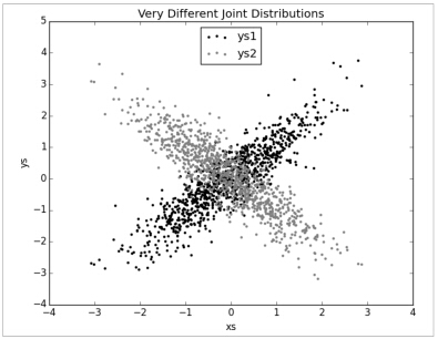
如果你看这个相关系数,你就能看出不同:
print correlation(xs, ys1) # 0.9
print correlation(xs, ys2) # -0.9
多维数据(Many Dimensions)
带着许多维度,你想要知道全部维度跟另外一个维度的关系,一个简单的方法就是看相关性矩阵,在数据中第i维和第j维之间的关系可以看成相关性矩阵第i行和第j列的相关系数:
def correlation_matrix(data):
    """returns the num_columns x num_columns matrix whose (i, j)th entry
    is the correlation between columns i and j of data"""

    _, num_columns = shape(data)

    def matrix_entry(i, j):
        return correlation(get_column(data, i), get_column(data, j))

    return make_matrix(num_columns, num_columns, matrix_entry)
一个更加直观的方法(如果你没有很多维度)是做散点矩阵图,那个显示成对的散点图,为了做这个我们使用plt.subplots(),那个允许我们在一副图上创建子图:
import matplotlib.pyplot as plt

_, num_columns = shape(data)
fig, ax = plt.subplots(num_columns, num_columns)

for i in range(num_columns):
    for j in range(num_columns):

    # scatter column_j on the x-axis vs column_i on the y-axis
    if i != j: ax[i][j].scatter(get_column(data, j), get_column(data, i))

    # unless i == j, in which case show the series name
    else: ax[i][j].annotate("series " + str(i), (0.5, 0.5),
                            xycoords='axes fraction',
                            ha="center", va="center")

    # then hide axis labels except left and bottom charts
    if i < num_columns - 1: ax[i][j].xaxis.set_visible(False)
    if j > 0: ax[i][j].yaxis.set_visible(False)

# fix the bottom right and top left axis labels, which are wrong because
# their charts only have text in them
ax[-1][-1].set_xlim(ax[0][-1].get_xlim())
ax[0][0].set_ylim(ax[0][1].get_ylim())

plt.show()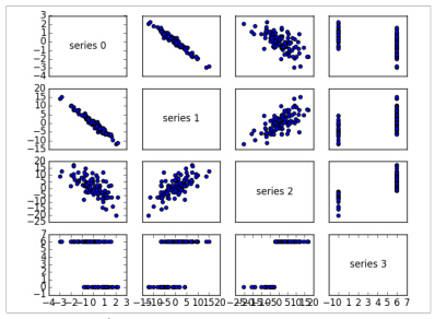
看这个散点图,你能看到series1跟series0是负相关的;series2跟series1是正相关;series3只取0值和6值,其中0对应series2中的小值,6对应的是大值。
这是一个快速的方法让你粗略感知变量之间的相关性。


 4023
4023

 被折叠的 条评论
为什么被折叠?
被折叠的 条评论
为什么被折叠?
 到【灌水乐园】发言


