


Matplotlib绘图
Matplotlib基本概念
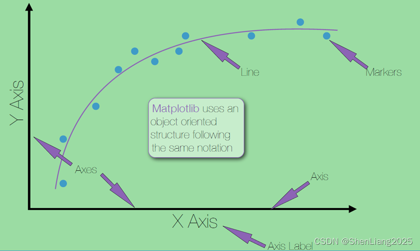
Matplotlib:基于对象的思维构建的视觉符号。
每一个Axes(坐标轴)对象包含一个或者多个Axis(轴)对象,比如X轴、Y轴。
一个Figure(画像)是由一堆坐标轴对象组成的。
换句话说,Marker(标记)/Line(线)表示针对一个或多个Axis(轴)绘制的数据集。一个Axes对象(有效地)是一个Figure(画像)的子图
连续图
绘制连续图(连线图、折线图)。
需求说明:对GDP数据按照年进行绘制。
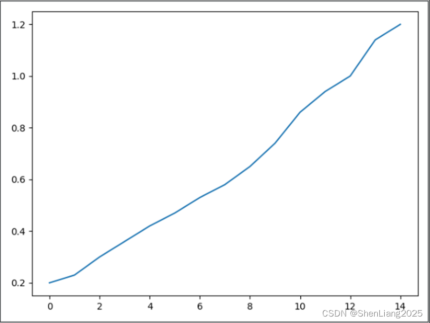
默认方式
hfgdp = [0.2,0.23,0.3,0.36,0.42,0.47,0.53,0.58,0.65,0.74,0.86,0.94,1,1.14,1.2]
plt.plot(hfgdp)
plt.show()
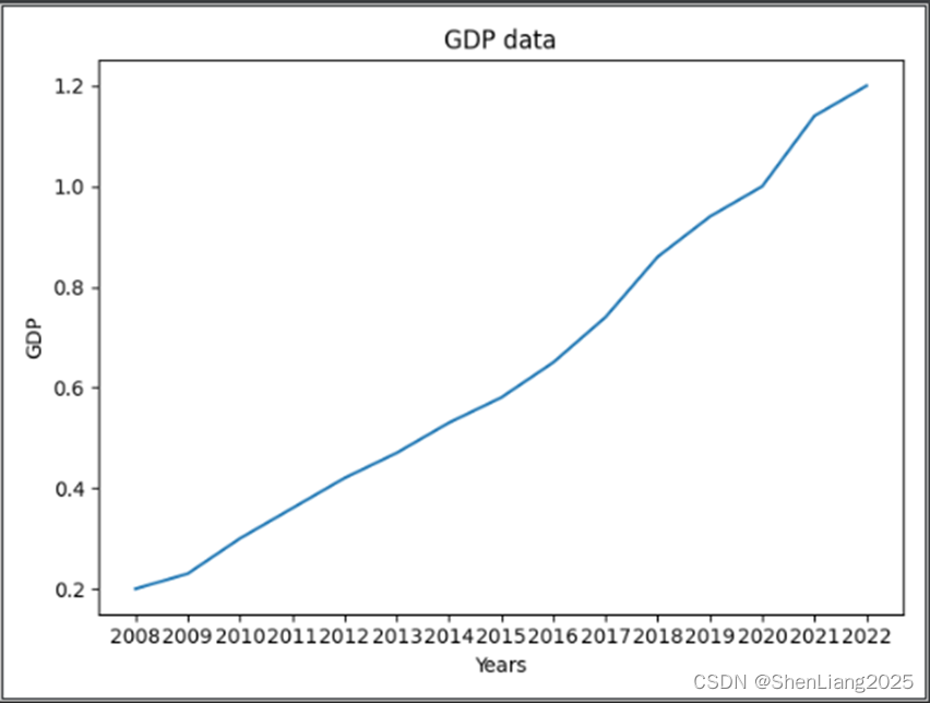
添加轴说明
这里指定X轴为年份、Y轴位GDP值,标题为GDP data
hfgdp = [0.2,0.23,0.3,0.36,0.42,0.47,0.53,0.58,0.65,0.74,0.86,0.94,1,1.14,1.2]
years = [str(i) for i in range(2008,2008+len(hfgdp))]
fig,ax = plt.subplots()
ax.plot(years, hfgdp)
ax.set(xlabel='Years',ylabel='GDP',title='GDP data')
plt.show()
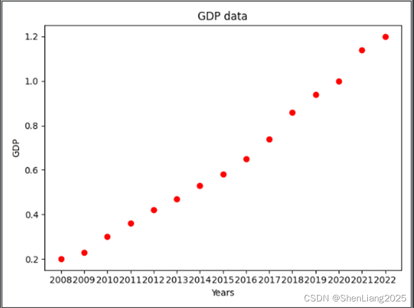
展示离散点
指定离散值以红点的形式展示。
hfgdp = [0.2,0.23,0.3,0.36,0.42,0.47,0.53,0.58,0.65,0.74,0.86,0.94,1,1.14,1.2]
years = [str(i) for i in range(2008,2008+len(hfgdp))]
fig,ax = plt.subplots()
ax.plot(years, hfgdp ,"ro")
ax.set(xlabel='Years',ylabel='GDP',title='GDP data')
plt.show()
标记marker的样式见下,一般常用的是“o”即圆点。
|
参数 |
说明 |
|
'-' |
实线 |
|
'--' |
虚线 |
|
'-.' |
点划线 |
|
':' |
冒号 |
|
'.' |
点 |
|
',' |
像素 |
|
'o' |
圆圈 |
|
'v' |
下尖号 |
|
'^' |
上尖号 |
|
'<' |
左尖号 |
|
'>' |
右尖号 |
|
'1' |
下三角 |
|
'2' |
上三角 |
|
'3' |
左三角 |
|
'4' |
右三角 |
|
's' |
方块 |
|
'p' |
五边形 |
|
'*' |
星号 |
|
'h' |
六边形 |
|
'H' |
六边形 |
|
'+' |
加号 |
|
'x' |
字母x |
|
'D' |
钻石 |
|
'd' |
细钻石 |
|
'|' |
竖线 |
|
'_' |
横线 |
|
参数 |
说明 |
|
'b' |
蓝色 |
|
'g' |
绿色 |
|
'r' |
红色 |
|
'c' |
青色 |
|
'm' |
洋红 |
|
'y' |
黄色 |
|
'b' |
黑色 |
|
'w' |
白色 |
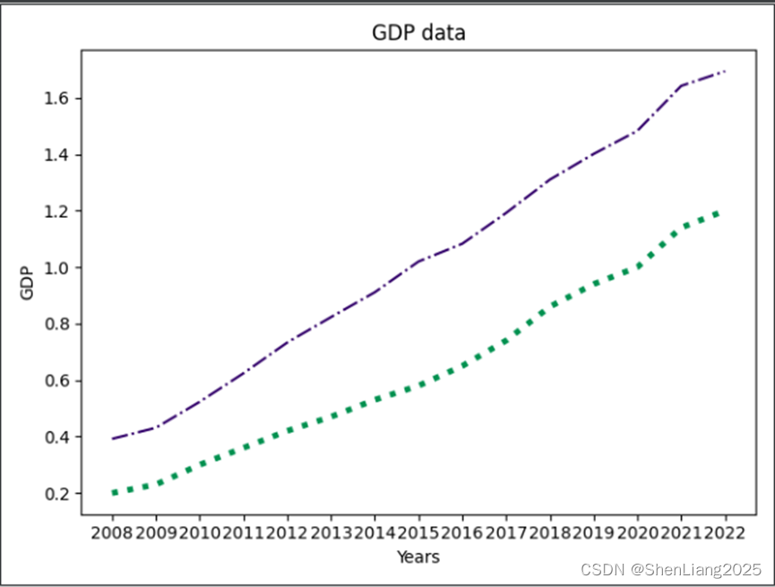
指定输出格式
可以自定义颜色及线的粗细程度。
hfgdp = [0.2,0.23,0.3,0.36,0.42,0.47,0.53,0.58,0.65,0.74,0.86,0.94,1,1.14,1.2]
njgdp = [0.392,0.431,0.523,0.624,0.733,0.823,0.911,1.02,1.083,1.192,1.31,1.401,1.483,1.642,1.694]
years = [str(i) for i in range(2008,2008+len(hfgdp))]
fig,ax = plt.subplots()
ax.plot(years,hfgdp,color="#009150",linewidth=3.5,linestyle=":")
ax.plot(years,njgdp,color="#33036b",linewidth=1.5,linestyle="-.")
ax.set(xlabel='Years',ylabel='GDP',title='GDP data')
plt.show()
饼图
计算程序语言的占比的饼图。
labels =  'Python','C', 'Java', 'C++', 'C#', 'others'
rate = [14.26,13.06,11.19,8.66,5.92]
explode=(0,0.1,0,0,0.2,0)
rate.append(100-sum(rate))
fig,ax = plt.subplots()
ax.pie(rate,labels=labels,explode=explode,autopct='%1.0f%%',shadow=True,startangle=0)
plt.title("Program Language rate 2022 Mar")
plt.show()

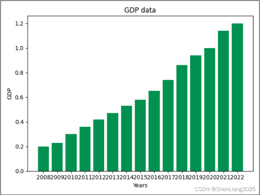
柱状图
普通柱状图
通过柱状图展示GDP的明细数据。
hfgdp = [0.2,0.23,0.3,0.36,0.42,0.47,0.53,0.58,0.65,0.74,0.86,0.94,1,1.14,1.2]
years = [str(i) for i in range(2008,2008+len(hfgdp))]
fig,ax = plt.subplots()
plt.bar (years,hfgdp,color="#009150",linewidth=3.5,linestyle=":")
ax.set(xlabel='Years',ylabel='GDP',title='GDP data')
plt.show()
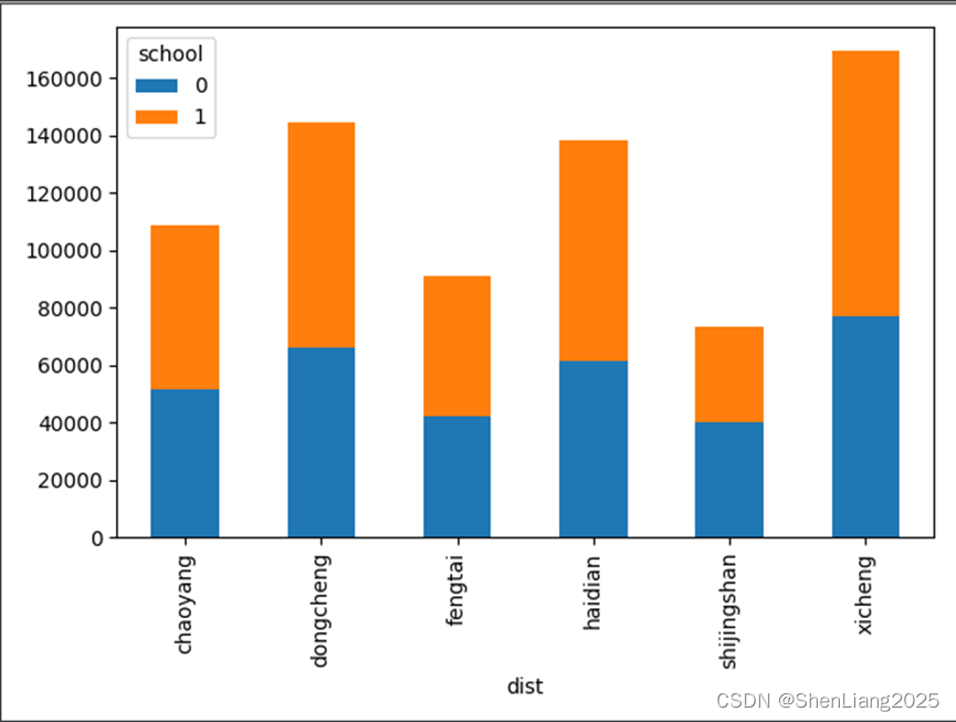
两分类堆叠柱状图
housedata=pd.read_csv('data/sndHsPr.csv')
data = housedata.pivot_table(values='price',index='dist',columns=['school'],aggfunc=np.mean)
data.plot(kind='bar',stacked=True)
plt.show()
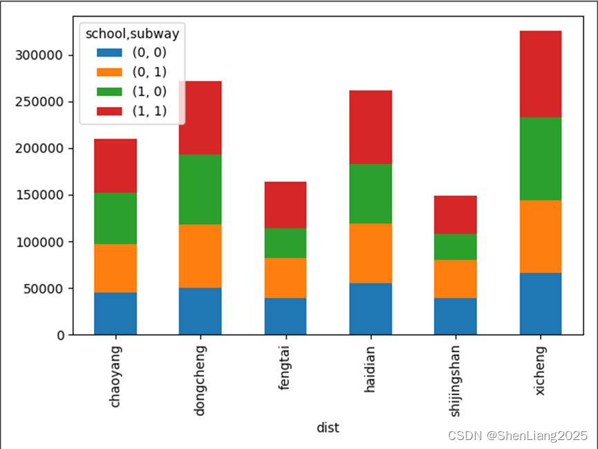
多分类堆叠柱状图
housedata=pd.read_csv('data/sndHsPr.csv')
data = housedata.pivot_table(values='price',index='dist',columns=['school','subway'],aggfunc=np.mean)
data.plot(kind='bar',stacked=True)
plt.show()
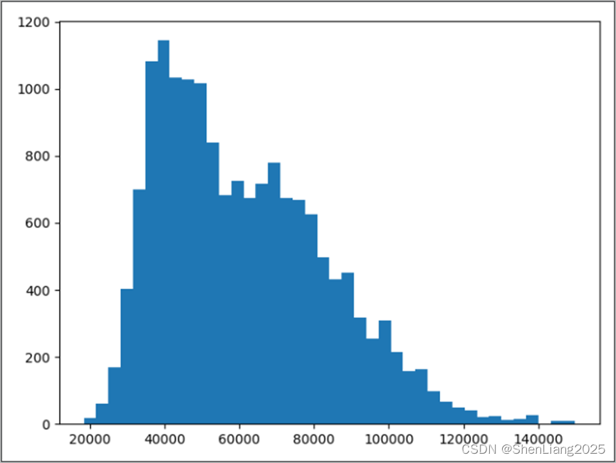
直方图
housedata=pd.read_csv('data/sndHsPr.csv')
plt.hist(housedata['price'],bins=40)
plt.show()
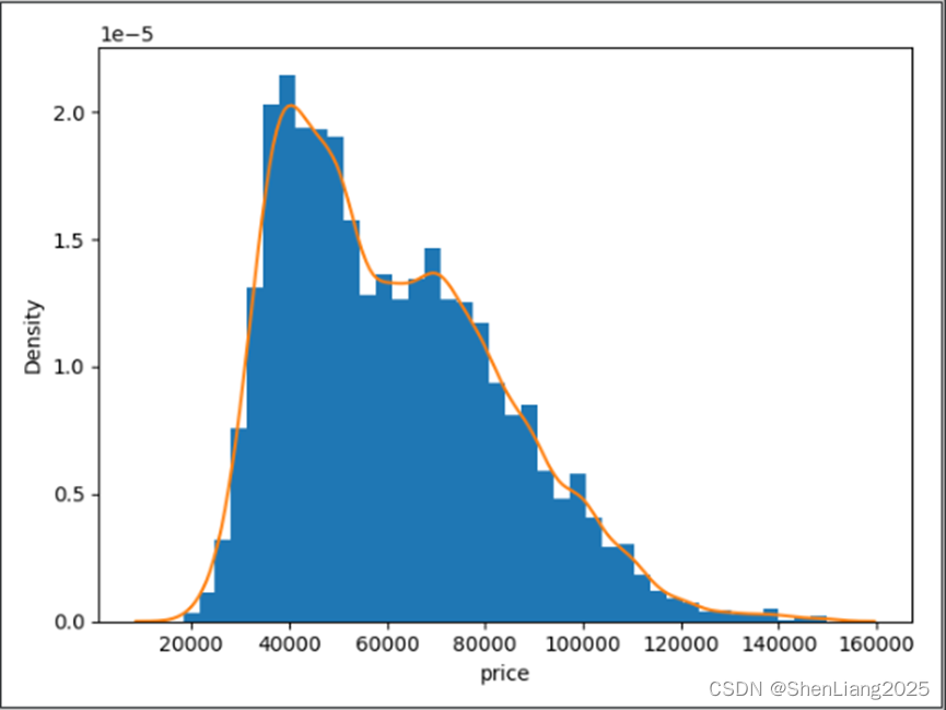
概率密度图
import seaborn as sns
housedata=pd.read_csv('data/sndHsPr.csv')
price=housedata['price']
plt.hist(price,bins=40,density=True)
sns.kdeplot(price)
plt.show()
sns.displot(data=rate,kde=True)
plt.show()
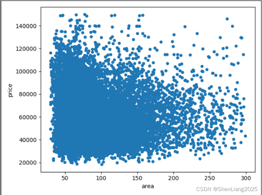
散点图
housedata=pd.read_csv('data/sndHsPr.csv')
housedata.plot.scatter(x='area',y='price')
plt.show()
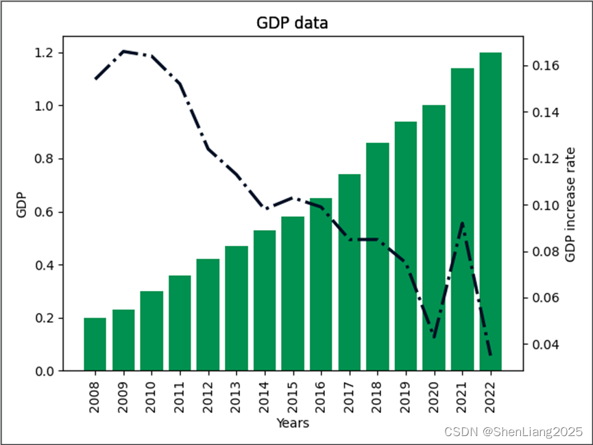
双轴图
通过展示GDP和GDP增长率,以双轴的形式显示。
hfgdp = [0.2,0.23,0.3,0.36,0.42,0.47,0.53,0.58,0.65,0.74,0.86,0.94,1,1.14,1.2]
hfgdpcr = [0.154,0.166,0.164,0.152,0.124,0.113,0.098,0.103,0.099,0.085,0.085,0.075,0.043,0.092,0.035]
#plt.plot(gdp)
#plt.xticks(rotation=270)
years = [str(i) for i in range(2008,2008+len(hfgdp))]
fig,ax = plt.subplots()
plt.bar (years,hfgdp,color="#009150",width=0.8)
ax.set(xlabel='Years',ylabel='GDP',title='GDP data')
plt.xticks(rotation=90) #控制x轴里值的显示方式,水平或者垂直及任意角度
axr=ax.twinx()
axr.plot(years,hfgdpcr,color="#001024",linewidth=2.5,linestyle="-.")

axr.set(ylabel='GDP increase rate',title='GDP data')
plt.show()
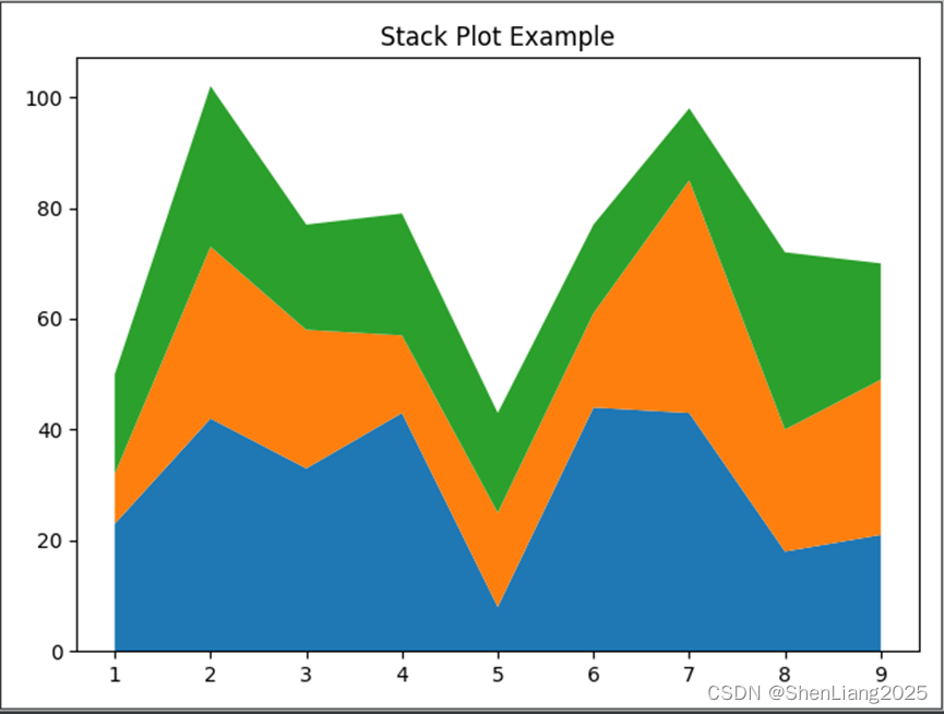
面积图
idx = [ 1, 2, 3, 4, 5, 6, 7, 8, 9]
y1 = [23, 42, 33, 43, 8, 44, 43, 18, 21]
y2 = [9, 31, 25, 14, 17, 17, 42, 22, 28]
y3 = [18, 29, 19, 22, 18, 16, 13, 32, 21]
plt.stackplot(idx,
y1, y2, y3)
plt.title('Stack Plot Example')
plt.show()
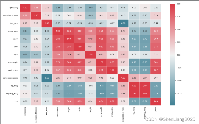
热力图
普通热力图
import seaborn as sns

import pandas as pd

df = pd.read_csv("data/automobile.csv")

sns.set(rc={'figure.figsize':(16,10)})

cm = df.columns.tolist()

xcorr = df.corr()

#cmap是设置热图的颜色

cmap = sns.diverging_palette(220, 10, as_cmap=True)

sns.heatmap(data=df.corr(),

            annot=True,

            linewidths=.5,

            center=0,

            cbar=True,

            #mask=mask,

            cmap=cmap, #"PiYG",

            fmt='0.2f')

#plt.savefig("data/mobile.png")

plt.show()
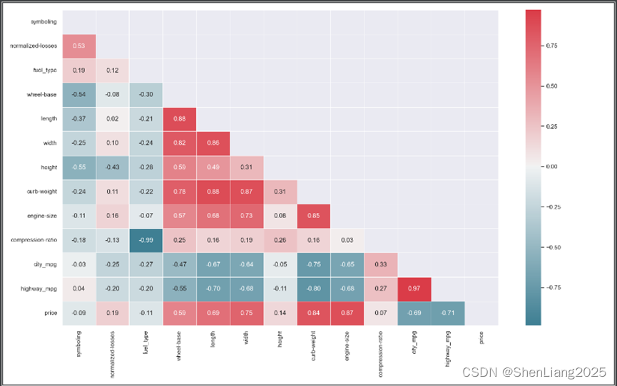
仅显示左下角热力图
import seaborn as sns

import pandas as pd

df = pd.read_csv("data/automobile.csv")


sns.set(rc={'figure.figsize':(16,10)})

cm = df.columns.tolist()

xcorr = df.corr()

#设置右上三角不绘制


#mask为 和相关系数矩阵xcorr一样大的 全0(False)矩阵

mask = np.zeros_like(xcorr, dtype=np.bool_)

# 将mask右上三角(列号》=行号)设置为True

mask[np.triu_indices_from(mask)] = True

#cmap是设置热图的颜色

cmap = sns.diverging_palette(220, 10, as_cmap=True)

sns.heatmap(data=df.corr(),

            annot=True,

            linewidths=.5,

            center=0,

            cbar=True,

            mask=mask,

            cmap=cmap, #"PiYG",

            fmt='0.2f')

plt.savefig("data/mobile.png")

plt.show()
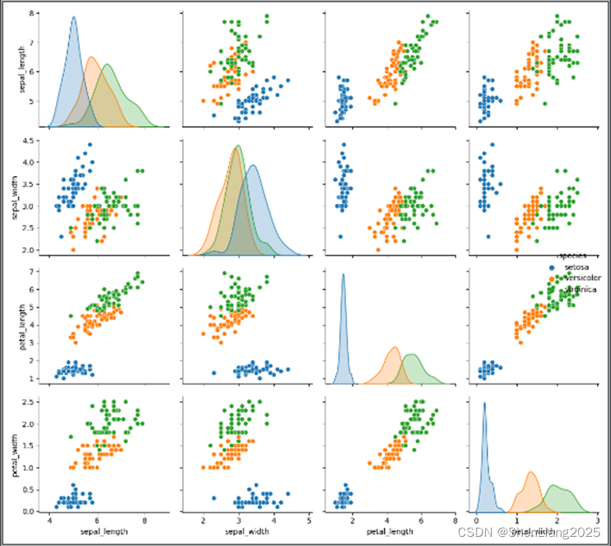
成对图
import seaborn as sns
import matplotlib.pyplot as plt
iris= sns.load_dataset('iris')
sns.pairplot(iris, hue='species')
plt.show()


 1万+
1万+

 被折叠的 条评论
为什么被折叠?
被折叠的 条评论
为什么被折叠?
 到【灌水乐园】发言


