


自定义绘制设置
当某些组件本身的绘制内容不满足需求时,可使用自定义组件绘制功能,在原有组件基础上部分绘制、或者全部自行绘制,以达到预期效果。例如:独特的按钮形状、文字和图像混合的图标等。自定义组件绘制提供了自定义绘制修改器,来实现更自由地组件绘制。
说明:
从API Version 12开始支持。后续版本如有新增内容,则采用上角标单独标记该内容的起始版本。
drawModifier
drawModifier(modifier: DrawModifier | undefined)
设置组件的自定义绘制修改器。
系统能力: SystemCapability.ArkUI.ArkUI.Full
组件支持范围:
AlphabetIndexer、Badge、Blank、Button、CalendarPicker、Checkbox、CheckboxGroup、Circle、Column、ColumnSplit、Counter、DataPanel、DatePicker、Ellipse、Flex、FlowItem、FolderStack、FormLink、Gauge、Grid、GridCol、GridItem、GridRow、Hyperlink、Image、ImageAnimator、ImageSpan、Line、List、ListItem、ListItemGroup、LoadingProgress、Marquee、Menu、MenuItem、MenuItemGroup、NavDestination、Navigation、Navigator、NavRouter、NodeContainer、Path、PatternLock、Polygon、Polyline、Progress、QRCode、Radio、Rating、Rect、Refresh、RelativeContainer、RichEditor、Row、RowSplit、Scroll、ScrollBar、Search、Select、Shape、SideBarContainer、Slider、Stack、Stepper、StepperItem、Swiper、SymbolGlyph、TabContent、Tabs、Text、TextArea、TextClock、TextInput、TextPicker、TextTimer、TimePicker、Toggle、WaterFlow、XComponent
参数:
| 参数名 | 类型 | 必填 | 说明 |
|---|---|---|---|
| modifier | DrawModifier | undefined | 是 | 自定义绘制修改器,其中定义了自定义绘制的逻辑。 默认值:undefined 说明: 每个自定义修改器只对当前绑定组件的FrameNode生效,对其子节点不生效。 |
DrawModifier
DrawModifier可设置前景(drawFront)、内容(drawContent)和背景(drawBehind)的绘制方法,还提供主动触发重绘的方法invalidate。每个DrawModifier实例只能设置到一个组件上,禁止进行重复设置
系统能力: SystemCapability.ArkUI.ArkUI.Full
drawFront
drawFront?(drawContext: DrawContext): void
自定义绘制前景的接口,若重载该方法则可进行前景的自定义绘制。
系统能力: SystemCapability.ArkUI.ArkUI.Full
参数:
| 参数名 | 类型 | 必填 | 说明 |
|---|---|---|---|
| drawContext | DrawContext | 是 | 图形绘制上下文。 |
drawContent
drawContent?(drawContext: DrawContext): void
自定义绘制内容的接口,若重载该方法可进行内容的自定义绘制,会替换组件原本的内容绘制函数。
系统能力: SystemCapability.ArkUI.ArkUI.Full
参数:
| 参数名 | 类型 | 必填 | 说明 |
|---|---|---|---|
| drawContext | DrawContext | 是 | 图形绘制上下文。 |
drawBehind
drawBehind?(drawContext: DrawContext): void
自定义绘制背景的接口,若重载该方法则可进行背景的自定义绘制。
系统能力: SystemCapability.ArkUI.ArkUI.Full
参数:
| 参数名 | 类型 | 必填 | 说明 |
|---|---|---|---|
| drawContext | DrawContext | 是 | 图形绘制上下文。 |
invalidate
invalidate(): void
主动触发重绘的接口,开发者无需也无法重载,调用会触发所绑定组件的重绘。
系统能力: SystemCapability.ArkUI.ArkUI.Full
示例
// xxx.ets
import drawing from '@ohos.graphics.drawing';
import animator, { AnimatorResult } from '@ohos.animator';

class MyFullDrawModifier extends DrawModifier {
  public scaleX: number = 1;
  public scaleY: number = 1;

  drawBehind(context: DrawContext): void
  {
    const brush = new drawing.Brush();
    brush.setColor({
      alpha: 255,
      red: 255,
      green: 0,
      blue: 0
    });
    context.canvas.attachBrush(brush);
    const halfWidth = context.size.width / 2;
    const halfHeight = context.size.width / 2;
    context.canvas.drawRect({
      left: vp2px(halfWidth - 50 * this.scaleX),
      top: vp2px(halfHeight - 50 * this.scaleY),
      right: vp2px(halfWidth + 50 * this.scaleX),
      bottom: vp2px(halfHeight + 50 * this.scaleY)
    });
  }

  drawContent(context: DrawContext): void
  {
    const brush = new drawing.Brush();
    brush.setColor({
      alpha: 255,
      red: 0,
      green: 255,
      blue: 0
    });
    context.canvas.attachBrush(brush);
    const halfWidth = context.size.width / 2;
    const halfHeight = context.size.width / 2;
    context.canvas.drawRect({
      left: vp2px(halfWidth - 30 * this.scaleX),
      top: vp2px(halfHeight - 30 * this.scaleY),
      right: vp2px(halfWidth + 30 * this.scaleX),
      bottom: vp2px(halfHeight + 30 * this.scaleY)
    });
  }

  drawFront(context: DrawContext): void
  {
    const brush = new drawing.Brush();
    brush.setColor({
      alpha: 255,
      red: 0,
      green: 0,
      blue: 255
    });
    context.canvas.attachBrush(brush);
    const halfWidth = context.size.width / 2;
    const halfHeight = context.size.width / 2;
    const radiusScale = (this.scaleX + this.scaleY) / 2;
    context.canvas.drawCircle(vp2px(halfWidth), vp2px(halfHeight), vp2px(20 * radiusScale));
  }
}

class MyFrontDrawModifier extends DrawModifier {
  public scaleX: number = 1;
  public scaleY: number = 1;

  drawFront(context: DrawContext): void
  {
    const brush = new drawing.Brush();
    brush.setColor({
      alpha: 255,
      red: 0,
      green: 255,
      blue: 0
    });
    context.canvas.attachBrush(brush);
    const halfWidth = context.size.width / 2;
    const halfHeight = context.size.width / 2;
    const radiusScale = (this.scaleX + this.scaleY) / 2;
    context.canvas.drawCircle(vp2px(halfWidth), vp2px(halfHeight), vp2px(20 * radiusScale));
  }
}

@Entry
@Component
struct DrawModifierExample {
  private fullModifier: MyFullDrawModifier = new MyFullDrawModifier();
  private frontModifier: MyFrontDrawModifier = new MyFrontDrawModifier();
  private drawAnimator: AnimatorResult | undefined = undefined;
  @State modifier: DrawModifier = new MyFrontDrawModifier();
  private count = 0;

  create() {
    let self = this;
    this.drawAnimator = animator.create({
      duration: 1000,
      easing: 'ease',
      delay: 0,
      fill: 'forwards',
      direction: 'normal',
      iterations: 1,
      begin: 0,
      end: 2
    });
    this.drawAnimator.onFrame = (value: number) => {
      console.log('frame value =', value);
      const tempModifier = self.modifier as MyFullDrawModifier | MyFrontDrawModifier;
      tempModifier.scaleX = Math.abs(value - 1);
      tempModifier.scaleY = Math.abs(value - 1);
      self.modifier.invalidate();
    };
  }

  build() {
    Column() {
      Row() {
        Text('test text')
        .width(100)
        .height(100)
        .margin(10)
        .backgroundColor(Color.Gray)
        .onClick(() => {
          const tempModifier = this.modifier as MyFullDrawModifier | MyFrontDrawModifier;
          tempModifier.scaleX -= 0.1;
          tempModifier.scaleY -= 0.1;
        })
        .drawModifier(this.modifier)
      }
      Row() {
        Button('create')
        .width(100)
        .height(100)
        .margin(10)
        .onClick(() => {
          this.create();
        })
        Button('play')
        .width(100)
        .height(100)
        .margin(10)
        .onClick(() => {
          if (this.drawAnimator) {
            this.drawAnimator.play();
          }
        })
        Button('changeModifier')
        .width(100)
        .height(100)
        .margin(10)
        .onClick(() => {
          this.count += 1;
          if (this.count % 2 === 1) {
            console.log('change to full modifier');
            this.modifier = this.fullModifier;
          } else {
            console.log('change to front modifier');
            this.modifier = this.frontModifier;
          }
        })
      }
    }
    .width('100%')
    .height('100%')
  }
}
ts
最后
有很多小伙伴不知道学习哪些鸿蒙开发技术?不知道需要重点掌握哪些鸿蒙应用开发知识点?而且学习时频繁踩坑,最终浪费大量时间。所以有一份实用的鸿蒙(HarmonyOS NEXT)资料用来跟着学习是非常有必要的。
这份鸿蒙(HarmonyOS NEXT)资料包含了鸿蒙开发必掌握的核心知识要点,内容包含了(ArkTS、ArkUI开发组件、Stage模型、多端部署、分布式应用开发、音频、视频、WebGL、OpenHarmony多媒体技术、Napi组件、OpenHarmony内核、OpenHarmony南向开发、鸿蒙项目实战等等)鸿蒙(HarmonyOS NEXT)技术知识点。
希望这一份鸿蒙学习资料能够给大家带来帮助,有需要的小伙伴自行领取,限时开源,先到先得~无套路领取!!
获取这份完整版高清学习路线,请点击→纯血版全套鸿蒙HarmonyOS NEXT学习资料
鸿蒙(HarmonyOS NEXT)最新学习路线

-
HarmonOS基础技能

- HarmonOS就业必备技能

- HarmonOS多媒体技术

- 鸿蒙NaPi组件进阶

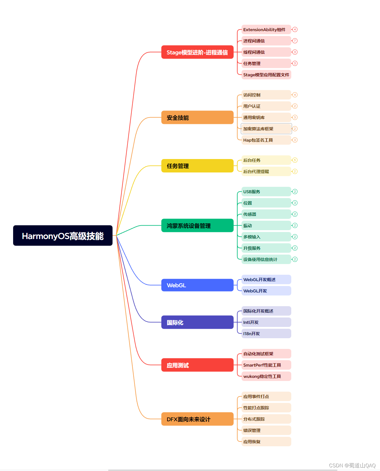
- HarmonOS高级技能
- 初识HarmonOS内核

- 实战就业级设备开发

有了路线图,怎么能没有学习资料呢,小编也准备了一份联合鸿蒙官方发布笔记整理收纳的一套系统性的鸿蒙(OpenHarmony )学习手册(共计1236页)与鸿蒙(OpenHarmony )开发入门教学视频,内容包含:ArkTS、ArkUI、Web开发、应用模型、资源分类…等知识点。
获取以上完整版高清学习路线,请点击→纯血版全套鸿蒙HarmonyOS NEXT学习资料
《鸿蒙 (OpenHarmony)开发入门教学视频》

《鸿蒙生态应用开发V2.0白皮书》

《鸿蒙 (OpenHarmony)开发基础到实战手册》
OpenHarmony北向、南向开发环境搭建

《鸿蒙开发基础》
- ArkTS语言
- 安装DevEco Studio
- 运用你的第一个ArkTS应用
- ArkUI声明式UI开发
- .……

《鸿蒙开发进阶》
- Stage模型入门
- 网络管理
- 数据管理
- 电话服务
- 分布式应用开发
- 通知与窗口管理
- 多媒体技术
- 安全技能
- 任务管理
- WebGL
- 国际化开发
- 应用测试
- DFX面向未来设计
- 鸿蒙系统移植和裁剪定制
- ……

《鸿蒙进阶实战》
- ArkTS实践
- UIAbility应用
- 网络案例
- ……

获取以上完整鸿蒙HarmonyOS学习资料,请点击→纯血版全套鸿蒙HarmonyOS NEXT学习资料
总结
总的来说,华为鸿蒙不再兼容安卓,对中年程序员来说是一个挑战,也是一个机会。只有积极应对变化,不断学习和提升自己,他们才能在这个变革的时代中立于不败之地。


 扫一扫
扫一扫
 46
46

 被折叠的 条评论
为什么被折叠?
被折叠的 条评论
为什么被折叠?
 到【灌水乐园】发言


