


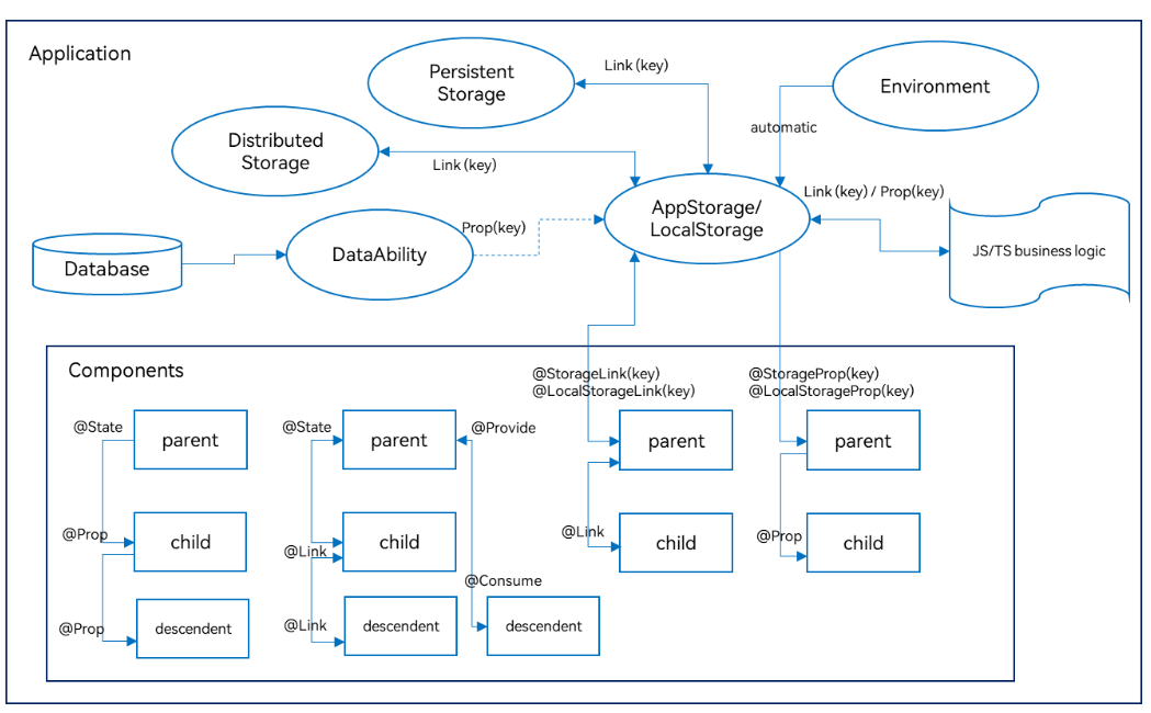
ArkTS-装饰器
- ■ UI状态管理
- ■ @Entry (进入)页面的生命周期
- ■ @Component (组件)
- ■ @Builder(构建): 自定义构建函数可复用 UI 片段
- ■ @Extend (扩展组件) // @Extend仅支持在全局定义,不支持在组件内部定义
- ■ @Styles (样式) //定义组件重用样式
- ■ @State(状态)
- ■ @Prop(父子单向同步)
- ■ @Link (双向数据绑定)
- ■ AppStorage
- ■ @ObjectLink (与父组件共享同一对象引用)
- ■ @Observed (观察)
- ■ @Track(跟踪)
- ■ @Provide(提供数据)和@Consume (消费数据)
- ■ @Watch(监听)
- ■ @Monitor (监听) //状态变量修改
- ■ @LocalBuilder: 维持组件父子关系
- ■ @AnimatableExtend(动画)
- ■ @Require装饰器:校验构造传参
- ■ @Reusable (复用) //组件复用
- ■ @Param (参数) 组件外部输入
- ■ @Once:初始化同步一次
- ■ @Event (事件)
- ■ @Type (类型) //标记类属性的类型
■ UI状态管理
■ @Entry (进入)页面的生命周期
一个页面有且仅有一个@Entry入口。
■ aboutToAppear
aboutToAppear 是一个生命周期钩子,在组件构建(build)之前、首次出现或重新出现时自动执行。

@Entry
@Component
struct IndexPage {


  @State userInfo: string = ''
  // 生命周期:组件即将显示时调用
  aboutToAppear() {


    console.info('IndexPage 即将显示')

    // 示例1:从 AppStorage 获取数据
    this.userInfo = AppStorage.get<string>('userName', '匿名用户')

    // 示例2:模拟网络请求
    this.loadUserData()

    // 示例3:埋点统计
    analyticsService.pageView('HomePage')
  }

  async loadUserData() {


    try {


      // 模拟异步请求
      const data = await fetchUserApi()
      console.info('用户数据加载完成:', data)
      // 更新状态,触发 UI 刷新
      this.userInfo = data.name
    } catch (error) {


      console.error('加载失败:', error)
    }
  }

  build() {


    Column() {


      Text(`用户:${

     this.userInfo}`)
        .fontSize(18)
        .margin(20)
    }
    .width('100%')
    .height('100%')
  }
}
■ aboutToDisappear
aboutToAppear() {


  console.info('页面显示')
  // 开始监听
  eventHub.on('dataUpdate', this.handleData)
}

aboutToDisappear() {


  console.info('页面隐藏')
  // 及时解绑,避免内存泄漏
  eventHub.off('dataUpdate', this.handleData)
}
■ @Component (组件)
HarmonyOS的生命周期可以分为 @Compnent的生命周期和 @Entry的生命周期 也就是自定义组件的生命周期和页面的生命周期。
@Component和@Entry,ArkTS通过这两个关键字来装饰struct声明的数据结构,这个过程我们称为自定义组件。
组件内部需要提供一个build函数,我们在该函数体内按照链式调用的方式来描述整个页面的UI布局。
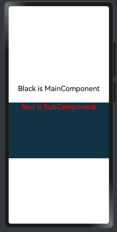
■ 1. Component装饰的struct称为UI组件。主要特征:
- 一个页面有且仅有一个@Entry入口。
- 一个页面可以包含一个或多个component;
- 每个component都必须实现 build 方法来更新UI;
- 一个component内部还可以调用另外一个component;
■ 2. component内部还可以调用另外一个component 示例
示例
@Entry       //一个页面有且仅有一个@Entry入口。
@Component   //一个页面可以包含一个或多个component;
struct MainComponent {


  build() {


    Flex({

    direction: FlexDirection.Column, alignItems: ItemAlign.Center, justifyContent: FlexAlign.Center }) {


      Text('Black is MainComponent')
        .fontSize(26)
        .fontColor(Color.Black)
        .height(50)
      SubComponent()  //调用
			.width('100%')   //自定义组件也有属性。
			.height(200)
			.backgroundColor('#123343')
    }
    .width('100%')
    .height('100%')
  }
}

@Component  //一个页面可以包含一个或多个component;
struct SubComponent {


  build() {


    Flex({

    direction: FlexDirection.Row, alignItems: ItemAlign.Center, justifyContent: FlexAlign.Center }) {


      Text('Red is SubComponent')
        .fontSize(26)
        .fontWeight(500)
        .fontColor(Color.Red)
    }
    .width('100%')
  }
}
■ @Builder(构建): 自定义构建函数可复用 UI 片段
■ 1. @Builder无参数
  // 简单的无参数Builder
  @Builder
  simpleTextBuilder() {


    Text('Hello World')
      .fontSize(30)
      .fontWeight(FontWeight.Bold)
      .fontColor(Color.Blue)
  }
■ 2. @Builder带参数的
  // 带参数的Builder
  @Builder
  parameterizedBuilder(text: string, size: number, color: Color) {


    Text(text)
      .fontSize(size)
      .fontColor(color)
      .fontWeight(FontWeight.Medium)
  }
■ 3. @Builder包含逻辑的
  // 包含逻辑的Builder
  @Builder
  conditionalBuilder(score: number) {


    if (score >= 90) {


      Text('优秀')
        .fontColor(Color.Green)
    } else if (score >= 60) {


      Text('及格')
        .fontColor(Color.Orange)
    } else {


      Text('不及格')
        .fontColor(Color.Red)
    }
  }
■ 4. @Builder包含循环的
  // 包含循环的Builder
  @Builder
  listBuilder(items: string[]) {


    Column() {


      ForEach(items, (item: string) => {


        Text(item)
          .fontSize(16)
          .margin(5)
      })
    }
  }
■ 5. @Builder使用列表
@Entry
@Component
struct BuilderExample {


  // 简单的无参数Builder
  @Builder
  simpleTextBuilder() {


    Text('Hello World')
      .fontSize(30)
      .fontWeight(FontWeight.Bold)
      .fontColor(Color.Blue)
  }

  // 带参数的Builder
  @Builder
  parameterizedBuilder(text: string, size: number, color: Color) {


    Text(text)
      .fontSize(size)
      .fontColor(color)
      .fontWeight(FontWeight.Medium)
  }

  // 包含逻辑的Builder
  @Builder
  conditionalBuilder(score: number) {


    if (score >= 90) {


      Text('优秀')
        .fontColor(Color.Green)
    } else if (score >= 60) {


      Text('及格')
        .fontColor(Color.Orange)
    } else {


      Text('不及格')
        .fontColor(Color.Red)
    }
  }

  // 包含循环的Builder
  @Builder
  listBuilder(items: string[]) {


    Column() {


      ForEach(items, (item: string) => {


        Text(item)
          .fontSize(16)
          .margin(5)
      })
    }
  }

  build() {


    Column({

    space: 20 }) {


      // 使用无参数Builder
      this.simpleTextBuilder()

      // 使用带参数Builder
      this.parameterizedBuilder('自定义文本', 24, Color.Red)

      Divider()

      // 使用条件Builder
      this.conditionalBuilder(85)
      this.conditionalBuilder(55)

      Divider()

      // 使用列表Builder
      this.listBuilder(['项目1', '项目2', '项目3', '项目4'])
    }
    .width('100%')
    .height('100%')
    .padding(20)
    .justifyContent(FlexAlign.Center)
  }
}
■ 6. @Builder全局定义
// 全局Builder定义
@Builder
function GlobalCard(title: string, content: string) {


  Column() {


    Text(title)
      .fontSize(20)
      .fontWeight(FontWeight.Bold)
      .margin({

    bottom: 10 })

    Text(content)
      .fontSize(16)
      .fontColor(Color.Gray)
  }
  .padding(15)
  .backgroundColor(Color.White)
  .border({

    width: 1, color: Color.Gray })
  .borderRadius(8)
  .width('90%')
  .margin({

    bottom: 10 })
}

@Entry
@Component
struct GlobalBuilderExample {


  build() {


    Column() {


      Text('全局Builder示例')
        .fontSize(24)
        .fontWeight(FontWeight.Bold)
        .margin({

    bottom: 20 })

      // 使用全局Builder
      GlobalCard('标题1', '这是第一个卡片的内容')
      GlobalCard('标题2', '这是第二个卡片的内容,内容可以更长一些')
      GlobalCard('标题3', '第三个卡片的内容')
    }
    .width('100%')
    .height('100%')
    .padding(20)
    .backgroundColor('#F5F5F5')
    .justifyContent(FlexAlign.Start)
  }
}
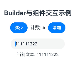
■ 7. @Builder 与组件交互
@Entry
@Component
struct InteractiveBuilderExample {


  @State count: number = 0
  @State text: string = '初始文本'

  // Builder访问组件状态
  @Builder
  counterBuilder() {


    Row() {


      Button('减少')
        .onClick(() => {


          this.count--
        })

      Text(`计数: ${

   this.count}`)
        .fontSize(18)
        .margin(10)

      Button('增加')
        .onClick(() => {


          this.count++
        })
    }
  }

  // Builder访问组件方法
  @Builder
  textInputBuilder() {


    Column() {


      TextInput({

    text: this.text })
        .onChange((value: string) => {


          this.text = value
        })
        .width(200)

      Text(`当前文本: ${

   this.text}`)
        .fontSize(16)
        .margin({

    top: 10 })
    }
  }

  build() {


    Column({

    space: 20 }) {


      Text('Builder与组件交互示例')
        .fontSize(24)
        .fontWeight(FontWeight.Bold)

      this.counterBuilder()
      this.textInputBuilder()
    }
    .width('100%')
    .height('100%')
    .padding(20)
    .justifyContent(FlexAlign.Center)
  }
}
■ 8. @BuilderParam:使用@Builder 作为参数
- @BuilderParam 允许将接收@Builder作为参数传递给组件,实现高度可定制的 UI:
@Component
struct CustomCard {


  // 使用@BuilderParam接收Builder作为参数
  @BuilderParam headerBuilder: () => void
  @BuilderParam contentBuilder: () => void

  build() {


    Column() {


      // 使用传入的headerBuilder
      this.headerBuilder()

      Divider()
        .margin(10)

      // 使用传入的contentBuilder
      this.contentBuilder()
    }
    .padding(15)
    .border({

    width: 1, color: Color.Gray })
    .borderRadius(8)
    .width('90%')
    .margin(10)
  }
}

@Entry
@Component
struct BuilderParamExample {


  @Builder
  customHeader() {


    Row() {


      Image($r('app.media.icon'))
        .width(30)
        .height(30)
        .margin({

    right: 10 })

      Text('自定义标题')
        .fontSize(18)
        .fontWeight(FontWeight.Bold)
    }
  }

  @Builder
  customContent() {


    Text('这是自定义的内容区域,可以包含任何UI组件和布局')
      .fontSize(14)
      .fontColor(Color.Gray)
  }

  @Builder
  anotherHeader() {


    Text('另一个标题样式'<
最低0.47元/天 解锁文章


 扫一扫
扫一扫


 3513
3513

 被折叠的 条评论
为什么被折叠?
被折叠的 条评论
为什么被折叠?
 到【灌水乐园】发言


