


效果
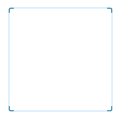
html
<!-- 框 -->
<div class="win">
    <!-- 四个角的边框效果 -->
    <div class="border_corner border_corner_left_top"></div>
    <div class="border_corner border_corner_right_top"></div>
    <div class="border_corner border_corner_left_bottom"></div>
    <div class="border_corner border_corner_right_bottom"></div>
    <div class="main">
        <!-- 这里写内容 -->
    </div>
</div>
CSS
.win {
    margin: 20px;
    position: relative;
    display: inline-block;
}
.main {
    width: 200px;
    height: 200px;
    border: 1px solid rgb(153, 204, 255);
    border-radius: 4px;
}
.border_corner{
    z-index: 2500;
    position: absolute;
    width: 8px;
    height: 8px;
    background: rgba(0,0,0,0);
    border: 2px solid #2f7f9d;
}
.border_corner_left_top{
    top: 0;
    left: 0;
    border-right: none;
    border-bottom: none;
    border-top-left-radius: 4px;
}
.border_corner_right_top{
    top: 0;
    right: 0;
    border-left: none;
    border-bottom: none;
    border-top-right-radius: 4px;
}
.border_corner_left_bottom{
    bottom: 0;
    left: 0;
    border-right: none;
    border-top: none;
    border-bottom-left-radius: 4px;
}
.border_corner_right_bottom{
    bottom: 0;
    right: 0;
    border-left: none;
    border-top: none;
    border-bottom-right-radius: 4px;
}
注意:
1、外层的 class=" win" 必须设置 position:relative/absolute,因为4个角 position 是 absolute;
2、class="main" 设置边框,外层的class=" win" 不能设置,否则4个角会在里面;


 3059
3059


 被折叠的 条评论
为什么被折叠?
被折叠的 条评论
为什么被折叠?
 到【灌水乐园】发言


