


CSS之四角边框
作者:爱编程的小金毛球球
日期:2020年4月1日
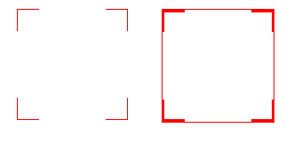
效果图:
首先,介绍linear-gradient()函数:
linear-gradient() 函数用于创建一个线性渐变的 “图像”。
为了创建一个线性渐变,你需要设置一个起始点和一个方向(指定为一个角度)的渐变效果。你还要定义终止色。终止色就是你想让Gecko去平滑的过渡,并且你必须指定至少两种,当然也会可以指定更多的颜色去创建更复杂的渐变效果。
#grad {
  /*以下实例演示了从左侧开始的线性渐变,从红色开始,转为黄色:*/
  background-image: linear-gradient(180deg, red, yellow);
}

现在来看怎么实现开头的两种四角边框吧!
HTML
<div class="div1"></div>
<div class="div2"></div>
CSS
.div1{
    position: absolute;
    top: 20px;
    left: 20px;
    width: 100px;
    height: 100px;
    background: linear-gradient(to left, #f00, #f00) left top no-repeat,
    linear-gradient(to bottom, #f00, #f00) left top no-repeat,
    linear-gradient(to left, #f00, #f00) right top no-repeat,
    linear-gradient(to bottom, #f00, #f00) right top no-repeat,
    linear-gradient(to left, #f00, #f00) left bottom no-repeat,
    linear-gradient(to bottom, #f00, #f00) left bottom no-repeat,
    linear-gradient(to left, #f00, #f00) right bottom no-repeat,
    linear-gradient(to left, #f00, #f00) right bottom no-repeat;
    background-size: 1px 20px, 20px 1px, 1px 20px, 20px 1px;
  }
  .div2{
    border: 1px red solid;
    position: absolute;
    top: 20px;
    left: 150px;
    width: 100px;
    height: 100px;
    background: linear-gradient(to left, #f00, #f00) left top no-repeat,
    linear-gradient(to bottom, #f00, #f00) left top no-repeat,
    linear-gradient(to left, #f00, #f00) right top no-repeat,
    linear-gradient(to bottom, #f00, #f00) right top no-repeat,
    linear-gradient(to left, #f00, #f00) left bottom no-repeat,
    linear-gradient(to bottom, #f00, #f00) left bottom no-repeat,
    linear-gradient(to left, #f00, #f00) right bottom no-repeat,
    linear-gradient(to left, #f00, #f00) right bottom no-repeat;
    background-size: 2px 20px, 20px 2px, 2px 20px, 20px 2px;
  }


 2003
2003


 被折叠的 条评论
为什么被折叠?
被折叠的 条评论
为什么被折叠?
 到【灌水乐园】发言


