


需求:el-tree 的默认、选中、半选中和禁止图标。
一. 原始样式
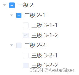
二. 修改后

三. 单项说明
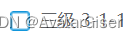
默认
.el-tree {
    /* 默认 */
    .el-checkbox__inner {
        background: url('../assets/images/default.png');
        background-size: contain;
        border: none;
        border-radius: none;
        width: 16px;
        height: 16px;
        &:before {
            display: none;
        }
    }
}
勾选
.el-tree {
/* checked 选中 */
.is-checked .el-checkbox__inner {
background: url('../assets/images/checked.png');
background-size: contain;
border: none;
border-radius: none;
width: 16px;
height: 16px;
&:before {
display: none;
}
}
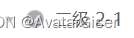
}半勾选
.el-tree {
/* 半勾选 */
.is-indeterminate .el-checkbox__inner {
background: url('../assets/images/indeterminate.png');
background-size: contain;
border: none;
border-radius: none;
width: 16px;
height: 16px;
&:before {
display: none;
}
}
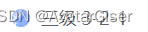
}禁止
.el-tree {
    /* disabled 禁止 */
    .is-disabled .el-checkbox__inner {
        background: url('../assets/images/disabled.png');
        background-size: contain;
        border: none;
        border-radius: none;
        width: 16px;
        height: 16px;
        &:before {
            display: none;
        }
    }
}
四. 完整代码
<template>
    <el-tree
        :data="data"
        show-checkbox
        node-key="id"
        :default-expanded-keys="[2, 3]"
        :default-checked-keys="[5]">
    </el-tree>
</template>
<script>
  export default {
    data() {
      return {
        data: [{
          id: 1,
          label: '一级 2',
          children: [{
            id: 3,
            label: '二级 2-1',
            children: [{
              id: 4,
              label: '三级 3-1-1'
            }, {
              id: 5,
              label: '三级 3-1-2',
              disabled: true
            }]
          }, {
            id: 2,
            label: '二级 2-2',
            disabled: true,
            children: [{
              id: 6,
              label: '三级 3-2-1'
            }, {
              id: 7,
              label: '三级 3-2-2',
              disabled: true
            }]
          }]
        }],
        defaultProps: {
          children: 'children',
          label: 'label'
        }
      };
    }
  };
</script>
<style lang="stylus" >

.el-tree {
    /* 默认 */
    .el-checkbox__inner {
        background: url('../assets/images/default.png');
        background-size: contain;
        border: none;
        border-radius: none;
        width: 16px;
        height: 16px;
        &:before {
            display: none;
        }
    }

    /* checked 选中 */
    .el-tree .is-checked .el-checkbox__inner {
        background: url('../assets/images/checked.png');
        background-size: contain;
        border: none;
        border-radius: none;
        width: 16px;
        height: 16px;
        &:before {
            display: none;
        }
    }

    /* 半勾选 */
    .el-tree .is-indeterminate .el-checkbox__inner {
        background: url('../assets/images/indeterminate.png');
        background-size: contain;
        border: none;
        border-radius: none;
        width: 16px;
        height: 16px;
        &:before {
            display: none;
        }
    }

    /* disabled 禁止 */
    .is-disabled .el-checkbox__inner {
        background: url('../assets/images/disabled.png');
        background-size: contain;
        border: none;
        border-radius: none;
        width: 16px;
        height: 16px;
        &:before {
            display: none;
        }
    }
}
</style>
五. 扩展
当点击节点,发现内容无法使用,立即设为 disabled,且改为禁止图标。可在 el-tree 事件 check-change 中改造:
nodeCheck (node, isChecked, indeterminate) {
    // 设为 disabled
    node.disabled = true;
    // 取消勾选为 true。属性 node-key 设为 tId
    this.$refs.tree.setChecked(node.tId, false);
    // 必须:但节点刷新
    this.$refs.tree.updateKeyChildren('tId', node.tId);
}


 898
898


 被折叠的 条评论
为什么被折叠?
被折叠的 条评论
为什么被折叠?
 到【灌水乐园】发言


