


shape标签可以用于自定义一些简单的图形
一个简单例子,定义一个圆角矩形:
在res/drawable目录下创建example.xml
<?xml version="1.0" encoding="utf-8"?>
<shape xmlns:android="http://schemas.android.com/apk/res/android"
    android:shape="rectangle">

    <corners android:radius="2dp" />

    <size android:height="20dp" android:width="30dp"/>

    <solid android:color="#ffffff"/>

    <stroke android:color="#ff6767" android:width="12dp"/>

</shape>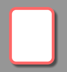
这就是定义好的圆角矩形
shape标签有一个android:shape属性,包括了四个值:
| shape | value |
|---|---|
| 直线 | line |
| 矩形 | rectangle |
| 椭圆 | oval |
| 圆环 | ring |
这个属性定义了图形的类型。
在shape标签下还有五个标签:
| 标签 | 内容 | 属性 |
|---|---|---|
| solid | 填充。直接填充颜色 | color: 填充的颜色 |
| gradient | 渐变。指定多种颜色及渐变方式和角度,颜色渐变填充 | startColor: 起始颜色 centerColor: 中间颜色 endColor: 最终颜色 type: 渐变类型 angle: 角度…… |
| corners | 圆角。比如矩形的圆角 | radius: 圆角半径 还有topLeft..、topRight、bottomLeft、bottomRight你懂的 |
| padding | 边距 | left、right、top、bottom分别指哪里你懂的 |
| size | 大小。指定形状的width和height | width和height也是你懂的 |
| stroke | 描边。可以指定形状描边的线性、大小、颜色和间距等 | width: 描边线宽 color: 颜色 dashGap: 描边间隔长度 dashWidth: 描边间隔的宽度 |
然后就可以应用自定义的图形作为控件的背景等。
例如
将上述自定义的圆角矩形指定为布局容器的背景
布局文件:
<?xml version="1.0" encoding="utf-8"?>
<RelativeLayout xmlns:android="http://schemas.android.com/apk/res/android"
    xmlns:tools="http://schemas.android.com/tools"
    android:layout_width="match_parent"
    android:layout_height="match_parent"
    android:paddingBottom="@dimen/activity_vertical_margin"
    android:paddingLeft="@dimen/activity_horizontal_margin"
    android:paddingRight="@dimen/activity_horizontal_margin"
    android:paddingTop="@dimen/activity_vertical_margin"
    tools:context="com.example.easonchung.test.MainActivity">

    <!-- LinearLayout的background属性设置成刚刚定义的图形 -->
    <LinearLayout
        android:layout_width="match_parent"
        android:layout_height="match_parent"
        android:orientation="vertical"
        android:background="@drawable/example"
        android:padding="16dp">

        <TextView
            android:layout_width="match_parent"
            android:layout_height="wrap_content"
            android:text="Hello World!"
            android:textSize="30sp"/>

    </LinearLayout>

</RelativeLayout>
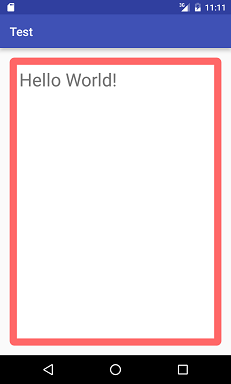
效果如图
也可以用作按钮等控件的自定义样式
将example.xml复制一个副本命名为example_pressed.xml
然后将里面的solid颜色改为描边的颜色,而stroke颜色改为更鲜艳的红色
<?xml version="1.0" encoding="utf-8"?>
<shape xmlns:android="http://schemas.android.com/apk/res/android"
    android:shape="rectangle">

    <corners android:radius="2dp"/>

    <size
        android:width="30dp"
        android:height="20dp" />

    <solid android:color="#ff6767" />

    <stroke
        android:width="12dp"
        android:color="#ff2d2d" />

</shape>
再新建一个资源文件button.xml
这里需要用到 selector 标签
<?xml version="1.0" encoding="utf-8"?>
<selector xmlns:android="http://schemas.android.com/apk/res/android">

    <!-- 点击时的drawable -->
    <!-- 指定为example_pressed.xml -->
    <item android:drawable="@drawable/example_pressed" android:state_focused="true" />

    <!-- 点住不松手时的drawable -->
    <!-- 也指定为example_pressed.xml -->
    <item android:drawable="@drawable/example_pressed" android:state_pressed="true" />

    <!-- 一般时候的drawable -->
    <!-- 指定为example.xml -->
    <item android:drawable="@drawable/example" />

</selector>
之后再将Button的background指定为上面写好的button.xml
<Button
            android:layout_width="wrap_content"
            android:layout_height="wrap_content"
            android:text="Button"
            android:background="@drawable/button"/>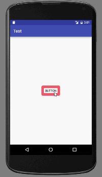
效果如图


 扫一扫
扫一扫
 481
481

 被折叠的 条评论
为什么被折叠?
被折叠的 条评论
为什么被折叠?
 到【灌水乐园】发言


