


实例一:
在鼠标悬停时添加箭头:
代码实现:
<!DOCTYPE html>
<html>
<head>
<style>
/*设置按钮*/
.button {
display: inline-block; /*把button转换成行内块元素*/
border-radius: 4px;/*设置圆角*/
background-color: #f4511e;
border: none;
color: #FFFFFF;
text-align: center;
font-size: 28px;
padding: 20px;
width: 200px;
transition: all 0.5s; /*设置动画效果*/
cursor: pointer;/*鼠标指针变成小手*/
margin: 5px;
}
.button span {
cursor: pointer; /*鼠标指针变成小手*/
display: inline-block;
position: relative;/*给一个相对定位,让动画效果实现后,在文档流中的位置仍然保留*/
transition: 0.5s;/*动画效果时间*/
}
/*通过:after选择器可以在span元素后插入一些内容*/
.button span:after {
content: '\00bb';/*00bb是显示》*/
position: absolute;/*因为父元素为相对定位,所以给子元素一个绝对定位,让位置不发生偏移*/
opacity: 0;/*设置透明度*/
top: 0;/*设置定位位置*/
right: -20px;
transition: 0.5s;
}
.button:hover span {
padding-right: 25px;/*设置当鼠标停留button时的使右内边距发生效果*/
}
.button:hover span:after {
opacity: 1;
right: 0;
}
</style>
</head>
<body>
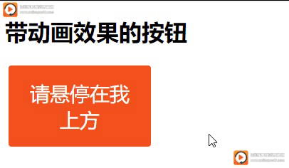
<h1>带动画效果的按钮</h1>
<button class="button" style="vertical-align:middle"><span>请悬停在我上方</span></button>
</body>
</html>
实例二
添加点击时的“按键按下”效果:
代码实现:
<!DOCTYPE html>
<html>
<head>
<style>
.button {
display: inline-block;
padding: 15px 25px;
font-size: 24px;
cursor: pointer;
text-align: center;
text-decoration: none;
outline: none; /*使绘制于元素周围的一条线无效。*/
color: #fff;
background-color: #4CAF50;
border: none;
border-radius: 15px; /*设置圆角边框*/
box-shadow: 0 9px #999;
}
.button:hover {background-color: #3e8e41} /*设置button的鼠标停留效果*/
.button:active {
background-color: #3e8e41;
box-shadow: 0 5px #666; /*设置阴影效果*/
transform: translateY(4px);/*设置平移效果*/
}/*设置button的鼠标未点击时效果*/
</style>
</head>
<body>
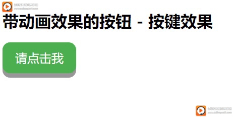
<h1>带动画效果的按钮 - 按键效果</h1>
<button class="button">请点击我</button>
</body>
</html>
实例 3
鼠标悬停时淡入:
代码实现:
<!DOCTYPE html>
<html>
<head>
<meta name="viewport" content="width=device-width, initial-scale=1">
<style>
.button {
background-color: #f4511e;
border: none;
color: white;
padding: 16px 32px;
text-align: center;
font-size: 16px;
margin: 4px 2px;
opacity: 0.6;/* 透明效果*/
transition: 0.3s; /*动画变换时间*/
display: inline-block;
text-decoration: none;
cursor: pointer;/*改变鼠标指针形状*/
}
.button:hover {opacity: 1}/* 鼠标停留时透明效果改变*/
</style>
</head>
<body>
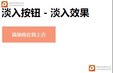
<h1>淡入按钮 - 淡入效果</h1>
<button class="button">请悬停在我上方</button>
</body>
</html>
实例 4
添加点击时的“涟漪”效果:
代码实现:
<!DOCTYPE html>
<html>
<head>
<style>
.button {
position: relative;
/*给父元素一个相对定位方便子元素的定位和偏移属性改变元素的位置,使它在文档流中的位置仍然保持*/
background-color: #4CAF50;
border: none;
font-size: 28px;
color: #FFFFFF;
padding: 20px;
width: 200px;
text-align: center;
transition-duration: 0.4s;/*设置“悬停”效果的速度:*/
text-decoration: none;
overflow: hidden;/*超出文档的内容影藏*/
cursor: pointer;/*设置鼠标停留时改变鼠标的形状*/
.button:after {
/*通过选择器在按钮后加入属性*/
content: "";/*插入空白内容*/
background: #f1f1f1;
display: block; /*使空白内容转变成块元素*/
position: absolute;/*相对于父元素设置绝对定位*/
padding-top: 300%;
padding-left: 350%;
margin-left: -20px !important;
margin-top: -120%;
opacity: 0;/*设置透明度*/
transition: all 0.8s/*设置动画效果*/
}
.button:active:after {
/*设置鼠标点击后效果*/
padding: 0;
margin: 0;
opacity: 1;
transition: 0s
}
</style>
</head>
<body>
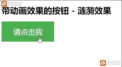
<h1>带动画效果的按钮 - 涟漪效果</h1>
<button class="button">请点击我</button>
</body>
</html>


 扫一扫
扫一扫


 322
322

 被折叠的 条评论
为什么被折叠?
被折叠的 条评论
为什么被折叠?
 到【灌水乐园】发言


