


本实例使用 CSS flex 实现瀑布流布局。
关键点,横向 flex 布局嵌套多列纵向 flex 布局,使用了 vw 进行自适应缩放
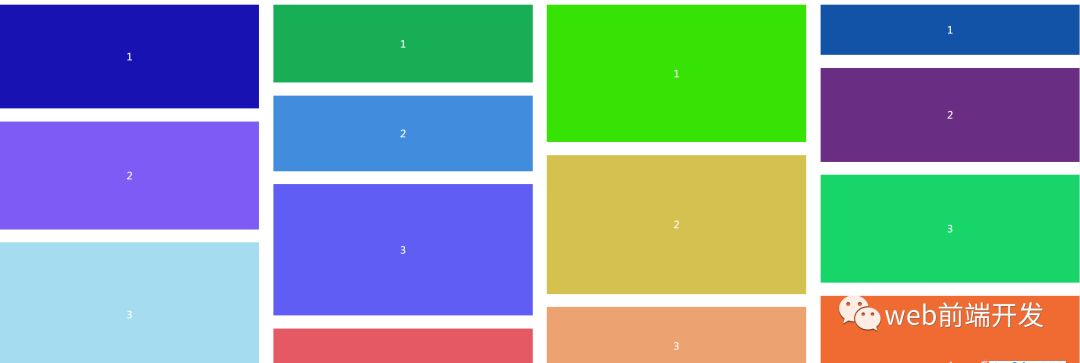
最终效果如下:
HTML代码如下:
<!-- 本例使用 CSS flex 实现瀑布流布局 -->
<!-- 关键点,横向flex布局嵌套多列纵向flex布局,使用了 vw 进行自适应缩放 -->
div.g-container
-for(var i = 0; i<4; i++)
div.g-queue
-for(var j = 0; j<8; j++)
div.g-item
CSS(SCSS)代码如下:
$lineCount: 4;
$count: 8;
@function randomNum($max, $min: 0, $u: 1) {
@return ($min + random($max)) * $u;
}
@function randomColor() {
@return rgb(randomNum(255), randomNum(255), randomNum(255));
}
.g-container {
display: flex;
flex-direction: row;
justify-content: space-between;
overflow: hidden;
}
.g-queue {
display: flex;
flex-direction: column;
flex-basis: 24%;
}
.g-item {
position: relative;
width: 100%;
margin: 2.5% 0;
}
@for $i from 1 to $lineCount+1 {
.g-queue:nth-child(#{$i}) {
@for $j from 1 to $count+1 {
.g-item:nth-child(#{$j}) {
height: #{randomNum(300, 50)}px;
background: randomColor();
&::after {
content: "#{$j}";
position: absolute;
color: #fff;
font-size: 24px;
top: 50%;
left: 50%;
transform: translate(-50%, -50%);
}
}
}
}
}
演示地址:https://codepen.io/Chokcoco/pen/wYgYXX


 849
849


 被折叠的 条评论
为什么被折叠?
被折叠的 条评论
为什么被折叠?
 到【灌水乐园】发言


