


Trident 内核--IE浏览器
Gecko firefox
webkit chrome (2018年blink引擎)
浏览器前缀:
-webkit chrome safari
-moz firefox
-ms- IE
-o- opera
css3使以前能用图片和脚本就实现的,用css3语句实现
(1)border-radius:
(2) box-shadow:
box-shadow: X轴偏移量 Y轴偏移量 [阴影模糊半径] [阴影扩展半径] [阴影颜色] [投影方式];
前两项可以为负数。正数时,阴影在右边。负数时,阴影在左边。
阴影模糊半径,值越大,阴影的边缘越模糊。
阴影扩展半径:可以为正数和负数。正数时,整个阴影都扩大,负数时,整个阴影都缩小。
insert设置内阴影和外阴影。
可设置多个阴影
.box_shadow{
    box-shadow:4px 2px 6px #f00, -4px -2px 6px #000, 0px 0px 12px 5px #33CC00 inset;
}
(3)border-image
(4)线性渐变
linear-gradient radical-gradient
(5)文字和字体
但是text-overflow只是用来说明文字溢出时用什么方式显示,要实现溢出时产生省略号的效果,还须定义强制文本在一行内显示(white-space:nowrap)及溢出内容为隐藏(overflow:hidden),只有这样才能实现溢出文本显示省略号的效果,代码如下:
text-overflow:ellipsis;
overflow:hidden;
white-space:nowrap;
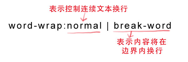
同时,word-wrap也可以用来设置文本行为,当前行超过指定容器的边界时是否断开转行。
语法:
font-face:
@font-face {
font-family:
src:
}
text-shadow:设置文本的阴影效果
text-shadow: X-Offset Y-Offset blur color;
(6) 背景
background-origin:设置背景图片的起始位置
background-origin : border-box | padding-box | content-box;
需要背景设置为no-repeat。否则,它会从边框开始显示
background-clip: 用来将背景图片做适当的裁剪以适应需要
background-clip : border-box | padding-box | content-box | no-clip
background-size: 设置背景图片的大小。以长度或者百分比来显示
background-size: auto | <长度值> | <百分比> | cover | contain
(7)选择器
属性选择器
a[class^=icon]{
  background: green;
  color:#fff;
}
:root:指根元素--html元素
:not否定选择器
input:not([type="submit"]){
  border:1px solid red;
}
:empty空选择器
p:empty {
display: none;
}
:target选择器
:first-child
选择父元素的第一个子元素的元素E
:last-child
:nth-child: 定位某个父元素的一个或多个特定的子元素
从0开始计算
ol > li:nth-child(2n){
  background: orange;
}
:nth-last-child: 从父元素的最后一个元素开始计算
:first-of-child:定位父元素下的某个类型的第一个子元素
/*我要改变第一个段落的背景为橙色*/
.wrapper > p:first-of-type {
  background: orange;
}
:nth-of-type(n)
:last-of-type
:nth-last-of-type()
:only-child: 父元素仅有一个子元素
:only-of-type
:enabled
:disabled
:checked
::selection: 匹配鼠标选择文本时的文本
:read-only
input[type="text"]:read-only{
  border-color: #ccc;
}
:read-write
::before和::after
.clearfix::before,
.clearfix::after {
    content: ".";
    display: block;
    height: 0;
    visibility: hidden;
}
.clearfix:after {clear: both;}
.clearfix {zoom: 1;}
<!DOCTYPE html>
<html>
<head>
<meta charset=utf-8 />
<title>before、after</title>
<style>
.box h3{
  text-align:center;
  position:relative;
  top:80px;
}
.box {
  width:70%;
  height:200px;
  background:#FFF;
  margin:40px auto;
}

.effect{
  position:relative;
    -webkit-box-shadow:0 1px 4px rgba(0, 0, 0, 0.3), 0 0 40px rgba(0, 0, 0, 0.1) inset;
	   -moz-box-shadow:0 1px 4px rgba(0, 0, 0, 0.3), 0 0 40px rgba(0, 0, 0, 0.1) inset;
			box-shadow:0 1px 4px rgba(0, 0, 0, 0.3), 0 0 40px rgba(0, 0, 0, 0.1) inset;
}
.effect::before, .effect::after{
    content:"";
	position:absolute;
	z-index:-1;
	-webkit-box-shadow:0 0 20px rgba(0,0,0,0.8);
	-moz-box-shadow:0 0 20px rgba(0,0,0,0.8);
	box-shadow:0 0 20px rgba(0,0,0,0.8);
	top:50%;
	bottom:0;
	left:10px;
	right:10px;
	-moz-border-radius:100px / 10px;
	border-radius:100px / 10px;
}
</style>
</head>
<body>
  <div class="box effect">
  <h3>Shadow Effect </h3>
</div>
</body>
</html>
(8)旋转变形
旋转:
transform: rotate(-20deg)
扭曲:
tansform: skew(45deg)
缩放:
transform: scale(0.8)
位移
transform: translate(50px, 100px)
矩阵
matrix
修改原点
transform-origin
transition
transition-property:指定过渡或动态模拟的CSS属性
transition-duration:指定完成过渡所需的时间
transition-timing-function:指定过渡函数
transition-delay:指定开始出现的延迟时间
transition-property需要有中心点才能有过渡效果
div {
  width: 200px;
  height: 200px;
  background: red;
  margin: 20px auto;
  -webkit-transition: width;
  transition:width;
  -webkit-transition-duration:.5s;
  transition-duration:.5s;
  -webkit-transition-timing-function: ease-in;
  transition-timing-function: ease-in;
  -webkit-transition-delay: .18s;
  	transition-delay:.18s;
}
div:hover {
  width: 400px;
}
animation
@keyframes
@keyframes wobble {
  0% {
    margin-left: 100px;
    background:green;
  }
  40% {
    margin-left:150px;
    background:orange;
  }
  60% {
    margin-left: 75px;
    background: blue;
  }
  100% {
    margin-left: 100px;
    background: red;
  }
}
div {
  width: 100px;
  height: 100px;
  background:red;
  color: #fff;
}
div:hover{
  animation: wobble 5s ease .1s;
}
animation-name
animation-timing-function
animation-delay
animation-iteration-count: infinite
animation-direction: normal alternate
animation-play-state: running/ paused
@keyframes move {
  0%{
    transform: translateY(90px);
  }
  15%{
    transform: translate(90px,90px);
  }
  30%{
    transform: translate(180px,90px);
  }
  45%{
    transform: translate(90px,90px);
  }
  60%{
    transform: translate(90px,0);
  }
  75%{
    transform: translate(90px,90px);
  }
  90%{
    transform: translate(90px,180px);
  }
  100%{
    transform: translate(90px,90px);
  }
}

div {
  width: 200px;
  height: 200px;
  border: 1px solid red;
  margin: 20px auto;
}
span {
  display: inline-block;
  width: 20px;
  height: 20px;
  background: orange;
  transform: translateY(90px);
  animation-name: move;
  animation-duration: 10s;
  animation-timing-function: ease-in;
  animation-delay: .2s;
  animation-iteration-count:infinite;
  animation-direction:alternate;
  animation-play-state:paused;
}
div:hover span {
  animation-play-state:running;
}
(9) 列设置
columns: 200px 2;
参数 | 参数说明 |
<column-width> | 主要用来定义多列中每列的宽度 |
<column-count> | 主要用来定义多列中的列数 |
flex布局
(10) 媒体查询
@importurl(style.css) all
@media screen{
}
使用min-width和max-width
@media screen and (min-width:600px) and (max-width:900px){}
使用device width设备的尺寸
@media screen and (max-device-width:480px)
not和only
@media not print and ( )
<meta name=”viewport” content=”width=device-width,initial-scale=1.0” />
(11)css中的函数
attr() : attr(title)
calc() : calc(100%-100px)
(12)自由缩放属性resize
用来改变元素尺寸大小
resize: none | both | horizontal | vertical | inherit
取值说明:
属性值 | 取值说明 |
none | 用户不能拖动元素修改尺寸大小。 |
both | 用户可以拖动元素,同时修改元素的宽度和高度 |
horizontal | 用户可以拖动元素,仅可以修改元素的宽度,但不能修改元素的高度。 |
vertical | 用户可以拖动元素,仅可以修改元素的高度,但不能修改元素的宽度。 |
inherit | 继承父元素的resize属性值。 |
例如:通过resize属性,让文本域可以沿水平方向拖大。代码为:
textarea {
  -webkit-resize: horizontal;
  -moz-resize: horizontal;
  -o-resize: horizontal;
  -ms-resize: horizontal;
  resize: horizontal;
}
(11) 3D
父元素增加
perspective: 400
perspective-origin: 50% 50%
transform-style: preserve-3d
transform :


 2232
2232

 被折叠的 条评论
为什么被折叠?
被折叠的 条评论
为什么被折叠?
 到【灌水乐园】发言


