


<!DOCTYPE html>
<html lang="en">
<head>
<meta charset="UTF-8">
<meta name="viewport" content="width=device-width, initial-scale=1.0">
<title>霓虹效果按钮</title>
</head>
<body>
<a href="#">按钮</a>
<style>
body{
display: flex;
flex-direction: column;
justify-content: center;
align-items: center;
/* background: #000000; */
min-height: 100vh;
}
a{
position: relative;
padding: 10px 30px;
margin: 45px 0;
color: #2fdbc1;
font-size: 20px;
text-transform:none;
text-decoration: none;
transition: 0.5s;
overflow: hidden;
-webkit-box-reflect: below 1px liner-gradient(transparent,#000 );
}
a::before,a::after{
content:'';
position: absolute;
width: 10px;
height: 10px;
transition: 0.5s;
transition-delay: 0.5s;
}
a::before{
left: 0;
top: 0;
border-top: 2px solid #2fdbc1;
border-left: 2px solid #2fdbc1;
}
a::after{
right: 0;
bottom: 0;
border-bottom: 2px solid #2fdbc1;
border-right: 2px solid #2fdbc1;
}
a:hover{
background: #2fdbc1;
color:#fff;
box-shadow: 0 0 50px #2fdbc1;
transition-delay: 0.5s;
}
a:hover::before,a:hover::after{
width: 100%;
height: 100%;
transition-delay: 0.5s;
}
</style>
</body>
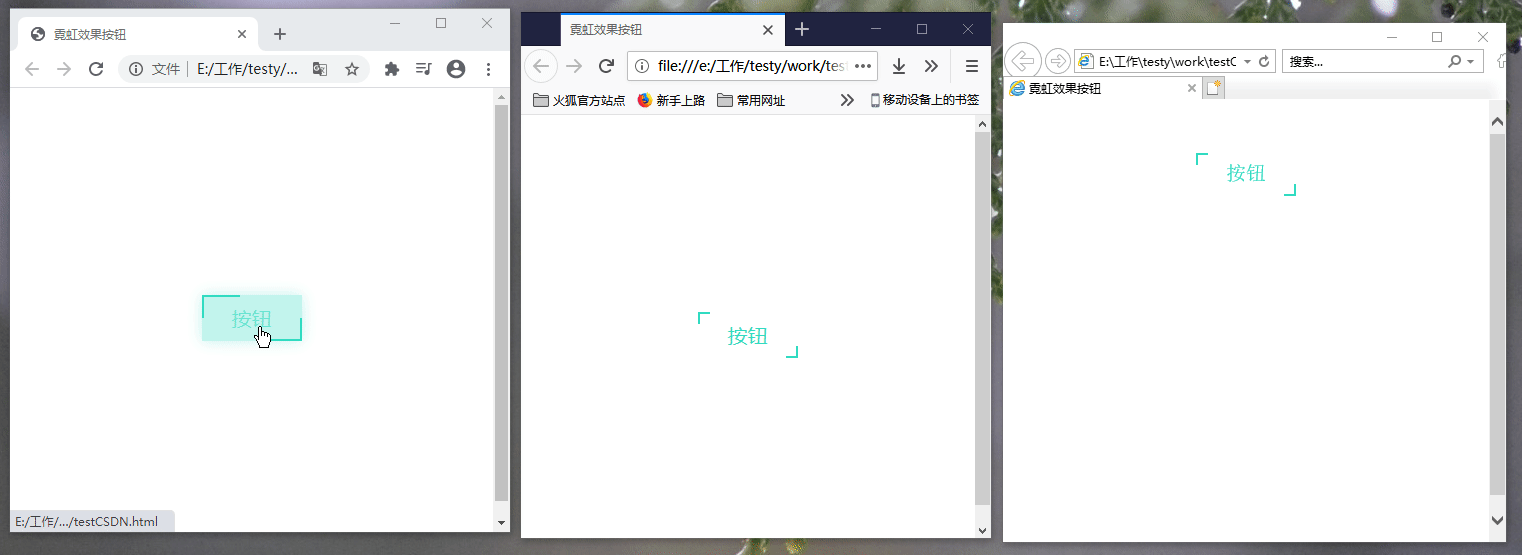
</html>效果如下:
从左至右依次是: 谷歌浏览器 火狐浏览器 IE浏览器


 1091
1091


 被折叠的 条评论
为什么被折叠?
被折叠的 条评论
为什么被折叠?
 到【灌水乐园】发言


