


HarmonyOS NEXT是纯血鸿蒙,鸿蒙原生应用,彻底摆脱安卓
本课程是基于harmony os4的,与next仅部分api有区别。入门=本文适合有语言基础的学习者查看。
套件
语言&框架
harmony os design
ArkTs 语言
ArkUI 提供各种组件
ArkCompiler 方舟编译器
开发&测试
DevEco Studio 开发工具
DevEco Testing
分发&运营
AppGallery Connect 提供了云开发功能
好处:一次开发,多端部署
开发准备
官网 developer.harmonyos.com
设计->开发->分发(发布,应用上架),有文档(指南、api参考)
安装
跟着教程安装,有一些细节需要注意。
DevEco Studio设置Nodejs提示路径只能包含英文、数字、下划线等
ArkTS
与前端三件套的区别:html控制页面,css控制页面布局和样式,javascript控制逻辑和数据状态。鸿蒙只需要ArkTS一种语言。

ArkTS:声明式UI,状态管理。
自带默认样式,布局、样式等的实现方式全部通过调用类的属性实现。
好处:开发效率高,开发体验好,性能高,多系统适配。

Typescript语法
typescriptlang.org是官网,而且有在线编译器
- 基于javascript
- 分号是可选的
- console.log()控制台输出日志
数据类型
-
加入了静态类型检查,如
let msg:string = 'hello world',左侧是变量声明,const表示常量,let表示变量 ,msg是变量名,:string是数据类型。数据类型在变量名之后。
数据类型可以是string,number(整数,小数等,支持二进制0b,十六进制等),boolean(false,true),any(不确定是什么类型,不要去做类型检查),string|number|boolean联合数据类型union,可以是多种类型。自己慎重使用any。还有一种是对象,let p ={name:jack",age:21},取可以用p.name,或者p[‘name’]类似字典。 -
数组有2种:
let names:Array<string>=['a','b'],,let ages:number[]=[21,18]
条件控制
支持if-else,if else if else,switch。
比较运算符是三个等于号。==会比较数据类型是否一致,如果不一致则做类型转换。
let num:number=21

if (num%2===0){
	console.log('偶数')
}else{
	console.log('奇数')
}
空字符串,0,null,undefined都被认为是false
let grade:string ='A'
switch(grade){
	case 'A':{
		break
	}
	case 'B':{
	}
	default:{
	}
}
循环迭代
支持for,while
for(let i=1;i<=10;i++){
}
let i=1;
while(i<=10){
	i++;
}
同时为Array等提供了快速迭代语法
for in 遍历得到下标,for of 得到元素本身
let names:string[]=['Jack','Rose']
for (const i in names){
	console.log(i+':'+names[i])
}
for (const name of names){
	console.log(names[name])
}
函数
用function声明,支持可选参数,默认参数,箭头函数等。
这个语言把所有的类型都放在后面写.:void可以省略
function sayHello(name:string):void{
	console.log('hello'+name)
}
sayHello('Jack')

function  sum(x:number,y:number):number{
	return x+y
}
let result=sum(21,18)
箭头函数
let sayHi=(name:string)=>{
	console.log('hello'+name)
}
sayHi('Rose')
?表示参数可选
function sayHello(name?:string):void{
	name=name?name:'陌生人'
	console.log('hello'+name)
}
sayHello('Jack')
sayHello()
默认参数
function sayHello(name:string='陌生人'):void{
	console.log('hello'+name)
}
sayHello('Jack')
sayHello()
类和接口
具备面向对象的语法,如interface,class,enum,具备封装、继承、多态等特性。
枚举如果不赋值,默认是数字0123…
类内、接口的函数不加function关键字
enum Msg{
	HI='Hi',
	HELLO='Hello'
}
interface A{
	say(msg:Msg):void
}
class B implements A{
	say(msg:Msg):void{
		console.log(msg)
	}
}
let a:A = new B() //初始化对象
a.say(Msg.HI)
class Rectangle{
	private width:number //不用let而用public/private
	private length:number
	//构造函数没有函数名
	constructor(width:number,length:number){
		this.width=width
		this.length=length
	}
	public area():number{
		return this.width*this.length
	}
}
//继承
class Square extends Rectangle{
	constructor(side:number){
		super(side,side)
	}
}
let s = new Square(10)
console.log('正方形面积为:'+s.area())
模块开发
把通用功能抽取到单独的ts文件中,每个文件都是一个模块,模块可以相互加载。
rectangle.ts
export class Rectangle{
	public width:number //不用let而用public/private
	public length:number
	//构造函数没有函数名
	constructor(width:number,length:number){
		this.width=width
		this.length=length
	}
}
export function area(rec:Rectangle):number{
		return rec.width*rec.length
}
//要用什么导入什么
import{Rectangle,area} from '../rectangle' //相对路径,上级目录
let r= new Rectangle(10,20)
console.log(area(r))
快速入门
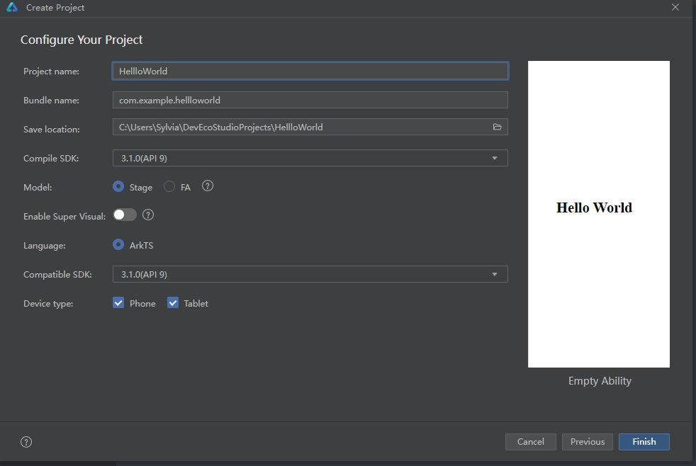
bundle name是域名的倒置(习惯上),要保证唯一性。
目录自己调整。
entry是入口ablity,其余是配置文件
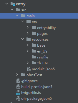
resources资源,en_US,zh_CN国际化相关,中英文描述不同
pages页面,ets后缀表示ArkTs文件,首页index.ets
previewer即预览器
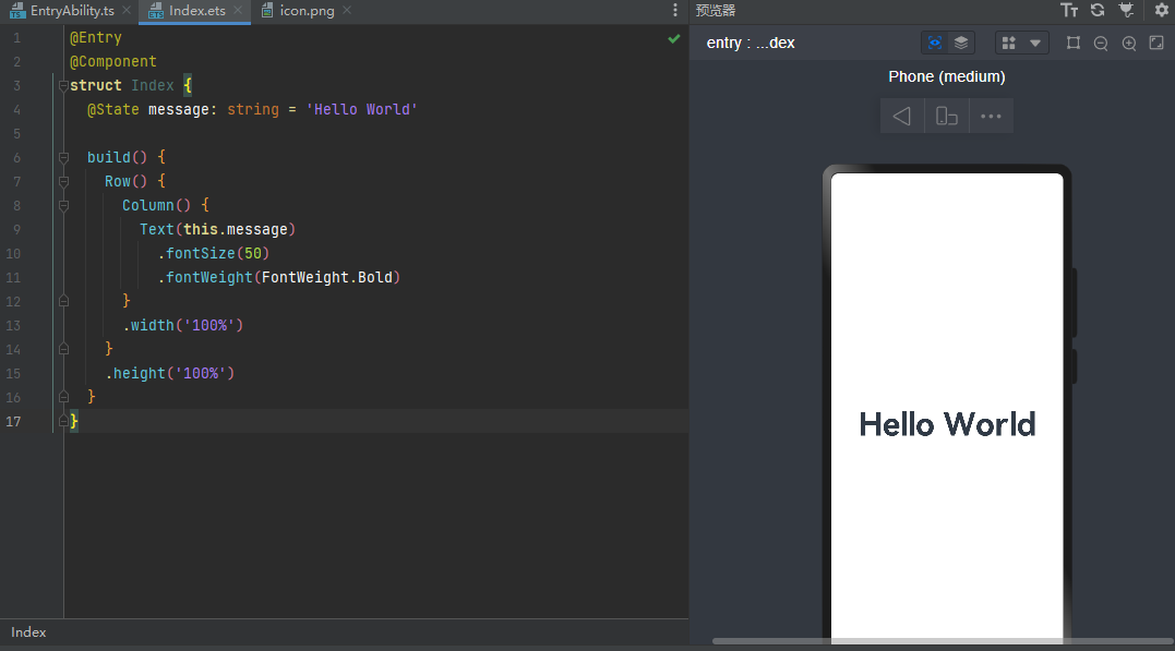
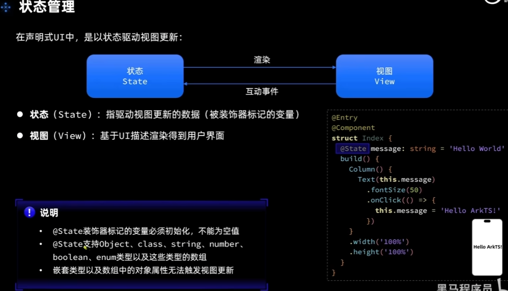
声明式UI,状态数据的变更驱动页面变化
@Entry //入口组件,可以被独立访问,自己就是一个页面。否则是普通组件,必须被入口型组件引用
@Component //@装饰器,装饰类结构、方法、变量 component指组件
struct Index { //自定义组件(可复用的UI单元)
  @State message: string = 'Hell World' //标记变量是状态型变量,会被监控,一旦变化,则重新渲染

  build() { //描述组件内部的UI结构
    Row() { //这些都是内置组件。一类是容器组件,如Row,Column,一类是基础组件,自带样式和功能,如Text
      Column() {
        Text(this.message)
          .fontSize(50) //属性方法。设置组件的UI样式
          .fontWeight(FontWeight.Bold)
          .fontColor('#365')
          .onClick(()=>{
            this.message='Hello World!'
          })
      }
      .width('100%')
    }
    .height('100%')
  }
}
抄官方文档
ArkUI组件
Image 图片展示组件
Image(src:string|PixelMap|Resource)
string常用来加载网络图片,必须先申请网络访问权限ohos.permission.INTERNET
PixelMap 像素图,可以编辑图片,需要构建pixelMapObject,非常繁琐
Resource 加载本地图片(应用内部图片)
Image($('app.media.mate60)) //resource-base-media里放的资源,省略了文件后缀
Image($rawfile('mate60.png))//resources-rawfile里放着,要加文件后缀
组件属性:
Image($('app.media.mate60))
	.width(100)//宽度
	.height(120)//高度
	.borderRadius(10)//边框圆角
	.interpolation(ImageInterpolation.High)//图片插值。低分辨率图片放大会有锯齿,用插值弥补。有高中低三个选项。
前三个是组件通用属性,最后一个是特有属性。
预览的时候加载网络图片不需要权限,真机需要(真机调试或安装模拟器)。
配置权限:指南-安全-访问控制-访问控制授权申请。在module.json5里声明权限。权限类型分为system_grant和user_grant两种类型。INTERNET属于system_grant。
"requestPermissions":[
      {
        "name": "ohos.permission.INTERNET"//必填
      }
    ]
  build() { //描述组件内部的UI结构
    Row() { //这些都是内置组件。一类是容器组件,如Row,Column,一类是基础组件,自带样式和功能,如Text
      Column() {
        Text(this.message)
          .fontSize(50) //属性方法。设置组件的UI样式
          .fontWeight(FontWeight.Bold)
          .fontColor('#365')
          .onClick(()=>{
            this.message='Hello World!'
          })
         Image('https://www.sxhm.com/Uploads/Picture/2023/03/01/s63ff193da6907.JPG')
           .width('90%') //按比例缩小,单位是虚拟像素vp.或字符串内加百分比
        Image($r('app.media.icon'))
          .width(250)
          .interpolation(ImageInterpolation.High)
      }
      .width('100%')
    }
    .height('100%')
  }
Text 文本显示组件
Text(content?:string|Resource)
string:直接填写文本内容
Resource:读取本地资源文件$r('app.string.width_label')
app是固定前缀,string是找string.json里width_label的变量

限定词目录和base目录其实一样,但是初始化只有element一个文件夹。base目录是默认目录。string.json里放的就是字符串。可以对应写中文和英文的文本,实现中英文显示的不同。要改en_US和zh_CN目录的string.json文件,必须在base里也写上这个变量,否则找不到,因为找的时候会找默认目录。下面是string.json
"string": [
    {
      "name": "module_desc",
      "value": "模块描述"
    },
    {
      "name": "EntryAbility_desc",
      "value": "description"
    },
    {
      "name": "EntryAbility_label",
      "value": "label"
    },
    {
      "name": "width_label",
      "value": "Image Width"
    }
  ]
下面是ets文件里的text组件使用
Text($r('app.string.width_label'))
        .fontSize(30)
        .fontWeight((FontWeight.Bold))
      }
TextInput 文本输入框
TextInput({placeholder?:ResourceStr,text?:ResourceStr})
placeholder占位符 提示文本 如
TextInput({placeholder:"请输入账号"})
text输入框当前的文本内容,即给用户一个默认的值,用户可以修改
TextInput({text:"itcast"})
属性方法:
通用属性:width,height,backgroundColor背景色,默认是灰色
专有属性:type输入框类型(InputType.Password) 密码输入,其他类型还有Normal,Email,Number,PhoneNumber,支持输入的字符不同,只做约束不做校验。
事件方法:onChange(value=>{}) //value是用户输入的文本内容
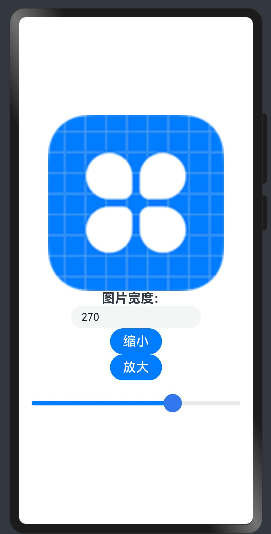
struct Index { //自定义组件(可复用的UI单元)
  @State imageWidth: number=250 //标记变量是状态型变量,会被监控,一旦变化,则重新渲染
  build() { //描述组件内部的UI结构
    Row() { //这些都是内置组件。一类是容器组件,如Row,Column,一类是基础组件,自带样式和功能,如Text
      Column() {
        Image($r('app.media.icon'))
          .width(this.imageWidth)
          .interpolation(ImageInterpolation.High)
        Text($r('app.string.width_label'))
        .fontSize(20)
        .fontWeight((FontWeight.Bold))

        TextInput({placeholder:"请输入图片宽度",text:this.imageWidth.toFixed(0)})//参数是小数点的位数
          .width(200)
          .type(InputType.Number)
          .onChange((value:string)=>{ //只有一个参数可以省略括号
            this.imageWidth = parseInt(value)
          })
      }
      .width('100%')
    }
    .height('100%')
  }
}
数字到字符串有.toFixed方法,字符串到数字有parseInt方法
Button
Button(label?:ResourceStr)
label是按钮上的文字说明,可以传字符串或ResourceStr
可以传可以不传,不传的话,需要内嵌其他组件,比如图片,就可以搞成搜索图标的样子
属性方法:
width,height
type类型,枚举,里面有(Capsule胶囊-默认,Circle圆形,Normal不带圆角)
onClick 处理点击事件
Button(){
	Image($r('app.media.search')).width(20).margin(10)
}
Button('缩小')
  .width(80)
  .fontSize(20)
  .onClick(()=>{
    if (this.imageWidth>=10) {
      this.imageWidth -= 10
    }
  })
Button('放大')
  .width(80)
  .fontSize(20)
  .onClick(()=>{
    if (this.imageWidth<=340) {
      this.imageWidth += 10
    }
  })
Slider 滑动条
Slider(options?:SliderOptions)
min最小0,max最大100,value当前值,step步长,style样式(Inset,Outset),direction(Horizontal,Vertical从上到下),reverse(最小值最大值是否反向)
传入一堆参数要用{}框起来
属性:width,showTip(是否展示百分比提示,弹出气泡窗),blockColor(滑块颜色),onChange(value=>{})
Slider({
   min:100,
   max:350,
   value:this.imageWidth,
   step:10
 })
   .width(350)
   .blockColor('#37E')
   .trackThickness(7)
   .showTips(true)
   .onChange(value=>{
     this.imageWidth=value
   })
效果:
Column,Row 线性布局组件
Column 列,一列内有n行Row
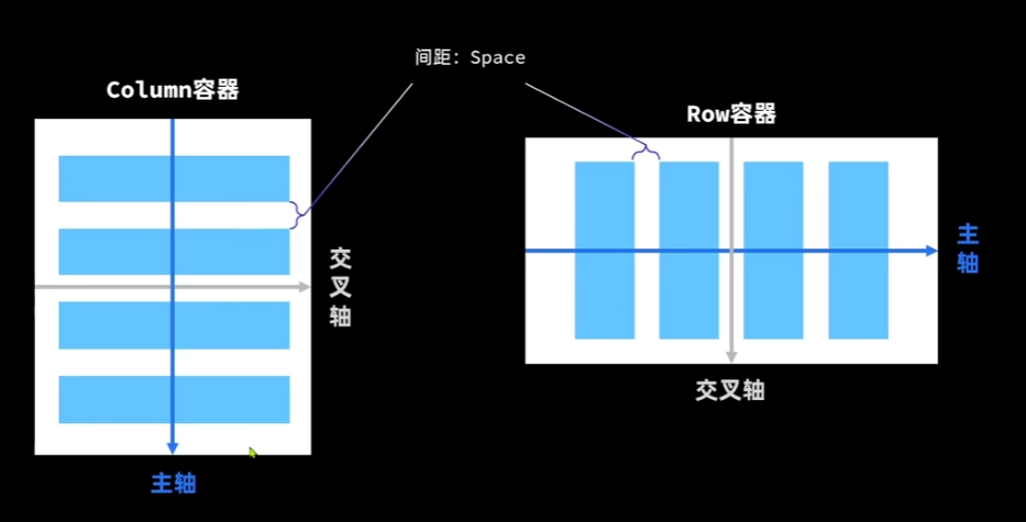
细节:控制对齐方式 space是小写
属性方法:
justifyContent 设置主轴方向的对齐格式 FlexAlign枚举
alignItems 设置交叉轴方向的对齐格式 Row用 VerticalAlign,Column用HorizontalAlign
build(){
    Column({space:20}){
      Text('Item1')
        .fontSize(30)
      Text('Item2')
      Text('Item3')
      Text('Item4')

    }
    .width('100%')
    .height('100%')
    .justifyContent(FlexAlign.Center)
    .alignItems(HorizontalAlign.Center)
  }
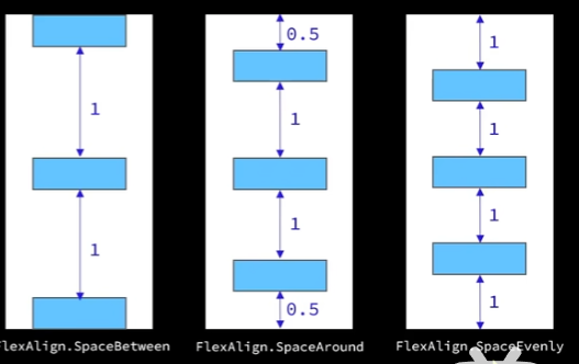
FlexAlign枚举包括 start 置顶(最上/最左),center 居中,end置底(最下,最右),SpaceBetween 均匀分布,SpaceAround ,SpaceEvenly

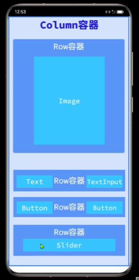
想要图片变大变小其他位置的元素都不变,可以把图片放进行容器里
容器具有属性内边距padding,有top bottom left right四个,.padding(20) 四个全设置,传{}可以分别设置
具有外边距margin 方法同padding
@Entry //入口组件,可以被独立访问,自己就是一个页面。否则是普通组件,必须被入口型组件引用
@Component //@装饰器,装饰类结构、方法、变量 component指组件
struct Index { //自定义组件(可复用的UI单元)
  @State imageWidth: number = 150 //标记变量是状态型变量,会被监控,一旦变化,则重新渲染
  build() { //描述组件内部的UI结构
    Column() { //可以传入{space:20}
      Row(){
        Image($r('app.media.icon'))
          .width(this.imageWidth)
          .interpolation(ImageInterpolation.High)
      }
      .width('100%')
      .height(350)
      .justifyContent(FlexAlign.Center)

      Row(){
        Text($r('app.string.width_label'))
          .fontSize(20)
          .fontWeight((FontWeight.Bold))

        TextInput({ placeholder: "请输入图片宽度", text: this.imageWidth.toFixed(0) }) //参数是小数点的位数
          .width(200)
          .type(InputType.Number)
          .onChange((value: string) => { //只有一个参数可以省略括号
            this.imageWidth = parseInt(value)
          })
      }
      .justifyContent(FlexAlign.SpaceBetween)
      .width('100%')
      .padding({left:20,right:20})

      Divider()
        .width('90%')

      Row(){
        Button('缩小')
          .width(80)
          .fontSize(20)
          .onClick(() => {
            if (this.imageWidth >= 10) {
              this.imageWidth -= 10
            }
          })
        Button('放大')
          .width(80)
          .fontSize(20)
          .onClick(() => {
            if (this.imageWidth <= 340) {
              this.imageWidth += 10
            }
          })
      }
      .width('100%')
      .justifyContent(FlexAlign.SpaceEvenly)
      .margin({top:30})

      Slider({
        min: 100,
        max: 350,
        value: this.imageWidth,
        step: 10
      })
        .width('100%')
        .blockColor('#37E')
        .trackThickness(7)
        .showTips(true)
        .onChange(value => {
          this.imageWidth = value
        })
    }
    .width('100%')
    .height('100%')
    .justifyContent(FlexAlign.Center)
  }
}
效果: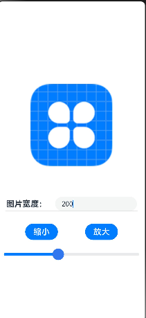
循环控制 ForEach
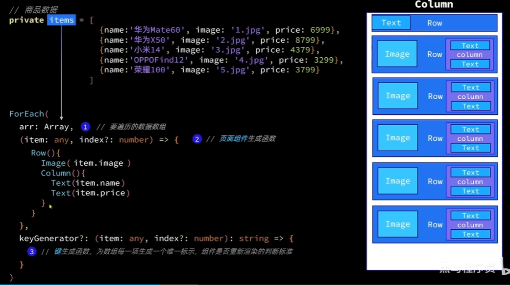
keyGenerator用途是数组变化时,判断是否变更,如果变更了,才重新渲染
如果不传,默认的是角标拼数据
class Item{
name:string
image:ResourceStr
price:number
constructor(name:string,image:ResourceStr,price:number) {
this.name=name
this.image=image
this.price=price
}
}
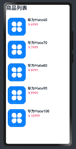
@Entry
@Component
struct ItemPage {
private items: Array<Item> = [
new Item('华为Mate60', $r('app.media.icon'), 6999),
new Item('华为Mate70', $r('app.media.icon'), 7999),
new Item('华为Mate80', $r('app.media.icon'), 8999),
new Item('华为Mate90', $r('app.media.icon'), 9999),
new Item('华为Mate100', $r('app.media.icon'), 10999)
]
build() {
Column({ space: 8 }) {
Row() {
Text('商品列表')
.fontSize(30)
.fontWeight(FontWeight.Bold)
}
.width('100%')
.margin({ bottom: 20 })
ForEach(
this.items,
(item:Item) =>{
Row({space:10}){
Image(item.image)
.width('30%')
Column({space:4}){
Text(item.name)
.fontSize(20)
.fontWeight(FontWeight.Bold)
Text('¥'+item.price)
.fontColor('#F36')
.fontSize(18)
}
.height('100%')
.alignItems(HorizontalAlign.Start)
}
.width('100%')
.backgroundColor('#FFF')
.borderRadius(20)
.height(120)
.padding(10)
}
)
}
.width('100%')
.height('100%')
}
}
效果:
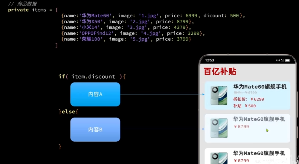
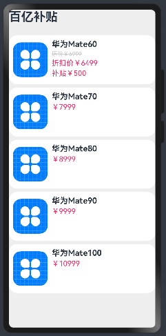
class Item{
  name:string
  image:ResourceStr
  price:number
  discount:number

  constructor(name:string,image:ResourceStr,price:number,discount:number=0) {
    this.name=name
    this.image=image
    this.price=price
    this.discount=discount
  }
}

@Entry
@Component
struct  ItemPage {
  private items: Array<Item> = [
    new Item('华为Mate60', $r('app.media.icon'), 6999,500),
    new Item('华为Mate70', $r('app.media.icon'), 7999),
    new Item('华为Mate80', $r('app.media.icon'), 8999),
    new Item('华为Mate90', $r('app.media.icon'), 9999),
    new Item('华为Mate100', $r('app.media.icon'), 10999)
  ]

  build() {
    Column({ space: 8 }) {
      Row() {
        Text('百亿补贴')
          .fontSize(30)
          .fontWeight(FontWeight.Bold)
      }
      .width('100%')
      .margin({ bottom: 20 })

      ForEach(
        this.items,
        (item:Item) =>{
          Row({space:10}){
            Image(item.image)
              .width('25%')
            Column({space:4}){
              Text(item.name)
                .fontSize(20)
                .fontWeight(FontWeight.Bold)
              if (item.discount){
                Text('原价¥'+item.price)
                  .fontColor('#CCC')
                  .fontSize(14)
                  .decoration({type:TextDecorationType.LineThrough})
                Text('折扣价¥'+(item.price-item.discount))
                  .fontColor('#F36')
                  .fontSize(18)
                Text('补贴¥'+item.discount)
                  .fontColor('#F36')
                  .fontSize(18)
              }else{
                Text('¥'+item.price)
                  .fontColor('#F36')
                  .fontSize(18)
              }

            }
            .height('100%')
            .alignItems(HorizontalAlign.Start)
          }
          .width('100%')
            .backgroundColor('#FFF')
            .borderRadius(20)
            .height(120)
            .padding(10)
        }
      )
      }
    .width('100%')
    .height('100%')
    .backgroundColor('#EEE')

    }
  }
效果
列表布局 List
- 自动提供滚动功能
- 既可以纵向排列,也可以横向排列
List({space:10}){
      ForEach([1,2,3,4],item=>{
        ListItem(){ //并不是容器,只是一个标记,只能包含一个根组件。可以把两个text包到一个row里
          Text("ListItem")
        }
      })

    }
    .listDirection(Axis.Horizontal)
代码:
build() {
    Column({ space: 8 }) {
      Row() {
        Text('百亿补贴')
          .fontSize(30)
          .fontWeight(FontWeight.Bold)
      }
      .width('100%')
      .height(30)
      .margin({ bottom: 20 })

      List({space:8}){
        ForEach(
          this.items,
          (item:Item) =>{
            ListItem(){
              Row({space:10}){
                Image(item.image)
                  .width('25%')
                Column({space:4}){
                  Text(item.name)
                    .fontSize(20)
                    .fontWeight(FontWeight.Bold)
                  if (item.discount){
                    Text('原价¥'+item.price)
                      .fontColor('#CCC')
                      .fontSize(14)
                      .decoration({type:TextDecorationType.LineThrough})
                    Text('折扣价¥'+(item.price-item.discount))
                      .fontColor('#F36')
                      .fontSize(18)
                    Text('补贴¥'+item.discount)
                      .fontColor('#F36')
                      .fontSize(18)
                  }else{
                    Text('¥'+item.price)
                      .fontColor('#F36')
                      .fontSize(18)
                  }

                }
                .height('100%')
                .alignItems(HorizontalAlign.Start)
              }
              .width('100%')
              .backgroundColor('#FFF')
              .borderRadius(20)
              .height(120)
              .padding(10)
            }

          }
        )

      }.width('100%')
      .layoutWeight(1)//表示权重,为0表示只有自己的固定高度,此处为1,表示它占据除了标题以外的全部空间


      }
    .width('100%')
    .height('100%')
    .backgroundColor('#EEE')

    }
自定义组件
用于提高代码的可复用性
@Component //不加@Entry就变成了可复用的组件
struct
可以在本页定义(仅本页面可用),也可以单独定义成一个文件(导入使用)
文字描述不能写死,应该封装为组件的成员变量,然后传参
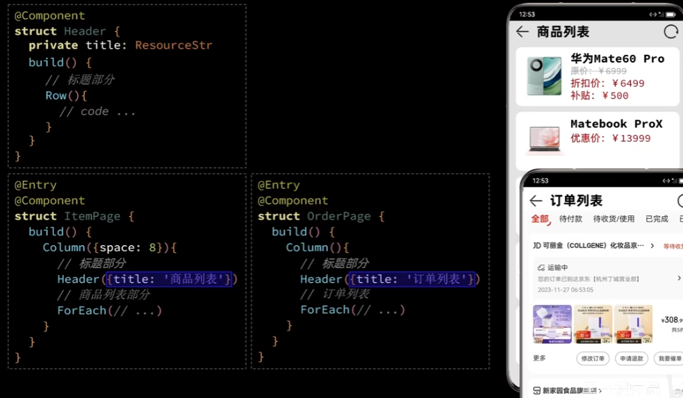
commonComponent.ets
@Component
export struct Header{
  private title:ResourceStr
  build(){
    Row() {
      Image($r('app.media.icon'))
        .width(30)
      Text(this.title)
        .fontSize(30)
        .fontWeight(FontWeight.Bold)
      Blank()//空白组件,占据所有的中间的空间
      Image($r('app.media.icon'))
        .width(30)
    }
    .width('100%')
    .height(30)
  }
}
调用:
import {Header} from '../Components/commonComponents'

Header({title:"商品列表"})
      .margin(10)
本页定义可以直接调用。
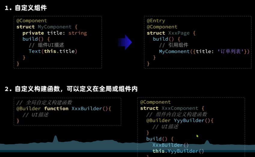
自定义构建函数,不同于组件但用法非常类似。
//全局自定义构建函数,本文件的Component都能用。也可以定义在组件内部。
@Builder function ItemCard(item:Item){
  Row({space:10}){
    Image(item.image)
      .width('25%')
    Column({space:4}){
      Text(item.name)
        .fontSize(20)
        .fontWeight(FontWeight.Bold)
      if (item.discount){
        Text('原价¥'+item.price)
          .fontColor('#CCC')
          .fontSize(14)
          .decoration({type:TextDecorationType.LineThrough})
        Text('折扣价¥'+(item.price-item.discount))
          .fontColor('#F36')
          .fontSize(18)
        Text('补贴¥'+item.discount)
          .fontColor('#F36')
          .fontSize(18)
      }else{
        Text('¥'+item.price)
          .fontColor('#F36')
          .fontSize(18)
      }

    }
    .height('100%')
    .alignItems(HorizontalAlign.Start)
  }
  .width('100%')
  .backgroundColor('#FFF')
  .borderRadius(20)
  .height(120)
  .padding(10)
}
调用
ItemCard(item)
局部自定义构建函数:
@Entry
@Component
struct  ItemPage {
  private items: Array<Item> = [
    new Item('华为Mate60', $r('app.media.icon'), 6999,500),
    new Item('华为Mate70', $r('app.media.icon'), 7999),
    new Item('华为Mate80', $r('app.media.icon'), 8999),
    new Item('华为Mate90', $r('app.media.icon'), 9999),
    new Item('华为Mate100', $r('app.media.icon'), 10999),
    new Item('华为Mate100', $r('app.media.icon'), 10999)

  ]
  //局部自定义构建函数
  @Builder ItemCard(item:Item){
    Row({space:10}){
      Image(item.image)
        .width('25%')
      Column({space:4}){
        Text(item.name)
          .fontSize(20)
          .fontWeight(FontWeight.Bold)
        if (item.discount){
          Text('原价¥'+item.price)
            .fontColor('#CCC')
            .fontSize(14)
            .decoration({type:TextDecorationType.LineThrough})
          Text('折扣价¥'+(item.price-item.discount))
            .fontColor('#F36')
            .fontSize(18)
          Text('补贴¥'+item.discount)
            .fontColor('#F36')
            .fontSize(18)
        }else{
          Text('¥'+item.price)
            .fontColor('#F36')
            .fontSize(18)
        }

      }
      .height('100%')
      .alignItems(HorizontalAlign.Start)
    }
    .width('100%')
    .backgroundColor('#FFF')
    .borderRadius(20)
    .height(120)
    .padding(10)
  }
  build() {
    Column({ space: 8 }) {
      Header({title:"商品列表"})
      .margin(10)

      List({space:8}){
        ForEach(
          this.items,
          (item:Item) =>{
            ListItem(){
              this.ItemCard(item)
            }
          }
        )
      }.width('100%')
      .layoutWeight(1)
      }
    .width('100%')
    .height('100%')
    .backgroundColor('#EEE')
    }
  }
调用时要加this.
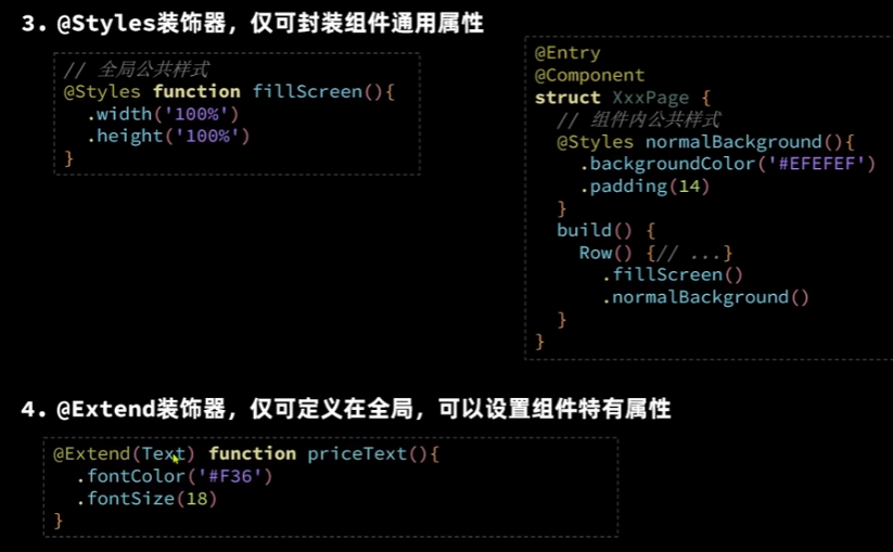
自定义的全局公共样式
//自定义的全局公共样式
@Styles function fillScreen(){
  .width('100%')
  .height('100%')
  .backgroundColor('#EFEFEF')
}
调用方法:
.fillScreen()
局部公共样式只需要去掉function,其他一模一样
注意:公共样式函数必须得用commonAttribue,即公共属性。想写特有属性的话,用@Extend(组件名),这个不能写在组件内部。除了普通属性以外,也可以写事件方法。
ArkUI状态管理
@State
any,union不被允许。自定义的允许。
Object套Object,里面的变更无法监测;数组里的对象的属性变化无法触发更新,但新增、删除对象,或者重新赋值对象(即new一个对象赋值给原来的数组下标)可以。
struct Index { //自定义组件(可复用的UI单元)
  @State message: string = '博物馆' //标记变量是状态型变量,会被监控,一旦变化,则重新渲染
  @State age:number=21

  build() { //描述组件内部的UI结构
    Row() { //这些都是内置组件。一类是容器组件,如Row,Column,一类是基础组件,自带样式和功能,如Text
      Column() {
        Text(`${this.message}:${this.age}`)//字符串模板。这是`键,在esc下面。用${}引用变量。
          .fontSize(50) //属性方法。设置组件的UI样式
          .fontWeight(FontWeight.Bold)
          .fontColor('#365')
          .onClick(()=>{
            this.age++
          })
      }
      .width('100%')
    }
    .height('100%')
  }
}
对象也是ok的,但是对象里面的对象的属性变化,不会被监控到
class Person{
  name:string
  age:number
  friend:Person
  constructor(name:string,age:number,friend?:Person) {
    this.name=name
    this.age=age
    this.friend=friend
  }
}
@Entry //入口组件,可以被独立访问,自己就是一个页面。否则是普通组件,必须被入口型组件引用
@Component //@装饰器,装饰类结构、方法、变量 component指组件
struct Index { //自定义组件(可复用的UI单元)
  @State p:Person=new Person('Jack',21,new Person('Rose',22))

  build() { //描述组件内部的UI结构
    Row() { //这些都是内置组件。一类是容器组件,如Row,Column,一类是基础组件,自带样式和功能,如Text
      Column() {
        Text(`${this.p.name}:${this.p.age}`)//字符串模板。这是`键,在esc下面。用${}引用变量。
          .fontSize(50) //属性方法。设置组件的UI样式
          .fontWeight(FontWeight.Bold)
          .fontColor('#365')
          .onClick(()=>{
            this.p.age++
          })
      }
      .width('100%')
    }
    .height('100%')
  }
}
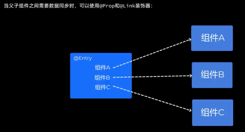
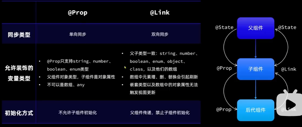
@Prop @Link
先来看一个任务统计案例:
class Task{ //任务表
static id:number =1 //任务编号 静态变量,类内所有对象共享
name:string=`任务${Task.id++}` //任务名称
finished:boolean=false //完成情况
}
@Styles function card(){
.width('95%')
.padding(20)
.backgroundColor(Color.White)
.borderRadius(15)
.shadow({radius:6,color:'#1F000000',offsetX:2,offsetY:4})
}
@Extend(Text) function finishedTask(){
.decoration({type:TextDecorationType.LineThrough})
.fontColor('B1B2B1')
}
@Entry
@Component
struct PropPage{
@State totalTask:number=0
@State finishTask:number=0
@State tasks:Task[]=[]
handleTaskChange(){
//更新任务总数量
this.totalTask=this.tasks.length
//更新已完成任务的数量
this.finishTask = this.tasks.filter(item=>item.finished).length
}
@Builder deleteButton(index:number){
Button(){
Image($r('app.media.icon'))
.width(20)
}
.width(40)
.height(40)
.type(ButtonType.Circle)
.backgroundColor(Color.Red)
.margin(5)
.onClick(
()=>{
this.tasks.splice(index,1)
this.handleTaskChange()
}
)
}
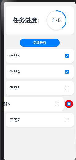
build(){
Column({space:10}){
// 1.任务进度卡片
Row(){
Text('任务进度:')
.fontSize(30)
.fontWeight(FontWeight.Bold)
Stack(){//堆叠容器,后面的会覆盖前面的
Progress({value:this.finishTask,total:this.totalTask,type:ProgressType.Ring})
.width(100) //环形进度条
Row() {
Text(this.finishTask.toString())
.fontSize(24)
.fontColor('#36D')
Text(' / ')
Text(this.totalTask.toString())
.fontSize(24)
}
}
}
.card()
.margin({top:20,bottom:10})
.justifyContent(FlexAlign.SpaceEvenly)
// 2.新增任务按钮
Button('新增任务')
.width(200)
.onClick(()=>{
//新增任务数据
this.tasks.push(new Task())
this.handleTaskChange()
})
// 3.任务列表
List({space:10}){
ForEach(
this.tasks,
(item:Task,index)=>{
ListItem(){
Row(){
Text(item.name)
.fontSize(20)
Checkbox()
.select(item.finished)
.onChange(val=>{
//更新当前任务状态
item.finished=val
this.handleTaskChange()
})
}
.card()
.justifyContent(FlexAlign.SpaceBetween)
}
.swipeAction({end:this.deleteButton(index)})
}
)
}
.width('100%')
.alignListItem(ListItemAlign.Center)
.layoutWeight(1)
}
.width('100%')
.height('100%')
.backgroundColor('#F1F2F3')
}
}
效果:
引用关系产生:
对代码进行封装,组件分离出来后,如果把父组件和子组件都加上@state,会报错Assigning the '@State' decorated attribute 'finishTask' to the '@State' decorated attribute 'finishTask' is not allowed. <etsLint>,如果去掉子组件的state,无法实现监控的功能。
单向同步:父组件修改,会传给子组件,但不会反向传递。实际上是拷贝传递,覆盖了子组件的变量。
双向同步:两者修改,对方都会感知到。这时传递的是变量的引用。
@Prop 修饰的变量不能做初始化
@Link 修饰的变量在传入时必须传入$引用变量;和State很像,允许的类型很像,刷新的类型很像
官网文档有时和现在的api用法不同。
封装优化后的代码:
class Task{ //任务表
  static id:number =1 //任务编号 静态变量,类内所有对象共享
  name:string=`任务${Task.id++}` //任务名称
  finished:boolean=false   //完成情况
}
@Styles function card(){
  .width('95%')
  .padding(20)
  .backgroundColor(Color.White)
  .borderRadius(15)
  .shadow({radius:6,color:'#1F000000',offsetX:2,offsetY:4})
}
@Extend(Text) function  finishedTask(){
  .decoration({type:TextDecorationType.LineThrough})
  .fontColor('B1B2B1')
}

@Entry
@Component
struct PropPage{
  @State totalTask:number=0
  @State finishTask:number=0

  build(){
    Column({space:10}){
      // 1.任务进度卡片
      TaskStatistic({finishTask:this.finishTask,totalTask:this.totalTask}) //需要数据同步

      // 2.新增任务按钮
      TaskList({finishTask:$finishTask,totalTask:$totalTask})

    }
    .width('100%')
    .height('100%')
    .backgroundColor('#F1F2F3')
  }
}


@Component
struct TaskStatistic {
  @Prop finishTask:number
  @Prop totalTask:number
  build() {
    Row(){
      Text('任务进度:')
        .fontSize(30)
        .fontWeight(FontWeight.Bold)
      Stack(){//堆叠容器,后面的会覆盖前面的
        Progress({value:this.finishTask,total:this.totalTask,type:ProgressType.Ring})
          .width(100) //环形进度条
        Row() {
          Text(this.finishTask.toString())
            .fontSize(24)
            .fontColor('#36D')
          Text(' / ')
          Text(this.totalTask.toString())
            .fontSize(24)
        }
      }
    }
    .card()
    .margin({top:20,bottom:10})
    .justifyContent(FlexAlign.SpaceEvenly)
  }
}


@Component
struct TaskList {
  @Link totalTask:number
  @Link finishTask:number
  @State tasks:Task[]=[]

  handleTaskChange(){
    //更新任务总数量
    this.totalTask=this.tasks.length
    //更新已完成任务的数量
    this.finishTask = this.tasks.filter(item=>item.finished).length
  }
  @Builder deleteButton(index:number){
    Button(){
      Image($r('app.media.icon'))
        .width(20)
    }
    .width(40)
    .height(40)
    .type(ButtonType.Circle)
    .backgroundColor(Color.Red)
    .margin(5)
    .onClick(
      ()=>{
        this.tasks.splice(index,1)
        this.handleTaskChange()
      }
    )
  }

  build() {
    Column(){
      Button('新增任务')
        .width(200)
        .onClick(()=>{
          //新增任务数据
          this.tasks.push(new Task())
          this.handleTaskChange()
        })
      // 3.任务列表
      List({space:10}){
        ForEach(
          this.tasks,
          (item:Task,index)=>{
            ListItem(){
              Row(){
                Text(item.name)
                  .fontSize(20)
                Checkbox()
                  .select(item.finished)
                  .onChange(val=>{
                    //更新当前任务状态
                    item.finished=val
                    this.handleTaskChange()
                  })
              }
              .card()
              .justifyContent(FlexAlign.SpaceBetween)
            }
            .swipeAction({end:this.deleteButton(index)})
          }
        )
      }
      .width('100%')
      .alignListItem(ListItemAlign.Center)
      .layoutWeight(1)
    }

  }
}
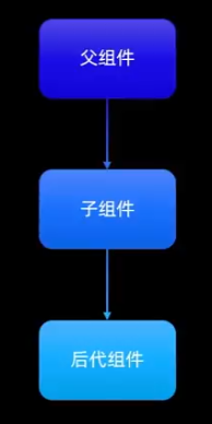
@Provide @Comsume
提供跨组件的类似@State和@Link的双向同步
无需传参,特别方便,父组件用Provide,子组件用Consume,但是这种用法需要内部自己维护,会消耗资源。所以一般情况还是要用Prop,Link
修改后的样例:
class Task{ //任务表
  static id:number =1 //任务编号 静态变量,类内所有对象共享
  name:string=`任务${Task.id++}` //任务名称
  finished:boolean=false   //完成情况
}
class StatInfo{
  totalTask:number=0
  finishTask:number=0
}
@Styles function card(){
  .width('95%')
  .padding(20)
  .backgroundColor(Color.White)
  .borderRadius(15)
  .shadow({radius:6,color:'#1F000000',offsetX:2,offsetY:4})
}
@Extend(Text) function  finishedTask(){
  .decoration({type:TextDecorationType.LineThrough})
  .fontColor('B1B2B1')
}

@Entry
@Component
struct PropPage{
  @Provide stat:StatInfo=new StatInfo()
  build(){
    Column({space:10}){
      // 1.任务进度卡片
      TaskStatistic() //需要数据同步
      // 2.新增任务按钮
      TaskList()
    }
    .width('100%')
    .height('100%')
    .backgroundColor('#F1F2F3')
  }
}

@Component
struct TaskStatistic {
  @Consume stat:StatInfo
  build() {
    Row(){
      Text('任务进度:')
        .fontSize(30)
        .fontWeight(FontWeight.Bold)
      Stack(){//堆叠容器,后面的会覆盖前面的
        Progress({value:this.stat.finishTask,total:this.stat.totalTask,type:ProgressType.Ring})
          .width(100) //环形进度条
        Row() {
          Text(this.stat.finishTask.toString())
            .fontSize(24)
            .fontColor('#36D')
          Text(' / ')
          Text(this.stat.totalTask.toString())
            .fontSize(24)
        }
      }
    }
    .card()
    .margin({top:20,bottom:10})
    .justifyContent(FlexAlign.SpaceEvenly)
  }
}


@Component
struct TaskList {

  @Consume stat:StatInfo
  @State tasks:Task[]=[]

  handleTaskChange(){
    //更新任务总数量
    this.stat.totalTask=this.tasks.length
    //更新已完成任务的数量
    this.stat.finishTask = this.tasks.filter(item=>item.finished).length
  }
  @Builder deleteButton(index:number){
    Button(){
      Image($r('app.media.icon'))
        .width(20)
    }
    .width(40)
    .height(40)
    .type(ButtonType.Circle)
    .backgroundColor(Color.Red)
    .margin(5)
    .onClick(
      ()=>{
        this.tasks.splice(index,1)
        this.handleTaskChange()
      }
    )
  }

  build() {
    Column(){
      Button('新增任务')
        .width(200)
        .onClick(()=>{
          //新增任务数据
          this.tasks.push(new Task())
          this.handleTaskChange()
        })
      // 3.任务列表
      List({space:10}){
        ForEach(
          this.tasks,
          (item:Task,index)=>{
            ListItem(){
              Row(){
                Text(item.name)
                  .fontSize(20)
                Checkbox()
                  .select(item.finished)
                  .onChange(val=>{
                    //更新当前任务状态
                    item.finished=val
                    this.handleTaskChange()
                  })
              }
              .card()
              .justifyContent(FlexAlign.SpaceBetween)
            }
            .swipeAction({end:this.deleteButton(index)})
          }
        )
      }
      .width('100%')
      .alignListItem(ListItemAlign.Center)
      .layoutWeight(1)
    }

  }
}
功能和之前的一模一样。
@Observed @ObjectLink
视频17
用在嵌套对象和数组元素为对象的场景中进行双向数据传递。正好弥补了之前不能实现的功能。


 扫一扫
扫一扫


 2208
2208

 被折叠的 条评论
为什么被折叠?
被折叠的 条评论
为什么被折叠?
 到【灌水乐园】发言


