


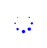
效果如下:8个小圆点一直的这样转动
8个小点的生成方式:
将8个小圆点分别放在2个盒子上,一个黑子放4个,分别放在4个角上,然后第2 个盒子旋转45度,将两个盒子重叠到一起,就可以生成这个8个小圆点了。
具体代码如下:
<!DOCTYPE html>
<html lang="en">
<head>
    <meta charset="UTF-8">
    <meta name="viewport" content="width=device-width, initial-scale=1.0">
    <title>loading</title>
    <style>
        *{
            margin: 0;
            padding: 0;
        }
        .loading{
            width: 100px;
            height: 100px;
            margin: 100px auto;
        }
        .box1,.box2{
            width: 40px;
            height: 40px;
            position: absolute;
        }
        .box1 div ,.box2 div{
            width: 10px;
            height: 10px;
            background-color: #00f;
            position: absolute;
            border-radius: 50%;
            animation: loading 1.5s infinite linear;
        }
        .box2{transform: rotate(45deg);}
        .box1 div:nth-child(1),.box2 div:nth-child(1){
            left: 0;
            top: 0;
        }
        .box1 div:nth-child(2),.box2 div:nth-child(2){
            right: 0;
            top: 0;
        }
        .box1 div:nth-child(3),.box2 div:nth-child(3){
            right: 0;
            bottom: 0;

        }
        .box1 div:nth-child(4), .box2 div:nth-child(4){
            left: 0;
            bottom: 0;
        }
        @keyframes loading{
            0%{
                transform: scale(1);
            }
            50%{
                transform: scale(0);
            }
            100%{
                transform: scale(1);
            }
        }
        .box1 div:nth-child(1){animation-delay: 0s;}
        .box2 div:nth-child(1){animation-delay: .2s;}
        .box1 div:nth-child(2){animation-delay: .4s;}
        .box2 div:nth-child(2){animation-delay: .6s;}
        .box1 div:nth-child(3){animation-delay: .8s;}
        .box2 div:nth-child(3){animation-delay: 1s;}
        .box1 div:nth-child(4){animation-delay: 1.2s;}
        .box2 div:nth-child(4){animation-delay: 1.4s;}
    </style>
</head>
<body>
    <div class="loading">
        <div class="box1">
            <div></div>
            <div></div>
            <div></div>
            <div></div>
        </div>
        <div class="box2">
            <div></div>
            <div></div>
            <div></div>
            <div></div>
        </div>
    </div>
</body>
</html>


 694
694


 被折叠的 条评论
为什么被折叠?
被折叠的 条评论
为什么被折叠?
 到【灌水乐园】发言


