


TextInputLayout
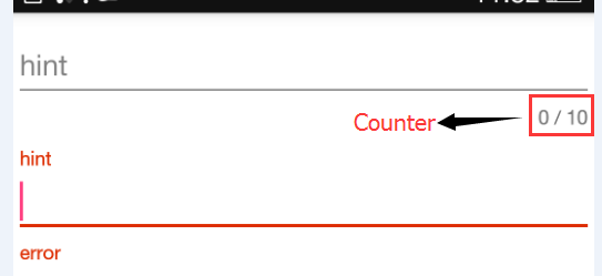
其实质是一个含有EditText的垂直线性布局。它与EditText最大的区别在于:普通的EditText在输入文字时,hint会被隐藏,而TextInputLayout却不会,它会将hint收缩到EditText上方。如下图中的"hint"所处位置。并且TextInputLayout在Edittext下方新添加了两个TextView,一个是"error"一个是"counter"。其中error区域用来显示输入的错误提示信息,而counter区域用来显示当前edittext输入的文字个数及最大输入文字个数。
其各个部件如下:
常用属性
hintAnimationEnabled:hint从edittext中收缩到hint区域时是否有动画。
hintTextAppearance:hint区域文字的样式
errorTextAppearance:error区域文字样式
errorEnabled:是否使用error区域
counterEnabled:是否使用counter区域
counterTextAppearance:未超出maxLength长度时,counter区域文字样式。
counterOverflowTextAppearance:超出长度后,counter区域文字样式。
counterMaxLength:edittext最大输入长度。
常用方法
getEditText():获取TextInputLayout所包含的EditText对象。
其余方法为对hint,error与counter区域的操作,略。
分析
setErrorEnabled()源码如下:
    public void setErrorEnabled(boolean enabled) {
        if (mErrorEnabled != enabled) {
            if (mErrorView != null) {
                ViewCompat.animate(mErrorView).cancel();
            }

            if (enabled) {//代码一
                mErrorView = new TextView(getContext());
                mErrorView.setTextAppearance(getContext(), mErrorTextAppearance);
                mErrorView.setVisibility(INVISIBLE);
                ViewCompat.setAccessibilityLiveRegion(mErrorView,
                        ViewCompat.ACCESSIBILITY_LIVE_REGION_POLITE);
                addIndicator(mErrorView, 0);
            } else {
                mErrorShown = false;
                updateEditTextBackground();
                removeIndicator(mErrorView);//将errorTextView从mIndicatorArea中remove 。略
	                mErrorView = null;            }            mErrorEnabled = enabled;        }    }
最后调用的addIndicator()如下:
    private void addIndicator(TextView indicator, int index) {
        if (mIndicatorArea == null) {
            mIndicatorArea = new LinearLayout(getContext());
            mIndicatorArea.setOrientation(LinearLayout.HORIZONTAL);
            addView(mIndicatorArea, LinearLayout.LayoutParams.MATCH_PARENT,
                    LinearLayout.LayoutParams.WRAP_CONTENT);

            // Add a flexible spacer in the middle so that the left/right views stay pinned
            final Space spacer = new Space(getContext());
            final LinearLayout.LayoutParams spacerLp = new LinearLayout.LayoutParams(0, 0, 1f);
            mIndicatorArea.addView(spacer, spacerLp);

            if (mEditText != null) {
                adjustIndicatorPadding();
            }
        }
        mIndicatorArea.setVisibility(View.VISIBLE);
        mIndicatorArea.addView(indicator, index);
    }
其实这个水平的线性布局中一共有三个view,errorTextView,一个weight为1的空白view(即上述代码中的Space)和counterTextView。空白view的主要作用是将errorTextView与counterTextView挤到两头。
示例
    <android.support.design.widget.TextInputLayout
        android:id="@+id/first"
        android:layout_width="match_parent"
        android:layout_height="wrap_content"
        app:counterEnabled="true"
        app:counterOverflowTextAppearance="@style/CounterOverflowApperance"
        app:counterTextAppearance="@style/CounterApperance"
        app:hintAnimationEnabled="true">

        <EditText
            android:layout_width="match_parent"
            android:layout_height="wrap_content"
            android:hint="hint"
            android:textColorHint="@android:color/holo_red_dark" />
    </android.support.design.widget.TextInputLayout>
总结
显示error提示文字,只需要调用setError("error msg")即可。取消error的显示,调用setErrorEnabled(false)即可。
TextInputLayout使用时,必须为它添加一个EditText子控件。
FloatingActionButton
继承于ImageButton,因此点击事件与普通控件一样。效果如下:
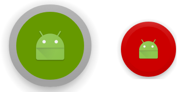
左边为按下效果,右边为正常时显示效果
中间的小机器人为src(继承于ImageButton,所以src属性仍旧有效)。
左图中,外围灰色的圆环的宽度为borderWidth。灰色为backgroundTint中的pressed时对应的color。中间的绿色颜色为rippleColor。
右图中,红色为backgrountTint中正常情况下的color。
在上图中,每一个按钮周围都有一圈渐变到透明的阴影。按下时阴影是通过pressedTranslationZ控制,正常时通过elevation控制。
常用属性
fabSize:fab的大小。mini与normal两种。
rippleColor:在md设计中,按下是会有波纹效果。波纹效果的颜色。
backgroundTint:fab的显示颜色。可以写成颜色选择器。
borderWidth:边框的宽度。
elevation:海拔。控件在z轴的坐标。
pressedTranslationZ:按下时z轴的移动距离。
示例
    <android.support.design.widget.FloatingActionButton
        android:id="@+id/fab"
        android:layout_width="wrap_content"
        android:layout_height="wrap_content"
        android:layout_centerInParent="true"
        android:src="@mipmap/ic_launcher"
        android:layout_margin="0dp"
        android:background="@android:color/holo_orange_dark"
        app:elevation="50dp"
        app:borderWidth="0dp"
        app:pressedTranslationZ="20dp"
        app:fabSize="normal"
        app:rippleColor="@android:color/holo_green_dark"
app:backgroundTint="@color/fab_bg_tint" /><selector xmlns:android="http://schemas.android.com/apk/res/android">
<item android:color="@android:color/darker_gray" android:state_pressed="true" />
<item android:color="@android:color/holo_red_dark" />
</selector>Snackbar
与Toast类似,是一种简短的文字提示。但与Toast最不同的在于,它含有一个button,并且该button可以响应点击事件;另外,snackbar只会显示到窗口的底部。
分析
上述代码中,make()方法除第一个参数外,其余与Toast完全一致;setAction()为snackbar中的按钮注册点击事件回调;show()方法类似于Toast#show()。
查看Snackbar的make()源码可知,该参数被传递到了如下方法中当作参数:
    private static ViewGroup findSuitableParent(View view) {
        ViewGroup fallback = null;
        do {
            if (view instanceof CoordinatorLayout) {
                // 当是CoordinatorLayout时,直接返回
                return (ViewGroup) view;
            } else if (view instanceof FrameLayout) {
                if (view.getId() == android.R.id.content) {
                    // 没有找到CoordinatorLayout,但View树已经遍历到decor view了,就使用该decor view。一般情况下,该判断肯定会成功。
                    return (ViewGroup) view;
                } else {
                    //
                    fallback = (ViewGroup) view;
                }
            }

            if (view != null) {
                // 逆向遍历view树
                final ViewParent parent = view.getParent();
                view = parent instanceof View ? (View) parent : null;
            }
        } while (view != null);

        // If we reach here then we didn't find a CoL or a suitable content view so we'll fallback
        return fallback;
    }
可以通过Snackbar#getView()获取到SnackbarLayout实例对象,再通过getChildAt()方法分别获取到msgView与actionView。
示例
                Snackbar bar = Snackbar.make(findViewById(R.id.root), "snack", Snackbar.LENGTH_SHORT)
                .setAction("dismiss", new View.OnClickListener() {
                    @Override
                    public void onClick(View v) {
                        //snackbar中按钮的点击响应事件
                    }
                });
                Snackbar.SnackbarLayout view = (Snackbar.SnackbarLayout) bar.getView();
                view.setBackgroundColor(getResources().getColor(android.R.color.holo_blue_light));
                TextView msgView = (TextView) view.getChildAt(0);
                msgView.setTextColor(Color.WHITE);
                msgView.setText("msgView");
                Button actionBtn = (Button) view.getChildAt(1);
                actionBtn.setTextColor(getResources().getColor(android.R.color.holo_red_light));
                bar.show();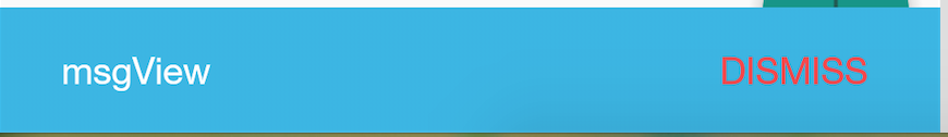


 扫一扫
扫一扫
 1415
1415

 被折叠的 条评论
为什么被折叠?
被折叠的 条评论
为什么被折叠?
 到【灌水乐园】发言


