鸿蒙开发笔记(二十六):交互事件--触摸,按键,鼠标,焦点

交互事件按照触发类型来分类,包括触屏事件、键鼠事件和焦点事件。

  • 触屏事件:手指或手写笔在触屏上的单指或单笔操作。

  • 键鼠事件:包括外设鼠标或触控板的操作事件和外设键盘的按键事件。
    鼠标事件是指通过连接和使用外设鼠标/触控板操作时所响应的事件。
    按键事件是指通过连接和使用外设键盘操作时所响应的事件。

  • 焦点事件:通过以上方式控制组件焦点的能力和响应的事件。

手势事件由绑定手势方法和绑定的手势组成,绑定的手势可以分为单一手势和组合手势两种类型,根据手势的复杂程度进行区分。

  • 绑定手势方法:用于在组件上绑定单一手势或组合手势,并声明所绑定的手势的响应优先级。

  • 单一手势:手势的基本单元,是所有复杂手势的组成部分。

  • 组合手势:由多个单一手势组合而成,可以根据声明的类型将多个单一手势按照一定规则组合成组合手势,并进行使用。

1. 触屏事件

触屏事件指当手指/手写笔在组件上按下、滑动、抬起时触发的回调事件。包括点击事件、拖拽事件和触摸事件。
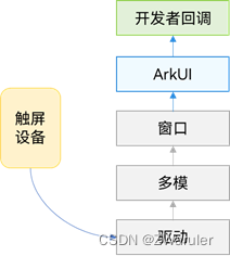
触摸事件原理

在这里插入图片描述

1.1 点击事件

点击事件是指通过手指或手写笔做出一次完整的按下和抬起动作。当发生点击事件时,会触发以下回调函数:

onClick(event: (event?: ClickEvent) => void)

event参数提供点击事件相对于窗口或组件的坐标位置,以及发生点击的事件源。

例如通过按钮的点击事件控制图片的显示和隐藏。

@Entry
@Component
struct IfElseTransition {
  @State flag: boolean = true;
  @State btnMsg: string = 'show';

  build() {
    Column() {
      Button(this.btnMsg).width(80).height(30).margin(30)
        .onClick(() => {
          if (this.flag) {
            this.btnMsg = 'hide';
          } else {
            this.btnMsg = 'show';
          }
          // 点击Button控制Image的显示和消失
          this.flag = !this.flag;
        })
      if (this.flag) {
        Image($r('app.media.icon')).width(200).height(200)
      }
    }.height('100%').width('100%')
  }
}

1.2 拖拽事件

拖拽事件指手指/手写笔长按组件(>=500ms),并拖拽到接收区域释放的事件。拖拽事件触发流程:

在这里插入图片描述
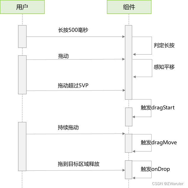
拖拽事件的触发通过长按、拖动平移判定,手指平移的距离达到5vp即可触发拖拽事件。ArkUI支持应用内、跨应用的拖拽事件。
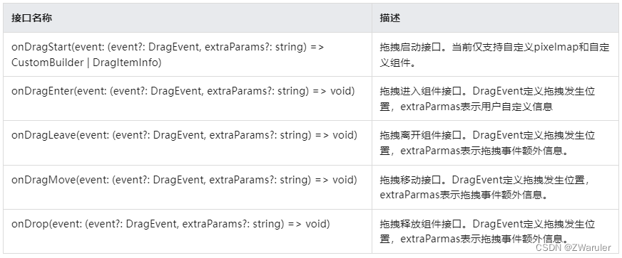
拖拽事件提供以下接口:

在这里插入图片描述
如下是跨窗口拖拽,拖出窗口示例:

import image from '@ohos.multimedia.image';

@Entry
@Component
struct Index {
  @State visible: Visibility = Visibility.Visible
  private pixelMapReader = undefined

  aboutToAppear() {
    console.info('begin to create pixmap has info message: ')
    this.createPixelMap()
  }

  createPixelMap() {
    let color = new ArrayBuffer(4 * 96 * 96);
    var buffer = new Uint8Array(color);
    for (var i = 0; i < buffer.length; i++) {
      buffer[i] = (i + 1) % 255;
    }
    let opts = {
      alphaType: 0,
      editable: true,
      pixelFormat: 4,
      scaleMode: 1,
      size: { height: 96, width: 96 }
    }
    const promise = image.createPixelMap(color, opts);
    promise.then((data) => {
      console.info('create pixmap has info message: ' + JSON.stringify(data))
      this.pixelMapReader = data;
    })
  }

  @Builder pixelMapBuilder() {
    Text('drag item')
      .width('100%')
      .height(100)
      .fontSize(16)
      .textAlign(TextAlign.Center)
      .borderRadius(10)
      .backgroundColor(0xFFFFFF)
  }

  build() {
    Flex({ direction: FlexDirection.Column, alignItems: ItemAlign.Center, justifyContent: FlexAlign.Center }) {
      Text('App1')
        .width('40%')
        .height(80)
        .fontSize(20)
        .margin(30)
        .textAlign(TextAlign.Center)
        .backgroundColor(Color.Pink)
        .visibility(Visibility.Visible)

      Text('Across Window Drag This')
        .width('80%')
        .height(80)
        .fontSize(16)
        .margin(30)
        .textAlign(TextAlign.Center)
        .backgroundColor(Color.Pink)
        .visibility(this.visible)
        .onDragStart(() => {                    //启动跨窗口拖拽
          console.info('Text onDrag start')
          return { pixelMap: this.pixelMapReader, extraInfo: 'custom extra info.' }
        })
        .onDrop((event: DragEvent, extraParams: string) => {
          console.info('Text onDragDrop,  ')
          this.visible = Visibility.None                    //拖动结束后,使源不可见
        })
    }

    .width('100%')
    .height('100%')
  }
}

跨窗口拖拽,拖入示例:

@Entry
@Component
struct Index {
  @State number: string[] = ['drag here']
  @State text: string = ''
  @State bool1: boolean = false
  @State bool2: boolean = false
  @State visible: Visibility = Visibility.Visible
  @State visible2: Visibility = Visibility.None
  scroller: Scroller = new Scroller()

  build() {
    Flex({ direction: FlexDirection.Column, alignItems: ItemAlign.Center, justifyContent: FlexAlign.Center }) {
      Text('App2')
        .width('40%')
        .height(80)
        .fontSize(20)
        .margin(30)
        .textAlign(TextAlign.Center)
        .backgroundColor(Color.Pink)
        .visibility(Visibility.Visible)

      List({ space: 20, initialIndex: 0 }) {
        ForEach(this.number, (item) => {
          ListItem() {
            Text('' + item)
              .width('100%')
              .height(80)
              .fontSize(16)
              .borderRadius(10)
              .textAlign(TextAlign.Center)
              .backgroundColor(0xFFFFFF)
          }
        }, item => item)

        ListItem() {
          Text('Across Window Drag This')
            .width('80%')
            .height(80)
            .fontSize(16)
            .margin(30)
            .textAlign(TextAlign.Center)
            .backgroundColor(Color.Pink)
            .visibility(this.visible2)
        }
      }
      .height('50%')
      .width('90%')
      .border({ width: 1 })
      .divider({ strokeWidth: 2, color: 0xFFFFFF, startMargin: 20, endMargin: 20 })
      .onDragEnter((event: DragEvent, extraParams: string) => {                         //拖拽进去组件
        console.info('List onDragEnter, ' + extraParams)
      })
      .onDragMove((event: DragEvent, extraParams: string) => {                          //拖拽时移动
        console.info('List onDragMove, ' + extraParams)
      })
      .onDragLeave((event: DragEvent, extraParams: string) => {                         //拖拽离开组件
        console.info('List onDragLeave, ' + extraParams)
      })
      .onDrop((event: DragEvent, extraParams: string) => {                              //释放组件
        console.info('List onDragDrop, ' + extraParams)
        this.visible2 = Visibility.Visible                                              //拖拽完成使拖入目标可见
      })
    }
    .width('100%')
    .height('100%')
  }
}

1.3 触摸事件

当手指或手写笔在组件上触碰时,会触发不同动作所对应的事件响应,包括按下(Down)、滑动(Move)、抬起(Up)事件:

onTouch(event: (event?: TouchEvent) => void)
  • event.type为TouchType.Down:表示手指按下。

  • event.type为TouchType.Up:表示手指抬起。

  • event.type为TouchType.Move:表示手指按住移动。

触摸事件可以同时多指触发,通过event参数可获取触发的手指位置、手指唯一标志、当前发生变化的手指和输入的设备源等信息。

// xxx.ets
@Entry
@Component
struct TouchExample {
  @State text: string = '';
  @State eventType: string = '';

  build() {
    Column() {
      Button('Touch').height(40).width(100)
        .onTouch((event: TouchEvent) => {
          if (event.type === TouchType.Down) {
            this.eventType = 'Down';
          }
          if (event.type === TouchType.Up) {
            this.eventType = 'Up';
          }
          if (event.type === TouchType.Move) {
            this.eventType = 'Move';
          }
          this.text = 'TouchType:' + this.eventType + '\nDistance between touch point and touch element:\nx: '
          + event.touches[0].x + '\n' + 'y: ' + event.touches[0].y + '\nComponent globalPos:('
          + event.target.area.globalPosition.x + ',' + event.target.area.globalPosition.y + ')\nwidth:'
          + event.target.area.width + '\nheight:' + event.target.area.height
        })
      Button('Touch').height(50).width(200).margin(20)
        .onTouch((event: TouchEvent) => {
          if (event.type === TouchType.Down) {
            this.eventType = 'Down';
          }
          if (event.type === TouchType.Up) {
            this.eventType = 'Up';
          }
          if (event.type === TouchType.Move) {
            this.eventType = 'Move';
          }
          this.text = 'TouchType:' + this.eventType + '\nDistance between touch point and touch element:\nx: '
          + event.touches[0].x + '\n' + 'y: ' + event.touches[0].y + '\nComponent globalPos:('
          + event.target.area.globalPosition.x + ',' + event.target.area.globalPosition.y + ')\nwidth:'
          + event.target.area.width + '\nheight:' + event.target.area.height
        })
      Text(this.text)
    }.width('100%').padding(30)
  }
}

2. 键鼠事件

2.1 鼠标事件

支持的鼠标事件包含通过外设鼠标、触控板触发的事件。

鼠标事件可触发以下回调:

在这里插入图片描述
当组件绑定onHover回调时,可以通过hoverEffect属性设置该组件的鼠标悬浮态显示效果。

鼠标事件数据流

在这里插入图片描述

鼠标事件传递到ArkUI之后,会先判断鼠标事件是否是左键的按下/抬起/移动,然后做出不同响应:

  • 是:鼠标事件先转换成相同位置的触摸事件,执行触摸事件的碰撞测试、手势判断和回调响应。接着去执行鼠标事件的碰撞测试和回调响应。

  • 否:事件仅用于执行鼠标事件的碰撞测试和回调响应。

所有单指可响应的触摸事件/手势事件,均可通过鼠标左键来操作和响应。例如当我们需要开发单击Button跳转页面的功能、且需要支持手指点击和鼠标左键点击,那么只绑定一个点击事件(onClick)就可以实现该效果。若需要针对手指和鼠标左键的点击实现不一样的效果,可以在onClick回调中,使用回调参数中的source字段即可判断出当前触发事件的来源是手指还是鼠标。

2.2 onHover

onHover(event: (isHover?: boolean) => void)

鼠标悬浮事件回调。参数isHover类型为boolean,表示鼠标进入组件或离开组件。该事件不支持自定义冒泡设置,默认父子冒泡。

若组件绑定了该接口,当鼠标指针从组件外部进入到该组件的瞬间会触发事件回调,参数isHover等于true;鼠标指针离开组件的瞬间也会触发该事件回调,参数isHover等于false。

// xxx.ets
@Entry
@Component
struct MouseExample {
  @State isHovered: boolean = false;

  build() {
    Column() {
      Button(this.isHovered ? 'Hovered!' : 'Not Hover')
        .width(200).height(100)
        .backgroundColor(this.isHovered ? Color.Green : Color.Gray)
        .onHover((isHover: boolean) => { // 使用onHover接口监听鼠标是否悬浮在Button组件上
          this.isHovered = isHover;
        })
    }.width('100%').height('100%').justifyContent(FlexAlign.Center)
  }
}

2.3 onMouse

onMouse(event: (event?: MouseEvent) => void)

鼠标事件回调。绑定该API的组件每当鼠标指针在该组件内产生行为(MouseAction)时,触发事件回调,参数为MouseEvent对象,表示触发此次的鼠标事件。该事件支持自定义冒泡设置,默认父子冒泡。常见用于开发者自定义的鼠标行为逻辑处理。

开发者可以通过回调中的MouseEvent对象获取触发事件的坐标(screenX/screenY/x/y)、按键(MouseButton)、行为(MouseAction)、时间戳(timestamp)、交互组件的区域(EventTarget)、事件来源(SourceType)等。MouseEvent的回调函数stopPropagation用于设置当前事件是否阻止冒泡。

按键(MouseButton)的值:Left/Right/Middle/Back/Forward 均对应鼠标上的实体按键,当这些按键被按下或松开时触发这些按键的事件。None表示无按键,会出现在鼠标没有按键按下或松开的状态下,移动鼠标所触发的事件中。

// xxx.ets
@Entry
@Component
struct MouseExample {
  @State isHovered: boolean = false;
  @State buttonText: string = '';
  @State columnText: string = '';

  build() {
    Column() {
      Button(this.isHovered ? 'Hovered!' : 'Not Hover')
        .width(200)
        .height(100)
        .backgroundColor(this.isHovered ? Color.Green : Color.Gray)
        .onHover((isHover: boolean) => {
          this.isHovered = isHover
        })
        .onMouse((event: MouseEvent) => {    // 给Button组件设置onMouse回调
          this.buttonText = 'Button onMouse:\n' + '' +
          'button = ' + event.button + '\n' +
          'action = ' + event.action + '\n' +
          'x,y = (' + event.x + ',' + event.y + ')' + '\n' +
          'screenXY=(' + event.screenX + ',' + event.screenY + ')';
        })
      Divider()
      Text(this.buttonText).fontColor(Color.Green)
      Divider()
      Text(this.columnText).fontColor(Color.Red)
    }
    .width('100%')
    .height('100%')
    .justifyContent(FlexAlign.Center)
    .borderWidth(2)
    .borderColor(Color.Red)
    .onMouse((event: MouseEvent) => {    // 给Column组件设置onMouse回调
      this.columnText = 'Column onMouse:\n' + '' +
      'button = ' + event.button + '\n' +
      'action = ' + event.action + '\n' +
      'x,y = (' + event.x + ',' + event.y + ')' + '\n' +
      'screenXY=(' + event.screenX + ',' + event.screenY + ')';
    })
  }
}

如果需要阻止鼠标事件冒泡,可以通过调用stopPropagation()方法进行设置。

Button(this.isHovered ? 'Hovered!' : 'Not Hover')
  .width(200)
  .height(100)
  .backgroundColor(this.isHovered ? Color.Green : Color.Gray)
  .onHover((isHover: boolean) => {
    this.isHovered = isHover;
  })
  .onMouse((event: MouseEvent) => {
    event.stopPropagation(); // 在Button的onMouse事件中设置阻止冒泡
    this.buttonText = 'Button onMouse:\n' + '' +
    'button = ' + event.button + '\n' +
    'action = ' + event.action + '\n' +
    'x,y = (' + event.x + ',' + event.y + ')' + '\n' +
    'screenXY=(' + event.screenX + ',' + event.screenY + ')';
  })

效果是:当鼠标在Button组件上操作时,仅Button的onMouse回调会响应,Column的onMouse回调不会响应。

2.4 hoverEffect

hoverEffect(value: HoverEffect)

鼠标悬浮态效果设置的通用属性。参数类型为HoverEffect,HoverEffect提供的Auto、Scale、Highlight效果均为固定效果,开发者无法自定义设置效果参数。

在这里插入图片描述

// xxx.ets
@Entry
@Component
struct HoverExample {
  build() {
    Column({ space: 10 }) {
      Button('Auto')
        .width(170).height(70)
      Button('Scale')
        .width(170).height(70)
        .hoverEffect(HoverEffect.Scale)
      Button('Highlight')
        .width(170).height(70)
        .hoverEffect(HoverEffect.Highlight)
      Button('None')
        .width(170).height(70)
        .hoverEffect(HoverEffect.None)
    }.width('100%').height('100%').justifyContent(FlexAlign.Center)
  }
}

3. 按键事件

按键事件数据流

在这里插入图片描述

按键事件由外设键盘等设备触发,经驱动和多模处理转换后发送给当前获焦的窗口。窗口获取到事件后,会先给输入法分发(输入法会消费按键用作输入),若输入法未消费该按键事件,才会将事件发给ArkUI框架。因此,当某输入框组件获焦,且打开了输入法,此时大部分按键事件均会被输入法消费,例如字母键会被输入法用来往输入框中输入对应字母字符、方向键会被输入法用来切换选中备选词。

按键事件到ArkUI框架之后,会先找到完整的父子节点获焦链。从叶子节点到根节点,逐一发送按键事件。

3.1 onKeyEvent

onKeyEvent(event: (event?: KeyEvent) => void)

按键事件回调,当绑定该方法的组件处于获焦状态下,外设键盘的按键事件会触发该API的回调响应,回调参数为KeyEvent,可由该参数获得当前按键事件的按键行为(KeyType)、键码(keyCode)、按键英文名称(keyText)、事件来源设备类型(KeySource)、事件来源设备id(deviceId)、元键按压状态(metaKey)、时间戳(timestamp)、阻止冒泡设置(stopPropagation)。

// xxx.ets
@Entry
@Component
struct KeyEventExample {
  @State buttonText: string = '';
  @State buttonType: string = '';
  @State columnText: string = '';
  @State columnType: string = '';

  build() {
    Column() {
      Button('onKeyEvent')
        .width(140).height(70)
        .onKeyEvent((event: KeyEvent) => { // 给Button设置onKeyEvent事件
          if (event.type === KeyType.Down) {
            this.buttonType = 'Down';
          }
          if (event.type === KeyType.Up) {
            this.buttonType = 'Up';
          }
          this.buttonText = 'Button: \n' +
          'KeyType:' + this.buttonType + '\n' +
          'KeyCode:' + event.keyCode + '\n' +
          'KeyText:' + event.keyText;
        })

      Divider()
      Text(this.buttonText).fontColor(Color.Green)

      Divider()
      Text(this.columnText).fontColor(Color.Red)
    }.width('100%').height('100%').justifyContent(FlexAlign.Center)
    .onKeyEvent((event: KeyEvent) => { // 给父组件Column设置onKeyEvent事件
      if (event.type === KeyType.Down) {
        this.columnType = 'Down';
      }
      if (event.type === KeyType.Up) {
        this.columnType = 'Up';
      }
      this.columnText = 'Column: \n' +
      'KeyType:' + this.buttonType + '\n' +
      'KeyCode:' + event.keyCode + '\n' +
      'KeyText:' + event.keyText;
    })
  }
}

打开应用后,依次在键盘上按这些按键:“空格、回车、左Ctrl、左Shift、字母A、字母Z”。

  1. 由于onKeyEvent事件默认是冒泡的,所以Button和Column的onKeyEvent都可以响应。

  2. 每个按键都有2次回调,分别对应KeyType.Down和KeyType.Up,表示按键被按下、然后抬起。

如果要阻止冒泡,即仅Button响应键盘事件,Column不响应,在Button的onKeyEvent回调中加入event.stopPropagation()方法即可

4. 焦点事件

4.1 基本概念

  • 焦点
    指向当前应用界面上唯一的一个可交互元素,当用户使用键盘、电视遥控器、车机摇杆/旋钮等非指向性输入设备与应用程序进行间接交互时,基于焦点的导航和交互是重要的输入手段。

  • 默认焦点
    应用打开或切换页面后,若当前页上存在可获焦的组件,则树形结构的组件树中第一个可获焦的组件默认获得焦点。可以使用自定义默认焦点进行自定义指定。

  • 获焦
    指组件获得了焦点,同一时刻,应用中最多只有1个末端组件是获焦的,且此时它的所有祖宗组件(整个组件链)均是获焦的。当期望某个组件获焦,须确保该组件及其所有的祖宗节点均是可获焦的(focusable属性为true)。

  • 失焦
    指组件从获焦状态变成了非获焦状态,失去了焦点。组件失焦时,它的所有祖宗组件(失焦组件链)与新的获焦组件链不相同的节点都会失焦。

  • 走焦
    表示焦点在当前应用中转移的过程,走焦会带来原焦点组件的失焦和新焦点组件的获焦。应用中焦点发生变化的方式按行为可分为两类:

    1. 主动走焦:指开发者/用户主观的行为导致焦点移动,包含:外接键盘上按下TAB/方向键、使用requestFocus主动给指定组件申请焦点、组件focusOnTouch属性为true后点击组件。

    2. 被动走焦:指组件焦点因其他操作被动的转移焦点,此特性为焦点系统默认行为,无法由开发者自由设定,例如当使用if-else语句将处于获焦的组件删除/将处于获焦的组件(或其父组件)置成不可获焦时、当页面切换时。

  • 焦点态
    获焦组件的样式,不同组件的焦点态样式大同小异,默认情况下焦点态不显示,仅使用外接键盘按下TAB键/方向键时才会触发焦点态样式出现。首次触发焦点态显示的TAB键/方向键不会触发走焦。当应用接收到点击事件时(包括手指触屏的按下事件和鼠标左键的按下事件),自动隐藏焦点态样式。焦点态样式由后端组件定义,开发者无法修改。

4.2 走焦规则

走焦规则是指用户使用“TAB键/SHIFT+TAB键/方向键”主动进行走焦,或焦点系统在执行被动走焦时的顺序规则。组件的走焦规则默认由走焦系统定义,由焦点所在的容器决定。

  • 线性走焦:常见的容器有Flex、Row、Column、List,这些都是典型的单方向容器,组件在这些容器内的排列都是线性的,那么走焦规则也是线性的。走焦的方向和方向键的方向一致。

    线性走焦示意图

在这里插入图片描述

  • 十字走焦:使用方向键上(↑)下(↓)左(←)右(→)可以使焦点在相邻的组件上切换。典型的是Grid容器,

    Grid组件十字走焦示意图

在这里插入图片描述

  1. TAB/SHIFT+TAB键在以上两种走焦规则上的功能和方向键一致。TAB键等同于“先执行方向键右,若无法走焦,再执行方向键下”,SHIFT+TAB键等同于“先执行方向键左,若无法走焦,再执行方向键上”。

  2. 触发走焦的按键是按下的事件(DOWN事件)。

  3. 删除组件、设置组件无法获焦后,会使用线性走焦规则,自动先往被删除/Unfocusable组件的前置兄弟组件上走焦,无法走焦的话,再往后置兄弟组件上走焦。

  • tabIndex走焦:给组件设置tabIndex通用属性,自定义组件的TAB键/SHIFT+TAB键的走焦顺序。

  • 区域走焦:给容器组件设置tabIndex通用属性,再结合groupDefaultFocus通用属性,自定义容器区域的TAB键/SHIFT+TAB键的走焦顺序和默认获焦组件。

  • 走焦至容器组件规则:当焦点走焦到容器(该容器没有配置groupDefaultFocus)上时,若该容器组件为首次获焦,则会先计算目标容器组件的子组件的区域位置,得到距离目标容器中心点最近的子组件,焦点会走到目标容器上的该子组件上。若该容器非首次获焦,焦点会自动走焦到上一次目标容器中获焦的子组件。

  • 焦点交互:当某组件获焦时,该组件的固有点击任务或开发者绑定的onClick回调任务,会自动挂载到空格/回车按键上,当按下按键时,任务就和手指/鼠标点击一样被执行。

本文涉及到的焦点均为组件焦点,另外一个焦点的概念是:窗口焦点,指向当前获焦的窗口。当窗口失焦时,该窗口应用中的所有获焦组件全部失焦。

4.3 监听组件的焦点变化

获焦事件回调,绑定该API的组件获焦时,回调响应。

onFocus(event: () => void)

失焦事件回调,绑定该API的组件失焦时,回调响应。

onBlur(event:() => void)

onFocus和onBlur两个接口通常成对使用,来监听组件的焦点变化。

以下示例代码展示获焦/失焦回调的使用方法:

// xxx.ets
@Entry
@Component
struct FocusEventExample {
  @State oneButtonColor: Color = Color.Gray;
  @State twoButtonColor: Color = Color.Gray;
  @State threeButtonColor: Color = Color.Gray;

  build() {
    Column({ space: 20 }) {
      // 通过外接键盘的上下键可以让焦点在三个按钮间移动,按钮获焦时颜色变化,失焦时变回原背景色
      Button('First Button')
        .width(260)
        .height(70)
        .backgroundColor(this.oneButtonColor)
        .fontColor(Color.Black)
          // 监听第一个组件的获焦事件,获焦后改变颜色
        .onFocus(() => {
          this.oneButtonColor = Color.Green;
        })
          // 监听第一个组件的失焦事件,失焦后改变颜色
        .onBlur(() => {
          this.oneButtonColor = Color.Gray;
        })

      Button('Second Button')
        .width(260)
        .height(70)
        .backgroundColor(this.twoButtonColor)
        .fontColor(Color.Black)
          // 监听第二个组件的获焦事件,获焦后改变颜色
        .onFocus(() => {
          this.twoButtonColor = Color.Green;
        })
          // 监听第二个组件的失焦事件,失焦后改变颜色
        .onBlur(() => {
          this.twoButtonColor = Color.Grey;
        })

      Button('Third Button')
        .width(260)
        .height(70)
        .backgroundColor(this.threeButtonColor)
        .fontColor(Color.Black)
          // 监听第三个组件的获焦事件,获焦后改变颜色
        .onFocus(() => {
          this.threeButtonColor = Color.Green;
        })
          // 监听第三个组件的失焦事件,失焦后改变颜色
        .onBlur(() => {
          this.threeButtonColor = Color.Gray ;
        })
    }.width('100%').margin({ top: 20 })
  }
}

4.4 设置组件是否获焦

通过focusable接口设置组件是否可获焦:

focusable(value: boolean)

按照组件的获焦能力可大致分为三类:

  1. 默认可获焦的组件,通常是有交互行为的组件,例如Button、Checkbox,TextInput组件,此类组件无需设置任何属性,默认即可获焦。

  2. 有获焦能力,但默认不可获焦的组件,典型的是Text、Image组件,此类组件缺省情况下无法获焦,若需要使其获焦,可使用通用属性focusable(true)使能。

  3. 无获焦能力的组件,通常是无任何交互行为的展示类组件,例如Blank、Circle组件,此类组件即使使用focusable属性也无法使其可获焦。

  • focusable为false表示组件不可获焦,同样可以使组件变成不可获焦的还有通用属性enabled。

  • 当某组件处于获焦状态时,将其的focusable属性或enabled属性设置为false,会自动使该组件失焦,然后焦点按照走焦规则将焦点转移给其他组件。

基础组件获焦能力

在这里插入图片描述
在这里插入图片描述
在这里插入图片描述

容器组件获焦能力

在这里插入图片描述
在这里插入图片描述
在这里插入图片描述

4.5 自定义默认焦点

defaultFocus(value: boolean)

焦点系统在页面初次构建完成时,会搜索当前页下的所有组件,找到第一个绑定了defaultFocus(true)的组件,然后将该组件置为默认焦点,若无任何组件绑定defaultFocus(true),则将第一个找到的可获焦的组件置为默认焦点。

以如下应用为例,应用布局如下:
在这里插入图片描述
以下是实现该应用的示例代码,且示例代码中没有设置defaultFocus:

// xxx.ets
import promptAction from '@ohos.promptAction';

class MyDataSource implements IDataSource {
  private list: number[] = [];
  private listener: DataChangeListener;

  constructor(list: number[]) {
    this.list = list;
  }

  totalCount(): number {
    return this.list.length;
  }

  getData(index: number): any {
    return this.list[index];
  }

  registerDataChangeListener(listener: DataChangeListener): void {
    this.listener = listener;
  }

  unregisterDataChangeListener() {
  }
}

@Entry
@Component
struct SwiperExample {
  private swiperController: SwiperController = new SwiperController()
  private data: MyDataSource = new MyDataSource([])

  aboutToAppear(): void {
    let list = []
    for (let i = 1; i <= 4; i++) {
      list.push(i.toString());
    }
    this.data = new MyDataSource(list);
  }

  build() {
    Column({ space: 5 }) {
      Swiper(this.swiperController) {
        LazyForEach(this.data, (item: string) => {
          Row({ space: 20 }) {
            Column() {
              Button('1').width(200).height(200)
                .fontSize(40)
                .backgroundColor('#dadbd9')
            }

            Column({ space: 20 }) {
              Row({ space: 20 }) {
                Button('2')
                  .width(100)
                  .height(100)
                  .fontSize(40)
                  .type(ButtonType.Normal)
                  .borderRadius(20)
                  .backgroundColor('#dadbd9')
                Button('3')
                  .width(100)
                  .height(100)
                  .fontSize(40)
                  .type(ButtonType.Normal)
                  .borderRadius(20)
                  .backgroundColor('#dadbd9')
              }

              Row({ space: 20 }) {
                Button('4')
                  .width(100)
                  .height(100)
                  .fontSize(40)
                  .type(ButtonType.Normal)
                  .borderRadius(20)
                  .backgroundColor('#dadbd9')
                Button('5')
                  .width(100)
                  .height(100)
                  .fontSize(40)
                  .type(ButtonType.Normal)
                  .borderRadius(20)
                  .backgroundColor('#dadbd9')
              }

              Row({ space: 20 }) {
                Button('6')
                  .width(100)
                  .height(100)
                  .fontSize(40)
                  .type(ButtonType.Normal)
                  .borderRadius(20)
                  .backgroundColor('#dadbd9')
                Button('7')
                  .width(100)
                  .height(100)
                  .fontSize(40)
                  .type(ButtonType.Normal)
                  .borderRadius(20)
                  .backgroundColor('#dadbd9')
              }
            }
          }
          .width(480)
          .height(380)
          .justifyContent(FlexAlign.Center)
          .borderWidth(2)
          .borderColor(Color.Gray)
          .backgroundColor(Color.White)
        }, item => item)
      }
      .cachedCount(2)
      .index(0)
      .interval(4000)
      .indicator(true)
      .loop(true)
      .duration(1000)
      .itemSpace(0)
      .curve(Curve.Linear)
      .onChange((index: number) => {
        console.info(index.toString());
      })
      .margin({ left: 20, top: 20, right: 20 })

      Row({ space: 40 }) {
        Button('←')
          .fontSize(40)
          .fontWeight(FontWeight.Bold)
          .fontColor(Color.Black)
          .backgroundColor(Color.Transparent)
          .onClick(() => {
            this.swiperController.showPrevious();
          })
        Button('→')
          .fontSize(40)
          .fontWeight(FontWeight.Bold)
          .fontColor(Color.Black)
          .backgroundColor(Color.Transparent)
          .onClick(() => {
            this.swiperController.showNext();
          })
      }
      .width(480)
      .height(50)
      .justifyContent(FlexAlign.Center)
      .borderWidth(2)
      .borderColor(Color.Gray)
      .backgroundColor('#f7f6dc')

      Row({ space: 40 }) {
        Button('Cancel')
          .fontSize(30)
          .fontColor('#787878')
          .type(ButtonType.Normal)
          .width(140)
          .height(50)
          .backgroundColor('#dadbd9')
        
        Button('OK')
          .fontSize(30)
          .fontColor('#787878')
          .type(ButtonType.Normal)
          .width(140)
          .height(50)
          .backgroundColor('#dadbd9')
          .onClick(() => {
            promptAction.showToast({ message: 'Button OK on clicked' });
          })
      }
      .width(480)
      .height(80)
      .justifyContent(FlexAlign.Center)
      .borderWidth(2)
      .borderColor(Color.Gray)
      .backgroundColor('#dff2e4')
      .margin({ left: 20, bottom: 20, right: 20 })
    }.backgroundColor('#f2f2f2')
    .margin({ left: 50, top: 50, right: 20 })
  }
}

当前应用上无任何defaultFocus设置,所以第一个可获焦的组件默认获取焦点,按下TAB键/方向键让获焦的组件显示焦点态样式

假设开发者想让应用打开的时候,无需执行多余的切换焦点操作,直接点击按键的空格/回车键,就可以执行Button-OK的onClick回调操作,那么就可以给这个Button绑定defaultFocus(true),让它成为该页面上的默认焦点:

Button('OK')
  .defaultFocus(true)    // 设置Button-OK为defaultFocus
  .fontSize(30)
  .fontColor('#787878')
  .type(ButtonType.Normal)
  .width(140).height(50).backgroundColor('#dadbd9')
  .onClick(() => {
    promptAction.showToast({ message: 'Button OK on clicked' });
  })

4.6 自定义TAB键走焦顺序

tabIndex(index: number)

tabIndex用于设置自定义TAB键走焦顺序,默认值为0。使用“TAB/Shift+TAB键”走焦时(方向键不影响),系统会自动获取到所有配置了tabIndex大于0的组件,然后按照递增/递减排序进行走焦。

在这里插入图片描述
默认的走焦顺序从第一个获焦组件一路走到最后一个获焦组件,会经历Button1->Button4->Button5->Button7->左箭头->右箭头->ButtonOK。这种走焦队列比较完整,遍历了大部分的组件。但缺点是从第一个走到最后一个所经历的路径较长。

如果想实现快速的从第一个走到最后一个,又不想牺牲太多的遍历完整性,就可以使用tabIndex通用属性。

比如:开发者把白色的区域当为一个整体,黄色的区域当为一个整体,绿色的区域当为一个整体,实现Button1->左箭头->ButtonOK这种队列的走焦顺序,只需要在Button1、左箭头、ButtonOK这三个组件上依次增加tabIndex(1)、tabIndex(2)、tabIndex(3)。tabIndex的参数表示TAB走焦的顺序(从大于0的数字开始,从小到大排列)。

  Button('1').width(200).height(200)
    .fontSize(40)
    .backgroundColor('#dadbd9')
    .tabIndex(1)    // Button-1设置为第一个tabIndex节点

  Button('←')
    .fontSize(40)
    .fontWeight(FontWeight.Bold)
    .fontColor(Color.Black)
    .backgroundColor(Color.Transparent)
    .onClick(() => {
      this.swiperController.showPrevious();
    })
    .tabIndex(2)    // Button-左箭头设置为第二个tabIndex节点
 Button('OK')
  .fontSize(30)
  .fontColor('#787878')
  .type(ButtonType.Normal)
  .width(140).height(50).backgroundColor('#dadbd9')
  .onClick(() => {
    promptAction.showToast({ message: 'Button OK on clicked' });
  })
  .tabIndex(3)    // Button-OK设置为第三个tabIndex节点
  • 当焦点处于tabIndex(大于0)节点上时,TAB/ShiftTAB会优先在tabIndex(大于0)的队列中寻找后置/前置的节点,存在则走焦至相应的tabIndex节点。若不存在,则使用默认的走焦逻辑继续往后/往前走焦。

  • 当焦点处于tabIndex(等于0)节点上时,TAB/ShiftTAB使用默认的走焦逻辑走焦,走焦的过程中会跳过tabIndex(大于0)和tabIndex(小于0)的节点。

  • 当焦点处于tabIndex(小于0)节点上时,TAB/ShiftTAB无法走焦。

1. groupDefaultFocus

groupDefaultFocus(value: boolean)

自定义TAB键走焦顺序中所展示的使用tabIndex完成快速走焦的能力有如下问题:

每个区域(白色/黄色/绿色三个区域)都设置了某个组件为tabIndex节点(白色-Button1、黄色-左箭头、绿色-ButtonOK),但这样设置之后,只能在这3个组件上按TAB/ShiftTab键走焦时会有快速走焦的效果。

解决方案是给每个区域的容器设置tabIndex,但是这样设置的问题是:第一次走焦到容器上时,获焦的子组件是默认的第一个可获焦组件,并不是自己想要的组件(Button1、左箭头、ButtonOK)。

这样便引入了groupDefaultFocus通用属性,参数:boolean,默认值:false。

用法需和tabIndex组合使用,使用tabIndex给区域(容器)绑定走焦顺序,然后给Button1、左箭头、ButtonOK绑定groupDefaultFocus(true),这样在首次走焦到目标区域(容器)上时,它的绑定了groupDefaultFocus(true)的子组件同时获得焦点。

// xxx.ets
import promptAction from '@ohos.promptAction';

class MyDataSource implements IDataSource {
  private list: number[] = [];
  private listener: DataChangeListener;

  constructor(list: number[]) {
    this.list = list;
  }

  totalCount(): number {
    return this.list.length;
  }

  getData(index: number): any {
    return this.list[index];
  }

  registerDataChangeListener(listener: DataChangeListener): void {
    this.listener = listener;
  }

  unregisterDataChangeListener() {
  }
}

@Entry
@Component
struct SwiperExample {
  private swiperController: SwiperController = new SwiperController()
  private data: MyDataSource = new MyDataSource([])

  aboutToAppear(): void {
    let list = []
    for (let i = 1; i <= 4; i++) {
      list.push(i.toString());
    }
    this.data = new MyDataSource(list);
  }

  build() {
    Column({ space: 5 }) {
      Swiper(this.swiperController) {
        LazyForEach(this.data, (item: string) => {
          Row({ space: 20 }) {    // 设置该Row组件为tabIndex的第一个节点
            Column() {
              Button('1').width(200).height(200)
                .fontSize(40)
                .backgroundColor('#dadbd9')
                .groupDefaultFocus(true)    // 设置Button-1为第一个tabIndex的默认焦点
            }

            Column({ space: 20 }) {
              Row({ space: 20 }) {
                Button('2')
                  .width(100)
                  .height(100)
                  .fontSize(40)
                  .type(ButtonType.Normal)
                  .borderRadius(20)
                  .backgroundColor('#dadbd9')
                Button('3')
                  .width(100)
                  .height(100)
                  .fontSize(40)
                  .type(ButtonType.Normal)
                  .borderRadius(20)
                  .backgroundColor('#dadbd9')
              }

              Row({ space: 20 }) {
                Button('4')
                  .width(100)
                  .height(100)
                  .fontSize(40)
                  .type(ButtonType.Normal)
                  .borderRadius(20)
                  .backgroundColor('#dadbd9')
                Button('5')
                  .width(100)
                  .height(100)
                  .fontSize(40)
                  .type(ButtonType.Normal)
                  .borderRadius(20)
                  .backgroundColor('#dadbd9')
              }

              Row({ space: 20 }) {
                Button('6')
                  .width(100)
                  .height(100)
                  .fontSize(40)
                  .type(ButtonType.Normal)
                  .borderRadius(20)
                  .backgroundColor('#dadbd9')
                Button('7')
                  .width(100)
                  .height(100)
                  .fontSize(40)
                  .type(ButtonType.Normal)
                  .borderRadius(20)
                  .backgroundColor('#dadbd9')
              }
            }
          }
          .width(480)
          .height(380)
          .justifyContent(FlexAlign.Center)
          .borderWidth(2)
          .borderColor(Color.Gray)
          .backgroundColor(Color.White)
          .tabIndex(1)
        }, item => item)
      }
      .cachedCount(2)
      .index(0)
      .interval(4000)
      .indicator(true)
      .loop(true)
      .duration(1000)
      .itemSpace(0)
      .curve(Curve.Linear)
      .onChange((index: number) => {
        console.info(index.toString());
      })
      .margin({ left: 20, top: 20, right: 20 })

      Row({ space: 40 }) {    // 设置该Row组件为第二个tabIndex节点
        Button('←')
          .fontSize(40)
          .fontWeight(FontWeight.Bold)
          .fontColor(Color.Black)
          .backgroundColor(Color.Transparent)
          .onClick(() => {
            this.swiperController.showPrevious();
          })
          .groupDefaultFocus(true)    // 设置Button-左箭头为第二个tabIndex节点的默认焦点
        Button('→')
          .fontSize(40)
          .fontWeight(FontWeight.Bold)
          .fontColor(Color.Black)
          .backgroundColor(Color.Transparent)
          .onClick(() => {
            this.swiperController.showNext();
          })
      }
      .width(480)
      .height(50)
      .justifyContent(FlexAlign.Center)
      .borderWidth(2)
      .borderColor(Color.Gray)
      .backgroundColor('#f7f6dc')
      .tabIndex(2)

      Row({ space: 40 }) {    // 设置该Row组件为第三个tabIndex节点
        Button('Cancel')
          .fontSize(30)
          .fontColor('#787878')
          .type(ButtonType.Normal)
          .width(140)
          .height(50)
          .backgroundColor('#dadbd9')

        Button('OK')
          .fontSize(30)
          .fontColor('#787878')
          .type(ButtonType.Normal)
          .width(140)
          .height(50)
          .backgroundColor('#dadbd9')
          .defaultFocus(true)
          .onClick(() => {
            promptAction.showToast({ message: 'Button OK on clicked' });
          })
          .groupDefaultFocus(true)    // 设置Button-OK为第三个tabIndex节点的默认焦点
      }
      .width(480)
      .height(80)
      .justifyContent(FlexAlign.Center)
      .borderWidth(2)
      .borderColor(Color.Gray)
      .backgroundColor('#dff2e4')
      .margin({ left: 20, bottom: 20, right: 20 })
      .tabIndex(3)
    }.backgroundColor('#f2f2f2')
    .margin({ left: 50, top: 50, right: 20 })
  }
}

2. focusOnTouch

focusOnTouch(value: boolean)

点击获焦能力,参数:boolean,默认值:false(输入类组件:TextInput、TextArea、Search、Web默认值是true)。

点击是指使用触屏或鼠标左键进行单击,默认为false的组件,例如Button,不绑定该API时,点击Button不会使其获焦,当给Button绑定focusOnTouch(true)时,点击Button会使Button立即获得焦点。

给容器绑定focusOnTouch(true)时,点击容器区域,会立即使容器的第一个可获焦组件获得焦点。

示例代码:

// requestFocus.ets
import promptAction from '@ohos.promptAction';

@Entry
@Component
struct RequestFocusExample {
  @State idList: string[] = ['A', 'B', 'C', 'D', 'E', 'F', 'N']

  build() {
    Column({ space:20 }){
      Button("id: " + this.idList[0] + " focusOnTouch(true) + focusable(false)")
        .width(400).height(70).fontColor(Color.White).focusOnTouch(true)
        .focusable(false)
      Button("id: " + this.idList[1] + " default")
        .width(400).height(70).fontColor(Color.White)
      Button("id: " + this.idList[2] + " focusOnTouch(false)")
        .width(400).height(70).fontColor(Color.White).focusOnTouch(false)
      Button("id: " + this.idList[3] + " focusOnTouch(true)")
        .width(400).height(70).fontColor(Color.White).focusOnTouch(true)
    }.width('100%').margin({ top:20 })
  }
}

Button-A虽然设置了focusOnTouch(true),但是同时也设置了focusable(false),该组件无法获焦,因此点击后也无法获焦;

Button-B不设置相关属性,点击后不会获焦;

Button-C设置了focusOnTouch(false),同Button-B,点击后也不会获焦;

Button-D设置了focusOnTouch(true),点击即可使其获焦;

由于焦点态的阐述的特性,焦点态在屏幕接收点击事件后会立即清除。因此该示例代码在每次点击后,需要再次按下TAB键使焦点态再次显示,才可知道当前焦点所在的组件。

3. focusControl.requestFocus

focusControl.requestFocus(id: string)

主动申请焦点能力的全局方法,参数:string,参数表示被申请组件的id(通用属性id设置的字符串)。

使用方法为:在任意执行语句中调用该API,指定目标组件的id为方法参数,当程序执行到该语句时,会立即给指定的目标组件申请焦点。

代码示例:

// requestFocus.ets
import promptAction from '@ohos.promptAction';

@Entry
@Component
struct RequestFocusExample {
  @State idList: string[] = ['A', 'B', 'C', 'D', 'E', 'F', 'N']
  @State requestId: number = 0

  build() {
    Column({ space:20 }){
      Row({space: 5}) {
        Button("id: " + this.idList[0] + " focusable(false)")
          .width(200).height(70).fontColor(Color.White)
          .id(this.idList[0])
          .focusable(false)
        Button("id: " + this.idList[1])
          .width(200).height(70).fontColor(Color.White)
          .id(this.idList[1])
      }
      Row({space: 5}) {
        Button("id: " + this.idList[2])
          .width(200).height(70).fontColor(Color.White)
          .id(this.idList[2])
        Button("id: " + this.idList[3])
          .width(200).height(70).fontColor(Color.White)
          .id(this.idList[3])
      }
      Row({space: 5}) {
        Button("id: " + this.idList[4])
          .width(200).height(70).fontColor(Color.White)
          .id(this.idList[4])
        Button("id: " + this.idList[5])
          .width(200).height(70).fontColor(Color.White)
          .id(this.idList[5])
      }
    }.width('100%').margin({ top:20 })
    .onKeyEvent((e) => {
      if (e.keyCode >= 2017 && e.keyCode <= 2022) {
        this.requestId = e.keyCode - 2017;
      } else if (e.keyCode === 2030) {
        this.requestId = 6;
      } else {
        return;
      }
      if (e.type !== KeyType.Down) {
        return;
      }
      let res = focusControl.requestFocus(this.idList[this.requestId]);
      if (res) {
        promptAction.showToast({message: 'Request success'});
      } else {
        promptAction.showToast({message: 'Request failed'});
      }
    })
  }
}

在这里插入图片描述
解读:页面中共6个Button组件,其中Button-A组件设置了focusable(false),表示其不可获焦,在外部容器的onKeyEvent中,监听按键事件,当按下A ~ F按键时,分别去申请Button A ~ F 的焦点,另外按下N键,是给当前页面上不存在的id的组件去申请焦点。

  1. 按下TAB键,由于第一个组件Button-A设置了无法获焦,那么默认第二个组件Button-B获焦,Button-B展示焦点态样式;

  2. 键盘上按下A键,申请Button-A的焦点,气泡显示Request failed,表示无法获取到焦点,焦点位置未改变;

  3. 键盘上按下B键,申请Button-B的焦点,气泡显示Request success,表示获焦到了焦点,焦点位置原本就在Button-B,位置未改变;

  4. 键盘上按下C键,申请Button-C的焦点,气泡显示Request success,表示获焦到了焦点,焦点位置从Button-B变更为Button-C;

  5. 键盘上按下D键,申请Button-D的焦点,气泡显示Request success,表示获焦到了焦点,焦点位置从Button-C变更为Button-D;

  6. 键盘上按下E键,申请Button-E的焦点,气泡显示Request success,表示获焦到了焦点,焦点位置从Button-D变更为Button-E;

  7. 键盘上按下F键,申请Button-F的焦点,气泡显示Request success,表示获焦到了焦点,焦点位置从Button-E变更为Button-F;

  8. 键盘上按下N键,申请未知组件的焦点,气泡显示Request failed,表示无法获取到焦点,焦点位置不变;

  • 42
    点赞
  • 18
    收藏
    觉得还不错? 一键收藏
  • 1
    评论

“相关推荐”对你有帮助么?

  • 非常没帮助
  • 没帮助
  • 一般
  • 有帮助
  • 非常有帮助
提交
评论 1
添加红包

请填写红包祝福语或标题

红包个数最小为10个

红包金额最低5元

当前余额3.43前往充值 >
需支付:10.00
成就一亿技术人!
领取后你会自动成为博主和红包主的粉丝 规则
hope_wisdom
发出的红包
实付
使用余额支付
点击重新获取
扫码支付
钱包余额 0

抵扣说明:

1.余额是钱包充值的虚拟货币,按照1:1的比例进行支付金额的抵扣。
2.余额无法直接购买下载,可以购买VIP、付费专栏及课程。

余额充值