


目录
前言
Drawer 是 Qt Quick Controls 提供的一个用于实现侧边导航栏的 QML 类型。它是一个可以通过滑动手势打开和关闭的侧边面板,通常用于触控界面上,提供一个中央位置用于导航。
相关阅读:https://doc.qt.io/qt-6/qml-qtquick-controls-drawer.html
1. 基础用法
1.1 属性描述
dragMargin
- 类型:real
- 描述:此属性定义了从屏幕边缘开始拖动以打开抽屉的距离。如果设置为 0 或更小的值,则无法通过拖动打开抽屉。
- 默认值:Application.styleHints.startDragDistance。
edge
- 类型:enumeration
- 描述:此属性定义了抽屉将从哪个窗口边缘打开。可接受的值包括:Qt.TopEdge、Qt.LeftEdge、Qt.RightEdge、Qt.BottomEdge
interactive
- 类型:bool
- 描述:此属性定义了抽屉是否对滑动操作有反应。如果设置为 false,抽屉将不会对滑动操作做出反应。
- 默认值:true(自 QtQuick.Controls 2.2 起)。
position
- 类型:real
- 描述:此属性定义了抽屉相对于其最终目的地的位置。值为 0.0 表示完全关闭,值为 1.0 表示完全打开。
open
- 类型:bool
- 描述:此属性定义了抽屉是否打开。可以通过设置此属性为 true 或 false 来程序化地打开或关闭抽屉。
modal
- 类型:bool
- 描述:此属性定义了抽屉是否为模态。如果设置为 true,抽屉将阻止用户与底层内容的交互。
- 默认值:true。
closePolicy
- 类型:enumeration
- 描述:此属性定义了抽屉的关闭策略。可接受的值包括:Popup.CloseOnEscape:按下 Escape 键时关闭;Popup.CloseOnPressOutside:点击抽屉外部时关闭。
dim
- 类型:bool
- 描述:此属性定义了抽屉打开时是否对背景进行半透明处理。
- 默认值:true。
1.2 基础示例
以下是一个在 ApplicationWindow 中使用 Drawer 的示例:
import QtQuick
import QtQuick.Controls
import QtQuick.Layouts

ApplicationWindow {
    id: myWindow
    width: 640
    height: 480
    visible: true

    Drawer {
        id: drawer
        width: 200
        height: myWindow.height
        margins: 10

        //默认属性
        modal: true

        ColumnLayout {
            spacing: 10
            Button {
                text: "按钮1"
                Layout.preferredWidth: 150
                Layout.preferredHeight: 40
            }
            Button {
                text: "按钮2"
                Layout.preferredWidth: 150
                Layout.preferredHeight: 40
            }
            Button {
                text: "按钮3"
                Layout.preferredWidth: 150
                Layout.preferredHeight: 40
            }
        }
    }

    Button {
        text: "Center Button"
        width: 240
        height: 60
        font.pointSize: 20
        anchors.centerIn: parent
    }
}
1.3 代码说明
创建侧边栏(Drawer) :
- id: 为 Drawer 指定一个唯一的标识符。
- width 和 height:设置 Drawer 的宽度和高度。高度与主窗口相同。
- margins: 10:设置 Drawer 的内边距。
- modal: true:使 Drawer 以模态方式显示,打开时会阻止用户与主界面交互。
在侧边栏中创建垂直布局(ColumnLayout ):
- spacing: 10:设置子组件之间的间距。
- Button:按钮控件,Drawer 中包含三个按钮,分别显示“按钮1”、“按钮2”和“按钮3”。
- Layout.preferredWidth 和 Layout.preferredHeight:设置按钮的宽度和高度。
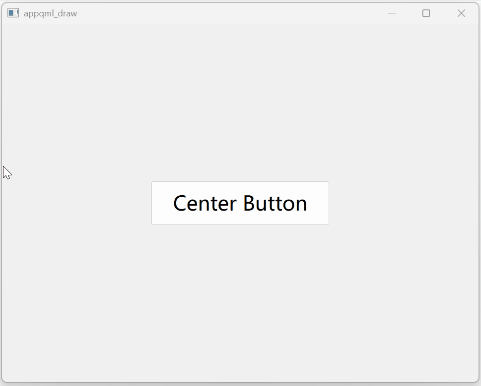
1.4 运行效果
从左侧拉出抽屉:
2. 使用场景与注意事项
Drawer 通常用于需要在屏幕上快速访问导航功能或设置的移动应用程序或桌面应用程序。例如,社交媒体应用程序可以使用 Drawer 来显示用户的个人资料、消息和通知。
在某些平台上,某些边缘可能被系统手势保留,无法使用 Drawer。
例如,Android 和 iOS 的顶部和底部边缘可能被保留用于系统通知和控制中心。
3. 相关控件
导航组件相关阅读:https://doc.qt.io/qt-6/qtquickcontrols-navigation.html
- SwipeView:用于在不同页面之间进行水平滑动的导航。
- Customizing Drawer:自定义抽屉的外观和行为。
- Navigation Controls:导航控件的总称。
- Popup Controls:弹出控件的总称。


 扫一扫
扫一扫


 1190
1190

 被折叠的 条评论
为什么被折叠?
被折叠的 条评论
为什么被折叠?
 到【灌水乐园】发言


