


 本文介绍了QtQuick Controls中的Drawer组件,它是一个可从屏幕边缘滑动打开和关闭的侧边栏。Drawer可以从上下左右四个方向打开,并且可以通过设置dragMargin、edge和interactive属性进行定制。示例代码展示了如何改变背景颜色、添加边框以及与内容元素交互。此外,还讨论了position属性,用于控制Drawer的打开程度。
一、描述
Drawer 提供一个可以使用滑动手势打开和关闭的侧面板。继承自 Popup。
Drawer 可以从上下左右四个方向打开。
import QtQuick
import QtQuick.Controls

ApplicationWindow {
    id: window
    visible: true

    Drawer {
        id: drawer
        width: 0.66 * window.width
        height: window.height

        Label {
            text: "Content goes here!"
            anchors.centerIn: parent
        }
    }
}
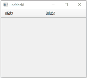
将 Drawer 定位为显示在窗口标题下方:
import QtQuick
import QtQuick.Controls
import QtQuick.Layouts 1.12

ApplicationWindow {
    id: window
    visible: true

    header: ToolBar
    {
        RowLayout {
          anchors.fill: parent
          ToolButton {
              text: "测试1"
          }
          ToolButton {
              text: "测试2"
          }
        }
    }

    Drawer {
        y: header.height
        width: window.width * 0.6
        height: window.height - header.height

        Label {
            text: "Content goes here!"
            anchors.centerIn: parent
        }
    }
}
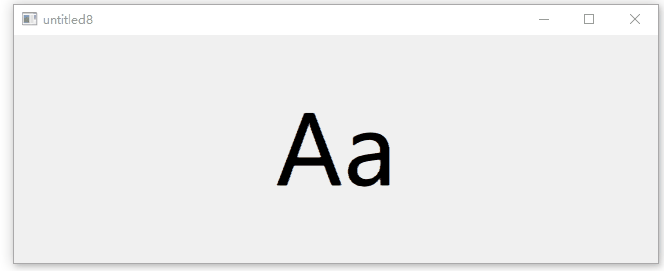
position 属性确定 Drawer 的可见程度,值介于 0.0 和 1.0 之间。以下代码使用一个和 Drawer 同级的 Label 来演示“Label 被 Drawer 推动”的效果:
import QtQuick
import QtQuick.Controls

ApplicationWindow {
    id: window
    width: 200
    height: 228
    visible: true

    Drawer {
        id: drawer
        width: 0.66 * window.width
        height: window.height
    }

    Label {
        id: content

        text: "Aa"
        font.pixelSize: 96
        anchors.fill: parent
        verticalAlignment: Label.AlignVCenter
        horizontalAlignment: Label.AlignHCenter

        transform: Translate {    //x属性变化规律
            x: drawer.position * content.width * 0.33
        }
    }
} 
二、自定义Drawer示例
import QtQuick
import QtQuick.Controls

ApplicationWindow {
    id: window
    visible: true

    Drawer {
        id: drawer
        width: 0.66 * window.width
        height: window.height

        background: Rectangle {
            color: "#128bf1"
            Rectangle {
                x: parent.width - 3
                width: 3
                height: parent.height
                color: "#ff0000"
            }
        }

        Label {
            text: "Content goes here!"
            anchors.centerIn: parent
        }
    }
}
三、属性成员
1、dragMargin : real
与屏幕边缘的距离,在该距离内拖动操作将打开 Drawer。设置为 小于等于 0 可禁用通过拖动打开Drawer。
默认值为 Qt.styleHints.startDragDistance。
2、edge : enumeration
打开 Drawer 的窗口边缘。
- Qt.TopEdge:上边缘。
- Qt.LeftEdge:左边缘(默认)。
- Qt.RightEdge:右边缘。
- Qt.BottomEdge:底部边缘。
3、interactive : bool
Drawer 是否是交互式的。 非交互式不会对滑动做出反应。默认为 true。
4、position : real
Drawer 相对于其最终目的地的位置。完全关闭时位置为 0.0,完全打开时位置为 1.0。


 扫一扫
扫一扫


 704
704

 被折叠的 条评论
为什么被折叠?
被折叠的 条评论
为什么被折叠?
 到【灌水乐园】发言


