


 本文介绍了在Android中自定义实现SwitchButton和SegmentControl两种UI组件的方法,包括组合View和自定义View绘制。通过实例代码展示了如何通过布局和动画实现状态切换效果,提供了完整的源码供读者参考学习。
《代码里的世界》 —UI篇
用文字札记描绘自己 android学习之路
转载请保留出处 by Qiao
http://blog.csdn.net/qiaoidea/article/details/46715453
1.概述
Android中关于控制开关和页面/状态切换的使用场景还是比较多的。源生做的支持也有比如RadioGroup 和Tabhost等。这里准备通过自定义View来模仿学习下IOS两种常见UI样式: SwitchButton 和 SegmentControl。
首先先通过简易的组装View来实现两种UI的相应效果,其次呢,尝试通过绘制来达到同样的更灵活的样式。代码前后共实现按钮切换和页面切换两个样式,三种实现方案,其中,两种SwitchButton实现,一种SegmentControl实现。实现方案中关于自定义View绘制,本篇只讲述SwitchView,希望大家能举一反三,同样做到SegmentControl的相同效果。个人也更倾向于使用自定义实现,更方便灵活。
先看效果图:
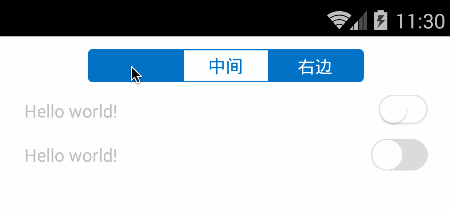
头部即为切换页面的SegmentControl,然后第一行是通过组装view来实现SwitchButton,第二行则是完全绘制出来的SwitchButton效果。接下来我们分别一一讲述代码实现。
2.SwitchButton样式两种实现
状态开关按钮常用于某些控制开关,设置选项里最为常见。
2.1 组合View实现
该方法比较简单明了,定义三个view,开启状态和关闭状态两个背景View,一个圆形按钮view。点击时候利用滑动动画移动按钮和状态背景,达到类似的视觉效果。
先看xml布局:
<?xml version="1.0" encoding="utf-8"?>
<merge xmlns:android="http://schemas.android.com/apk/res/android"
    android:layout_width="match_parent"
    android:layout_height="match_parent" >

    <FrameLayout
        android:layout_width="wrap_content"
        android:layout_height="wrap_content" >

        <ImageView
            android:id="@+id/on_bg_view"
            android:layout_width="wrap_content"
            android:layout_height="wrap_content"
            android:src="@drawable/switch_on_bg" />

        <ImageView
            android:id="@+id/off_bg_view"
            android:layout_width="wrap_content"
            android:layout_height="wrap_content"
            android:src="@drawable/switch_off_bg" />
    </FrameLayout>

    <ImageView
        android:id="@+id/circle_view"
        android:layout_width="wrap_content"
        android:layout_height="wrap_content"
        android:src="@drawable/switch_circle" />

</merge>
因为是帧布局,所以顶层使用merge(merge简化xml不解释,自行百度)。然后使用两个开关状态背景和一个圆形按钮组合而成。
1. 全局变量参数
public class SwitchView extends FrameLayout {

    protected boolean isChecked;  //是否选中状态
    protected View onBgView;
    protected View offBgView;
    protected View circleView;
    protected boolean autoForPerformClick = true; //是否允许点击自动切换
    protected OnCheckedChangedListener onCheckedChangedListener; //切换事件监听

    //...
}
一般状态切换是由click事件监听,根据业务逻辑来判断是否切换状态。但对于switchButton,通常我们操作时直观感受应该是先切换了状态才执行相应操作的,所以我们在performClick事件中直接根据autoForPerformClick 的状态来相应点击操作。
至于performClick ,其实就是控制条用onClickListener的方法体,具体逻辑在View源码中查看。
2. 初始化
    public SwitchView(Context context) {
        super(context);
        initialize();
    }

    public SwitchView(Context context, AttributeSet attrs) {
        super(context, attrs);
        initialize();
    }

    public SwitchView(Context context, AttributeSet attrs, int defStyle) {
        super(context, attrs, defStyle);
        initialize();
    }

    protected void initialize() {
        setClickable(true);
        LayoutInflater layoutInflater = (LayoutInflater) getContext().getSystemService(Context.LAYOUT_INFLATER_SERVICE);
        layoutInflater.inflate(R.layout.switch_view, this);
        onBgView = findViewById(R.id.on_bg_view);
        offBgView = findViewById(R.id.off_bg_view);
        circleView = findViewById(R.id.circle_view);
    }
3. 点击响应
    @Override
    public boolean performClick() {
        if (!autoForPerformClick) //如果不是自动响应则调用默认处理方法
            return super.performClick();
        /**
        *否则直接切换switch状态并触发事件监听
        */
        setChecked(!isChecked, true);
        if (onCheckedChangedListener != null) {
            onCheckedChangedListener.onChanged(this, isChecked);
        }
        return super.performClick();
    }
View点击后会执行performClick方法,并判断是否调用clickLisentener。这里我们直接重写performClick方法,如果自动响应autoForPerformClick为ture则直接切换Switch状态,否则调用默认处理逻辑。
4.切换状态动画
点击打开,则圆形按钮从左端滑动到右端,onBg显示,offBg隐藏;
再点击关闭,圆形按钮从右端滑动到左端,onBg隐藏,offBg显示。
public void setChecked(boolean value, boolean needAnimate) {
        if (isChecked == value)
            return;
        isChecked = value;

        float targetX = 0; //要移动的目标位置
        if (getWidth() != 0) {  //当前view没有渲染上去时候,getWidth()为零
            targetX = getWidth() - circleView.getWidth();
        } else {
            measure(0, 0);
            targetX = getMeasuredWidth() - circleView.getMeasuredWidth();
        }

        long durationMillis = needAnimate ? 200 : 0;
        if (isChecked) {
            onBgView.bringToFront(); //显示在最前端
            onBgView.setVisibility(View.VISIBLE);
            offBgView.setVisibility(View.VISIBLE);

            //平移动画
            TranslateAnimation an1 = new TranslateAnimation(0, targetX, 0, 0);
            an1.setFillAfter(true);
            an1.setDuration(durationMillis);
            circleView.startAnimation(an1);

            //透明度动画
            AlphaAnimation an2 = new AlphaAnimation(0, 1);
            an2.setFillAfter(true);
            an2.setDuration(durationMillis);
            onBgView.startAnimation(an2);
        } else {
            offBgView.bringToFront();
            onBgView.setVisibility(View.VISIBLE);
            offBgView.setVisibility(View.VISIBLE);

            TranslateAnimation an1 = new TranslateAnimation(targetX, 0, 0, 0);
            an1.setFillAfter(true);
            an1.setDuration(durationMillis);
            circleView.startAnimation(an1);

            AlphaAnimation an2 = new AlphaAnimation(0, 1);
            an2.setFillAfter(true);
            an2.setDuration(durationMillis);
            offBgView.startAnimation(an2);
        }
    }
状态切换的两个参数,value是否打开状态,needAnimate是否需要动画(否则直接切换效果)。setFillAfter保留动画结束状态,但并不影响View本身位置和状态。切换时,先将当前显示背景移动到最前端,其次添加按钮动画和渐隐动画。
至此,最基本的组合View实现已经完成了。想要了解详情的请在源码中查看。源码分为两部分,一个项目是View的实现lib,另一块是示例演示demo.
2.2 自定义View绘制实现
由于该样式并不十分复杂,所以可以通过基本的图形绘制draw出同样的效果。
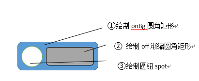
具体实现逻辑:通过自定view属性来确定按钮大小和中间圆钮大小,在测量onMesure方法中控制测量值mode和Size,并在onLayout方法中得到圆钮半径和起始点位置。然后进行绘制,先绘制底部on圆角矩形背景,再绘制off渐变缩放的圆角矩形,最后绘制spot圆钮。
嘴比较笨拙,又不会画图。用word的图形工具将就画下可以看就好了。
具体实现大体都类似,这里贴上主要部分代码
1.全局参数
public class SwitchButton extends View{

    /** */
    private float radius;
    /** 开启颜色*/
    private int onColor = Color.parseColor("#4ebb7f");
    /** 关闭颜色*/
    private int offBorderColor = Color.parseColor("#dadbda");
    /** 灰色带颜色*/
    private int offColor = Color.parseColor("#ffffff");
    /** 手柄颜色*/
    private int spotColor = Color.parseColor("#ffffff");
    /** 边框颜色*/
    private int borderColor = offBorderColor;
    /** 画笔*/
    private Paint paint ;
    /** 开关状态*/
    private boolean toggleOn = false;
    /** 边框大小*/
    private int borderWidth =
最低0.47元/天 解锁文章


 扫一扫
扫一扫
 1277
1277

 被折叠的 条评论
为什么被折叠?
被折叠的 条评论
为什么被折叠?
 到【灌水乐园】发言


