


CSS中动画主要由transition、animation两个属性组成。transition定义了从一个状态向另一个状态转变时应用的动画,animation则比transition强大的多,可以定义多个状态的转变,以及一些其他有趣的属性。当然在使用简单动画时,transition仍旧是不错的选择。transition、animation和transform三者的组合可以产生一些有趣的动画。下面将主要介绍transition和animation的用法。
1. Transition
CSS3中出现的transition可以让属性缓慢变化,以达到动画的效果,在应用简单动画的时候可以使用transition替代animation。
浏览器对于transition的支持
| 属性 | Chrome | IE | Firefox | Safari | Opera |
|---|---|---|---|---|---|
| transition | 26.04.0 -webkit- | 10.0 | 16.04.0 -moz- | 6.13.1 -webkit- | 12.110.5 -o- |
Transition有几个主要的属性:
- transition-delay : 动画延时时间
- transition-duration : 动画持续时间
- transition-property : 动画适用的属性
- transition-timing-function : 动画延时时间函数
下面一个例子中展示了一个div的长度变化:

.length-animation{
    width: 50px;
    height: 50px;
    background-color: #aaa;
    -webkit-transition: width 1s; /* Safari */
    transition: width 1s;
}
.length-animation:hover{
    width: 100px;
}注意:
- transition-duration的默认值为0,因此如果没有设置duration,那么transition就没有效果。
- transition-property如果没有设置则所有属性的变化都会有延时。
1.1 transition-delay
transition-delay属性可以用于有多个属性非同时发生变化时,如下图,div首先宽度发生变化,然后颜色才开始变化:

.delay-animation{
    margin: 20px;
    width: 50px;
    height: 50px;
    background-color: #aaa;
    transition: width 1s, background-color 1s 1s;
}
.delay-animation:hover{
    background-color: #EEAD0E;
    width: 100px;
}
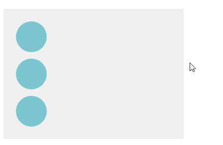
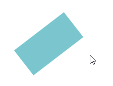
1.2 transition-timing-function
该属性指定了状态变化的速度函数,
- ease : 先加速再减速(默认)
- linear : 匀速
- ease-in : 加速
- ease-out : 减速
- ease-in-out : 先加速再减速
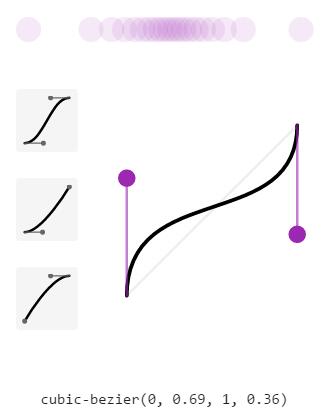
- cubic-bezier(n,n,n,n) : 自定义cubic-bezier函数
cubic-bezier函数中的4个参数定义了一条bezier曲线,即状态变化的速度函数,自定义cubic-bezier可以实现复杂的变换效果,可以在chrome浏览器的开发者模式下调试cubic-bezier曲线。
下面例子展示了ease、ease-in、cubic-bezier函数效果:
.time-animation{
    background-color: #eee;
    width: 250px;
    padding: 20px;
    color: #fff;
}
.time-animation div{
    width: 50px;
    height: 50px;
    border-radius: 100%;
    background-color: #7AC5CD;
}
.time-ease-animation{
    transition:transform 1s ease;
}
.time-easein-animation{
    margin-top: 10px;
    transition:transform 1s ease-in;
}
.time-cubic-animation{
    margin-top: 10px;
    transition:transform 1s cubic-bezier(0,.69,1,.36);
}
.time-animation:hover div{
    transform: translateX(200px);
}
cubic-bezier曲线如下图所示。
1.3 局限性
transition的优点在于简单易用,但是它有几个很大的局限。
1. transition需要事件触发,所以没法在网页加载时自动发生。
2. transition是一次性的,不能重复发生,除非一再触发。
3. transition只能定义开始状态和结束状态,不能定义中间状态,也就是说只有两个状态。
4. 一条transition规则,只能定义一个属性的变化,不能涉及多个属性。
CSS Animation就是为了解决这些问题而提出的。
2. Animation
相比于transition,animation具有更大的灵活性。animation使用keyframes可以在一次次运行周期内指定多个状态,并且可以设置循环次数,动画方向等属性。
浏览器对于transition的支持
| 属性 | Chrome | IE | Firefox | Safari | Opera |
|---|---|---|---|---|---|
| animation | 43.04.0 -webkit- | 10.0 | 16.05.0 -moz- | 9.04.0 -webkit- | 30.015.0 -webkit- 12.0 -o- |
animation具有以下几种属性:
- animation-name : 动画名称,指定keyframes
- animation-duration : 持续时间
- animation-timing-function : 时间函数
- animation-delay : 延迟时间
- animation-iteration-count : 循环次数
- animation-direction : 动画方向
其中animation-duration、animation-delay三个属性与transition中的类似,不作多述。相比transition,这里少了animation-property,因为这个属性需要在keyframes中定义。
keyframes中可以定义状态属性和变换时间点,如下面所示,一共定义了三个关键帧,分别为起始(0%)、中点(50%)、终点(100%)。其中0%和100%也可用from、to来代替。
@keyframes example {
    0%   {background-color: red;}
    50%  {background-color: blue;}
    100% {background-color: green;}
}

@keyframes example {
    from {background-color: red;}
    to   {background-color: green;}
}
2.1 animation-timing-function
animation中的时间函数相比于transition多了一个step函数。其他的函数都是平滑过渡的,例如从width:50px到width:200px,长度从50px到200px变换是连续函数。而step则是分步过渡,即状态随时间的变化是阶梯状的。
step有三种设置方法:
step-start : 等同于steps(1,start)
step-end : 等同于steps(1,end)
steps(int,start|end) : 第一个参数指定间隔次数,第二个参数指定在间隔的起点或终点发生阶跃变化
需要注意的是steps指定的间隔次数是指两个关键帧之间的,即如果使用steps(2),并指定了0%、50%、100%三个关键帧,那么会在0-50%之间变化2次,在50%-100%之间变化两次。
下面展示了step的用法,可以看到两个方块移动不同,这就是从间隔的起点或终点开始阶跃所导致的。
.step{
width: 300px;
padding: 20px;
background-color: #eee;
}
.step .start{
width:100px;
height: 50px;
background-color: #7AC5CD;
animation: step-ani 5s infinite steps(3,start);
}
.step .end{
margin-top: 20px;
width:100px;
height: 50px;
background-color: #7AC5CD;
animation: step-ani 5s infinite steps(3,end);
}
@keyframes step-ani{
0% {transform: translateX(0);}
50% {transform: translateX(50px);}
100%{transform: translateX(200px);}
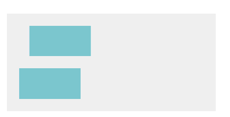
}2.2 animation-fill-mode
animation-fill-mode有以下几种状态:
- none:默认值,回到动画没开始时的状态
- backwards:让动画回到第一帧的状态
- forwards: 动画停在最后一帧
- both : 根据animation-direction轮流应用forwards和backwards
如下图展示了backwards和forwards的区别:
.fill-mode{
background-color: #eee;
width: 250px;
padding: 20px;
color: #fff;
}
.fill-mode div{
height: 50px;
width: 50px;
border-radius: 100%;
background-color: #7AC5CD;
}
.fill-mode .forwards{
margin-top: 20px;
}
.fill-mode:hover .backwards{
animation: move 1s backwards;
}
.fill-mode:hover .forwards{
animation: move 1s forwards;
}
@keyframes move{
to{transform: translateX(200px);}
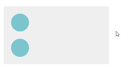
}2.3 animation-direction
- normal : 正常动画方向
- reverse : 反向
- alternate : 交替,即一次正向,一次反向交替,需要在动画循环次数大于1时才有效果
- alternate-reverse : 交替,先反向,再正向
下面展示了normal、alternate、reverse三种属性的变换:
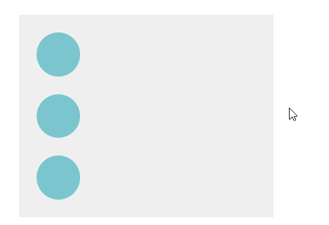
.direction{
    background-color: #eee;
    width: 250px;
    padding: 20px;
    color: #fff;
}
.direction div{
    height: 50px;
    width: 50px;
    border-radius: 100%;
    background-color: #7AC5CD;
}
.direction .reverse{
    margin-top: 20px;
}
.direction .alternate{
    margin-top: 20px;
}

.direction:hover .normal{
    animation: direction-rotate 1s normal infinite;
}
.direction:hover .reverse{
    animation: direction-rotate 1s reverse infinite;
}
.direction:hover .alternate{
    animation: direction-rotate 1s alternate infinite;
}
@keyframes direction-rotate{
    to{transform: translateX(200px);}
}
2.4 animation-play-state
- paused : 动画暂停
- running : 动画进行(默认值)
下面动画在鼠标悬停的时候运动,鼠标移开就会立刻停止:
.play-state{
    width:100px;
    height: 50px;
    background-color: #7AC5CD;
    animation: state-ani 2s ease-in infinite paused;
}
.play-state:hover{
    animation: state-ani 2s infinite running;
}
@keyframes state-ani{
    to{transform: rotate(360deg);}
}


 扫一扫
扫一扫
 3011
3011

 被折叠的 条评论
为什么被折叠?
被折叠的 条评论
为什么被折叠?
 到【灌水乐园】发言


