


1.代码:
<!DOCTYPE html>
<html>
<head>
<meta charset="utf-8">
<title>网页title</title>
<style>
/*---范例1:响应式卡片---*/
body {margin:25px;}
div.polaroid {
width: 80%;
background-color: white;
box-shadow: 0 4px 8px 0 rgba(0, 0, 0, 0.2), 0 6px 20px 0 rgba(0, 0, 0, 0.19);
margin-bottom: 25px;
}
div.container {
text-align: center;
padding: 3px 6px;
}
/*---范例2:图片模态框---*/
#myImg {
border-radius: 5px;
cursor: pointer;
transition: 0.3s;
}
#myImg:hover {opacity: 0.7;}
/* The Modal (background) */
.modal {
display: none; /* Hidden by default */
position: fixed; /* Stay in place */
z-index: 1; /* Sit on top */
padding-top: 100px; /* Location of the box */
left: 0;
top: 0;
width: 100%; /* Full width */
height: 100%; /* Full height */
overflow: auto; /* Enable scroll if needed */
background-color: rgb(0,0,0); /* Fallback color */
background-color: rgba(0,0,0,0.9); /* Black w/ opacity */
}
/* Modal Content (image) */
.modal-content {
margin: auto;
display: block;
width: 80%;
max-width: 700px;
}
/* Caption of Modal Image */
#caption {
margin: auto;
display: block;
width: 80%;
max-width: 700px;
text-align: center;
color: #ccc;
padding: 10px 0;
height: 150px;
}
/* Add Animation */
.modal-content, #caption {
-webkit-animation-name: zoom;
-webkit-animation-duration: 0.6s;
animation-name: zoom;
animation-duration: 0.6s;
}
@-webkit-keyframes zoom {
from {-webkit-transform: scale(0)}
to {-webkit-transform: scale(1)}
}
@keyframes zoom {
from {transform: scale(0.1)}
to {transform: scale(1)}
}
/* The Close Button */
.close {
position: absolute;
top: 15px;
right: 35px;
color: #f1f1f1;
font-size: 40px;
font-weight: bold;
transition: 0.3s;
}
.close:hover,
.close:focus {
color: #bbb;
text-decoration: none;
cursor: pointer;
}
/* 100% Image Width on Smaller Screens */
@media only screen and (max-width: 700px){
.modal-content {
width: 100%;
}
}
</style>
</head>
<body>
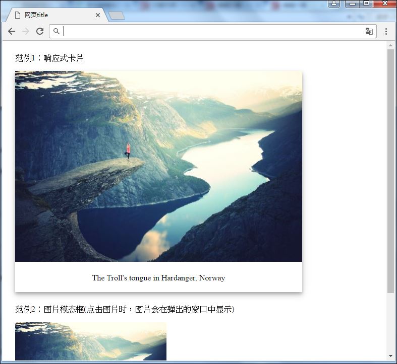
<p>范例1:响应式卡片</p>
<div class="polaroid">
<img src="figure.jpg" alt="Norway" style="width:100%">
<div class="container">
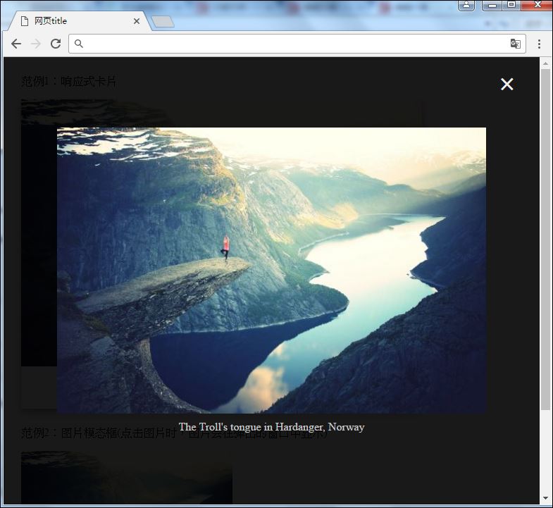
<p>The Troll's tongue in Hardanger, Norway</p>
</div>
</div>
<p>范例2:图片模态框(点击图片时,图片会在弹出的窗口中显示)</p>
<img id="myImg" src="figure.jpg" alt="The Troll's tongue in Hardanger, Norway" width="300" height="200">
<!-- The Modal -->
<div id="myModal" class="modal">
<span class="close">×</span>
<img class="modal-content" id="img01">
<div id="caption"></div>
</div>
<script>
// 获取模态窗口
var modal = document.getElementById('myModal');
// 获取图片模态框,alt 属性作为图片弹出中文本描述
var img = document.getElementById('myImg');
var modalImg = document.getElementById("img01");
var captionText = document.getElementById("caption");
img.onclick = function(){
modal.style.display = "block";
modalImg.src = this.src;
modalImg.alt = this.alt;
captionText.innerHTML = this.alt;
}
// 获取 <span> 元素,设置关闭模态框按钮
var span = document.getElementsByClassName("close")[0];
// 点击 <span> 元素上的 (x), 关闭模态框
span.onclick = function() {
modal.style.display = "none";
}
</script>
</body>
</html>2.本范例需要的素材:(figure.jpg)

3结果:
3.1起始画面:

3.2响应式卡片:(拉大浏览器后)
3.2图片模态框:(点击下面那张的图片模态框以后)


 扫一扫
扫一扫
 452
452

 被折叠的 条评论
为什么被折叠?
被折叠的 条评论
为什么被折叠?
 到【灌水乐园】发言


