


所有代码下载:react-native 组件
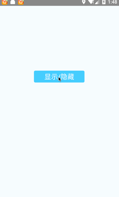
1.ActivityIndicator
import React, { Component } from 'react';
import {
  AppRegistry,
  StyleSheet,
  Text,
  View,
  ActivityIndicator,
  TouchableOpacity
} from 'react-native';
export default
class RNActivityIndicatorDemo extends Component {

  constructor(props) {
    super(props);
    this.state = {// 初始设为显示加载动画
      animating: true,
    };
  }

  // 按钮响应方法,切换显示与隐藏
  showOrHide() {
    if (this.state.animating) {
      this.setState({
        animating: false
      });
    } else {
      this.setState({
        animating: true
      });
    }
  }

  render() {
    return (
      <View style={styles.container}>

        <TouchableOpacity underlayColor="#fff" style={styles.btn} onPress={
          this.showOrHide.bind(this)}>
            <Text style={{color:'#fff', fontSize: 20}}>显示/隐藏</Text>
        </TouchableOpacity>

        <ActivityIndicator
          animating={this.state.animating}
          style={[styles.centering, {height: 80}]}
          size="small" />

        <ActivityIndicator
          animating={this.state.animating}
          style={[styles.centering, {height: 80}]}
          size="large" />
      </View>
    );
  }
}

const styles = StyleSheet.create({
  container: {
    flex: 1,
    justifyContent: 'center',
    alignItems: 'center',
    backgroundColor: '#F5FCFF',
  },
  centering: {
    alignItems: 'center',
    justifyContent: 'center',
    padding: 8,
  },
  btn:{
    marginTop:10,
    width:150,
    height:35,
    backgroundColor:'#3BC1FF',
    justifyContent:'center',
    alignItems:'center',
    borderRadius:4,
  },
});
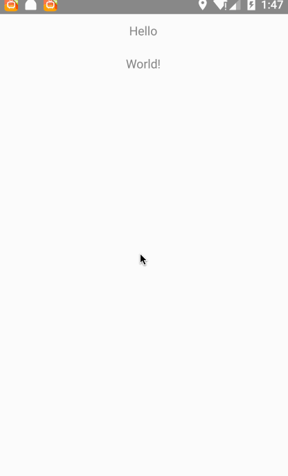
2.DrawerLayoutAndroid
import React, { Component } from 'react';
import {
  AppRegistry,
  StyleSheet,
  Text,
  View,
  DrawerLayoutAndroid,
  TouchableOpacity
} from 'react-native';
export default
class DrawerLayoutAndroidDemo extends Component {
  render() {
    var navigationView = (
      <View style={{flex: 1, backgroundColor: '#fff'}}>
        <Text style={{margin: 10, fontSize: 15, textAlign: 'left'}}>in the Drawer!</Text>
      </View>
    );
  return (
    <DrawerLayoutAndroid
      drawerWidth={300}
      drawerPosition={DrawerLayoutAndroid.positions.Left}
      renderNavigationView={() => navigationView}>
      <View style={{flex: 1, alignItems: 'center'}}>
        <Text style={{margin: 10, fontSize: 15, textAlign: 'right'}}>Hello</Text>
        <Text style={{margin: 10, fontSize: 15, textAlign: 'right'}}>World!</Text>
      </View>
    </DrawerLayoutAndroid>
  );
}

}

const styles = StyleSheet.create({
  container: {
    flex: 1,
    justifyContent: 'center',
    alignItems: 'center',
    backgroundColor: '#F5FCFF',
  },
  centering: {
    alignItems: 'center',
    justifyContent: 'center',
    padding: 8,
  },
  btn:{
    marginTop:10,
    width:150,
    height:35,
    backgroundColor:'#3BC1FF',
    justifyContent:'center',
    alignItems:'center',
    borderRadius:4,
  },
});
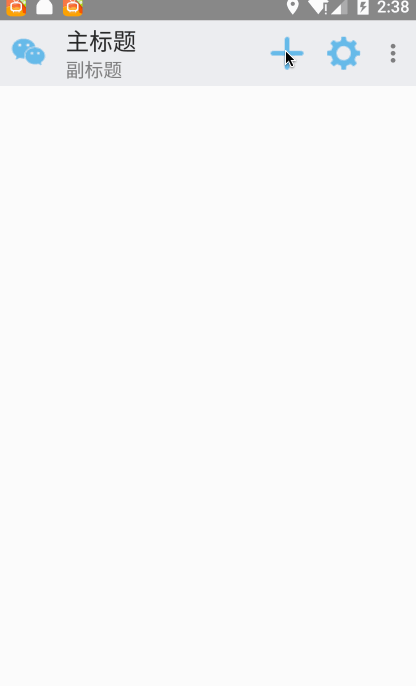
3.ToolBarAndroid
'use strict';
import React, { Component } from 'react';
import {
  AppRegistry,
  StyleSheet,
  Text,
  View,
  DrawerLayoutAndroid,
  TouchableOpacity,
  ToastAndroid,
} from 'react-native';
var ToolbarAndroid = require('ToolbarAndroid');
export default
class ToolBarAndroidDemo extends Component {
  render() {
    return (
       <ToolbarAndroid
            actions={toolbarActions}
            navIcon={require('../../app/image/weixin.png')}
            style={styles.toolbar}
            subtitle="副标题"
            title="主标题"
            onActionSelected={this.onActionSelected}></ToolbarAndroid>
    );
  }
  // onActionSelected=function(position) {
  onActionSelected=(position)=>{
       ToastAndroid.show('This is '+position, ToastAndroid.SHORT)
  }

}
var toolbarActions = [
  {title: 'Create', icon: require('../../app/image/create.png'), show: 'always'},
  {title: 'Filter'},
  {title: 'Filter1'},
  {title: 'Settings', icon: require('../../app/image/setting.png'), show: 'always'},
];
const styles = StyleSheet.create({
  toolbar: {
    backgroundColor: '#e9eaed',
    height: 56,
  },
});


 1102
1102

 被折叠的 条评论
为什么被折叠?
被折叠的 条评论
为什么被折叠?
 到【灌水乐园】发言


