


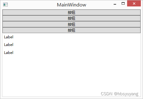
一、StackPanel堆叠布局
StackPanel是简单布局方式之一,可以很方便的进行纵向布局和横向布局 StackPanel默认是纵向布局的
<Window x:Class="WpfApplication1.MainWindow"
xmlns="http://schemas.microsoft.com/winfx/2006/xaml/presentation"
xmlns:x="http://schemas.microsoft.com/winfx/2006/xaml"
Title="MainWindow">
<StackPanel>
<Button Content="按钮"></Button>
<Button Content="按钮"></Button>
<Button Content="按钮"></Button>
<Button Content="按钮"></Button>
<Label Content="Label"></Label>
<Label Content="Label"></Label>
<Label Content="Label"></Label>
</StackPanel>
</Window>
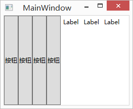
如果要横向布局的话,只要把StackPanel的Orientation属性设置成Horizontal即可
这个属性的默认值是Vertical
<Window x:Class="WpfApplication1.MainWindow"
xmlns="http://schemas.microsoft.com/winfx/2006/xaml/presentation"
xmlns:x="http://schemas.microsoft.com/winfx/2006/xaml"
Title="MainWindow">
<StackPanel Orientation="Horizontal">
<Button Content="按钮"></Button>
<Button Content="按钮"></Button>
<Button Content="按钮"></Button>
<Button Content="按钮"></Button>
<Label Content="Label"></Label>
<Label Content="Label"></Label>
<Label Content="Label"></Label>
</StackPanel>
</Window>
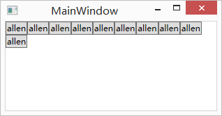
二、WrapPanel包裹布局
在WrapPanel面板中的元素以一次一行或一列的方式布局控件
WrapPanel也有Orientation属性,但与StackPanel不同的是,WrapPanel的Orientation属性的默认值是Horizontal
也就是说WrapPanel的默认展现方向是横向的
WrapPanel与StackPanel另一个不同的地方是,当容器实际宽度不够的情况下,内容将以多行或者多列的形式展现
<Window x:Class="WpfApplication1.MainWindow"
xmlns="http://schemas.microsoft.com/winfx/2006/xaml/presentation"
xmlns:x="http://schemas.microsoft.com/winfx/2006/xaml"
Title="MainWindow">
<WrapPanel>
<Button Content="allen"></Button>
<Button Content="allen"></Button>
<Button Content="allen"></Button>
<Button Content="allen"></Button>
<Button Content="allen"></Button>
<Button Content="allen"></Button>
</WrapPanel>
</Window>
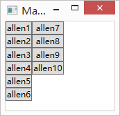
WrapPanel的纵向展现方式
<Window x:Class="WpfApplication1.MainWindow"
xmlns="http://schemas.microsoft.com/winfx/2006/xaml/presentation"
xmlns:x="http://schemas.microsoft.com/winfx/2006/xaml"
Title="MainWindow">
<WrapPanel Orientation="Vertical">
<Button Content="allen1"></Button>
<Button Content="allen2"></Button>
<Button Content="allen3"></Button>
<Button Content="allen4"></Button>
<Button Content="allen5"></Button>
<Button Content="allen6"></Button>
<Button Content="allen7"></Button>
<Button Content="allen8"></Button>
<Button Content="allen9"></Button>
<Button Content="allen10"></Button>
</WrapPanel>
</Window>
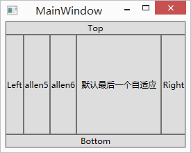
三、DockPanel停靠布局
<Window x:Class="WpfApplication1.MainWindow"
xmlns="http://schemas.microsoft.com/winfx/2006/xaml/presentation"
xmlns:x="http://schemas.microsoft.com/winfx/2006/xaml"
Title="MainWindow">
<DockPanel>
<!--沿着上边缘拉伸-->
<Button Content="Top" DockPanel.Dock="Top"></Button>
<!--沿着下边缘拉伸-->
<Button Content="Bottom" DockPanel.Dock="Bottom"></Button>
<!--沿着左边缘拉伸-->
<Button Content="Left" DockPanel.Dock="Left"></Button>
<!--沿着右边缘拉伸-->
<Button Content="Right" DockPanel.Dock="Right"></Button>
<!--默认沿着左边缘拉伸-->
<Button Content="allen5"></Button>
<!--默认沿着左边缘拉伸-->
<Button Content="allen6"></Button>
<!--最后一个元素默认填充满整个容器剩余的空间-->
<Button Content="默认最后一个自适应"></Button>
</DockPanel>
</Window>
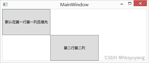
四、Grid表格布局
Grid布局容器可以把空间分割成多行多列,用以摆放不同的控件
<Window x:Class="WpfApplication1.MainWindow"
xmlns="http://schemas.microsoft.com/winfx/2006/xaml/presentation"
xmlns:x="http://schemas.microsoft.com/winfx/2006/xaml"
Title="MainWindow">
<Grid>
<!--定义两行-->
<Grid.RowDefinitions>
<RowDefinition></RowDefinition>
<RowDefinition></RowDefinition>
</Grid.RowDefinitions>
<!--定义三列-->
<Grid.ColumnDefinitions>
<ColumnDefinition></ColumnDefinition>
<ColumnDefinition></ColumnDefinition>
<ColumnDefinition></ColumnDefinition>
</Grid.ColumnDefinitions>
<!--Grid.Row或 Grid.Column的默认值为0-->
<Button Content="默认在第一行第一列且填充"></Button>
<!--如果我把Grid.Row的值设置成2,因为没有第三行,所以按钮会自动被放在最后一行,仍然是第二行-->
<Button Grid.Row="1" Grid.Column="1" Content="第二行第二列"></Button>
</Grid>
</Window>
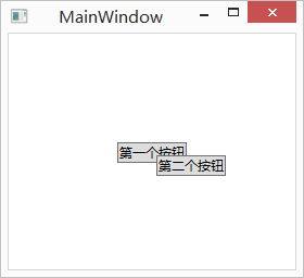
五、Canvas画布布局
Canvas画布布局容器允许使用精确的坐标来摆放画布内的元素
如果两个元素共用了同一块区域,那么后设置的元素将覆盖先设置的元素
<Window x:Class="WpfApplication1.MainWindow"
xmlns="http://schemas.microsoft.com/winfx/2006/xaml/presentation"
xmlns:x="http://schemas.microsoft.com/winfx/2006/xaml"
Title="MainWindow">
<Canvas>
<Button Canvas.Left="100" Canvas.Top="100" Content="第一个按钮"></Button>
<Button Canvas.Left="136" Canvas.Top="112" Content="第二个按钮"></Button>
</Canvas>
</Window>


 1万+
1万+


 被折叠的 条评论
为什么被折叠?
被折叠的 条评论
为什么被折叠?
 到【灌水乐园】发言


