


@TOC WPF 5种布局容器的使用场景
Grid网格布局
StackPanel
WrapPanel
DockPanel
Canvas
Grid网格布局的特点及使用
Grid意思为网格,是以网状表格的形式对元素进行布局,控件被放到设定好的小格子里面,每个小格子可以按照自己设定的比例进行全局缩放,对于制作自适应界面来说比较方便。Grid容器相比于其他四个容器使用更广,功能更强大。
效果图片

下面展示代码。
// WPF Grid的界面代码
// WPF Grid的界面代码
<Window x:Class="WpfApp1.MainWindow"
        xmlns="http://schemas.microsoft.com/winfx/2006/xaml/presentation"
        xmlns:x="http://schemas.microsoft.com/winfx/2006/xaml"
        xmlns:d="http://schemas.microsoft.com/expression/blend/2008"
        xmlns:mc="http://schemas.openxmlformats.org/markup-compatibility/2006"
        xmlns:local="clr-namespace:WpfApp1"
        mc:Ignorable="d"
        Title="MainWindow" Height="450" Width="800">
    <Grid>
        <Grid.ColumnDefinitions>
            <ColumnDefinition Width="597*"/>
            <ColumnDefinition Width="197*"/>
        </Grid.ColumnDefinitions>
        <Grid.RowDefinitions>
            <RowDefinition Height="120" />
            <RowDefinition/>
        </Grid.RowDefinitions>
        <Border Grid.Row="0" Background="Blue" Grid.ColumnSpan="2" Margin="0,0,-0.4,0"/>

        <Grid Grid.Row="1" Grid.ColumnSpan="2" Margin="0,0,-0.4,0">
            <Grid.ColumnDefinitions>
                <ColumnDefinition Width="150"/>

                <ColumnDefinition/>
            </Grid.ColumnDefinitions>
            <Border Grid.Row="0" Background="Green"/>

            <Grid Grid.Column="1">
                <Grid.ColumnDefinitions>
                    <ColumnDefinition/>
                    <ColumnDefinition/>
                    <ColumnDefinition/>
                    <ColumnDefinition/>
                    <ColumnDefinition/>
                </Grid.ColumnDefinitions>
                <Grid.RowDefinitions>
                    <RowDefinition/>
                    <RowDefinition Height="100"/>
                    <RowDefinition Height="100"/>
                </Grid.RowDefinitions>
                <Border
                    Grid.Column="0"
                    Margin="5"
                    Background="Yellow">
                    <Button Content="Button" Click="Button_Click"/>
                </Border>
                <Border
                    Grid.Column="1"
                    Margin="5"
                    Background="Yellow"/>
                <Border
                    Grid.Column="2"
                    Margin="5"
                    Background="Yellow"/>
                <Border
                    Grid.Column="3"
                    Margin="5"
                    Background="Yellow"/>
                <Border
                    Grid.Column="4"
                    Margin="5"
                    Background="Yellow"/>
                <Border
                    Grid.Row="1"
                    Grid.ColumnSpan="3"
                    Margin="5"
                    Background="Red"/>
                <Border
                    Grid.Row="2"
                    Grid.ColumnSpan="3"
                    Margin="5"
                    Background="Red"/>
                <Border
                    Grid.Row="1"
                    Grid.Column="3"
                    Grid.ColumnSpan="2"
                    Margin="5"
                    Background="Red"/>
                <Border
                    Grid.Row="2"
                    Grid.Column="3"
                    Grid.ColumnSpan="2"
                    Margin="5"
                    Background="Red"/>
            </Grid>
        </Grid>
        <Border BorderBrush="Black" BorderThickness="1" HorizontalAlignment="Left" Height="100" VerticalAlignment="Top" Width="100"/>
    </Grid>
</Window>
StackPanel布局的特点及使用
将子元素排列成水平或垂直的一行,属于布局控件,通俗说叫栈式面板。可将包含的元素在水平或垂直方向排成一条线,当移除一个元素后,后面的元素会自动向前填充空缺。
StackPanel 中的子元素超出的部分,被截取被隐藏;StackPanel 自身可以嵌套使用,嵌套在其他布局控件中,和其他布局控件结合使用。
效果图片

代码展示
// WPF StackPanel的界面代码
// An highlighted block
<Window x:Class="Grid1_20220708.StackPanel_Test"
        xmlns="http://schemas.microsoft.com/winfx/2006/xaml/presentation"
        xmlns:x="http://schemas.microsoft.com/winfx/2006/xaml"
        xmlns:d="http://schemas.microsoft.com/expression/blend/2008"
        xmlns:mc="http://schemas.openxmlformats.org/markup-compatibility/2006"
        xmlns:local="clr-namespace:Grid1_20220708"
        mc:Ignorable="d"
        Title="StackPanel_Test" Height="226.91" Width="240.747">
    <Grid>
        <GroupBox Header="请找出下面有错别字的选项" BorderBrush="Black" Margin="5">
            <StackPanel>
                <CheckBox Content="迫不急待" HorizontalAlignment="Left" Height="20" Margin="5,10,0,0" Width="143"/>
                <CheckBox Content="首曲一指" HorizontalAlignment="Left" Height="20" Margin="5,5,0,0" Width="143"/>
                <CheckBox Content="陈词烂调" HorizontalAlignment="Left" Height="20" Margin="5,5,0,0" Width="143"/>
                <CheckBox Content="唉声叹气" HorizontalAlignment="Left" Height="20" Margin="5,5,0,0" Width="143"/>
                <CheckBox Content="不可礼喻" HorizontalAlignment="Left" Height="20" Margin="5,5,0,0" Width="143"/>
                <StackPanel Orientation="Horizontal" HorizontalAlignment="Right">
                    <Button Content="清空" Width="50" Margin="5"/>
                    <Button Content="确定" Width="50" Margin="5"/>
                </StackPanel>
            </StackPanel>
        </GroupBox>
    </Grid>
</Window>
WrapPanel布局的特点及使用
WrapPanel内部采用的流式布局。WrapPanel使用Orientation属性来控制流延伸的方向,使用HorizontaAligment和VerticalAligment两个属性控制内部控件的对齐。在流延伸的方向上,WrapPanel会排列尽可能多的控件,排不下的控件将会新起一行或者一列继续排列。
效果图片
竖直方向的布局

水平方向的布局

下面展示一些 内联代码片。
// WPF WrapPanel布局代码
// An highlighted block
<Window x:Class="Grid1_20220708.Wrap"
       xmlns="http://schemas.microsoft.com/winfx/2006/xaml/presentation"
        xmlns:x="http://schemas.microsoft.com/winfx/2006/xaml"
        xmlns:d="http://schemas.microsoft.com/expression/blend/2008"
        xmlns:mc="http://schemas.openxmlformats.org/markup-compatibility/2006"
        xmlns:local="clr-namespace:Grid1_20220708"
        mc:Ignorable="d"
        Title="Wrap" Height="425.552" Width="531.834">
    <Grid>
        <WrapPanel Orientation="Horizontal" >
            <Button Content="1" Width="77" Height="75" Margin="10"/>
            <Button Content="2" Width="77" Height="75" Margin="10"/>
            <Button Content="3" Width="77" Height="75" Margin="10"/>
            <Button Content="4" Width="77" Height="75" Margin="10"/>
            <Button Content="5" Width="77" Height="75" Margin="10"/>
            <Button Content="6" Width="77" Height="75" Margin="10"/>
            <Button Content="7" Width="77" Height="75" Margin="10"/>
            <Button Content="8" Width="77" Height="75" Margin="10"/>
            <Button Content="9" Width="77" Height="75" Margin="10"/>
            <Button Content="10" Width="77" Height="75" Margin="10"/>
            <Button Content="11" Width="77" Height="75" Margin="10"/>
            <Button Content="12" Width="77" Height="75" Margin="10"/>
        </WrapPanel>
    </Grid>
</Window>
DockPanel布局使用
DockPanel定义一个区域,在此区域中,您可以使子元素通过描点的形式排列,这些对象位于 Children 属性中。停靠面板类似于WinForm中控件的Dock属性。DockPanel会对每个子元素进行排序,并将根据指定的边进行停靠,多个停靠在同侧的元素则按顺序排序。在DockPanel中,指定停靠边的控件,会根据定义的顺序占领边角,所有控件绝不会交叠。
默认情况下,后添加的元素只能使用剩余空间,无论对DockPanel的最后一个子元素设置任何停靠值,该子元素都将始终填满剩余的空间。如果不希望最后一个元素填充剩余区域,可以将DockPanel属性LastChildFill设置为false,还必须为最后一个子元素显式指定停靠方向。
效果图片

下面展示一些 内联代码片。
// WPF DockPanel布局代码
<Window x:Class="Grid1_20220708.Dock"
        xmlns="http://schemas.microsoft.com/winfx/2006/xaml/presentation"
        xmlns:x="http://schemas.microsoft.com/winfx/2006/xaml"
        xmlns:d="http://schemas.microsoft.com/expression/blend/2008"
        xmlns:mc="http://schemas.openxmlformats.org/markup-compatibility/2006"
        xmlns:local="clr-namespace:Grid1_20220708"
        mc:Ignorable="d"
        Title="Dock" Height="207.81" Width="613.582">
    <Grid>
        <DockPanel>
            <TextBox DockPanel.Dock="Top" Height="25" BorderBrush="Black"/>
            <TextBox DockPanel.Dock="Left" Width="150" BorderBrush="Black"/>
            <TextBox BorderBrush="Black"/>
        </DockPanel>
    </Grid>
</Window>
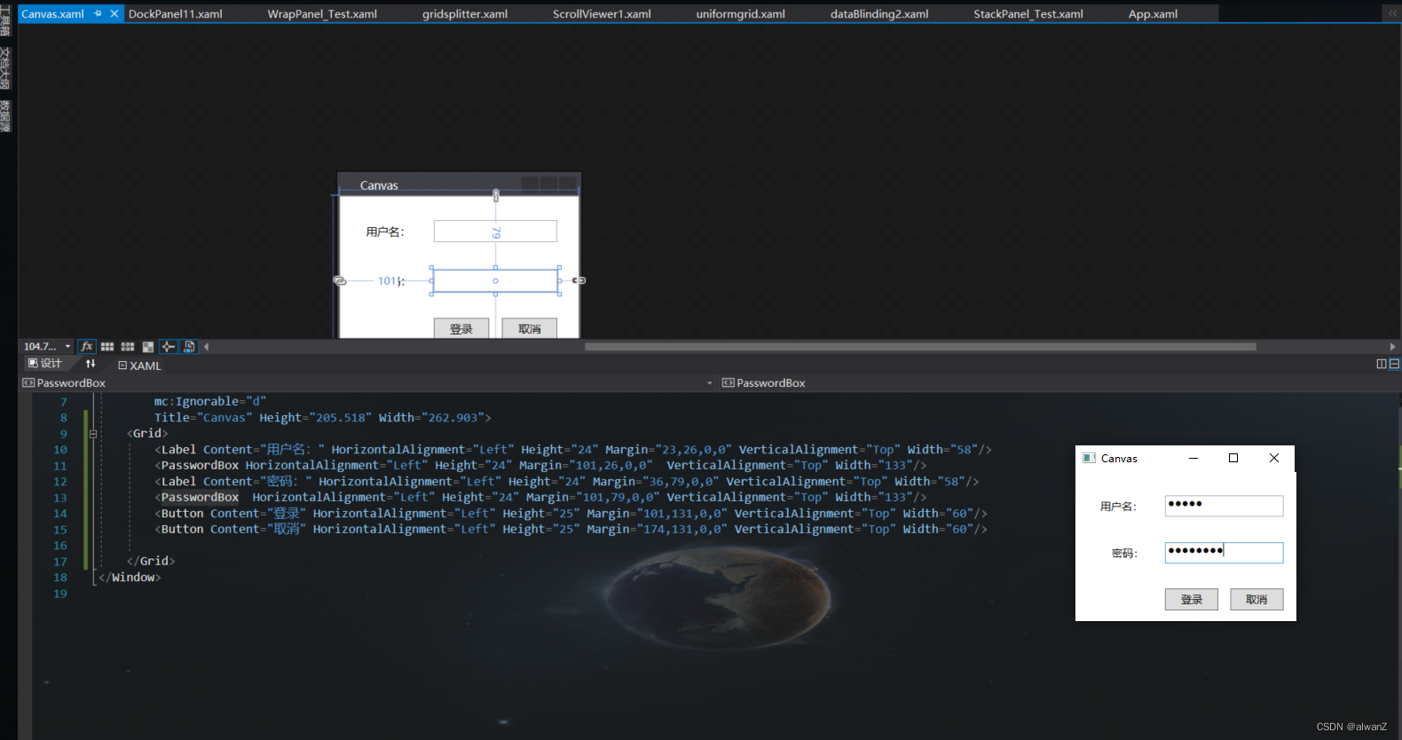
Canvas布局使用
Canvas中文意思是画布,在布局上就像画布上画控件一样。使用Canvas布局跟在winform上布局基本上一样,在winform上开发时我们通过设置控件的Left和Top等属性来确定控件在窗体上的位置,而WPF的控件没有left和top等属性,就像把控件放在Grid里被附加上Grid.Column和Grid.Row属性一样,当控件被放置在Canvas里时就会被附加上Canvas.X和Canvas.Y属性。
效果图片
下面展示一些 内联代码片。
//WPF Canvas布局使用
<Window x:Class="Grid1_20220708.Canvas"
        xmlns="http://schemas.microsoft.com/winfx/2006/xaml/presentation"
        xmlns:x="http://schemas.microsoft.com/winfx/2006/xaml"
        xmlns:d="http://schemas.microsoft.com/expression/blend/2008"
        xmlns:mc="http://schemas.openxmlformats.org/markup-compatibility/2006"
        xmlns:local="clr-namespace:Grid1_20220708"
        mc:Ignorable="d"
        Title="Canvas" Height="205.518" Width="262.903">
    <Grid>
        <Label Content="用户名:" HorizontalAlignment="Left" Height="24" Margin="23,26,0,0" VerticalAlignment="Top" Width="58"/>
        <PasswordBox HorizontalAlignment="Left" Height="24" Margin="101,26,0,0"  VerticalAlignment="Top" Width="133"/>
        <Label Content="密码:" HorizontalAlignment="Left" Height="24" Margin="36,79,0,0" VerticalAlignment="Top" Width="58"/>
        <PasswordBox  HorizontalAlignment="Left" Height="24" Margin="101,79,0,0" VerticalAlignment="Top" Width="133"/>
        <Button Content="登录" HorizontalAlignment="Left" Height="25" Margin="101,131,0,0" VerticalAlignment="Top" Width="60"/>
        <Button Content="取消" HorizontalAlignment="Left" Height="25" Margin="174,131,0,0" VerticalAlignment="Top" Width="60"/>

    </Grid>
</Window>


 217
217


 被折叠的 条评论
为什么被折叠?
被折叠的 条评论
为什么被折叠?
 到【灌水乐园】发言


