


1.0 其实是6大布局。主要是别人都写的是五大布局,我不这么写多不合群?
- 之前写到UI开发之八了,感兴趣的可以找我的之前发的文章,这篇主要讲解Android的布局之实用篇。
-
5大布局一定要一起讲!网上的文章大都没有强调过这一点。在实际运用中,各大布局往往随着需互相嵌套,而且只要逻辑上(思路)没什么问题,嵌套起来往往也会是推论中的效果。 - 总之,只要思想不滑坡,办法总比困难多。
1.1 Android Studio2.2以前的Android五大布局:
线性布局 LinearLayout相对布局 RelativeLayout帧布局 FrameLayout-
表格布局 TableLayout(很少有人用) -
绝对布局 AbsoluteLayout(这个玩意基本没人用)
现在我们去市面上买的Android学习的参考书,也就止步于上面的内容,但是!!!
1.2 Android Studio2.2及其以后的Android studio版本增加了一个布局:
-
约束布局 ConstarintLayout
这个在我的一篇文章里面已经讲解了,具体用法也在里面,现在自己写布局基本上也就是用的这个布局,主要是用起来特别方便。 - 布局可以相互嵌套,需要用比如线性布局LinearLayout的时候,大不了嵌套在里面得了。
链接在此: 【Android】10.0 UI开发(一)——如何编写程序界面、常见控件的使用 - 不要担心
约束布局 ConstarintLayout是新技术怕Android低版本不兼容,它一直向下兼容到Android 2.2。 - 所以我们还是可以叫
五大布局(绝对布局没啥用,而且Android studio2.x版本之后把绝对布局 AbsoluteLayout给删了……,当然,我们所说的删的意思是过时)
 2019-03-19_075248.png
palette列表都不提供绝对布局AbsoluteLayout:

- 新建一个项目,命名为LayoutTest,目录如下:
 2019-03-19_111910.png
2.0 相对布局 RelativeLayout
2.1 为什么先从相对布局讲起?
因为别人都是从 线性布局 LinearLayout 讲起的……
首先需要普及两个用法,怕作为带路党不敬业,特意录制好小视频放上来。
2.2 谷歌攻城狮的意思,就是鼓励大家用Android studio的图形化开发界面,不必像以前那样盯着源代码翻翻找找。(当然,如果你看不懂xml布局文件的源代码,等着崩溃吧,总有bug等着你)
先放五个控件上来,没错,一般的控件就这么放置就行了。(而且还可以ctrl+c加ctrl+v,在Design界面复制粘贴控件)
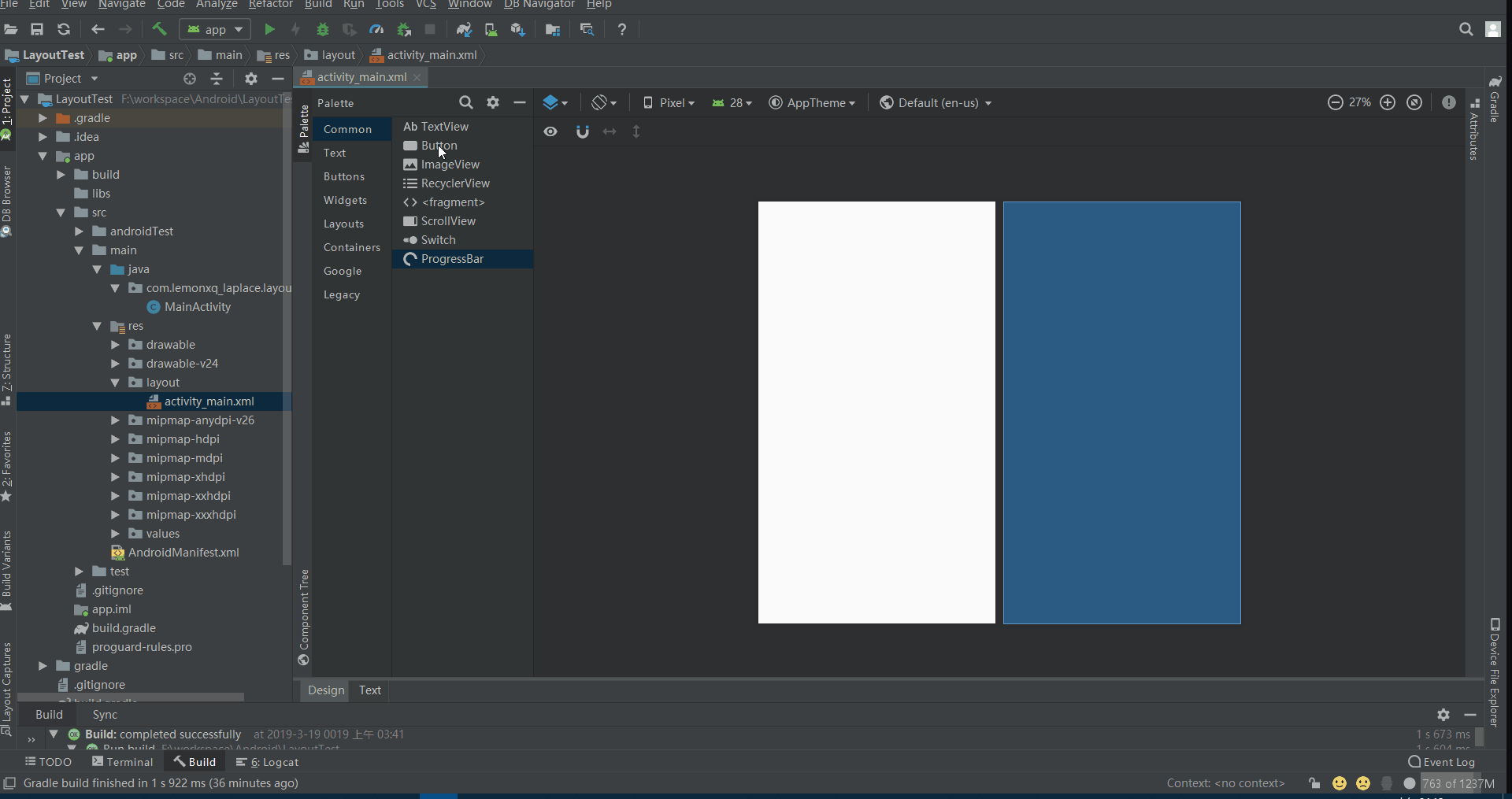
接下来打开我们的好伙伴们:
2.21
Component Tree当前的控件层次(翻译成中文叫组件树)-
2.22
Attributes翻译:属性,关于某个控件的一切都可以在这里图形化操作。- 这里还设置了它一个设置
Docked Mode(停靠模式),基本上Android studio类似于Attributes这样的组成部分,设置里面都有这个属性,意思是固定在墙边。Android studio 3.x版本之前的版本用的英文单词是Properties(性质),并不是现在的Attributes,不过位置还是在那个位置。 - 类似于
tab键上面的双箭头,就是属性的简详切换,看不懂意思的可以尝试放弃走程序员这条路。
-2.23Preview翻译:预览。进入text编辑界面,里面右侧有个这个,方便在源代码编辑、调试的时候,实时预览。
 2019-03-19_050543.png
- 这里还设置了它一个设置
2.3 为了方便预览,我们把id和text设置一下:
注意:我这里没有去源代码添加代码,也没有去控件选择具体某个控件,仅仅通过上图 步骤123来操作,效果简洁明了。
当修改完内容后,脱离修改位置,视图就会自动实时更新。
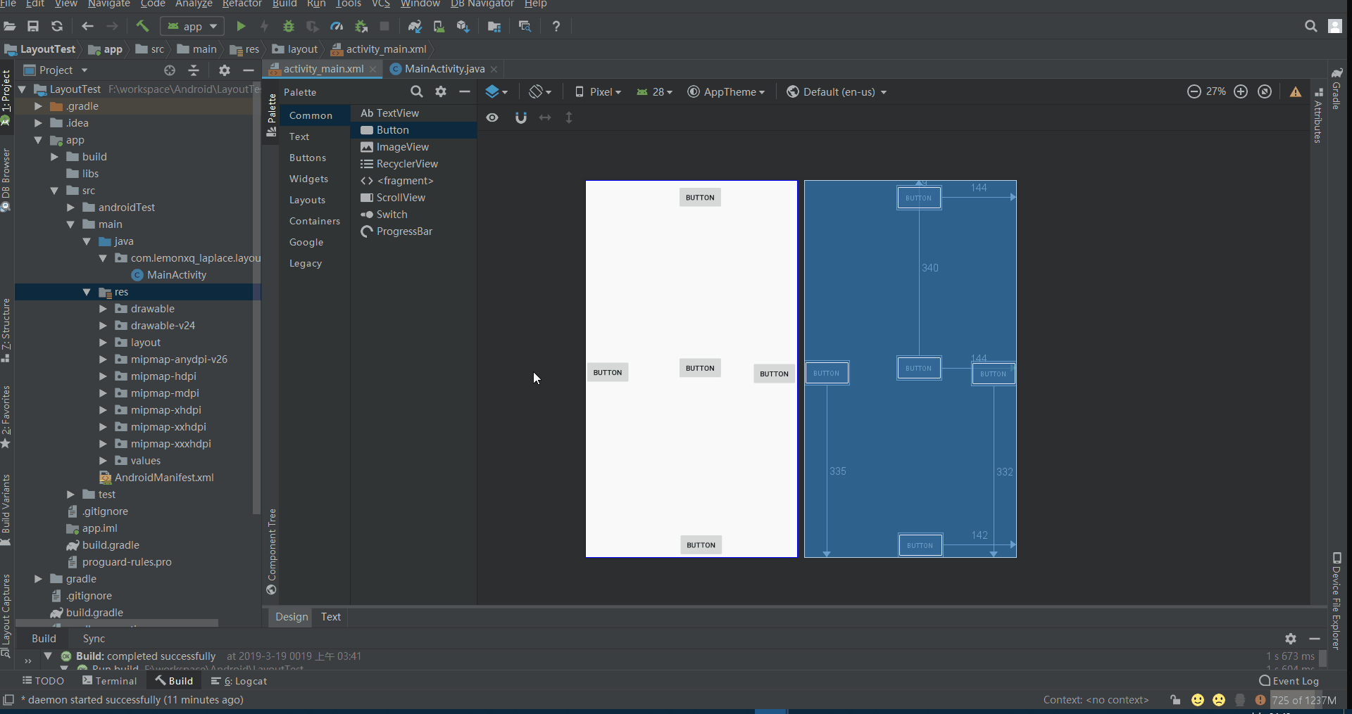
2.4 调整组件大小,首先为了方便编辑,我们把组件树的button控件变成上右下左中:
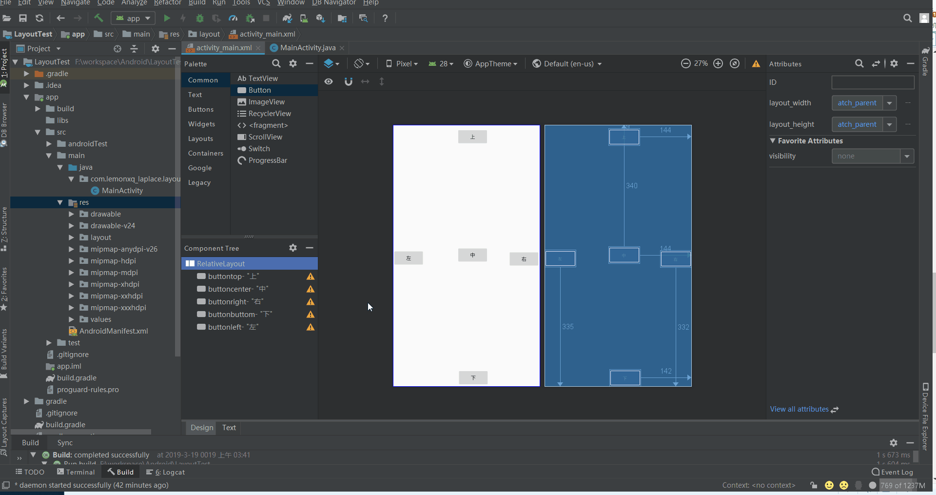
然后把横的铺满横的,竖的铺满竖的:

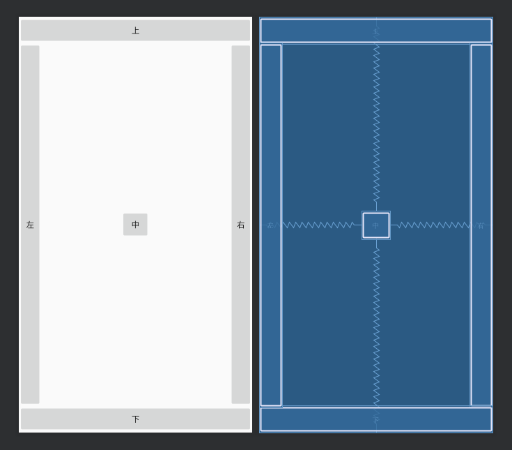
按照上图的步骤123,把上下左右4个控件这样设置一下,最后是这样的效果:
2.5 我们让它铺满:
为了不遮挡控件,用的左控件做例子,我们把鼠标挪过去,会发现出现小圆圈变红色,并停留一段时间会有信息提示(删除对xx边的约束),单击后,就会取消当前的约束。依样画葫芦把上下左右4个控件这样设置一下,最后是这样的效果:
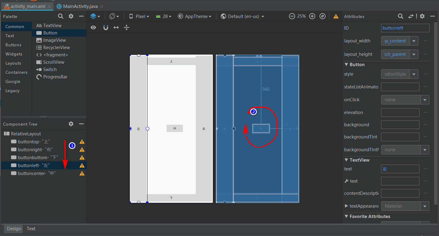
在右侧的纯蓝色的布局约束预览界面,可以看出组件有重叠,叠放层次完全取决于标注1组件树所示的层次。
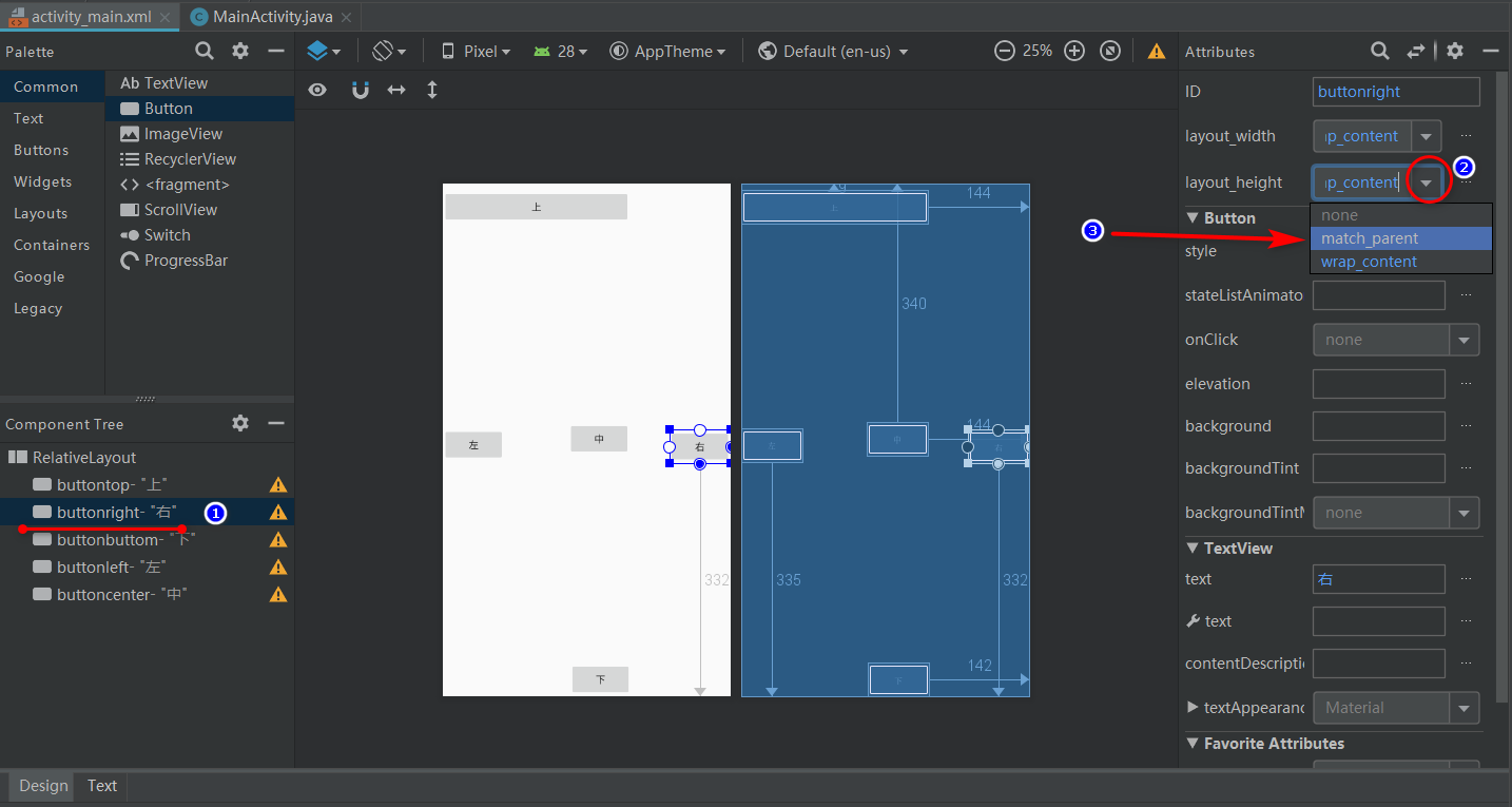
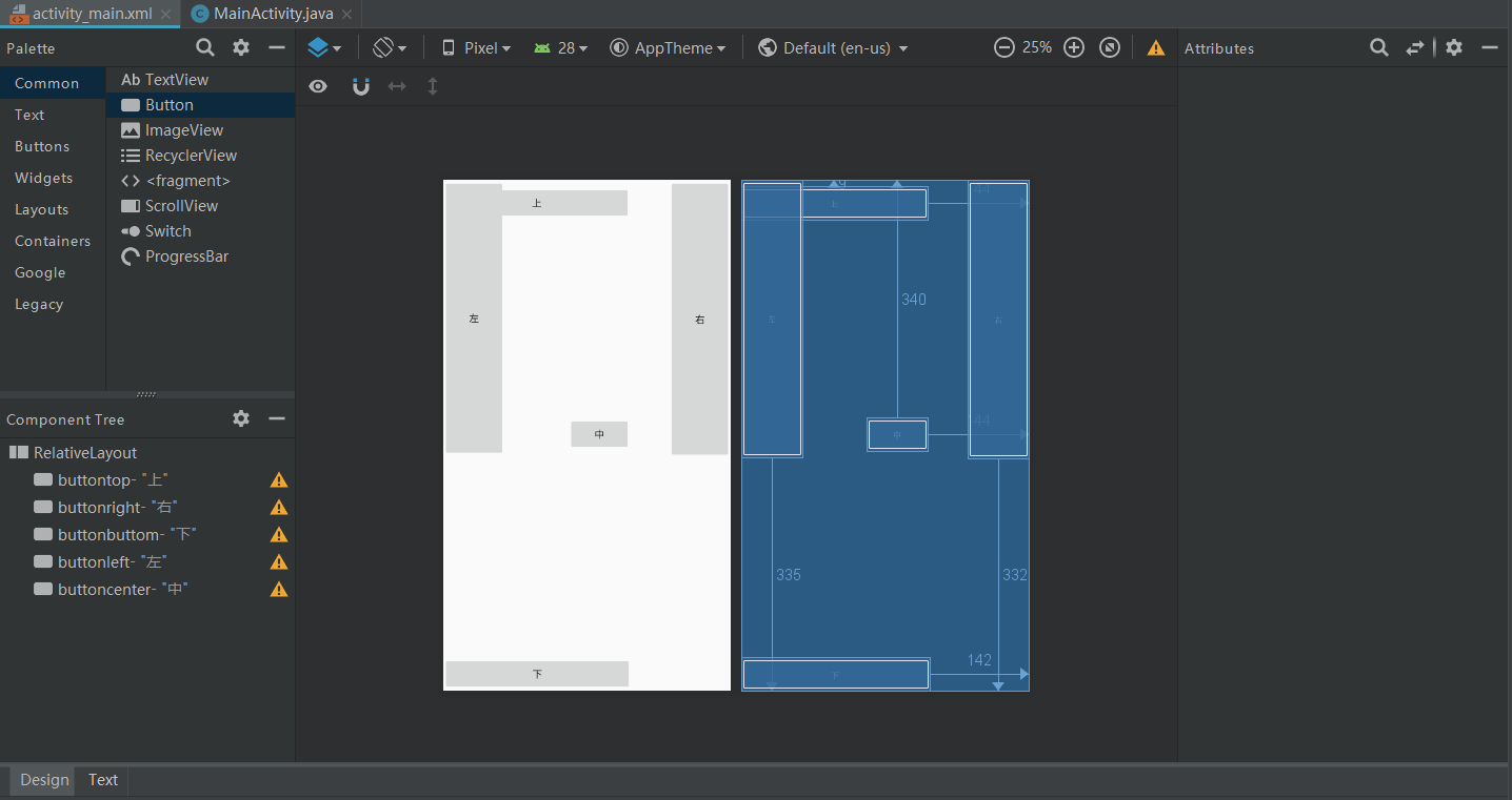
2.6 让控件靠着四边,并不再重叠。
- 2.61 首先解决靠边的问题。
主要是属性 layout_align系列在起作用,这个系列的势力庞大:
 2019-03-19_083445.png
但一旦使用一般最多用其中4种,具体意义和它的名字没什么区别,懂了就是懂了:
android:layout_alignBaseline 本元素的文本与父元素文本对齐
android:layout_alignWithParentIfMissing 如果对应的兄弟元素找不到的话就以父元素做参照物

android:layout_alignBottom 本元素的下边缘和某元素的的下边缘对齐
android:layout_alignEnd本元素与结束的父元素对齐
android:layout_alignLeft 本元素的左边缘和某元素的的左边缘对齐
android:layout_alignRight 本元素的右边缘和某元素的的右边缘对齐
android:layout_alignStart本元素与开始的父元素对齐
android:layout_alignEnd本元素与结束的父元素对齐

android:layout_below 在某元素的下方
android:layout_above 在某元素的的上方

android:layout_toLeftOf 在某元素的左边
android:layout_toRightOf 在某元素的右边
android:layout_toStartOf本元素从某个元素开始
android:layout_toEndOf本元素在某个元素结束

android:layout_alignParentBottom 贴紧父元素的下边缘
android:layout_alignParentEnd紧贴父元素结束位置结束
android:layout_alignParentLeft 贴紧父元素的左边缘
android:layout_alignParentRight 贴紧父元素的右边缘
android:layout_alignParentStart紧贴父元素结束位置开始
android:layout_alignParentTop 贴紧父元素的上边缘
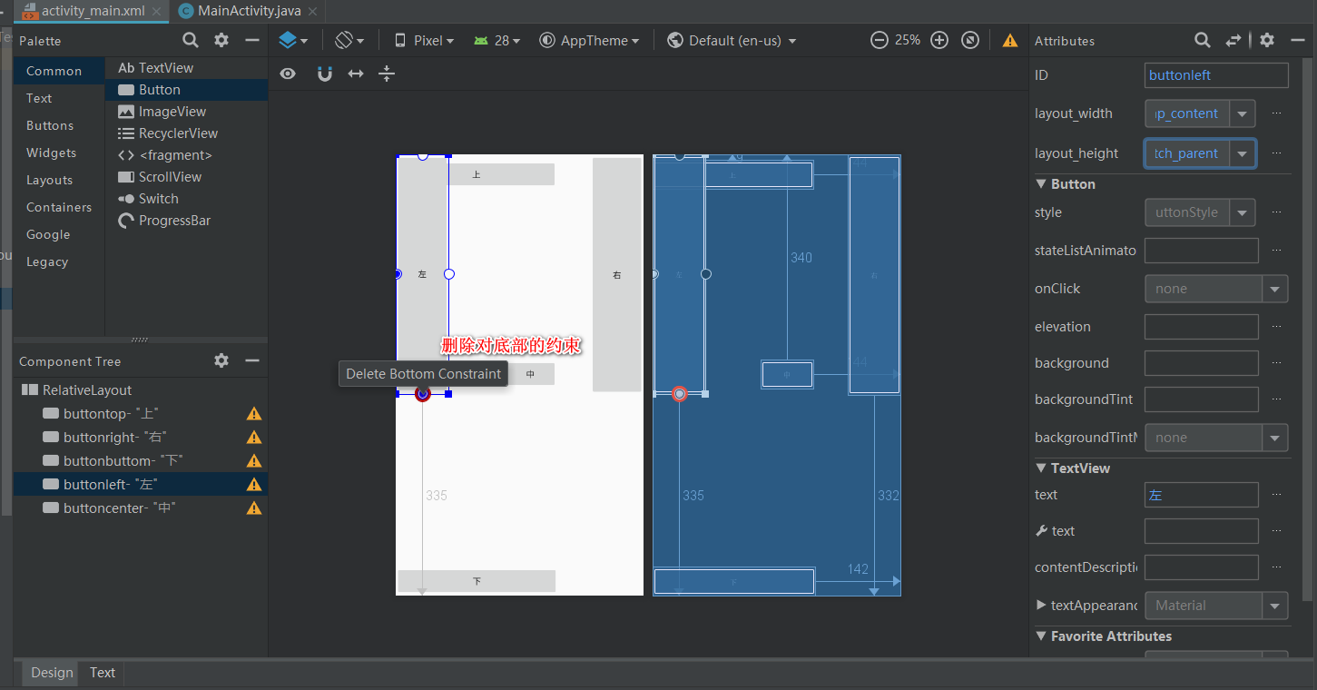
- 2.62 把各个元素和父元素的约束取消:
 004.gif
如果控件四边中间的白色小圆点试图拖动,或者没有约束的时候,会变成绿色,变成红色纯粹是为了告诉我们,可以删掉这小圆点代表的约束条件。 -
2.63 添加对父元素的贴边约束:
 2019-03-19_061110.png
找到上图所示的属性,点击变成对勾就行了。源代码就会相应地改变:
 2019-03-19_061307.png
点击上图划红线的地方,查看控件所在的源代码:
 2019-03-19_061417.png
就这么简单。
- 2.64 把按钮叠放空出来,这时候可以看出来
相对布局 RelativeLayout的缺点来了,首先你只能这个操作:
<?xml version="1.0" encoding="utf-8"?>
<RelativeLayout xmlns:android="http://schemas.android.com/apk/res/android"
    xmlns:app="http://schemas.android.com/apk/res-auto"
    xmlns:tools="http://schemas.android.com/tools"
    android:layout_width="match_parent"
    android:layout_height="match_parent"
    tools:context=".MainActivity">

    <Button
        android:id="@+id/buttontop"
        android:layout_width="match_parent"
        android:layout_height="wrap_content"
        android:layout_alignParentTop="true"
        android:text="上" />

    <Button
        android:id="@+id/buttonright"
        android:layout_width="40dp"
        android:layout_height="match_parent"
        android:layout_alignParentEnd="true"
        android:layout_marginTop="45dp"
        android:layout_marginBottom="45dp"
        android:text="右" />

    <Button
        android:id="@+id/buttonbuttom"
        android:layout_width="match_parent"
        android:layout_height="wrap_content"
        android:layout_alignParentBottom="true"
        android:layout_marginBottom="0dp"
        android:text="下" />

    <Button
        android:id="@+id/buttonleft"
        android:layout_width="40dp"
        android:layout_height="match_parent"
        android:layout_alignParentStart="true"
        android:layout_marginTop="45dp"
        android:layout_marginBottom="45dp"
        android:text="左" />

    <Button
        android:id="@+id/buttoncenter"
        android:layout_width="50dp"
        android:layout_height="50dp"
        android:layout_centerInParent="true"
        android:text="中" />
</RelativeLayout>
代码很简单,比如说左:
android:layout_marginTop="45dp"
android:layout_marginBottom="45dp"
这两行代码把上下按钮给空出来,这使得你不得不得去约束一个固定值的高度 android:layout_height="xxx dp"给上下按钮(这里我并没有设置),不然很可能出现在其他手机上运行效果不一致(再一次覆盖按钮或者空隙太多,UI效果差),并且还要做平板电脑的显示界面处理,因为控件并不会跟随屏幕大小,而等比例放大缩小。
layout_margin系列属性又是一个系列,可以百度其他人写的文章看一眼就知道怎么回事了。
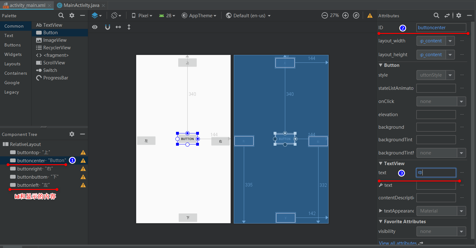
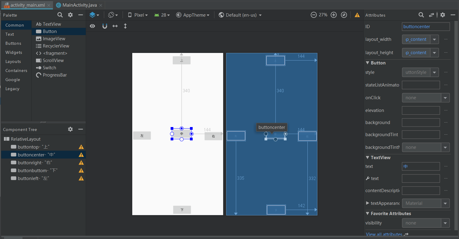
这里把中间加了一行代码居中了:
    <Button
        android:id="@+id/buttoncenter"
        android:layout_width="50dp"
        android:layout_height="50dp"
        android:layout_centerInParent="true"
        android:text="中" />
layout_center系列属性有3个:
-
android:layout_centerInparent相对于父元素完全居中 -
android:layout_centerHrizontal水平居中 -
android:layout_centerVertical垂直居中
目前显示效果如下:
2.7 相对布局 RelativeLayout还能做的最后一个示范。
-
2.71 把中按钮复制成9份:
 2019-03-19_081532.png
好吧,我知道我bottom字母打错了(控件id为buttonbottom,现在写成了buttonbuttom)
然后修改下内容和id:
 2019-03-19_081822.png
 2.72 这里面除了之前的第一个中按钮,变成了现在的5按钮,是居中之外,其他按钮需要设置一下。
我们做成九宫格的电话按钮效果,就用2.16所讲的属性 layout_align系列,增加同级约束(达到效果的约束有好几种,看你怎么相互约束而已),先看代码和效果:
<?xml version="1.0" encoding="utf-8"?>
<RelativeLayout xmlns:android="http://schemas.android.com/apk/res/android"
   xmlns:app="http://schemas.android.com/apk/res-auto"
   xmlns:tools="http://schemas.android.com/tools"
   android:layout_width="match_parent"
   android:layout_height="match_parent"
   tools:context=".MainActivity">

   <Button
       android:id="@+id/buttontop"
       android:layout_width="match_parent"
       android:layout_height="wrap_content"
       android:layout_alignParentTop="true"
       android:text="上" />

   <Button
       android:id="@+id/buttonright"
       android:layout_width="40dp"
       android:layout_height="match_parent"
       android:layout_alignParentEnd="true"
       android:layout_marginTop="45dp"
       android:layout_marginBottom="45dp"
       android:text="右" />

   <Button
       android:id="@+id/buttonbottom"
       android:layout_width="match_parent"
       android:layout_height="wrap_content"
       android:layout_alignParentBottom="true"
       android:layout_marginBottom="0dp"
       android:text="下" />

   <Button
       android:id="@+id/buttonleft"
       android:layout_width="40dp"
       android:layout_height="match_parent"
       android:layout_alignParentStart="true"
       android:layout_marginTop="45dp"
       android:layout_marginBottom="45dp"
       android:text="左" />

   <Button
       android:id="@+id/buttonnum1"
       android:layout_width="50dp"
       android:layout_height="50dp"
       android:layout_toLeftOf="@id/buttonnum2"
       android:layout_alignTop="@id/buttonnum2"
       android:text="1" />

   <Button
       android:id="@+id/buttonnum2"
       android:layout_width="50dp"
       android:layout_height="50dp"
       android:layout_above="@+id/buttonnum5"
       android:layout_alignStart="@id/buttonnum5"
       android:text="2" />

   <Button
       android:id="@+id/buttonnum3"
       android:layout_width="50dp"
       android:layout_height="50dp"
       android:layout_alignTop="@id/buttonnum2"
       android:layout_toEndOf="@id/buttonnum2"
       android:text="3" />

   <Button
       android:id="@+id/buttonnum4"
       android:layout_width="50dp"
       android:layout_height="50dp"
       android:layout_alignTop="@+id/buttonnum5"
       android:layout_toStartOf="@+id/buttonnum5"
       android:text="4" />

   <Button
       android:id="@+id/buttonnum5"
       android:layout_width="50dp"
       android:layout_height="50dp"
       android:layout_centerInParent="true"
       android:text="5" />

   <Button
       android:id="@+id/buttonnum6"
       android:layout_width="50dp"
       android:layout_height="50dp"
       android:layout_alignTop="@+id/buttonnum5"
       android:layout_toEndOf="@+id/buttonnum5"
       android:text="6" />

   <Button
       android:id="@+id/buttonnum7"
       android:layout_width="50dp"
       android:layout_height="50dp"
       android:layout_below="@+id/buttonnum6"
       android:layout_toStartOf="@+id/buttonnum5"
       android:text="7" />

   <Button
       android:id="@+id/buttonnum8"
       android:layout_width="50dp"
       android:layout_height="50dp"
       android:layout_below="@id/buttonnum5"
       android:layout_alignStart="@id/buttonnum5"
       android:text="8" />

   <Button
       android:id="@+id/buttonnum9"
       android:layout_width="50dp"
       android:layout_height="50dp"
       android:layout_toEndOf="@id/buttonnum8"
       android:layout_alignTop="@id/buttonnum8"
       android:text="9" />

</RelativeLayout>
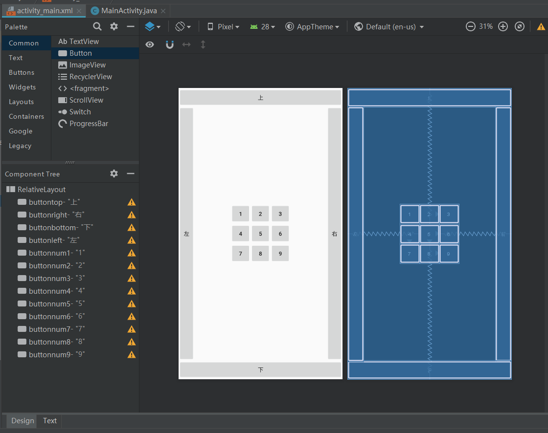
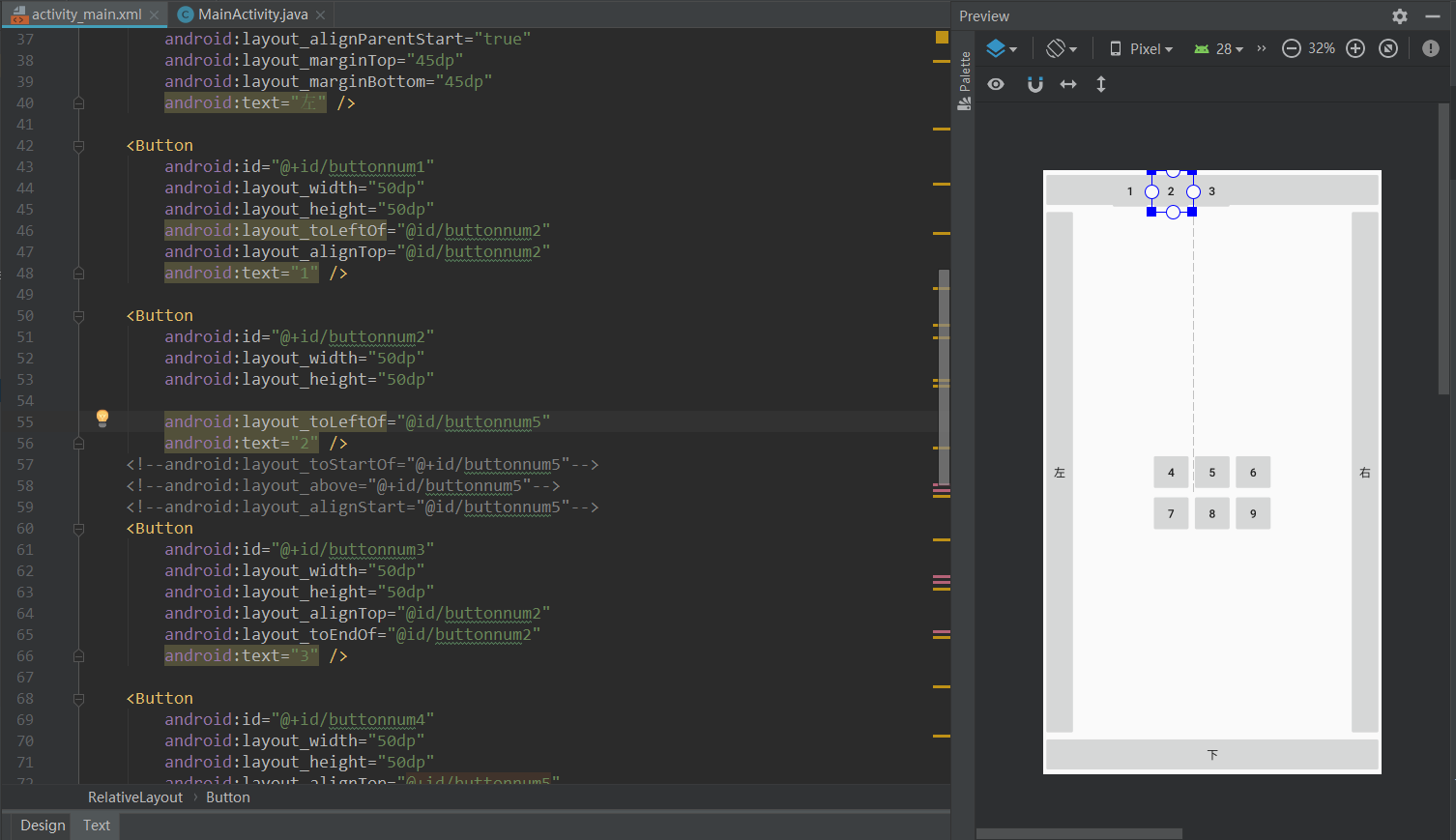
我的约束思路是,把 5按钮定格在屏幕中央,这样无论什么手机,无论屏幕多大,这9个键肯定在屏幕中间,然后 2、4、6、8按钮和 5按钮对齐, 1、3按钮和 2按钮对齐, 7、9按钮和 8按钮对齐。
首先看2按钮:
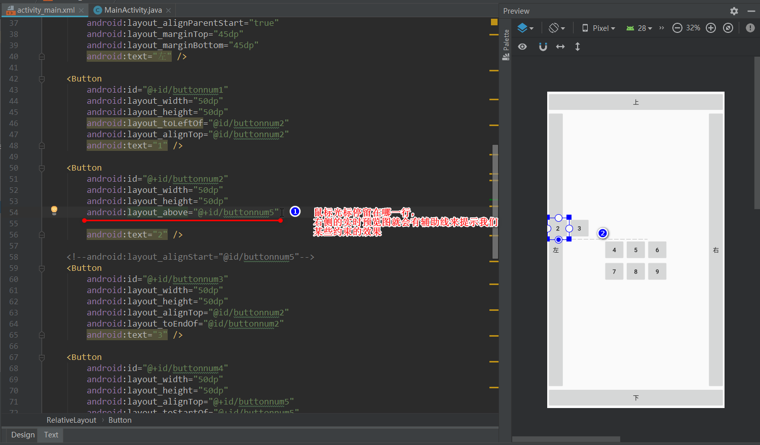
大家不要去看 1、3按钮,因为已经做好约束了, 标注1是代码, 标注2*是效果,一目了然。
android:layout_above 在某元素的的上方
然后,我们要把2按钮的左侧和5按钮的左侧对齐:
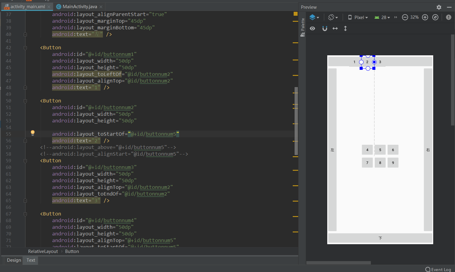
这里用toxxxof格式的约束,发现是热脸贴冷屁股型,贴到对方的left侧
说句实话:
如果Left型和Start型(还有Right和End型)同时存在的话,用起来其实没什么区别,效果一模一样。
不过Android studio会在Left型(Right型) 出现黄色覆盖标识,而Start型(End型)并不会,那意思不久就是建议用Start型(End型)呗。
如果是用图形化拖拽自动生成左右约束的话,生成的也是是Start/End类型约束的源代码。

align_left这样的属性明显是
同甘共苦型,它会和对方元素同左同右的。
于是,2按钮的约束也就成了如下的代码:
    <Button
        android:id="@+id/buttonnum2"
        android:layout_width="50dp"
        android:layout_height="50dp"
        android:layout_above="@+id/buttonnum5"
        android:layout_alignStart="@id/buttonnum5"
        android:text="2" />
再分析下9按钮,它得贴8按钮的右屁股,不然和8按钮左右对齐用同甘共苦型的话,两人就左对齐了:
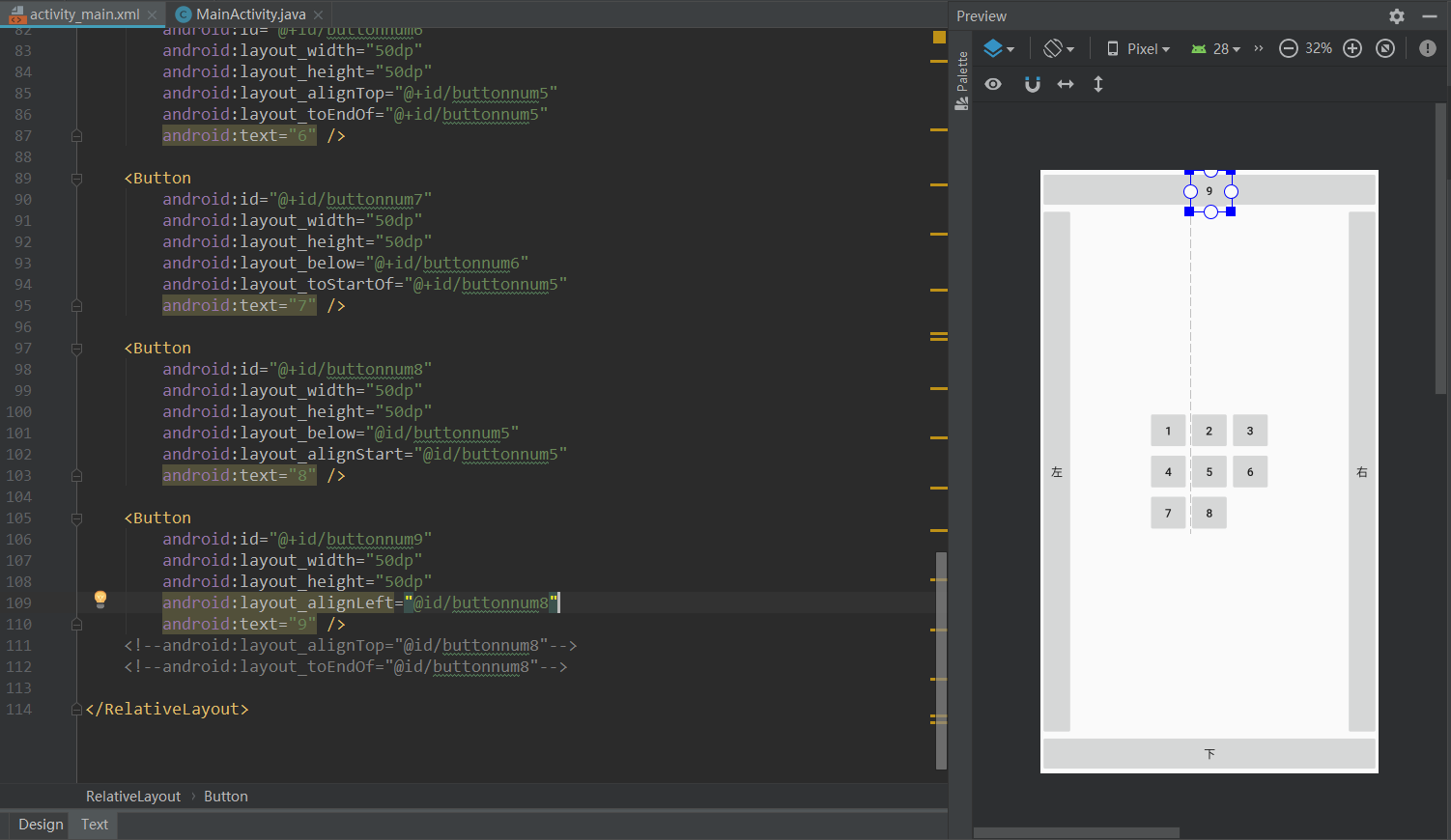
所以要这样:
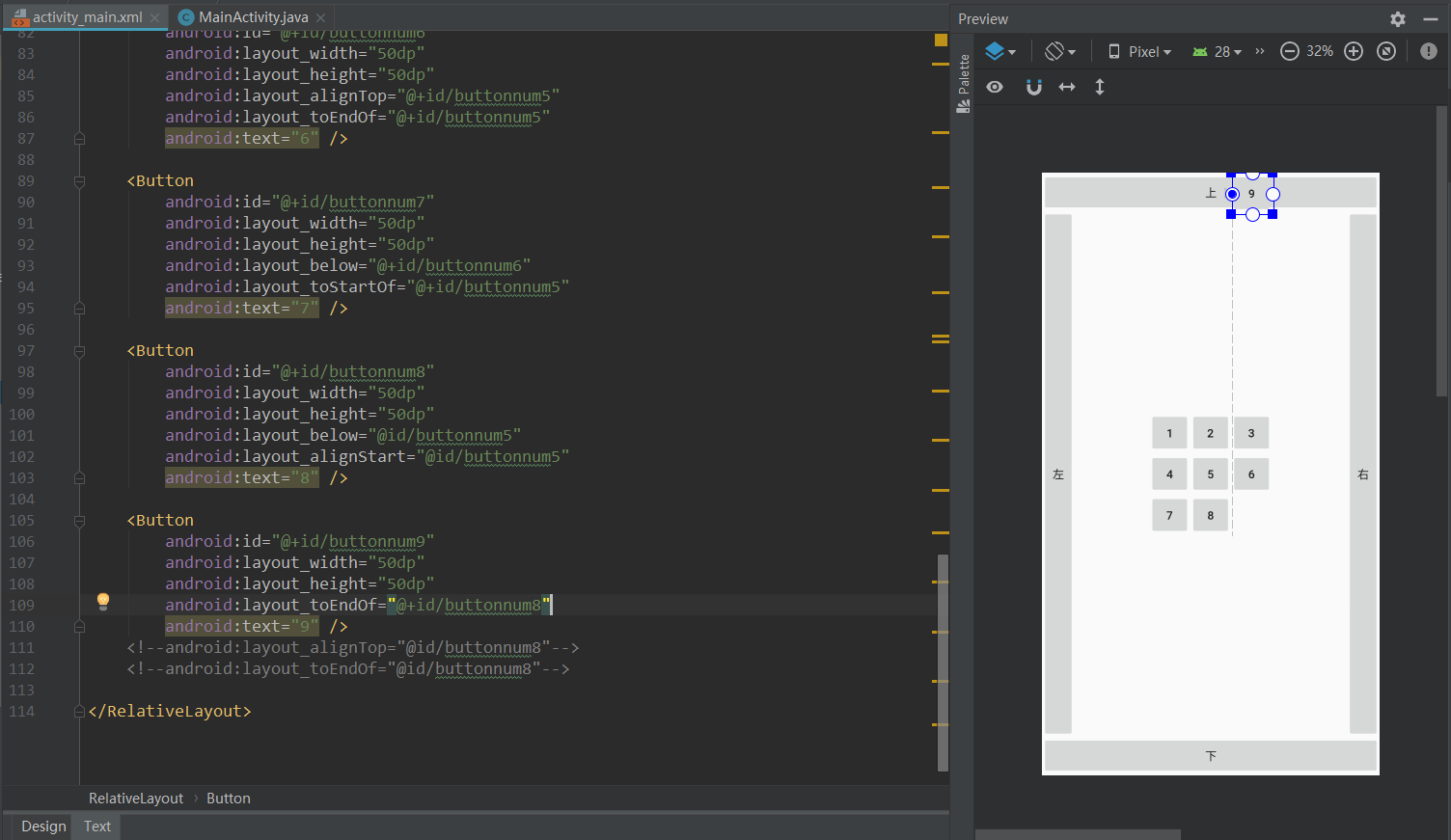
然后 9按钮和 8按钮上下 同生共死就行了:
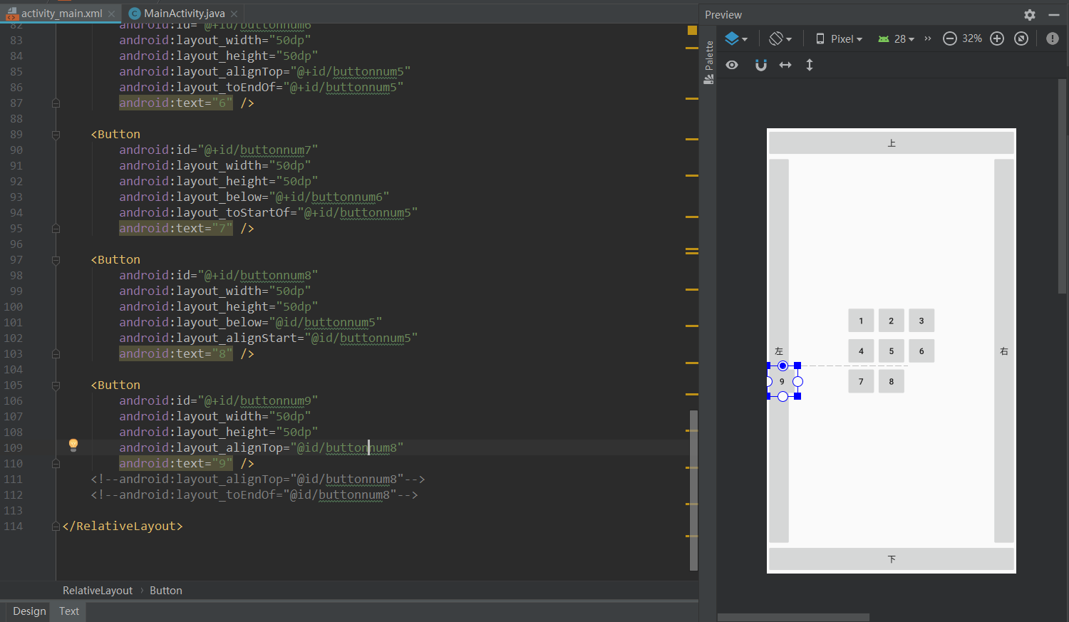
这里看到,是 同上边生死,那么同下边呢?
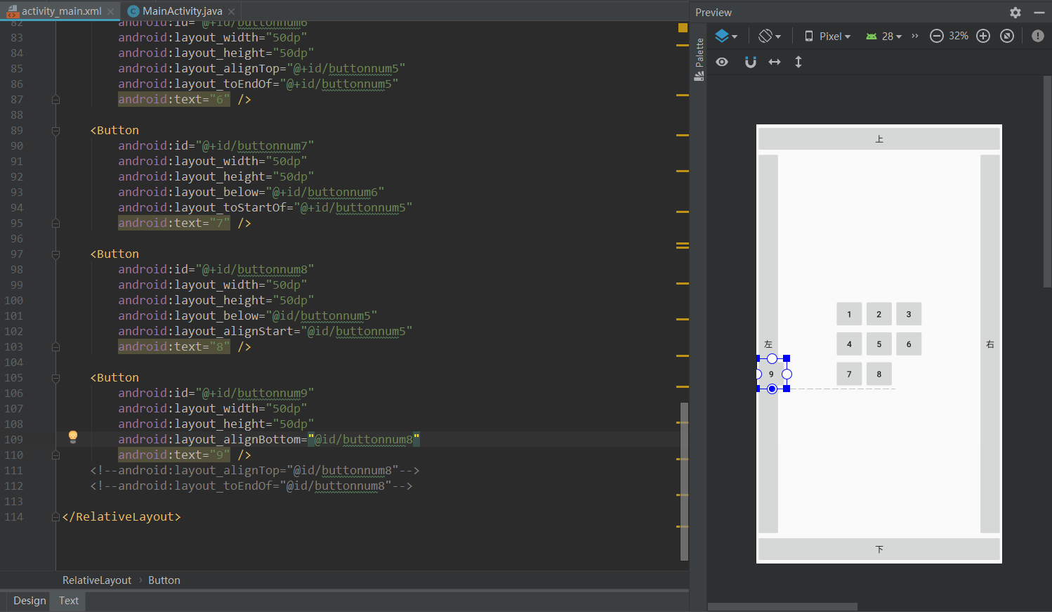
可见, 只要思想不滑坡,办法总比困难多。
最终效果的源代码就可以这样了:
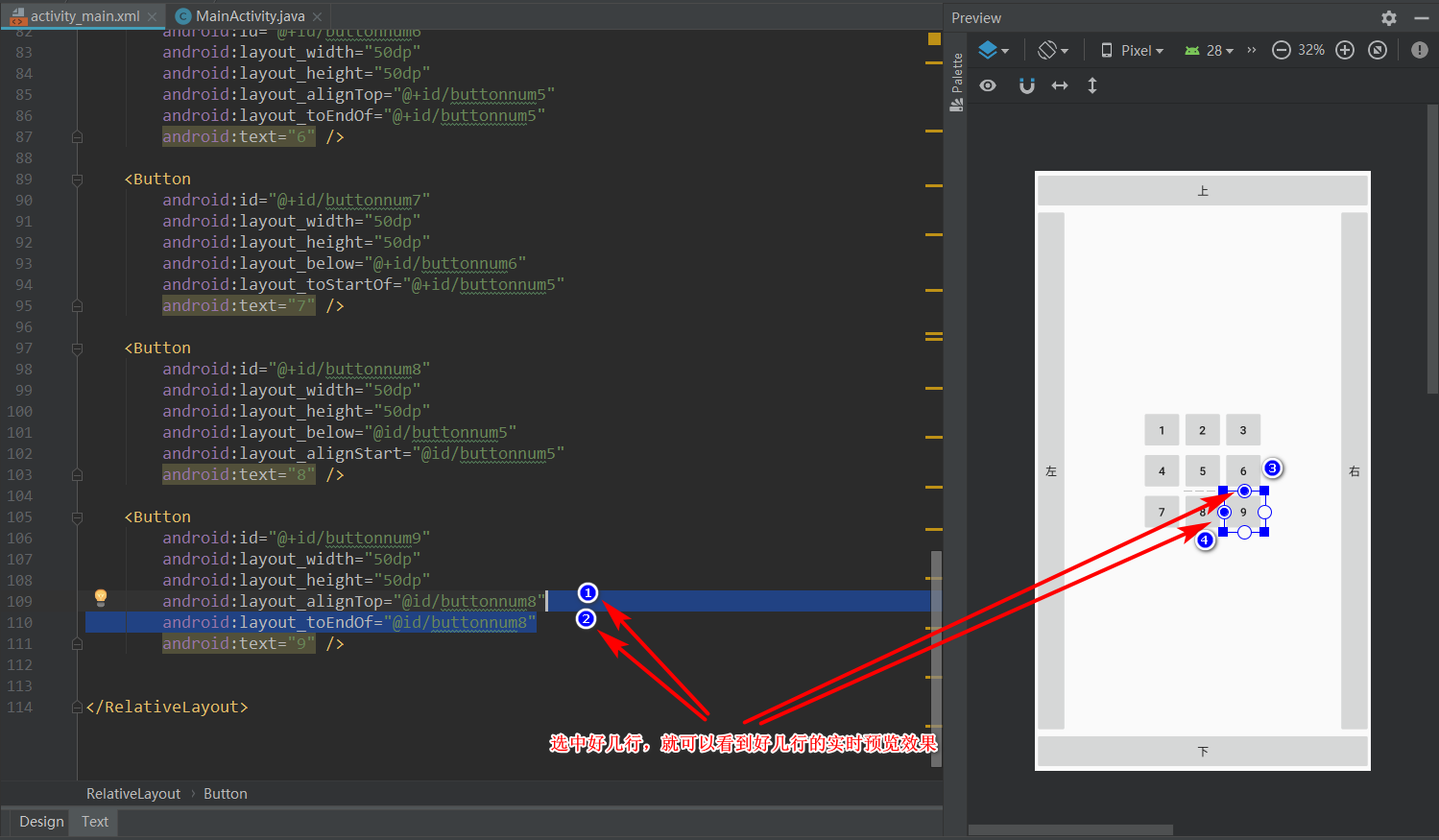
其他的按钮大同小异,逻辑上能走通,就能约束好控件,具体用什么属性 layout_align系列并没有唯一(死板)的解决方案。
3.0 线性布局 LinearLayout
3.1线性布局就讲一个案例,首先我们在app/src/main/res/layout目录下新建一个xml文件,文件名随意,我的叫linearlayout_activity,刚开始源代码是这样子:
<?xml version="1.0" encoding="utf-8"?>
<LinearLayout xmlns:android="http://schemas.android.com/apk/res/android"
    android:orientation="vertical" android:layout_width="match_parent"
    android:layout_height="match_parent">

</LinearLayout>
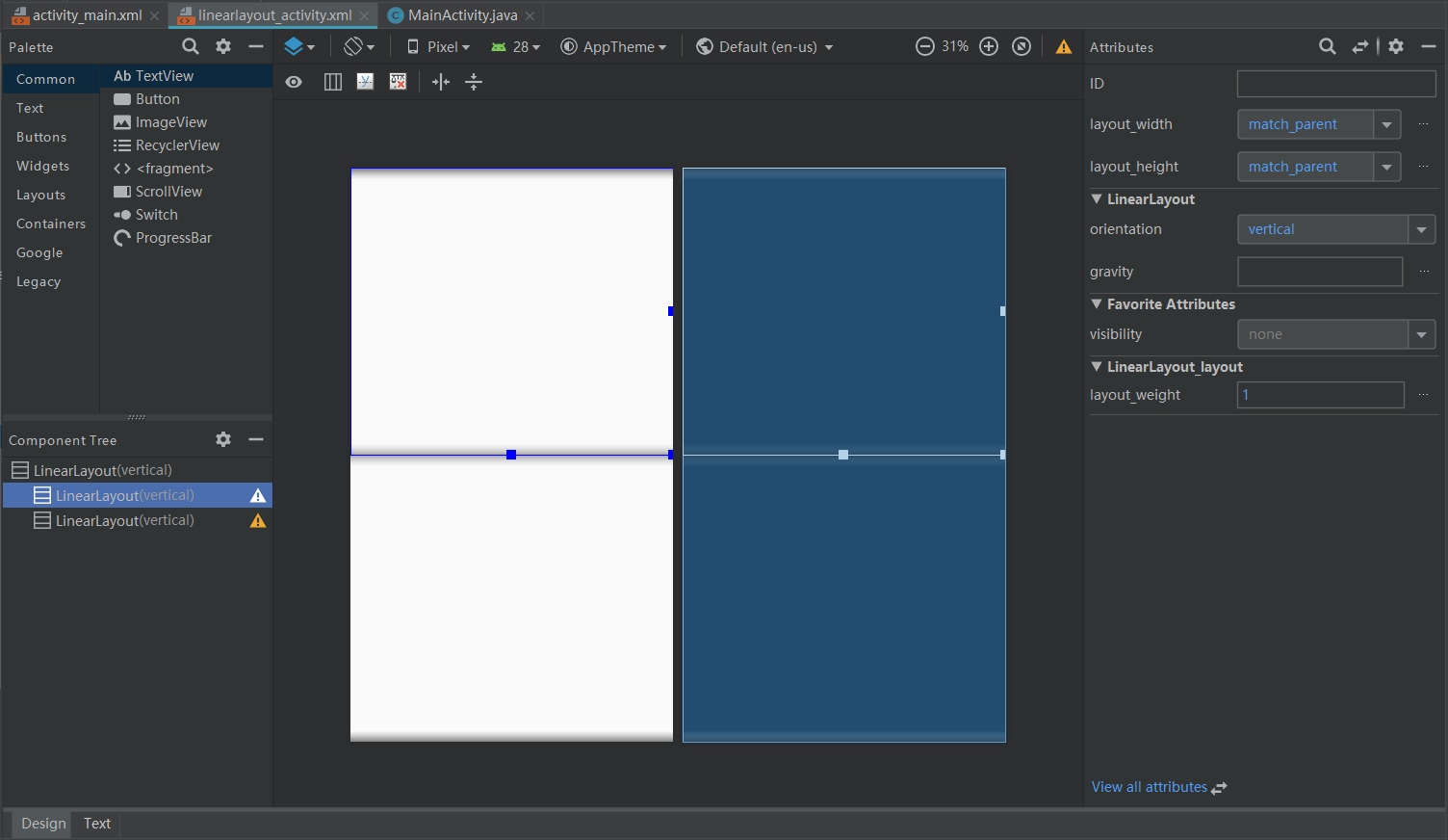
3.2 复制2份LinearLayout布局组件,并设置相应的权重(比重):
不过源代码是这样子:
<?xml version="1.0" encoding="utf-8"?>
<LinearLayout xmlns:android="http://schemas.android.com/apk/res/android"
    android:orientation="vertical" android:layout_width="match_parent"
    android:layout_height="match_parent">

    <LinearLayout
        android:layout_width="match_parent"
        android:layout_height="match_parent"
        android:layout_weight="1"
        android:orientation="horizontal">

    </LinearLayout>

    <LinearLayout
        android:layout_width="match_parent"
        android:layout_height="match_parent"
        android:layout_weight="1"
        android:orientation="vertical">

    </LinearLayout>
</LinearLayout>
android:layout_weight="1" 权重的概念很简单,父元素里面目前就两个权重控件,而且加起来等于2,意思就是,这两个控件对半分整个父元素,如果第LinearLayout组件 android:layout_weight="2",表示现在天下这份蛋糕,已经变成3份,而我将占据其中的2份。
android:orientation="vertical" 表示LinearLayout组件里面的元素是上下一个个排列的。(horizontal左右一个个排列)
3.3 我们给每个子LinearLayout组件各增加3个button控件,并改好名字:
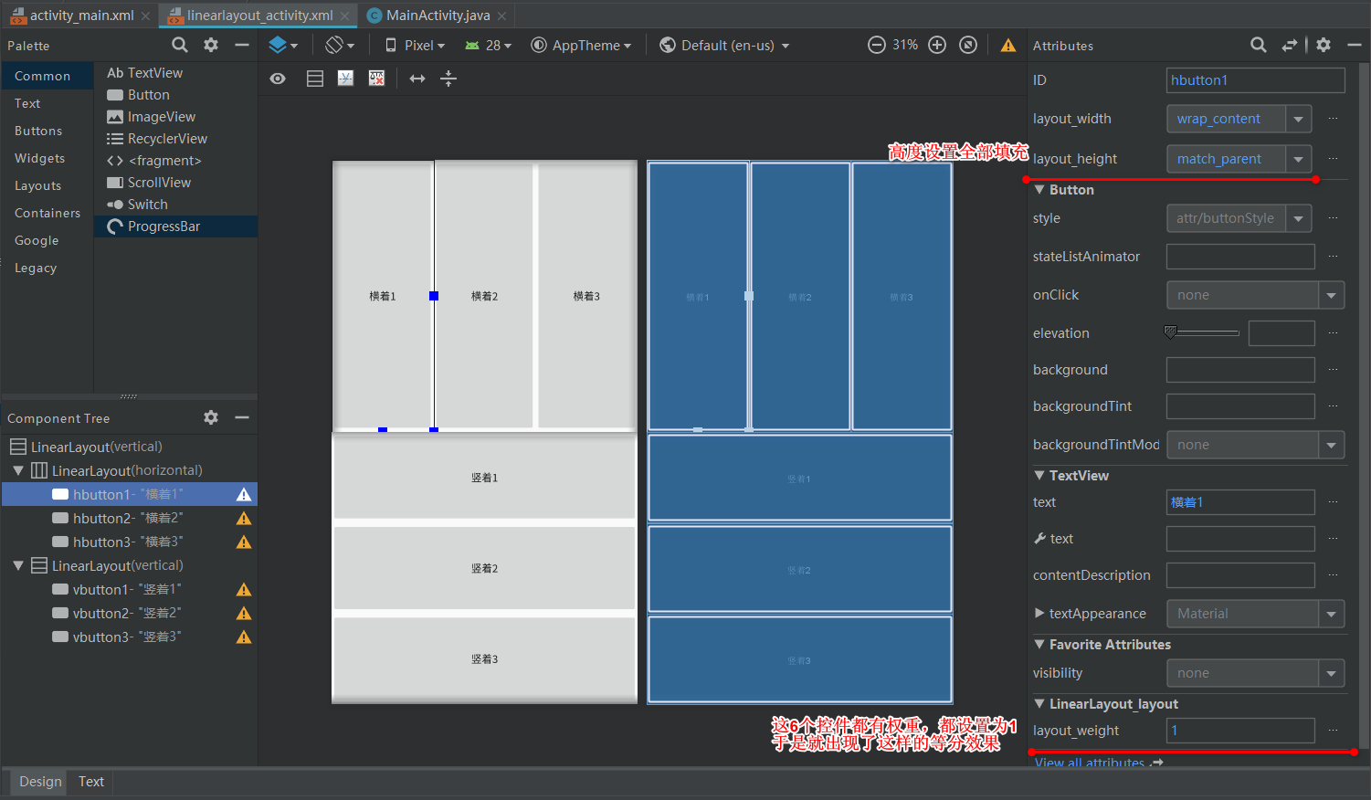
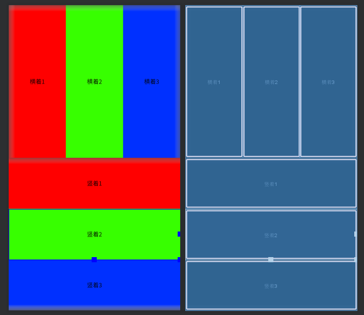
空间之间之所以有空隙,是文字自带的背景没填满的关系,可以给每个button控件增加一个背景颜色,像这样:
<?xml version="1.0" encoding="utf-8"?>
<LinearLayout xmlns:android="http://schemas.android.com/apk/res/android"
    android:orientation="vertical" android:layout_width="match_parent"
    android:layout_height="match_parent">

    <LinearLayout
        android:layout_width="match_parent"
        android:layout_height="match_parent"
        android:layout_weight="1"
        android:orientation="horizontal">

        <Button
            android:id="@+id/hbutton1"
            android:layout_width="wrap_content"
            android:background="#FF0000"
            android:layout_height="match_parent"
            android:layout_weight="1"
            android:text="横着1" />

        <Button
            android:id="@+id/hbutton2"
            android:layout_width="wrap_content"
            android:layout_height="match_parent"
            android:background="#37FF00"
            android:layout_weight="1"
            android:text="横着2" />

        <Button
            android:id="@+id/hbutton3"
            android:layout_width="wrap_content"
            android:layout_height="match_parent"
            android:background="#0030FF"
            android:layout_weight="1"
            android:text="横着3" />
    </LinearLayout>

    <LinearLayout
        android:layout_width="match_parent"
        android:layout_height="match_parent"
        android:layout_weight="1"
        android:orientation="vertical">

        <Button
            android:id="@+id/vbutton1"
            android:layout_width="match_parent"
            android:layout_height="wrap_content"
            android:background="#FF0000"
            android:layout_weight="1"
            android:text="竖着1" />

        <Button
            android:id="@+id/vbutton2"
            android:layout_width="match_parent"
            android:layout_height="wrap_content"
            android:background="#37FF00"
            android:layout_weight="1"
            android:text="竖着2" />

        <Button
            android:id="@+id/vbutton3"
            android:layout_width="match_parent"
            android:layout_height="wrap_content"
            android:background="#0030FF"
            android:layout_weight="1"
            android:text="竖着3" />
    </LinearLayout>
</LinearLayout>
4.0 帧布局 FrameLayout
4.1帧布局经常用在Android碎片活动里面,比如做出微信(QQ)主界面的效果,可以在下面的底部标题栏里面切换*“微信”、“通讯录”、“发现”、“我”时,不需要新建活动就可以达到显示内容切换的效果。
-
FrameLayout是几个布局中最简单的一个布局,单纯如白纸。
4.2 这里也就举一个案例,在app/src/main/res/layout新建一个xml文件,文件名随意,我的叫framelayout_activity,刚开始是这样的:
<?xml version="1.0" encoding="utf-8"?>
<FrameLayout xmlns:android="http://schemas.android.com/apk/res/android"
    android:layout_width="match_parent" android:layout_height="match_parent">

</FrameLayout>
4.3 我们拖4个TextView控件到里面,并改好名字:
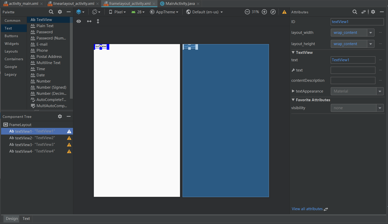
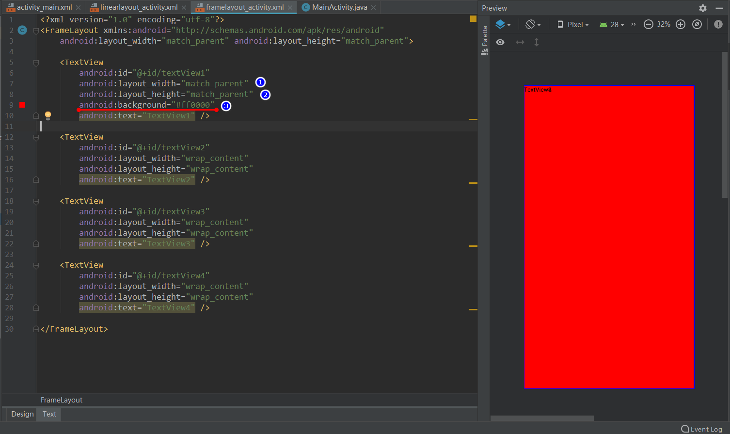
4.4先把textview1控件铺满全屏,并设置一个喜庆的大红色:
4.5 把textview2控件居中一下(严谨来说,最好textview1控件也做居中处理,但是没必要,都铺满了):
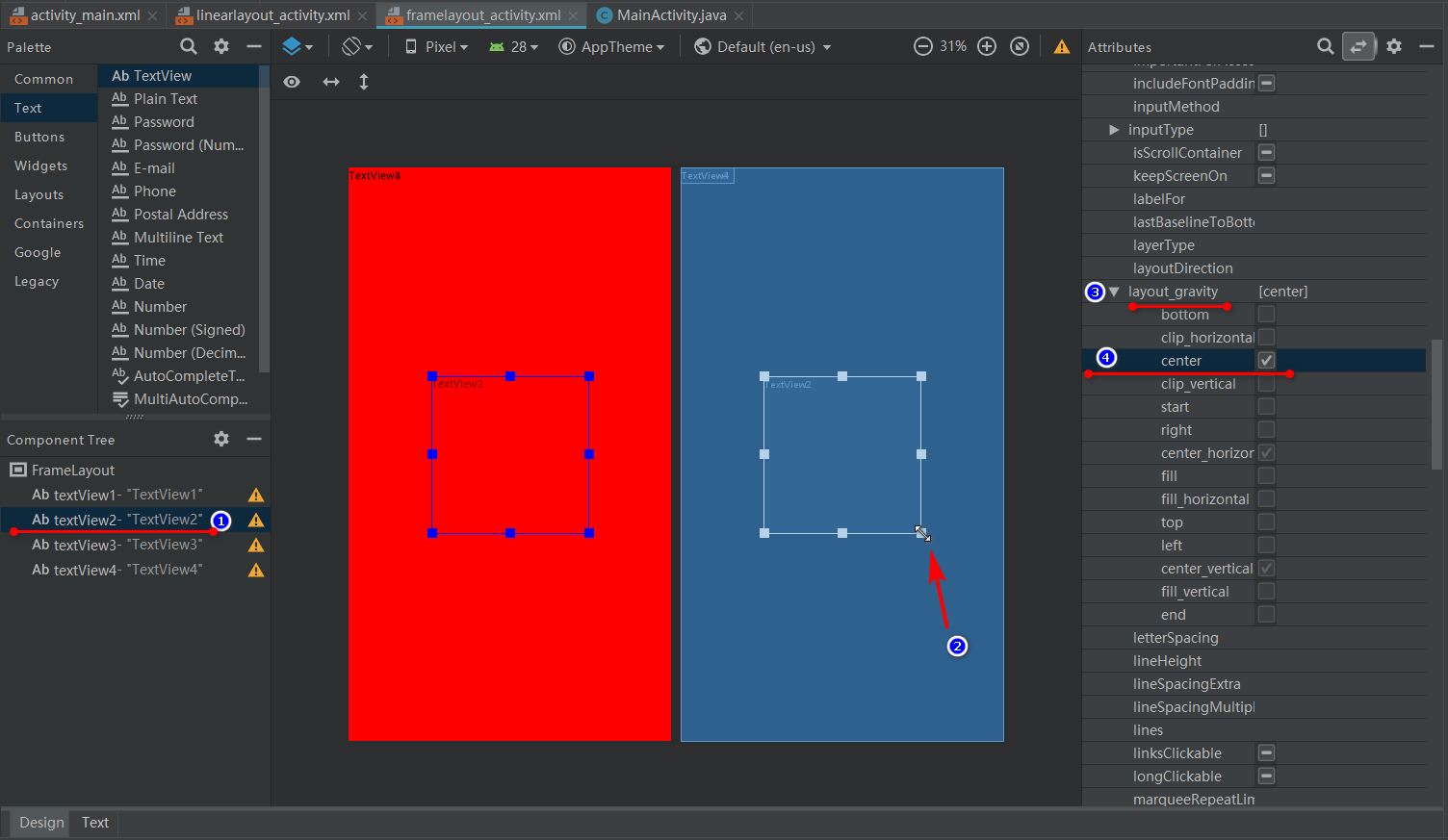
为了看出效果,这里通过步骤2把textview2控件变大一些,然后通过android:layout_gravity="center"设置控件居中。
源代码如下:
   <TextView
        android:id="@+id/textView2"
        android:layout_width="200dp"
        android:layout_height="200dp"
        android:layout_gravity="center"
        android:text="TextView2" />
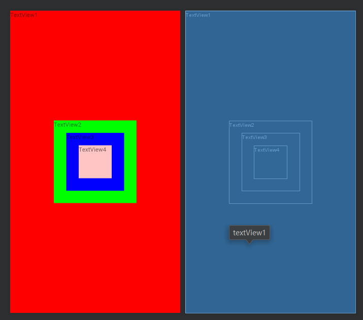
分别textview2控件、textview3控件、textview3控件设置一个背景颜色,把textview3控件、textview3控件大小调整下,给同样居中处理,源代码如下:
<?xml version="1.0" encoding="utf-8"?>
<FrameLayout xmlns:android="http://schemas.android.com/apk/res/android"
    android:layout_width="match_parent" android:layout_height="match_parent">

    <TextView
        android:id="@+id/textView1"
        android:layout_width="match_parent"
        android:layout_height="match_parent"
        android:background="#ff0000"
        android:text="TextView1" />

    <TextView
        android:id="@+id/textView2"
        android:layout_width="200dp"
        android:layout_height="200dp"
        android:layout_gravity="center"
        android:background="#00ff00"
        android:text="TextView2" />

    <TextView
        android:id="@+id/textView3"
        android:layout_width="140dp"
        android:layout_height="140dp"
        android:layout_gravity="center"
        android:background="#0000ff"
        android:text="TextView3" />

    <TextView
        android:id="@+id/textView4"
        android:layout_width="80dp"
        android:layout_height="80dp"
        android:layout_gravity="center"
        android:background="#FFC4C4"
        android:text="TextView4" />

</FrameLayout>
效果如下:
帧布局本身的话,就这些,如果配合碎片活动,才会变得比较复杂(需要构造适配器java类)
好吧,我居然没写碎片活动的文章……
5.0 表格布局TableLayout (绝对布局 AbsoluteLayout不做介绍和讲解)
用这个的是真心少,所以也是举一个例子介绍一下:
5.1,在app/src/main/res/layout新建一个xml文件,文件名随意,我的叫framelayout_activity,刚开始是这样的:
<?xml version="1.0" encoding="utf-8"?>
<TableLayout xmlns:android="http://schemas.android.com/apk/res/android"
    android:layout_width="match_parent" android:layout_height="match_parent">

</TableLayout>
-
Tablelayout类以行和列的形式对控件进行管理,每一行为一个TableRow对象,或一个View控件。 - 当为
TableRow对象时,可在Tablelayout下添加子控件,默认情况下,每个子控件占据一列。 - 当为
View控件时,该View将独占一行。
TableLayout可设置的属性包括全局属性及单元格属性。全局属性也即列属性,有以下3个参数:
android:stretchColumns设置可伸展的列。该列可以向行方向伸展,最多可占据一整行。android:shrinkColumns设置可收缩的列。当该列子控件的内容太多,已经挤满所在行,那么该子控件的内容将往列方向显示。android:collapseColumns设置要隐藏的列。
例如:android:stretchColumns="0"第0列可伸展android:shrinkColumns="1,2"第1,2列皆可收缩android:collapseColumns="*"隐藏所有行单元格属性,有以下2个参数:
android:layout_column指定该单元格在第几列显示android:layout_span指定该单元格占据的列数(未指定时,为1)
例如:android:layout_column="1"该控件显示在第1列android:layout_span="2"该控件占据2列
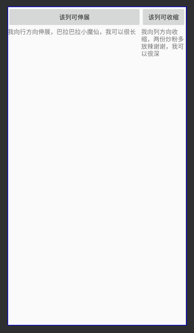
源代码如下:
<?xml version="1.0" encoding="utf-8"?>
<TableLayout xmlns:android="http://schemas.android.com/apk/res/android"
    android:layout_width="match_parent"
    android:layout_height="match_parent"
    android:stretchColumns="0"
    android:shrinkColumns="1"
    android:collapseColumns="2">

    <TableRow android:id="@+id/tablerow1">

        <Button android:id="@+id/button1" android:text="该列可伸展" />

        <Button android:id="@+id/button2" android:text="该列可收缩" />

        <Button android:id="@+id/button3"  android:text="我被隐藏了" />
    </TableRow>

    <TableRow android:id="@+id/tablerow2">

        <TextView android:id="@+id/textview01" android:text="我向行方向伸展,巴拉巴拉小魔仙,我可以很长    " />

        <TextView android:id="@+id/textview02" android:text="我向列方向收缩,两份炒粉多放辣谢谢,我可以很深" />
    </TableRow>
</TableLayout>
效果如下:

END


 1735
1735


 被折叠的 条评论
为什么被折叠?
被折叠的 条评论
为什么被折叠?
 到【灌水乐园】发言


