


前言
本篇是《C# wpf ScrollBar自定义详解》的示例。按照文中的方法实现一个音量调节样式的滚动条。音量调节控件一般用Slider会更合适,只是Slider和ScrollBar的构造几乎一样,继承了同一个基类RangeBase,样式可以相互使用,所以这里统一以ScrollBar为例子来说明。
一、步骤
1.确定参数
对于一个音量调节滚动条,可以定义的参数是:
(1)滚动条宽度
(2)轨道宽度
(3)轨道圆角
(4)轨道颜色
(5)滑块宽
(6)滑块高
(7)滑块圆角
(8)滑块颜色
2.定义style
style的名称就叫ScrollStyle_Volume,其他与《C# wpf ScrollBar自定义详解》中通用模板一致。
3.定义template
在template中显示滚动条的样式。在《C# wpf ScrollBar自定义详解》中通用模板的基础上,去除行按钮,页按钮透明,滑块设为圆角矩形。绑定滚动条宽度、轨道宽度、轨道圆角参数等。
二、完整代码
<ResourceDictionary
    xmlns="http://schemas.microsoft.com/winfx/2006/xaml/presentation"
    xmlns:x="http://schemas.microsoft.com/winfx/2006/xaml"
    xmlns:sys="clr-namespace:System;assembly=mscorlib">
    <!--  1.确定参数  -->
    <!--纵向滚动条宽度-->
    <sys:Double   x:Key="VerticalScrollBarThickness">16</sys:Double>
    <!--纵向轨道宽度-->
    <sys:Double   x:Key="VerticalTrackThickness">4</sys:Double>
    <!--纵向轨道圆角-->
    <CornerRadius   x:Key="VerticalTrackCornerRadius">2</CornerRadius>
    <!--纵向轨道颜色-->
    <SolidColorBrush x:Key="VerticalTrackBackground" Color="#cccccc"></SolidColorBrush>
    <!--纵向滑块宽-->
    <sys:Double x:Key="VerticalThumbWidth" >16</sys:Double>
    <!--纵向滑块高-->
    <sys:Double x:Key="VerticalThumbHeight" >16</sys:Double>
    <!--纵向滑块圆角-->
    <CornerRadius x:Key="VerticalThumbCornerRadius">8</CornerRadius>
    <!--纵向滑块颜色-->
    <SolidColorBrush x:Key="VerticalThumbBackground" Color="#cccccc"> </SolidColorBrush>

    <!--横向滚动条宽度-->
    <sys:Double   x:Key="HorizontalScrollBarThickness">16</sys:Double>
    <!--横向轨道宽度-->
    <sys:Double   x:Key="HorizontalTrackThickness">4</sys:Double>
    <!--横向轨道圆角-->
    <CornerRadius   x:Key="HorizontalTrackCornerRadius">2</CornerRadius>
    <!--横向轨道颜色-->
    <SolidColorBrush x:Key="HorizontalTrackBackground" Color="#cccccc"></SolidColorBrush>
    <!--横向滑块宽-->
    <sys:Double x:Key="HorizontalThumbWidth" >16</sys:Double>
    <!--横向滑块高-->
    <sys:Double x:Key="HorizontalThumbHeight" >16</sys:Double>
    <!--横向滑块圆角-->
    <CornerRadius x:Key="HorizontalThumbCornerRadius">8</CornerRadius>
    <!--横向滑块颜色-->
    <SolidColorBrush x:Key="HorizontalThumbBackground" Color="#cccccc"></SolidColorBrush>

    <!-- 2.定义Style  -->
    <Style x:Key="ScrollStyle_Volume" TargetType="ScrollBar">
        <Setter Property="OverridesDefaultStyle" Value="true" />
        <Style.Triggers>
            <Trigger Property="Orientation" Value="Horizontal">
                <Setter Property="Width" Value="Auto" />
                <Setter Property="Height" Value="{DynamicResource HorizontalScrollBarThickness}" />
                <Setter Property="Template" Value="{DynamicResource HorizontalScrollBar}" />
            </Trigger>
            <Trigger Property="Orientation" Value="Vertical">
                <Setter Property="Width" Value="{DynamicResource VerticalScrollBarThickness}" />
                <Setter Property="Height" Value="Auto" />
                <Setter Property="Template" Value="{DynamicResource VerticalScrollBar}" />
            </Trigger>
        </Style.Triggers>
    </Style>

    <!-- 3.定义template  -->
    <!-- 纵向滚动条template  -->
    <ControlTemplate x:Key="VerticalScrollBar" TargetType="{x:Type ScrollBar}">
        <Grid>
            <Border    Width="{DynamicResource VerticalTrackThickness}"  CornerRadius="{DynamicResource VerticalTrackCornerRadius}"  Background="{DynamicResource VerticalTrackBackground}"></Border>
            <!--如果想要Thumb固定长度,直接设置是没有效果的,必须先将Track的ViewportSize设置为NaN-->
            <Track    Name="PART_Track"  IsDirectionReversed="true" ViewportSize="NaN">
                <Track.DecreaseRepeatButton>
                    <RepeatButton Command="ScrollBar.PageUpCommand" Focusable="False"  Width="{DynamicResource VerticalTrackThickness}">
                        <RepeatButton.Template>
                            <ControlTemplate>
                                <Border Background="Transparent"></Border>
                            </ControlTemplate>
                        </RepeatButton.Template>
                    </RepeatButton>
                </Track.DecreaseRepeatButton>
                <Track.Thumb>
                    <Thumb  Width="{DynamicResource VerticalThumbWidth}"  Height="{DynamicResource VerticalThumbHeight}"  Focusable="False"  >
                        <Thumb.Template>
                            <ControlTemplate>
                                <Border   Background="{DynamicResource VerticalThumbBackground}"   CornerRadius="{DynamicResource VerticalThumbCornerRadius}" />
                            </ControlTemplate>
                        </Thumb.Template>
                    </Thumb>
                </Track.Thumb>
                <Track.IncreaseRepeatButton>
                    <RepeatButton Command="ScrollBar.PageDownCommand" Focusable="False"  Width="{DynamicResource VerticalTrackThickness}">
                        <RepeatButton.Template>
                            <ControlTemplate>
                                <Border Background="Transparent"></Border>
                            </ControlTemplate>
                        </RepeatButton.Template>
                    </RepeatButton>
                </Track.IncreaseRepeatButton>
            </Track>
        </Grid>
    </ControlTemplate>

    <!-- 横向滚动条template  -->
    <ControlTemplate x:Key="HorizontalScrollBar" TargetType="{x:Type ScrollBar}">
        <Grid>
            <Border    Height="{DynamicResource HorizontalTrackThickness}"  CornerRadius="{DynamicResource HorizontalTrackCornerRadius}"  Background="{DynamicResource HorizontalTrackBackground}"></Border>
            <!--如果想要Thumb固定长度,直接设置是没有效果的,必须先将Track的ViewportSize设置为NaN-->
            <Track    Name="PART_Track"  IsDirectionReversed="False"  ViewportSize="NaN">
                <Track.DecreaseRepeatButton>
                    <RepeatButton Command="ScrollBar.PageLeftCommand" Focusable="False"  Height="{DynamicResource HorizontalTrackThickness}">
                        <RepeatButton.Template>
                            <ControlTemplate>
                                <Border Background="Transparent"></Border>
                            </ControlTemplate>
                        </RepeatButton.Template>
                    </RepeatButton>
                </Track.DecreaseRepeatButton>
                <Track.Thumb>
                    <Thumb  Width="{DynamicResource HorizontalThumbWidth}"  Height="{DynamicResource HorizontalThumbHeight}"  Focusable="False"  >
                        <Thumb.Template>
                            <ControlTemplate>
                                <Border   Background="{DynamicResource HorizontalThumbBackground}"   CornerRadius="{DynamicResource HorizontalThumbCornerRadius}" />
                            </ControlTemplate>
                        </Thumb.Template>
                    </Thumb>
                </Track.Thumb>
                <Track.IncreaseRepeatButton>
                    <RepeatButton Command="ScrollBar.PageRightCommand" Focusable="False"  Height="{DynamicResource HorizontalTrackThickness}">
                        <RepeatButton.Template>
                            <ControlTemplate>
                                <Border Background="Transparent"></Border>
                            </ControlTemplate>
                        </RepeatButton.Template>
                    </RepeatButton>
                </Track.IncreaseRepeatButton>
            </Track>
        </Grid>
    </ControlTemplate>
</ResourceDictionary>
三、效果预览
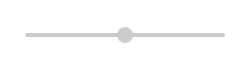
1.默认参数
<ScrollBar Orientation="Horizontal" Width="200" Height="200" Minimum="0" Value="50" Maximum="100" Style="{DynamicResource ScrollStyle_Volume}"/>
2.设置大小
<ScrollBar   Orientation="Horizontal"  Width="200" Height="200"   Minimum="0"   Value="50"  Maximum="100"  Style="{DynamicResource ScrollStyle_Volume}">
    <ScrollBar.Resources>
        <!--横向滑块宽-->
        <sys:Double x:Key="HorizontalThumbWidth" >10</sys:Double>
        <!--横向滑块高-->
        <sys:Double x:Key="HorizontalThumbHeight" >28</sys:Double>
        <!--横向滑块圆角-->
        <CornerRadius x:Key="HorizontalThumbCornerRadius">5</CornerRadius>
    </ScrollBar.Resources>
</ScrollBar>

3.设置颜色
<ScrollBar   Orientation="Horizontal"  Width="200" Height="200"   Minimum="0"   Value="50"  Maximum="100"  Style="{DynamicResource ScrollStyle_Volume}">
    <ScrollBar.Resources>
        <!--横向滑块颜色-->
        <SolidColorBrush x:Key="HorizontalThumbBackground" Color="LightBlue"></SolidColorBrush>
    </ScrollBar.Resources>
</ScrollBar>

总结
wpf实现的音量调节控件效果还是比较好的,虽然上述的代码用的是ScrollBar,但可以通过修改Style的TargetType以及Template的TargeTyle后将样式赋给Slider,但它们实现原理一致,所以示例统一用ScrollBar。


 958
958


 被折叠的 条评论
为什么被折叠?
被折叠的 条评论
为什么被折叠?
 到【灌水乐园】发言


