


本文中列举了一些QToolButton的使用方法,主要对带下拉菜单按钮的使用方法
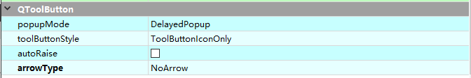
QToolButton属性说明
从Qt设计师或者Qt说明文档可以看见,QToolButton特有的属性主要有一下四种
- popupMode—弹出模式,控制菜单弹出模式
- toolButtonStyle—控制按钮中 Icon 和 Text 的位置关系
- autoRaise—控制按钮突起方式
- arrowType—控制按钮展示箭头的样式
弹出模式(popoupMode)
| 枚举 | 值 | 说明 |
|---|---|---|
| QToolButton::DelayedPopup | 0 | 按住按钮一段时间之后会弹出菜单 (默认) |
| QToolButton::MenuButtonPopup | 1 | toolButton会分成两部分,一部分展示Icon和Text;另一部分展示小箭头用于弹出菜单。注:本文中会将这两个部分叫做 IconButton和MenuButton |
| QToolButton::InstantPopup | 2 | 按钮按下就弹出菜单,按钮本身的action不会被触发 |
按钮风格(toolButtonStyle)
| 枚举 | 值 | 说明 |
|---|---|---|
| QToolButton::ToolButtonIconOnly | 0 | 只展示图标 (默认) |
| QToolButton::ToolButtonTextOnly | 1 | 只展示文字 |
| QToolButton::ToolButtonTextBesideIcon | 2 | 展示图标和文字,文字在图标的右方 |
| QToolButton::ToolButtonTextUnderIcon | 3 | 展示图标和文字,文字在图标的下方 |
| QToolButton::ToolButtonFollowStyle | 4 | 展示风格跟随QStyle |
按钮突起(autoRaise)
此属性控制toolButton是否自动突起。设置为false,则按钮一直时突起状态,如果值为true,按钮处于扁平状态,当鼠标放在按钮上时,按钮弹起,鼠标移开,按钮变成扁平,例如:
箭头样式(arrowType)
| 枚举 | 值 | 说明 |
|---|---|---|
| QToolButton::NoArrow | 0 | 没有箭头(默认) |
| QToolButton::UpArrow | 1 | 箭头向上 |
| QToolButton::DownArrow | 2 | 箭头向下 |
| QToolButton::LeftArrow | 3 | 箭头向左 |
| QToolButton::RightArrow | 4 | 箭头向右 |
一般用于折叠和展开折叠某一个面板,按钮会自带图标(比较丑,个人认为)
QToolButton的应用
这里主要讨论带下拉菜单的按钮
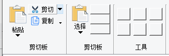
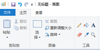
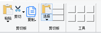
![(https://img-blog.csdnimg.cn/20210429162503278.png)]](https://img-blog.csdnimg.cn/20210429162722620.png)
toolButtonStyle == ToolButtonTextBesideIcon时
- 如果popoupMode==MenuButtonPopup时,如剪切。该按钮会被分成两个,点击menuButton会弹出菜单;点击IconButton会执行剪切按钮本身的Action
- 如果popoupMode==InstantPopup时,如复制,直接弹出菜单,不会执行复制按钮的Action
toolButtonStyle == ToolButtonTextUnderIcon时
菜单按钮依然在图标的左侧,而不是跟随Text移到下方,那么如何实现一下效果?
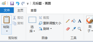
方法一 使用两个按钮
使用两个按钮,上面的按钮展示图标,下面的按钮展示文字和小箭头。这样会有两个问题:
下面按钮的箭头在右下角,而不是居中在下方,如何居中?
解决方法:
使用setStyleSheet来使小箭头居中
ui->mPastManuToolButton->setStyleSheet("QToolButton::menu-indicator:image{nosubcontrol-origin: margin;subcontrol-position: bottom center;margin-top: 10px;}"
当然也可以去掉小箭头
ui->mPastManuToolButton->setStyleSheet("QToolButton::menu-indicator{image:none}"
两个按钮如何同时保证hover状态?暂时没有想到比较好的办法,只能重写paintEvent() 比较麻烦,没有研究。如果哪位大神有比较好的办法,麻烦在评论区告知
注意:有菜单的时候不要设置 arrowType,否则会有两个箭头,巨丑
方法二 重写QStyle
Qt的控件是通过QStyle控制其展示样式,QWiget也支持设置单个控件的样式。重写QStyle很麻烦,但是是一劳永逸的事,重写后理论上可以以任意方式展示
QProxyStyle 是QStyle的子类,重写了一些接口,我们继承QProxyStyle。至于QStyle怎么控制控件的展示,以及具体控件绘制的流程以及组合控件的概念,以后有机会再整理出一个文档。这里只考虑如何实现目前的需求,直接看代码,忽略其中SpinBox相关
#include <QProxyStyle>

class QDemoToolButtonProxyStyle : public QProxyStyle
{
public:
    QDemoToolButtonProxyStyle(QStyle* style = nullptr);

    void drawComplexControl(ComplexControl control, const QStyleOptionComplex *option, QPainter *painter, const QWidget *widget = Q_NULLPTR) const;

	void drawControl(ControlElement element, const QStyleOption *option, QPainter *painter, const QWidget *widget = Q_NULLPTR) const;

	QSize sizeFromContents(ContentsType type, const QStyleOption *option, const QSize &size, const QWidget *widget) const;

	void drawItemText(QPainter *painter, const QRect &rect, int flags, const QPalette &pal, bool enabled, const QString &text, QPalette::ColorRole textRole = QPalette::NoRole) const;

	void drawPrimitive(PrimitiveElement element, const QStyleOption *option, QPainter *painter, const QWidget *widget = Q_NULLPTR) const;

	QRect subControlRect(ComplexControl cc, const QStyleOptionComplex *option, SubControl sc, const QWidget *widget) const;

	QRect subElementRect(SubElement element, const QStyleOption *option, const QWidget *widget) const;

	QRect itemTextRect(const QFontMetrics &fm, const QRect &r, int flags, bool enabled, const QString &text) const;
};
#include <QStyleOptionToolButton>
#include <QPainter>
#include <QStyle>
#include <QApplication>

QDemoToolButtonProxyStyle::QDemoToolButtonProxyStyle(QStyle *style)
    :QProxyStyle(style)
{
    setBaseStyle(style);
}

void QDemoToolButtonProxyStyle::drawComplexControl(QStyle::ComplexControl control, const QStyleOptionComplex *option, QPainter *painter, const QWidget *widget) const
{
	switch (control)
	{
	case QStyle::CC_SpinBox:
	{
		//是否为SpintBox
		QRect recOption = option->rect;
		if (const QStyleOptionSpinBox* spBox = qstyleoption_cast<const QStyleOptionSpinBox*>(option))
		{
			painter->save();
			if (spBox->frame && (option->subControls & SC_SpinBoxFrame))
			{
				painter->drawRect(recOption);
			}
			painter->restore();

			int nW = recOption.width()*0.8;
			int nH = recOption.height() / 2;

			QRect reUp(0, 0, nW, nH);
			QRect reDn(0, nH + 1, nW, nH - 1);
			QRect reEdit(nW, 0, recOption.width()*0.2,nH);
			auto spOption = *option;
			spOption.rect = reEdit;

			if (option->subControls & SC_SpinBoxEditField)
			{
				drawPrimitive(QStyle::PE_FrameLineEdit, &spOption, painter, widget);
			}

			spOption.rect = reUp;
			if (option->subControls & SC_SpinBoxUp)
			{
				drawPrimitive(QStyle::PE_IndicatorSpinUp, &spOption, painter, widget);
			}

			spOption.rect = reDn;
			if (option->subControls & SC_SpinBoxDown)
			{
				drawPrimitive(QStyle::PE_IndicatorSpinDown, option, painter, widget);
			}

			return;
		}
	}
	 case CC_ToolButton:
	 {
		 if (const QStyleOptionToolButton* pToolbutton = qstyleoption_cast<const QStyleOptionToolButton*>(option))
		 {
			 State flags = option->state;
			 QRect rectIcon = subControlRect(QStyle::CC_ToolButton, option, QStyle::SC_ToolButton,widget);
			 QRect rectMenu = subControlRect(QStyle::CC_ToolButton, option, QStyle::SC_ToolButtonMenu, widget);

			 bool autoRaise = flags & State_AutoRaise;
			 if (!autoRaise)
			 {
				 QProxyStyle::drawComplexControl(control, option, painter, widget);
				 return;
			 }
			 if (pToolbutton->subControls & SC_ToolButton)
			 {
				 //判断是否hover
				 QRect arrowBoxRect = option->rect;
				 bool arrowAreaHovered = arrowBoxRect.contains(widget->mapFromGlobal(QCursor::pos()));
				 if (flags & State_Enabled)
				 {
					 //先绘制背景颜色
					 if (arrowAreaHovered)
					 {
						 painter->save();

						 //先绘制ToolButton的矩形边框(当然也可以是任意形状的边框)
						 QPen pen(QColor(120, 170, 230));
						 pen.setWidth(1);
						 painter->setPen(pen);

						 QRect rectEd = rectIcon.adjusted(0, 0, -1, -1);
						 painter->drawRect(rectEd);

						 rectEd = rectMenu.adjusted(0, 0, -1, -1);
						 painter->drawRect(rectEd);

						 //鼠标停留在Icon还是Menu
						 //填充色区域要比边框区域小一个像素,不然会覆盖边框导致边框显示不出来
						 QBrush brush(QColor(220, 235, 248));
						 if (rectMenu.contains(widget->mapFromGlobal(QCursor::pos())))
						 {
							 rectEd = rectMenu.adjusted(1, 1, -1, -1);
							 painter->fillRect(rectEd, brush);
						 }
						 else
						 {
							 rectEd = rectIcon.adjusted(1, 1, -1, -1);
							 painter->fillRect(rectEd, brush);
						 }

						 painter->restore();
					 }

					 //绘制Icon
					 QPixmap pm;
					 QSize pmSize = pToolbutton->iconSize;
					 if (!pToolbutton->icon.isNull())
					 {
						 QIcon::State state = pToolbutton->state & State_On ? QIcon::On : QIcon::Off;
						 QIcon::Mode mode;
						 if (!(pToolbutton->state & State_Enabled))
							 mode = QIcon::Disabled;
						 else if ((option->state & State_MouseOver) && (option->state & State_AutoRaise))
							 mode = QIcon::Active;
						 else
							 mode = QIcon::Normal;

						 QWindow* window = widget ? widget->window()->windowHandle() : 0;
						 pm = pToolbutton->icon.pixmap(window, rectIcon.size().boundedTo(pToolbutton->iconSize),mode, state);
						 pmSize = pm.size() / pm.devicePixelRatio();

						 painter->setFont(pToolbutton->font);
						 QRect pr = pToolbutton->rect,
							 tr = pToolbutton->rect;
						 int alignment = Qt::TextShowMnemonic;
						 if (!proxy()->styleHint(SH_UnderlineShortcut, option, widget))
							 alignment |= Qt::TextHideMnemonic;

						 if (pToolbutton->toolButtonStyle == Qt::ToolButtonTextUnderIcon)
						 {
							 proxy()->drawItemPixmap(painter, rectIcon, Qt::AlignCenter, pm);

							 painter->save();

							 //绘制menuButton text 下拉三角形
							 QRect rectText = rectMenu;
							 rectText.adjust(0, 2, 0, -rectText.height() / 2 + 2);	//将MenuRect一分为二,上半部分写ToolButtonText,下半部分绘制三角形
							 QPen savedPen = painter->pen();
							 painter->setPen(QPen(option->palette.brush(QPalette::ButtonText), savedPen.widthF()));
							 painter->drawText(rectText, Qt::AlignCenter, pToolbutton->text);

							 //确定绘制三角形的范围
							 QRect rectArro = rectMenu;
							 rectArro.adjust(0, rectArro.height()/2, 0, 0);

							 //下拉三角形默认最小高度3pix,长6pix,最大高度6pix,宽度12pix ,上下左右预留2pix余量
							 int nHighMin = 2;
							 int nLenMin = 4;
							 int nHighMax = 4;
							 int nLenMax = 8;
							 int nLen = 0, nHigh = 0;
							 if (nHighMin + 4 > rectArro.height() || nLenMin + 4 > rectArro.width())
							 {
								 //位置太小不绘制三角形
								 return;
							 }
							 else if(nHighMax+ 4 < rectArro.height() || nLenMax+4 < rectArro.width())
							 {
								 //位置太大,就用默认最大范围绘制三角形,不然三角形太肥
								 nLen = nLenMax;
								 nHigh = nHighMax;
							 }
							 else
							 {
								 nLen = rectArro.width() - 4;
								 nHigh = rectArro.height() - 4;
							 }

							 //确定小三角形的位置
							 int posButtom = rectArro.y() + rectArro.height() - 2;
							 int posMiddle = (rectArro.width() - rectArro.x()) / 2;
							 QPoint pt3(posMiddle, posButtom);
							 QPoint pt1(posMiddle - nLen/2, posButtom - nHigh);
							 QPoint pt2(posMiddle + nLen/2, posButtom - nHigh);
							 QPolygon polygon;
							 polygon.append(pt3);
							 polygon.append(pt2);
							 polygon.append(pt1);
							 polygon.append(pt3);

							 painter->setBrush(QBrush(savedPen.color()));
							 painter->drawPolygon(polygon);

							 painter->restore();
						 }
						 else
						 {
							 //text在左边
						 }
					 }
				 }
				 else
				 {
					 //todo 工具状态为Enable
				 }
			 }
			 return;
		 }
	 }
		break;
	default:
		break;
	}

	QProxyStyle::drawComplexControl(control, option, painter, widget);
}

void QDemoToolButtonProxyStyle::drawControl(ControlElement element, const QStyleOption * opt, QPainter * p, const QWidget * widget) const
{
    QProxyStyle::drawControl(element,opt,p,widget);
}

void QDemoToolButtonProxyStyle::drawPrimitive(PrimitiveElement element, const QStyleOption * option, QPainter * painter, const QWidget * widget) const
{
    if (element == PE_IndicatorSpinUp || element == PE_IndicatorSpinDown)
	{
        QPolygon points(3);
        int x = option->rect.x();
        int y = option->rect.y();
        int w = option->rect.width() / 2;
        int h = option->rect.height() / 2;
        x += (option->rect.width() - w) / 2;
        y += (option->rect.height() - h) / 2;

        if (element == PE_IndicatorSpinUp) {
            points[0] = QPoint(x, y + h);
            points[1] = QPoint(x + w, y + h);
            points[2] = QPoint(x + w / 2, y);
        } else { // PE_SpinBoxDown
            points[0] = QPoint(x, y);
            points[1] = QPoint(x + w, y);
            points[2] = QPoint(x + w / 2, y + h);
        }

        if (option->state & State_Enabled) {
            painter->setPen(Qt::red);
            painter->setBrush(option->palette.buttonText());
        } else {
            painter->setPen(option->palette.buttonText().color());
            painter->setBrush(option->palette.mid());
        }
        painter->drawPolygon(points);

		return;
    }
	else if (element == QStyle::PE_IndicatorButtonDropDown)
	{
	}

	QProxyStyle::drawPrimitive(element, option, painter, widget);
}

QSize QDemoToolButtonProxyStyle::sizeFromContents(ContentsType type, const QStyleOption * option, const QSize & size, const QWidget * widget) const
{
    return QProxyStyle::sizeFromContents(type,option,size,widget);
}

void QDemoToolButtonProxyStyle::drawItemText(QPainter * painter, const QRect & rect, int flags, const QPalette & pal, bool enabled, const QString & text, QPalette::ColorRole textRole) const
{
    QProxyStyle::drawItemText(painter, rect,flags,pal,enabled,text, textRole);
}

QRect QDemoToolButtonProxyStyle::subControlRect(ComplexControl cc, const QStyleOptionComplex * option, SubControl sc, const QWidget * widget) const
{
	QRect ret;
	if (cc == QStyle::CC_SpinBox)
	{
		if (const QStyleOptionSpinBox* spinbox = qstyleoption_cast<const QStyleOptionSpinBox*>(option))
		{
			QSize bs;
			int fw = spinbox->frame ? proxy()->pixelMetric(PM_SpinBoxFrameWidth, spinbox, widget) : 0;
			bs.setHeight(qMax(8, spinbox->rect.height() / 2 - fw));
			// 1.6 -approximate golden mean
			bs.setWidth(qMax(16, qMin(bs.height() * 8 / 5, spinbox->rect.width() / 4)));
			//bs = bs.expandedTo(QApplication::globalStrut());
			int y = fw + spinbox->rect.y();	//button的高
			int x = fw;
			int lx, rx;
			lx = x + bs.width();
			rx = spinbox->rect.width() - bs.width() - 2*fw;

			switch (sc) {
			case SC_SpinBoxUp:
				if (spinbox->buttonSymbols == QAbstractSpinBox::NoButtons)
					return QRect();
				ret = QRect(x, y, bs.width(), bs.height());
				break;
			case SC_SpinBoxDown:
				if (spinbox->buttonSymbols == QAbstractSpinBox::NoButtons)
					return QRect();

				ret = QRect(x, y + bs.height(), bs.width(), bs.height());
				break;
			case SC_SpinBoxEditField:
				if (spinbox->buttonSymbols == QAbstractSpinBox::NoButtons) {
					ret = QRect(lx, fw, spinbox->rect.width() - 2 * fw, spinbox->rect.height() - 2 * fw);
				}
				else {
					ret = QRect(lx, fw, rx, spinbox->rect.height() - 2 * fw);
				}
				break;
			case SC_SpinBoxFrame:
				ret = spinbox->rect;
			default:
				break;
			}
			ret = visualRect(spinbox->direction, spinbox->rect, ret);

			return ret;
		}
	}
	else if (cc == QStyle::CC_ToolButton)
	{
		if (const QStyleOptionToolButton *tb = qstyleoption_cast<const QStyleOptionToolButton *>(option))
		{
			int mbi = proxy()->pixelMetric(PM_MenuButtonIndicator, tb, widget) * 2;
			ret = tb->rect;
			switch (sc) {
			case SC_ToolButton:
				if ((tb->features
					& (QStyleOptionToolButton::MenuButtonPopup | QStyleOptionToolButton::PopupDelay))
					== QStyleOptionToolButton::MenuButtonPopup)

					ret.adjust(0, 0,0, -mbi);
				break;
			case SC_ToolButtonMenu:
				if ((tb->features
					& (QStyleOptionToolButton::MenuButtonPopup | QStyleOptionToolButton::PopupDelay))
					== QStyleOptionToolButton::MenuButtonPopup)
					ret.adjust(0,ret.height() - mbi, 0, 0);
				break;
			default:
				break;
			}
			ret = visualRect(tb->direction, tb->rect, ret);

			return ret;
		}
	}

    return QProxyStyle::subControlRect(cc,option,sc,widget);
}

QRect QDemoToolButtonProxyStyle::subElementRect(SubElement element, const QStyleOption * option, const QWidget * widget) const
{
    return QProxyStyle::subElementRect(element,option,widget);
}

QRect QDemoToolButtonProxyStyle::itemTextRect(const QFontMetrics & fm, const QRect & r, int flags, bool enabled, const QString & text) const
{
	return QProxyStyle::itemTextRect(fm, r, flags, enabled, text);
}
调用方式以及展示样式如下
    ui->toolButton_4->setIcon(QDemoDrawerUtility::makeIcon("mActionPast.svg"));
    ui->toolButton_4->setIconSize(ui->toolButton_4->size());
    ui->toolButton_4->setText(u8"选择");
    ui->toolButton_4->setToolButtonStyle(Qt::ToolButtonTextUnderIcon);

    menu = new QMenu();
    action = new QAction(u8"矩形选择");
    menu->addAction(action);
    action = new QAction(u8"自由图形选择");
    menu->addAction(action);
    ui->toolButton_4->setMenu(menu);
    ui->toolButton_4->setAutoRaise(true);
    ui->toolButton_4->setPopupMode(QToolButton::MenuButtonPopup);
    ui->toolButton_4->setStyle(new QDemoToolButtonProxyStyle());
如果大家有更简单的方法,请在评论区告知,谢谢!


 1575
1575


 被折叠的 条评论
为什么被折叠?
被折叠的 条评论
为什么被折叠?
 到【灌水乐园】发言


