


 NavigationRail是Flutter中的一个MaterialDesign组件,用于在应用的侧边显示导航菜单,通常用于三到五个视图之间的切换。它包含如selectedIndex、destinations、labelType等属性,允许自定义背景色、海拔高度、按钮形状和文字样式等。文章展示了如何配置和使用NavigationRail,包括设置顶部和底部按钮,以及调整菜单标签的显示方式和位置。
NavigationRail 简介
一个 Material Design 小部件,旨在显示在应用程序的左侧或右侧,以便在少量视图(通常在三到五个视图之间)之间导航。
使用场景:
通过Row属性,左侧或右侧菜单栏按钮
| 属性 | 作用 |
|---|---|
| onDestinationSelected | 选择索引回调监听器 |
| selectedIndex | 目前选定目的地的索引 |
| destinations | 存放菜单按钮 |
| backgroundColor | 导航栏背景色 |
| elevation | 海拔高度 |
| height | 导航栏高度 |
| labelType | 是否展示菜单栏底部文字 |
| shadowColor | 阴影颜色 |
| animationDuration | 胶囊动画显示时长 |
| indicatorShape | 选中菜单背景圆角或者边框样式 |
| indicatorColor | 选中菜单背景色 |
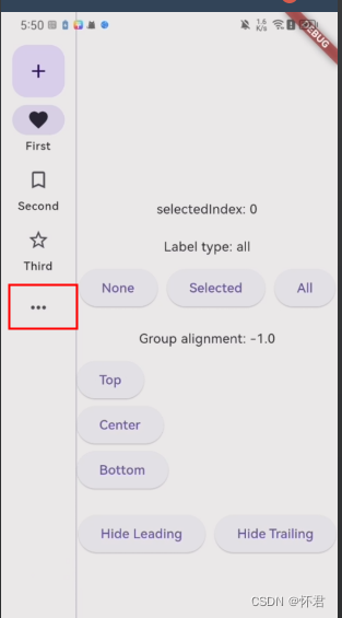
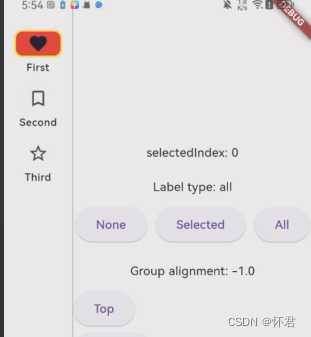
| leading | 顶部菜单按钮 |
| trailing | 底部菜单按钮 |
| groupAlignment | top,center,bottom 菜单按钮的显示位置 |
| selectedLabelTextStyle | 文字选择的样式 |
| unselectedLabelTextStyle | 文字未选择的样式 |
| useIndicator | 是否显示选中菜单背景色 |
| minWidth | 最小宽度 |
属性 groupAlignment: top、center、bottom
top
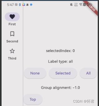
center
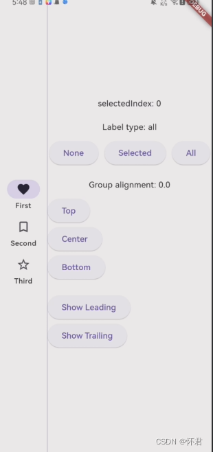
bottom
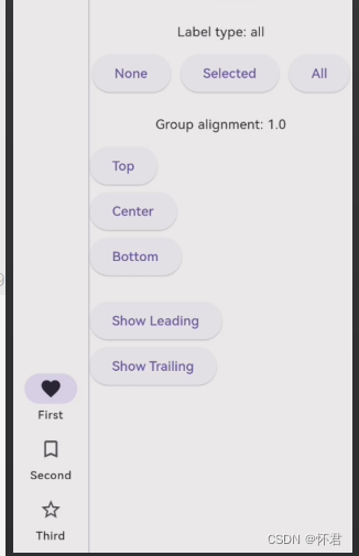
leading: 顶部菜单按钮
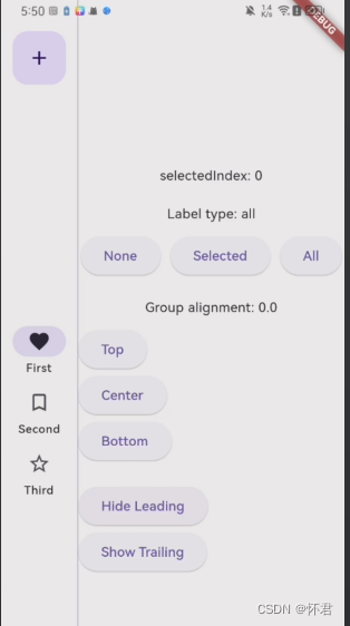
trailing: 底部菜单按钮
indicatorShape: 设置按钮背景圆角样式
代码块
import 'package:flutter/material.dart';
class NavigationRails extends StatefulWidget {
const NavigationRails({super.key});
State<NavigationRails> createState() => _NavigationRailsState();
}
class _NavigationRailsState extends State<NavigationRails> {
int _selectedIndex = 0;
NavigationRailLabelType labelType = NavigationRailLabelType.all;
bool showLeading = false;
bool showTrailing = false;
double groupAlignment = -1.0;
Widget build(BuildContext context) {
return Scaffold(
body: Row(
children: <Widget>[
NavigationRail(
selectedIndex: _selectedIndex,
groupAlignment: groupAlignment,
onDestinationSelected: (int index) {
setState(() {
_selectedIndex = index;
});
},
labelType: labelType,
minExtendedWidth: 150,
indicatorColor: Colors.red,
indicatorShape: RoundedRectangleBorder(
borderRadius: BorderRadius.circular(10.0),
side: BorderSide(color: Colors.yellow, width: 2.0),
),
leading: showLeading
? FloatingActionButton(
elevation: 0,
onPressed: () {
// Add your onPressed code here!
},
child: const Icon(Icons.add),
)
: const SizedBox(),
trailing: showTrailing
? IconButton(
onPressed: () {
// Add your onPressed code here!
},
icon: const Icon(Icons.more_horiz_rounded),
)
: const SizedBox(),
destinations: const <NavigationRailDestination>[
NavigationRailDestination(
icon: Icon(Icons.favorite_border),
selectedIcon: Icon(Icons.favorite),
label: Text('First'),
),
NavigationRailDestination(
icon: Icon(Icons.bookmark_border),
selectedIcon: Icon(Icons.book),
label: Text('Second'),
),
NavigationRailDestination(
icon: Icon(Icons.star_border),
selectedIcon: Icon(Icons.star),
label: Text('Third'),
),
],
),
const VerticalDivider(thickness: 1, width: 1),
// This is the main content.
Expanded(
child: Column(
mainAxisAlignment: MainAxisAlignment.center,
children: <Widget>[
Text('selectedIndex: $_selectedIndex'),
const SizedBox(height: 20),
Text('Label type: ${labelType.name}'),
const SizedBox(height: 10),
OverflowBar(
spacing: 10.0,
children: <Widget>[
ElevatedButton(
onPressed: () {
setState(() {
labelType = NavigationRailLabelType.none;
});
},
child: const Text('None'),
),
ElevatedButton(
onPressed: () {
setState(() {
labelType = NavigationRailLabelType.selected;
});
},
child: const Text('Selected'),
),
ElevatedButton(
onPressed: () {
setState(() {
labelType = NavigationRailLabelType.all;
});
},
child: const Text('All'),
),
],
),
const SizedBox(height: 20),
Text('Group alignment: $groupAlignment'),
const SizedBox(height: 10),
OverflowBar(
spacing: 10.0,
children: <Widget>[
ElevatedButton(
onPressed: () {
setState(() {
groupAlignment = -1.0;
});
},
child: const Text('Top'),
),
ElevatedButton(
onPressed: () {
setState(() {
groupAlignment = 0.0;
});
},
child: const Text('Center'),
),
ElevatedButton(
onPressed: () {
setState(() {
groupAlignment = 1.0;
});
},
child: const Text('Bottom'),
),
],
),
const SizedBox(height: 20),
OverflowBar(
spacing: 10.0,
children: <Widget>[
ElevatedButton(
onPressed: () {
setState(() {
showLeading = !showLeading;
});
},
child:
Text(showLeading ? 'Hide Leading' : 'Show Leading'),
),
ElevatedButton(
onPressed: () {
setState(() {
showTrailing = !showTrailing;
});
},
child: Text(
showTrailing ? 'Hide Trailing' : 'Show Trailing'),
),
],
),
],
),
),
],
),
);
}
}


 扫一扫
扫一扫


 1383
1383

 被折叠的 条评论
为什么被折叠?
被折叠的 条评论
为什么被折叠?
 到【灌水乐园】发言


