


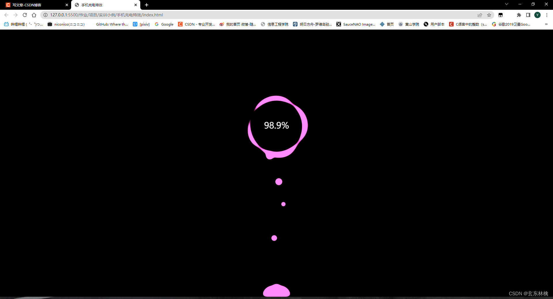
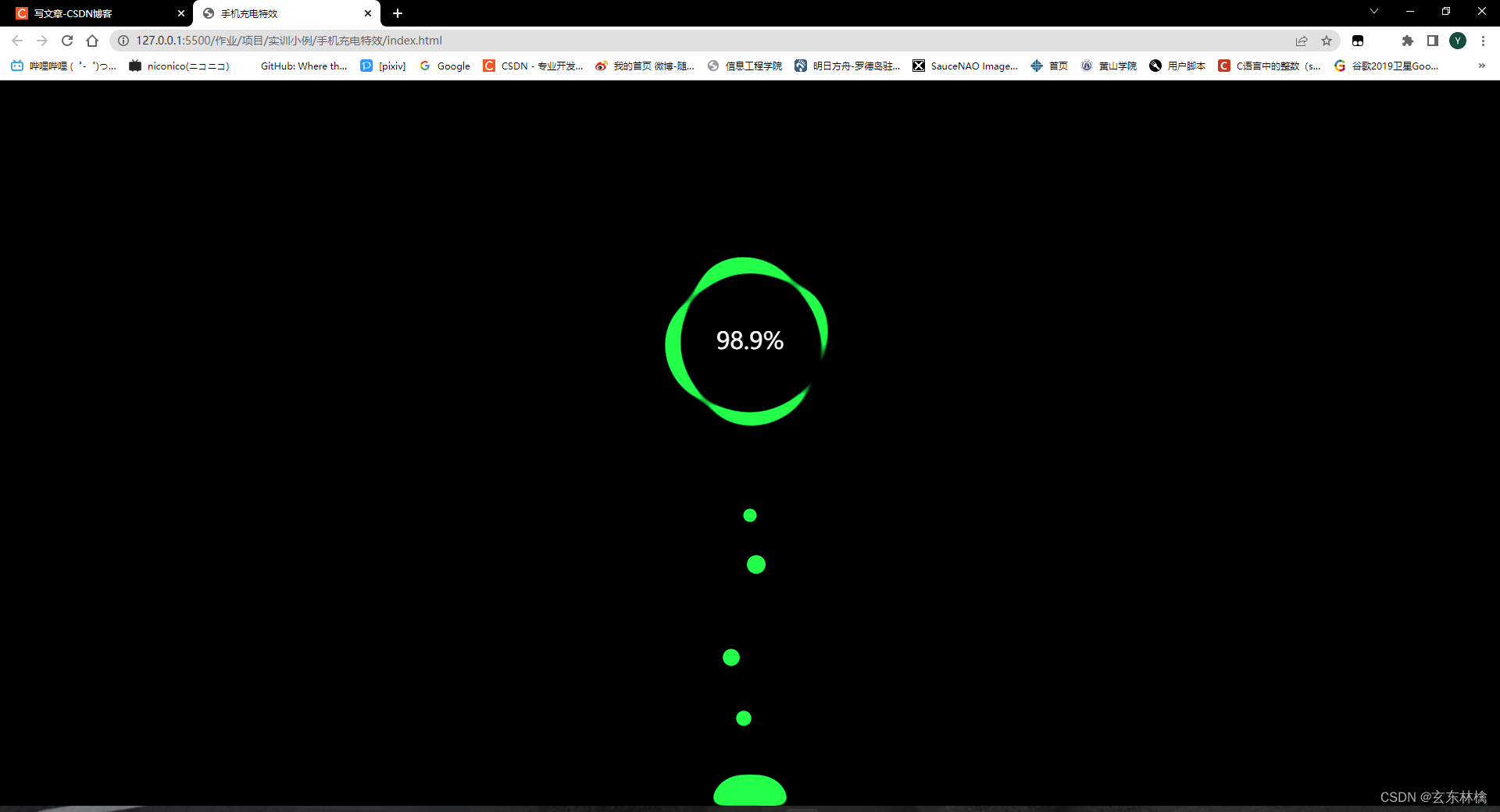
HTML、CSS——制作手机充电特效
尽管前端学习的第一阶段已经结束,接下了要全速开启js,vue,react阶段,练习CSS的次数必然会减少,现在还是能多练一点就多练一点
今天带来是是用CSS制作手机充电特效,用到了动画——animation

首先确定结构
见图
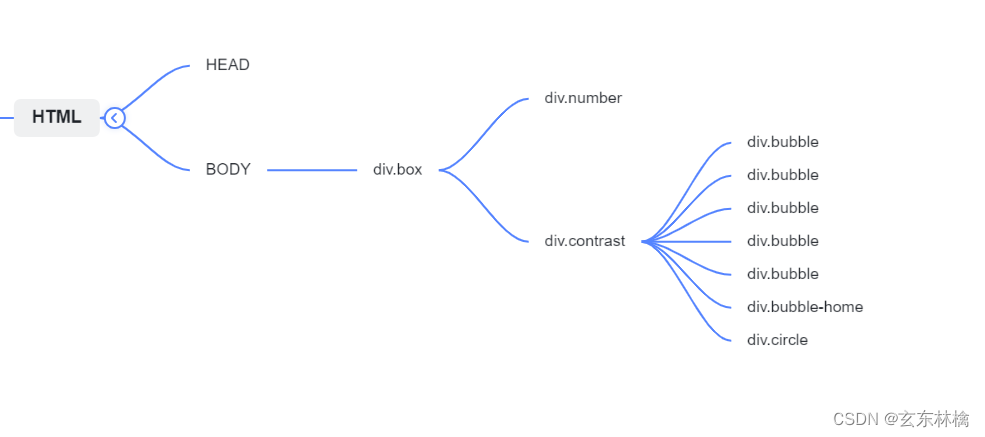
在一个box盒子里创建两个小盒子,一个用来显示数字,一个用来创建其他特效元素
HTML
<!DOCTYPE html>
<html lang="en">

<head>
    <meta charset="UTF-8">
    <meta http-equiv="X-UA-Compatible" content="IE=edge">
    <meta name="viewport" content="width=device-width, initial-scale=1.0">
    <title>手机充电特效</title>
    <link rel="stylesheet" href="./index.css">
</head>

<body>
    <div class="box">
        <div class="number">98.9%</div>
        <div class="contrast">
            <div class="bubble"></div>
            <div class="bubble"></div>
            <div class="bubble"></div>
            <div class="bubble"></div>
            <div class="bubble"></div>
            <div class="bubble-home"></div>
            <div class="circle"></div>
        </div>
    </div>
</body>

</html>
CSS
* {
    margin: 0;
    padding: 0;
}

body {
    height: 100vh;
    background: #000;
}

.box {
    width: 800px;
    height: 100%;
    margin: 0 auto;
    /* 相对定位 */
    position: relative;
}

/* 充电百分百的文字 */
.number {
    color: #fff;
    position: absolute;
    z-index: 1;
    width: 200px;
    height: 200px;
    line-height: 200px;
    text-align: center;
    font-size: 30px;
    top: 25%;
    left: 50%;
    margin-left: -100px;
}

/* 泡泡 */
.contrast {
    width: 100%;
    height: 100%;
    background-color: #000;
    position: relative;
    /* 设置对比度 */
    filter: contrast(15);

    /* 动画 */
    animation: hueRotate 5s linear infinite;
}

@keyframes hueRotate {
    0% {
        /*contrast是设置对比度  huerotate是设置颜色滤镜 通过设置度数来改变颜色  */
        filter: contrast(15) hue-rotate(0);
    }

    100% {
        filter: contrast(15) hue-rotate(360deg);
    }
}

.circle {
    width: 300px;
    height: 300px;
    position: absolute;
    top: 20%;
    left: 50%;
    margin-left: -150px;
    /* 设置模糊度,配合上面的 contrast 可以产生粘滞的效果*/
    filter: blur(8px);

    animation: circleRotate 5s linear infinite;
}

.circle::before {
    content: '';
    width: 200px;
    height: 200px;
    background-color: cyan;
    position: absolute;
    top: 50%;
    left: 50%;
    transform: translate(-50%, -50%);
    border-radius: 42% 38% 63% 49% / 45%;
}

/* 中心圈的黑色 */
.circle::after {
    content: '';
    width: 178px;
    height: 178px;
    background-color: #000;
    position: absolute;
    top: 50%;
    left: 50%;
    transform: translate(-50%, -50%);
    border-radius: 50%;
}

/* 圆的旋转动画 */
@keyframes circleRotate {
    0%{
        transform: rotate(0);
    }
    100%{
        transform: rotate(360deg);
    }
}
/* 下面泡泡群 */
.bubble-home {
    width: 100px;
    height: 40px;
    background-color: cyan;
    position: absolute;
    left: 50%;
    bottom: 0;
    margin-left: -50px;
    border-radius: 100px 100px 0 0;
    /* 模糊 */
    filter: blur(8px);
}

.bubble {
    width: 20px;
    height: 20px;
    background: cyan;
    border-radius: 100%;
    position: absolute;
    left: 50%;
    bottom: 0;
    transform: translateX(-50%);
    z-index: 2;
    filter: blur(5px);
    /* 动画 */
    animation: bubbleUp 5s ease-in-out infinite;
}

.bubble:nth-child(1) {
    width: 20px;
    height: 20px;
    left: 50%;
    animation-duration: 5s;
    animation-delay: 1s;
}

.bubble:nth-child(2) {
    width: 22px;
    height: 22px;
    left: 49%;
    animation-duration: 4s;
    animation-delay: 2s;
}

.bubble:nth-child(3) {
    width: 24px;
    height: 24px;
    left: 47%;
    animation-duration: 3s;
    animation-delay: 3s;
}

.bubble:nth-child(4) {
    width: 18px;
    height: 18px;
    left: 53%;
    animation-duration: 3s;
    animation-delay: 4s;
}

.bubble:nth-child(5) {
    width: 26px;
    height: 26px;
    left: 51%;
    animation-duration: 4s;
    animation-delay: 5s;
}

@keyframes bubbleUp {
    0% {
        bottom: 0;
    }

    100% {
        bottom: calc(80% - 260px);
    }
}


 738
738


 被折叠的 条评论
为什么被折叠?
被折叠的 条评论
为什么被折叠?
 到【灌水乐园】发言


