


| Date | Author | Version | Note |
|---|---|---|---|
| 2024.03.03 | Dog Tao | V1.0 | Release the note. |
文章目录
A Brief Introduction of the Violin Plot and Box Plot
Box Plot
A Box Plot, also known as a Box-and-Whisker Plot, provides a visual summary of a data set’s central tendency, variability, and skewness. The “box” represents the interquartile range (IQR) where the middle 50% of data points lie, with a line inside the box indicating the median value. The “whiskers” extend from the box to show the range of the data, typically to 1.5 * IQR beyond the quartiles, though this can vary. Data points outside of the whiskers are often considered outliers.
Violin Plot
A Violin Plot combines features of the Box Plot with a kernel density plot, which shows the distribution shape of the data. The width of the violin at different values indicates the kernel density estimation of the data at that value, providing a deeper insight into the distribution of the data, including multimodality (multiple peaks). It includes a marker for the median of the data and often includes a box plot inside the violin.
Histogram with Error Bar
A Histogram is a graphical representation of the distribution of numerical data, where the data is divided into bins, and the frequency of data points within each bin is depicted. An Error Bar can be added to a histogram to represent the variability of the data. The error bars typically represent the standard deviation, standard error, or confidence interval for the data.
Comparison
-
Violin Plot: This plot provides a visual summary of the data distribution along with its probability density. The width of the plot at different values indicates the density of the data at that point, showing where the data is more concentrated.
-
Box Plot: This plot shows the median (central line), interquartile range (edges of the box), and potential outliers (dots outside the ‘whiskers’). It’s useful for identifying the central tendency and spread of the data, as well as outliers.
-
Histogram with Error Bar: The histogram shows the frequency distribution of the data across different bins. The error bars on each bin represent the variability of the data within that bin, using the standard error of the mean to give an idea of the uncertainty around the count in each bin.
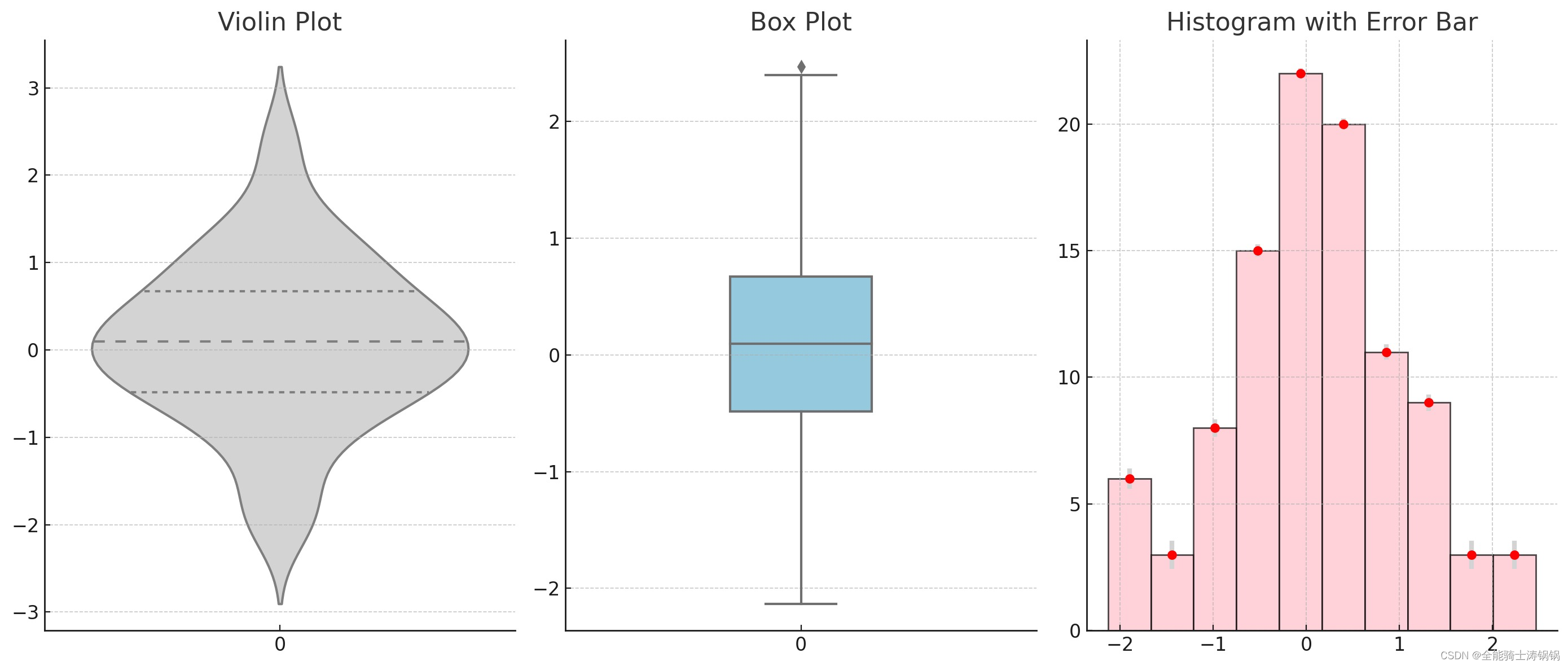
Example 1
import matplotlib.pyplot as plt
import numpy as np
import seaborn as sns

# Generating a random dataset
np.random.seed(10)
data = np.random.normal(loc=0, scale=1, size=100)

# Setting up the matplotlib figure
plt.figure(figsize=(14, 6))

# Creating a subplot for the Violin Plot
plt.subplot(1, 3, 1)
sns.violinplot(data=data, inner="quartile", color="lightgray")
plt.title('Violin Plot')

# Creating a subplot for the Box Plot
plt.subplot(1, 3, 2)
sns.boxplot(data=data, width=0.3, color="skyblue")
plt.title('Box Plot')

# Creating a subplot for the Histogram with Error Bar
plt.subplot(1, 3, 3)
mean = np.mean(data)
std = np.std(data)
count, bins, ignored = plt.hist(data, bins=10, color="pink", edgecolor='black', alpha=0.7)
plt.errorbar((bins[:-1] + bins[1:]) / 2, count, yerr=std / np.sqrt(count), fmt='o', color='red', ecolor='lightgray', elinewidth=3, capsize=0)
plt.title('Histogram with Error Bar')

plt.tight_layout()
plt.show()
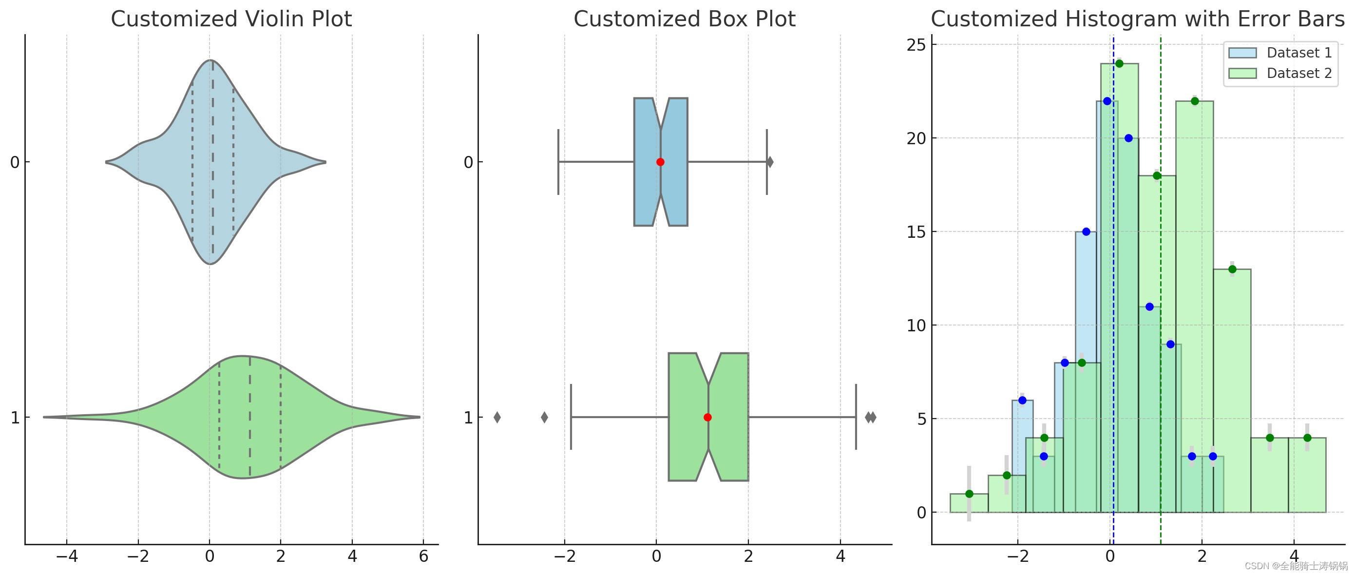
Example 2
# Generating two random datasets for comparison
np.random.seed(10)
data1 = np.random.normal(loc=0, scale=1, size=100)  # Dataset 1
data2 = np.random.normal(loc=1, scale=1.5, size=100)  # Dataset 2

# Setting up the matplotlib figure
plt.figure(figsize=(14, 6))

### Creating a customized Violin Plot
plt.subplot(1, 3, 1)
sns.violinplot(data=[data1, data2], inner="quartile", split=True, palette=["lightblue", "lightgreen"], orient="h")
plt.title('Customized Violin Plot')

### Creating a customized Box Plot
plt.subplot(1, 3, 2)
sns.boxplot(data=[data1, data2], width=0.5, palette=["skyblue", "lightgreen"], orient="h", showmeans=True, notch=True, meanprops={"marker":"o", "markerfacecolor":"red", "markeredgecolor":"black"})
plt.title('Customized Box Plot')

### Creating a customized Histogram with Error Bars
plt.subplot(1, 3, 3)

# Histogram for Dataset 1
count1, bins1, ignored1 = plt.hist(data1, bins=10, color="skyblue", edgecolor='black', alpha=0.5, label='Dataset 1')

# Histogram for Dataset 2
count2, bins2, ignored2 = plt.hist(data2, bins=10, color="lightgreen", edgecolor='black', alpha=0.5, label='Dataset 2')

# Error Bars for Dataset 1
std1 = np.std(data1)
plt.errorbar((bins1[:-1] + bins1[1:]) / 2, count1, yerr=std1 / np.sqrt(count1), fmt='o', color='blue', ecolor='lightgray', elinewidth=3, capsize=0)

# Error Bars for Dataset 2
std2 = np.std(data2)
plt.errorbar((bins2[:-1] + bins2[1:]) / 2, count2, yerr=std2 / np.sqrt(count2), fmt='o', color='green', ecolor='lightgray', elinewidth=3, capsize=0)

# Mean Lines and Legend
plt.axvline(np.mean(data1), color='blue', linestyle='dashed', linewidth=1)
plt.axvline(np.mean(data2), color='green', linestyle='dashed', linewidth=1)
plt.legend()

plt.title('Customized Histogram with Error Bars')

plt.tight_layout()
plt.show()


 3131
3131


 被折叠的 条评论
为什么被折叠?
被折叠的 条评论
为什么被折叠?
 到【灌水乐园】发言


