


前些天自己实现了一个自定义的ImageView,就是圆形头像里面包含文字,并且可以随机显示背景颜色的控件,详见:http://blog.csdn.net/u013606974/article/details/51900228
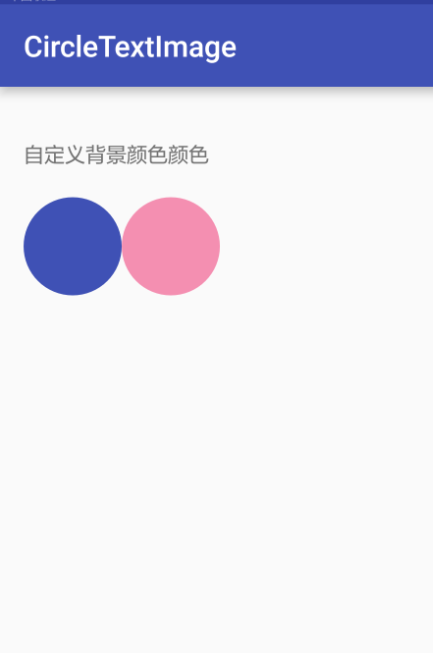
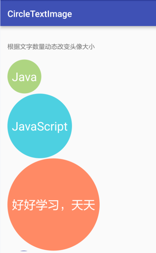
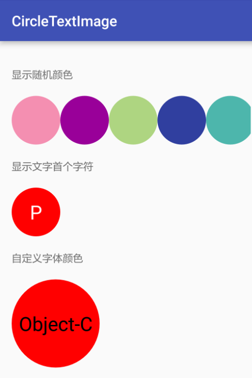
效果显示图:
今天就在这里做下总结,主要包含以下步骤:
定义一个集成ImagView的类;
定义属性attr文件;
重写继承的ImageView的部分方法。
一、首先我们定义一个类,就取名为:CircleTextImage,然后继承ImageView。
public class CircleTextImage extends ImageView {
...
}
二、我们定义一个属性配置文件,这里说下为什么要定义这个文件:
<Button
        android:id="@+id/def_bgcolor"
        android:layout_width="wrap_content"
        android:layout_marginBottom="20dp"
        android:layout_height="wrap_content"
        android:text="自定义背景颜色"/>
如上述代码,我们有时候在xml中对一个控件进行属性设置比如layout_width、text等,这里我们就要定义自己可以使用的属性值。
我在values中新建一个xml文件,取名为:attrs_circle_view,这里这个名字的命名没有太大要求,
然后我们在这个文件中写如何配置属性:
<?xml version="1.0" encoding="utf-8"?>
<resources>
    <declare-styleable name="circletextview">
        <!-- 定义背景颜色 -->
        <attr name="circle_color" format="color"/>
        <!-- 定义文字颜色 -->
        <attr name="circle_text_color" format="color"/>
        <!-- 是否使用随机背景颜色 -->
        <attr name="random_color" format="boolean"/>
        <!-- 是否截取text第一个字符作为显示值 -->
        <attr name="sub_first_character" format="boolean"/>
    </declare-styleable>
</resources>
这里定义了四个属性,因为我要自定义的这个空间就是我们可以定制这几个内容(详见注释),这边的四个属性的name就是我们控件中可以用到的属性,到时候可以这样使用:
circletextview:random_color="true"
circletextview:circle_color="@color/colorPrimary"
定义完了属性配置文件,接下来我们重写父类的部分方法,进行绘制我们的控件:
首先我们必须声明自己的构造方法,并且实现父类的构造方法:
public CircleTextImage(Context context) {
    super(context);
    init();
}

public CircleTextImage(Context context, AttributeSet attrs) {
    super(context, attrs);
    initAttr(context, attrs);
    init();
}

public CircleTextImage(Context context, AttributeSet attrs, int defStyleAttr) {
    super(context, attrs, defStyleAttr);
    initAttr(context, attrs);
    init();
}
接着我们重写这几个方法(绘制我们的控件):
@Override
protected void onMeasure(int widthMeasureSpec, int heightMeasureSpec) {
    super.onMeasure(widthMeasureSpec, heightMeasureSpec);
    int widthSpecMode = MeasureSpec.getMode(widthMeasureSpec);
    int widthSpecSize = MeasureSpec.getSize(widthMeasureSpec);
    int heightSpecMode = MeasureSpec.getMode(heightMeasureSpec);
    int heightSpecSize = MeasureSpec.getSize(heightMeasureSpec);

    if (null != text && !text.trim().equals("")) {
        int realSize = (int)paintTextForeground.measureText(text) + 60;
        if (realSize < 200) {
            realSize = 200;
        }
        if (widthSpecMode == MeasureSpec.AT_MOST && heightSpecMode == MeasureSpec.AT_MOST) {
            setMeasuredDimension(realSize, realSize);
        } else if (widthSpecMode == MeasureSpec.AT_MOST) {
            setMeasuredDimension(realSize, heightSpecSize);
        } else if (heightSpecMode == MeasureSpec.AT_MOST) {
            setMeasuredDimension(widthSpecSize, realSize);
        }
    } else {
        if (widthSpecMode == MeasureSpec.AT_MOST && heightSpecMode == MeasureSpec.AT_MOST) {
            setMeasuredDimension(200, 200);
        } else if (widthSpecMode == MeasureSpec.AT_MOST) {
            setMeasuredDimension(200, heightSpecSize);
        } else if (heightSpecMode == MeasureSpec.AT_MOST) {
            setMeasuredDimension(widthSpecSize, 200);
        }
    }

}

@Override
protected void onDraw(Canvas canvas) {
    super.onDraw(canvas);
    //get padding
    final int paddingLeft = getPaddingLeft();
    final int paddingRight = getPaddingRight();
    final int paddingTop = getPaddingTop();
    final int paddingBottom = getPaddingBottom();
    //deal padding
    int width = getWidth() - paddingLeft - paddingRight;
    int height = getHeight() - paddingTop - paddingBottom;
    int radius = Math.min(width, height) / 2;

    if (null != text && !text.trim().equals("")) {
        drawText(canvas);
    } else {
        canvas.drawCircle(width / 2, height / 2, radius, mPaint);
    }

}


@Override
protected void onSizeChanged(int w, int h, int oldw, int oldh) {
    super.onSizeChanged(w, h, oldw, oldh);
    int paddingLeft = getPaddingLeft();
    int paddingTop = getPaddingTop();
    int contentWidth = w - paddingLeft - getPaddingRight();
    int contentHeight = h - paddingTop - getPaddingBottom();
    radius = contentWidth < contentHeight ? contentWidth / 2 : contentHeight / 2;
    centerX = paddingLeft + radius;
    centerY = paddingTop + radius;
    refreshTextSizeConfig();

}
这边我们先看下omMeasure方法:
因为我要做自适应文字显示控件大小,所以这边我写了一个根据文字大的大小做了控件的更改:
int realSize = (int)paintTextForeground.measureText(text) + 60;
而定义的最小大小为200,text是我们要传入的文字,以下会介绍如何在imaView中绘制text。
之后就是onDraw方法:
这边主要是绘制圆形的部分,我们先判断一下,如果有文字传入,我们也要绘制文字部分:
private void drawText(Canvas canvas) {
        paintTextBackground.setColor(mCircleTextColor);
        canvas.drawCircle(centerX, centerY, radius, mPaint);
        canvas.drawText(text, 0, text.length(), centerX, centerY + Math.abs(fontMetrics.top + fontMetrics.bottom) / 2, paintTextForeground);

}
onSizeChanged该方法就是控件大小改变的时候调用的,相关的方法:
private void refreshTextSizeConfig() {
    paintTextForeground.setTextSize(textSizeRatio * 2 * 100);
    fontMetrics = paintTextForeground.getFontMetrics();

}
好了,讲了几个关键的方法,接下来我们完善以下该类。
定义相关属性:
private int mCircleColor = Color.RED;//Default background color
private int mCircleTextColor = Color.WHITE;//text color
private Paint mPaint = new Paint(Paint.ANTI_ALIAS_FLAG);
private boolean useRandomBackgroundColor = false;//use random background color
private boolean mSubFirstCharacter = false;

private String text;
private Paint paintTextForeground;
private Paint paintTextBackground;
private static final float DEFAULT_TEXT_SIZE_RATIO = 0.4f;
private float textSizeRatio = DEFAULT_TEXT_SIZE_RATIO;
private Paint.FontMetrics fontMetrics;
private int radius;
private int centerX;
private int centerY;
其次我们在构造函数中初始化:
private void initAttr(Context context, AttributeSet attrs) {
        if (attrs == null) {
            return;
        }
        TypedArray typedArray = context.obtainStyledAttributes(attrs, R.styleable.circletextview);
        mCircleColor = typedArray.getColor(R.styleable.circletextview_circle_color, Color.RED);
        mCircleTextColor = typedArray.getColor(R.styleable.circletextview_circle_text_color, Color.WHITE);
        useRandomBackgroundColor = typedArray.getBoolean(R.styleable.circletextview_random_color, false);
        mSubFirstCharacter = typedArray.getBoolean(R.styleable.circletextview_sub_first_character, false);

    typedArray.recycle();
  }

  private void init() {

    paintTextForeground = new Paint();
    paintTextForeground.setColor(mCircleTextColor);
    paintTextForeground.setAntiAlias(true);
    paintTextForeground.setTextAlign(Paint.Align.CENTER);

    paintTextBackground = new Paint();
    paintTextBackground.setColor(mCircleTextColor);
    paintTextBackground.setAntiAlias(true);
    paintTextBackground.setStyle(Paint.Style.FILL);

    if (useRandomBackgroundColor) {
        mPaint.setColor(Color.parseColor(CircleTextImageUtil.getRandomColor()));
    } else {
        mPaint.setColor(mCircleColor);
    }

  }
initAttr方法就是我们班读取attr属性配置文件。
自此,我们的类就定义完了,我们就可以按如下使用:
<circletextimage.viviant.com.circletextimagelib.view.CircleTextImage
     android:layout_width="wrap_content"
      android:layout_height="wrap_content"
      circletextview:circle_color="@color/colorPrimary"/>

<circletextimage.viviant.com.circletextimagelib.view.CircleTextImage
      android:layout_width="wrap_content"
      android:layout_height="wrap_content"
      circletextview:random_color="true"/>
使用自定义文字Java代码:
CircleTextImage cti6 = (CircleTextImage) findViewById(R.id.cti6);
cti6.setText4CircleImage("Object-C");详细介绍使用方法及源码下载可见:https://github.com/viviant1224/CircleTextImage
喜欢的朋友可以star。


 8041
8041

 被折叠的 条评论
为什么被折叠?
被折叠的 条评论
为什么被折叠?
 到【灌水乐园】发言


