


本篇文章涉及内容包括:
canvas:
- translate
- rotate
- scale
- transform(a,b,c,d,e,f),矩阵方法,拓展到SVG和CSS3(代码未提交,待续)
- setTransform,transform的区别
css3:
- 3D家居---css transform属性的执行次序
canvas使用的基本思路:
1.创建JAVASCRIPT对象,初始化基本配置
2.通过requestAnimationFrame来清空画布,绘制画布
3.通过修改基础配置来更新数据
cavnas里面绘制的物体没有DOM那样可以提供属性访问,需要提前创建javascript对象来保存这些属性,碰撞检测的时候访问的也是我们新建的JAVASCRIP对象(这句话感觉有点问题~~)
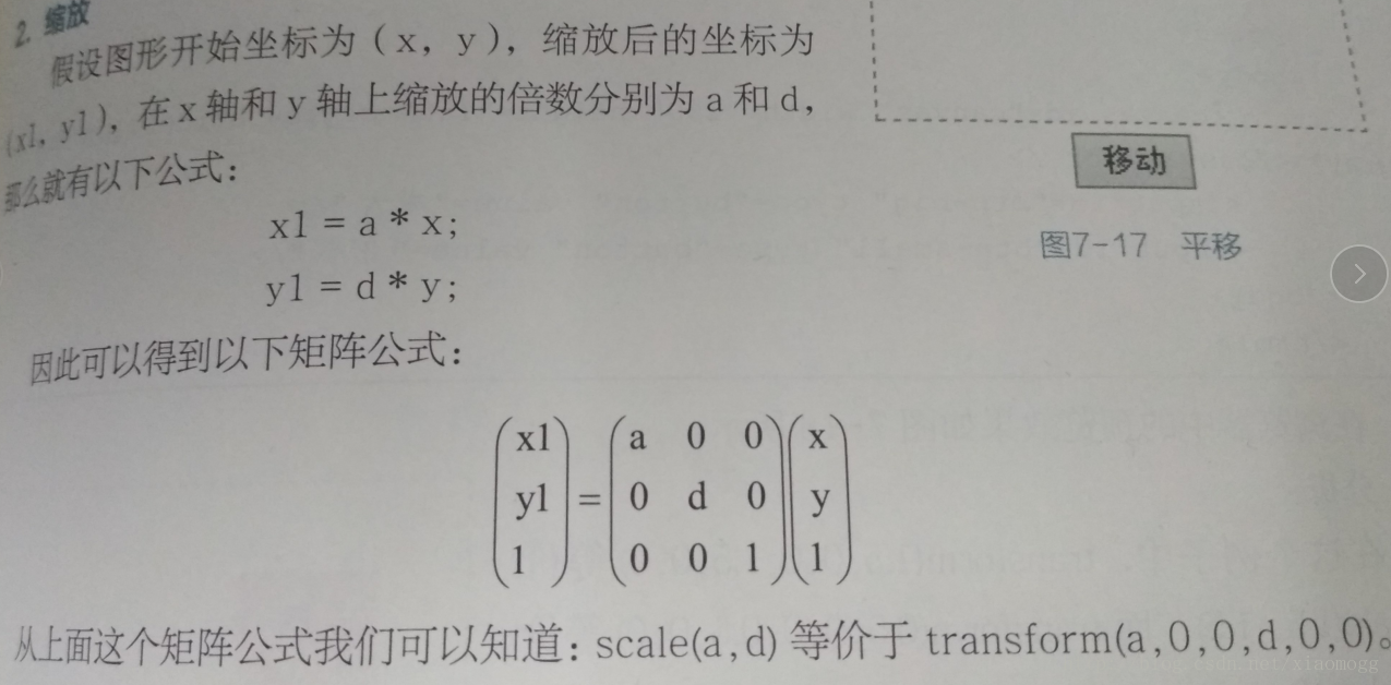
平移:
<!DOCTYPE html>
<html lang="en">
<head>
	<meta charset="UTF-8">
	<title>Document</title>
</head>
<body>
	<canvas id="canvas"></canvas>
	<script>
		function $$(id){
			return document.getElementById(id);
		}
		window.οnlοad=function(){
			var cnv=$$("canvas");
			console.log(cnv)
			var ct=cnv.getContext("2d");
			//绘制矩形
			ct.fillStyle="red";
			ct.fillRect(30,30,50,50);
			//位移、
			ct.translate(50,50);
			ct.fillRect(30,30,50,50);

		}
	</script>
</body>
</html>
更新位移:
<!DOCTYPE html>
<html lang="en">

<head>
    <meta charset="UTF-8">
    <title>Document</title>
</head>

<body>
    <div id="btn">位移</div>
   <canvas id="canvas" width="2000" height="1200"></canvas>
    <script>
    function $$(id) {
        return document.getElementById(id);
    }
    window.onload = function() {
        var cnv = $$("canvas");
        console.log(cnv)
        var ct = cnv.getContext("2d");
        //绘制矩形
        ct.fillStyle = "red";
        ct.fillRect(30, 30, 50, 50);
        //位移、
        ct.translate(50, 50);
        ct.fillRect(30, 30, 50, 50);


        function move() {
            //位移、
            ct.translate(50, 50);
            ct.fillRect(30, 30, 50, 50);
        }
        $$("btn").οnclick=function(){
        	move();
        }

    }
    </script>
</body>

</html>
位移并清空:
<!DOCTYPE html>
<html lang="en">

<head>
    <meta charset="UTF-8">
    <title>Document</title>
</head>

<body>
    <div id="btn">位移</div>
   <canvas id="canvas" width="2000" height="1200"></canvas>
    <script>
    function $$(id) {
        return document.getElementById(id);
    }
    window.onload = function() {
        var cnv = $$("canvas");
        console.log(cnv)
        var ct = cnv.getContext("2d");
        //绘制矩形
        ct.fillStyle = "red";
        ct.fillRect(30, 30, 50, 50);


        function move() {
            ct.clearRect(0,0,cnv.width,cnv.height);
            //位移、
            ct.translate(50, 50);
            ct.fillRect(30, 30, 50, 50);
        }
        $$("btn").οnclick=function(){
        	move();
        }

    }
    </script>
</body>

</html>
缩放:
<!DOCTYPE html>
<html lang="en">

<head>
    <meta charset="UTF-8">
    <title>Document</title>
</head>

<body>
    <div id="btn">缩放</div>
    <div id="btn2">缩小</div>
   <canvas id="canvas" width="2000" height="1200"></canvas>
    <script>
    function $$(id) {
        return document.getElementById(id);
    }
    window.onload = function() {
        var cnv = $$("canvas");
        console.log(cnv)
        var ct = cnv.getContext("2d");
        //绘制矩形
        ct.fillStyle = "red";
        ct.fillRect(30, 30, 50, 50);
        //位移、
         ct.translate(50, 50);

        //scale方法会改变一下几点
        /*
           左上角坐标
           宽度和高度
           线条宽度
        */
        function scale(p) {
            //位移、
            ct.fillStyle = "red";
            ct.scale(p,p)
            ct.fillRect(30, 30, 50, 50);
        }
        function scale2(p) {
            //位移、
            ct.fillStyle = "blue";
            ct.scale(p,p)
            ct.fillRect(30, 30, 50, 50);
        }
        $$("btn").οnclick=function(){
        	scale(1.5,1.5);
        }
        $$("btn2").οnclick=function(){
            scale2(0.8,0.8);
        }

    }
    </script>
</body>

</html>
旋转:
<!DOCTYPE html>
<html lang="en">

<head>
    <meta charset="UTF-8">
    <title>Document</title>
</head>

<body>
	<button id="btn">rotate</button>
   <canvas id="canvas" width="2000" height="1200"></canvas>
    <script>
    function $$(id) {
        return document.getElementById(id);
    }
    window.onload = function() {
        var cnv = $$("canvas");
        var ct = cnv.getContext("2d");
        ct.fillStyle = "red";
        ct.fillRect(30, 30, 50, 50);
        //是围绕选点坐标旋转的
        $$("btn").onclick = function() {
            ct.rotate(-10 * Math.PI / 180); //逆时针旋转180度
            ct.fillStyle = "blue";
            ct.fillRect(30, 30, 50, 50);
        }
    }
    </script>
</body>

</html>
旋转中心修改:
<!DOCTYPE html>
<html lang="en">

<head>
    <meta charset="UTF-8">
    <title>Document</title>
</head>

<body>
    <button id="btn">rotate</button>
    <canvas id="canvas" width="500" height="500"></canvas>
    <script>
    function $$(id) {
        return document.getElementById(id);
    }
    window.onload = function() {
        var cnv = $$("canvas");
        var ct = cnv.getContext("2d");
        ct.fillStyle = "red";
        ct.fillRect(30, 30, 50, 50);
        // //是围绕选点坐标旋转的
        // $$("btn").onclick = function() {
        //     ct.rotate(-10 * Math.PI / 180); //逆时针旋转180度
        //     ct.fillStyle = "blue";
        //     ct.fillRect(30, 30, 50, 50);
        // }
        var i = 0;
        var w = 100;
        var h = 100;
        setInterval(function() {
            i++;
            ct.clearRect(0, 0, cnv.width, cnv.height);
            ct.save(); //保存当前的状态

            ct.translate(cnv.width / 2, cnv.height / 2); //位移到中心
            ct.rotate(Math.PI * (i / 100)); //累计旋转

            ct.fillStyle = "green";
            ct.fillRect(-w / 2, -h / 2, w, h);
            ct.restore();

        }, 200)
    }
    </script>
</body>

</html>
矩阵:
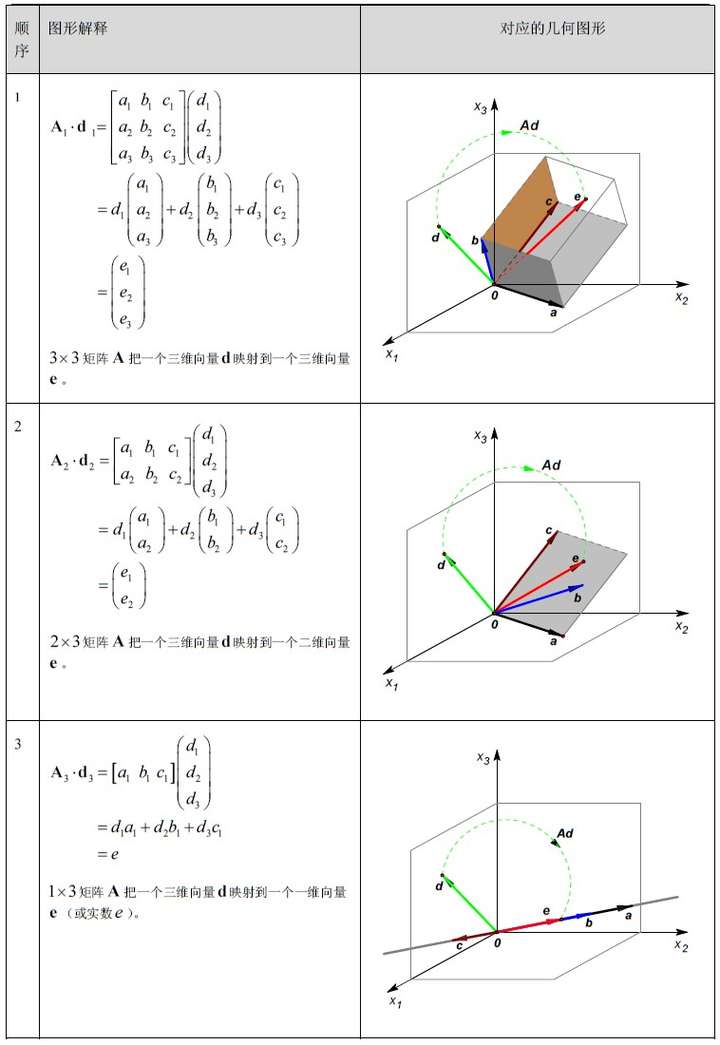
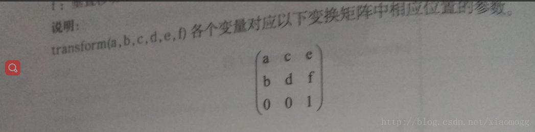
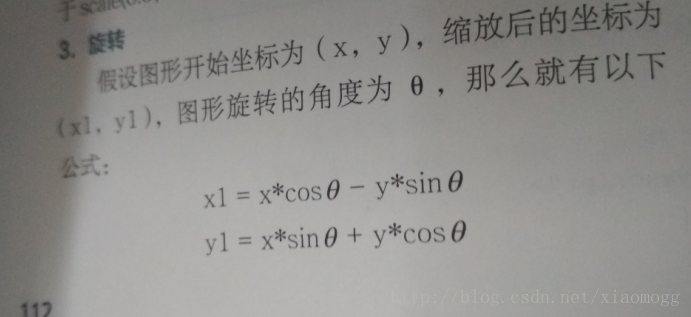
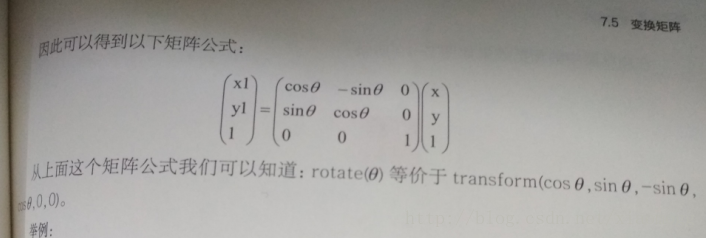
看不懂这个图
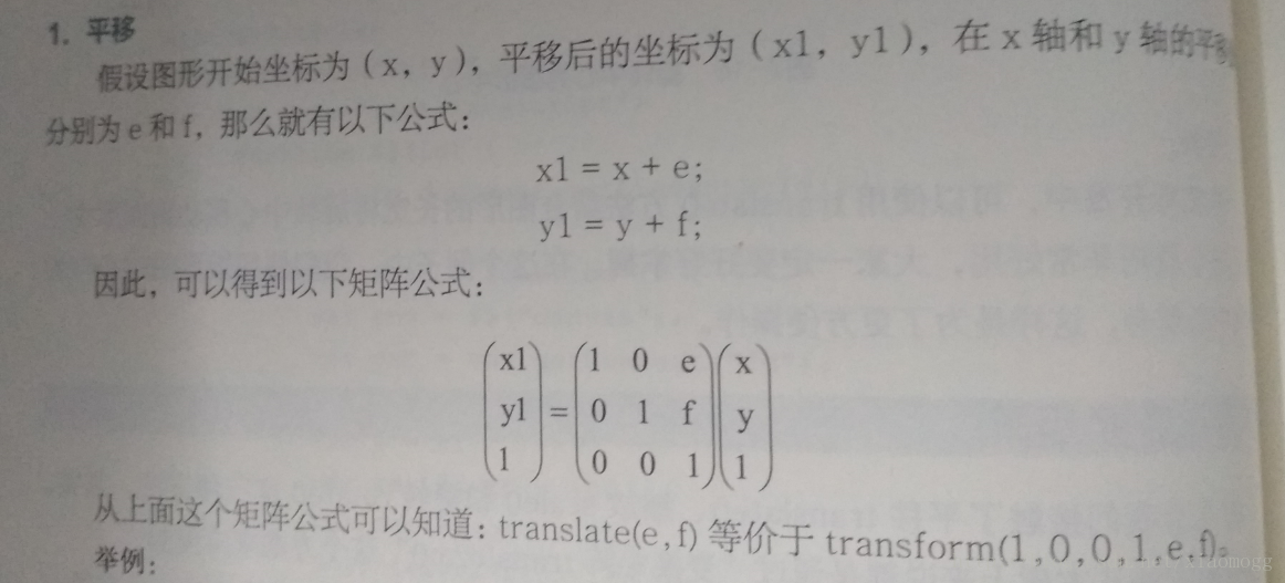
transform(a,b,c,d,e,f)对应的矩阵中的相应位置为:
1位移:
<!DOCTYPE html>
<html lang="en">
<head>
	<meta charset="UTF-8">
	<title>Document</title>
</head>
<body>
	<button id="btn">矩阵</button>
<canvas id="canvas" width="2000" height="1200"></canvas>
	<script>
		function $$(id){
			return document.getElementById(id);
		}
		window.οnlοad=function(){
			var cnv=$$("canvas");
			var ct=cnv.getContext("2d");
			//translate(10,10)
			ct.fillStyle="red";
			ct.fillRect(30,30,50,50);
			$$("btn").οnclick=function(){
				ct.clearRect(0,0,cnv.width,cnv.height);
				ct.transform(1,0,0,1,10,10);
				ct.fillRect(30,30,50,50);
			}
		}
	</script>
</body>
</html>
2.缩放:
<!DOCTYPE html>
<html lang="en">
<head>
	<meta charset="UTF-8">
	<title>Document</title>
</head>
<body>
	<button id="btn">矩阵放大</button>
	<button id="btn2">矩阵缩小</button>
<canvas id="canvas" width="2000" height="1200"></canvas>
	<script>
		function $$(id){
			return document.getElementById(id);
		}
		window.οnlοad=function(){
			var cnv=$$("canvas");
			var ct=cnv.getContext("2d");
			//translate(10,10)
			ct.fillStyle="red";
			ct.fillRect(30,30,50,50);
			$$("btn").οnclick=function(){
				ct.clearRect(0,0,cnv.width,cnv.height);
				ct.transform(1.5,0,0,1.5,0,0);
				ct.fillRect(30,30,50,50);
			}
			$$("btn2").οnclick=function(){
				ct.clearRect(0,0,cnv.width,cnv.height);
				ct.transform(0.5,0,0,0.5,0,0);
				ct.fillRect(30,30,50,50);
			}
		}
	</script>
</body>
</html>
3.旋转:
<!DOCTYPE html>
<html lang="en">
<head>
	<meta charset="UTF-8">
	<title>Document</title>
</head>
<body>
	<button id="btn">rotate</button>

<canvas id="canvas" width="2000" height="1200"></canvas>
	<script>
		function $$(id){
			return document.getElementById(id);
		}
		window.οnlοad=function(){
			var cnv=$$("canvas");
			var ct=cnv.getContext("2d");
			//translate(10,10)
			ct.fillStyle="red";
			ct.fillRect(30,30,50,50);
			$$("btn").οnclick=function(){
				ct.clearRect(0,0,cnv.width,cnv.height);
				var angle=-30*Math.PI/180;

				ct.transform(Math.cos(angle),Math.sin(angle),-Math.sin(angle),Math.cos(angle),0,0);
				ct.fillRect(30,30,50,50);
			}

		}
	</script>
</body>
</html>translate(e,f)对应transform(1,0,0,1,e,f);
scale(a,d)对应transform(a,0,0,d,0,0);
rotate(deg)对应transfom(COS(deg),sin(deg),-sin(deg),0,0);
SVG,CSS3规则同样
CSS3矩阵在线demo
实际开发并不推荐css3直接用矩阵,因为有有些一些参数是重叠的,需要计算,比较麻烦,只需要牢记css3 transform的属性是从右往左边执行的和会使用对应的"CSS函数"即可,例如transform:scale(0.5) translateX(10PX);是先执行位移然后再缩放的,在某种场景下这种顺序尤为重要
例如,3D家居在线demo 就是典型例子:
其实他就是个简单的3D盒子,transform: rotateY(0deg) translateZ(-512px);和普通3D盒子不同的地方在于先translateZ之后再rotateY
<!DOCTYPE html>
<html lang="en">
<head>
<meta charset="UTF-8">
<meta name="viewport" content="width=device-width,user-scalable=no" />
<title>Document</title>
<style type="text/css">
body {
	margin: 0;
}
body,
html {
	height: 100%;
}
#box {
	width: 100%;
	height: 100%;
	border: 1px solid #000;
	-webkit-perspective: 300px;
	perspective: 300px;
	overflow: hidden;
}
#z {
	position: absolute;
	left: 0;
	right: 0;
	top: 0;
	bottom: 0;
	-webkit-transform-style: preserve-3d;
	transform-style: preserve-3d;
	-webkit-transform: translateZ(200px);
	transform: translateZ(200px);
}
#div  {
	position: absolute;
	left: 50%;
	top: 50%;
	margin: -512px 0 0 -512px;
	width: 1024px;
	height: 1024px;
	color: #fff;
	-webkit-transform-style: preserve-3d;
	transform-style: preserve-3d;
	transition: 20s;
	-webkit-transform: rotateY(0deg);
	transform: rotateY(0deg);
}
#div span {
	position: absolute;
	left: 0;
	top: 0;
	width: 100%;
	height: 100%;
	transition: 5s;
	-webkit-backface-visibility: hidden;
	backface-visibility: hidden;
}
#div span:nth-of-type(1){
	background: url(http://7xscbt.com1.z0.glb.clouddn.com/neg-x.png) no-repeat;
	background-size: 100% 100%;
	-webkit-transform: rotateY(0deg) translateZ(-512px);
	transform: rotateY(0deg) translateZ(-512px);
}
#div span:nth-of-type(2){
	background: url(http://7xscbt.com1.z0.glb.clouddn.com/pos-z.png) no-repeat;
	background-size: 100% 100%;
	-webkit-transform: rotateY(-90deg) translateZ(-512px);
	transform: rotateY(-90deg) translateZ(-512px);
}
#div span:nth-of-type(3){
	background: url(http://7xscbt.com1.z0.glb.clouddn.com/pos-x.png) no-repeat;
	background-size: 100% 100%;
	-webkit-transform: rotateY(-180deg) translateZ(-512px);
	transform: rotateY(-180deg) translateZ(-512px);
}
#div span:nth-of-type(4){
	background: url(http://7xscbt.com1.z0.glb.clouddn.com/neg-z.png) no-repeat;
	background-size: 100% 100%;
	-webkit-transform: rotateY(-270deg) translateZ(-512px);
	transform: rotateY(-270deg) translateZ(-512px);
}
#div span:nth-of-type(5){
	background: url(http://7xscbt.com1.z0.glb.clouddn.com/pos-y.png) no-repeat;
	background-size: 100% 100%;
	-webkit-transform: rotateX(-90deg) translateZ(-512px);
	transform: rotateX(-90deg) translateZ(-512px);
}
#div span:nth-of-type(6){
	background: url(http://7xscbt.com1.z0.glb.clouddn.com/neg-y.png) no-repeat;
	background-size: 100% 100%;
	-webkit-transform: rotateX(90deg) translateZ(-512px);
	transform: rotateX(90deg) translateZ(-512px);
}
/*
transform-origin 变换原点 center center;
	关键字: top bottom center left right;
	具体的长度单位(em,rem,px...)

会受到原点影响的变换有:rotate、skew、scale

隐藏背面:  什么是背面;
背面即和父级角度相对的面

*/
</style>
<script type="text/javascript">
window.onload = function(){
	var div = document.querySelector('#div');
	div.style.WebkitTransform = div.style.transform = "rotateY(360deg)";
};
</script>
</head>
<body>
<div id="box">
	<div id="z">
		<div id="div">
			<span>前</span>
			<span>右</span>
			<span>后</span>
			<span>左</span>
			<span>上</span>
			<span>下</span>
		</div>
	</div>
</div>
</body>
</html>更多CSS3矩阵对应css3变形函数参考:http://www.zhangxinxu.com/wordpress/2012/06/css3-transform-matrix-%E7%9F%A9%E9%98%B5/comment-page-2/
<!DOCTYPE html>
<html lang="en">

<head>
    <meta charset="UTF-8">
    <title>Document</title>
    <style>
    * {
        margin: 0;
        padding: 0;
    }

    body {
        position: relative;
        min-height: 99999px;
    }

    div {
        position: relative;
        z-index: 999;
        color: red;
        font-weight: 700;
    }

    .div {
        width: 200px;
        height: 200px;
        background: green;
    }

    #div1 {
        transform: matrix(1, 0, 0, 1, 0, 100);
    }

    #div2 {
        transform: matrix(1, 0, 0, 1, 100, 0);
    }

    #div3 {
        transform: matrix(0.5, 0, 0, 0.8, 0, 0);
    }
    #div4 {
        transform: matrix(0.52, 0.85, -0.85, 0.52, 0,0);
    }
    </style>
</head>

<body>
    <div style="position: relative;width:600px;">
        <!-- translateY -->
        <div style="position: absolute;left:20px;top:0;width:1px;height:600px;background: red;"></div>
        <div style="position: absolute;left:20px;top:20px;width:600px;height:1px;background: red;"></div>
        <div style="height:20px;background:green;">它本来应该接触到我的</div>
        <div id="div1" class="div" style="background:green;">translateY(100)</div>
    </div>
    <div style="position: absolute;left:20;top:400px;width:400px;">
        <!-- translateX -->
        <div style="position: absolute;left:20px;top:0;width:1px;height:600px;background: red;"></div>
        <div style="position: absolute;left:20px;top:0px;width:600px;height:1px;background: red;"></div>
        <div style="height:20px;background:blue;position: absolute;left:0;top:0;height:400px;width:20px;">它本来应该接触到我的</div>
        <div id="div2" class="div" style="background:blue;">translateX(100)</div>
    </div>
    <div style="position: absolute;left:400px;top:20px;width:200px;height: 200px">
        <!-- scale(0.5,0.8) -->
        <div style="position: absolute;border:10px solid yellow;width:200px;height: 200px;z-index:99999;"></div>
        <div id="div3" class="div" style="background:yellow;border:10px solid yellow;">scale(0.5,0.8)</div>
    </div>
    <div style="position: absolute;left:400px;top:400px;width:200px;height: 200px">
        <!-- rotate(0.5,0.8) -->
        <div style="position: absolute;border:10px solid yellow;width:200px;height: 200px;z-index:99999;"></div>
        <div id="div4" class="div" style="background:yellow;width: 100px;height:100px;left:50px;top:50px;">scale(0.5,0.8)</div>
    </div>
</body>

</html>
setTransform和transform的区别:
setTransform每次都会重置后再操作,transform会累加
<!DOCTYPE html>
<html lang="en">

<head>
    <meta charset="UTF-8">
    <title>Document</title>
</head>

<body>
    <button id="btn">rotate</button>
    <canvas id="canvas" width="2000" height="1200"></canvas>
    <script>
    function $$(id) {
        return document.getElementById(id);
    }
    window.onload = function() {
        var cnv = $$("canvas");
        var ct = cnv.getContext("2d");
        //translate(10,10)
        ct.fillStyle = "red";

        //$$("btn").οnclick=function(){
        ct.clearRect(0, 0, cnv.width, cnv.height);
		//==============setTransform(每次设置后都不会影响后面的布局)
        ct.fillStyle = "yellow";
        ct.setTransform(1, 0.5, -0.5, 1, 30, 10);
        ct.fillRect(30, 30, 50, 50);

        ct.fillStyle = "blue";
        ct.setTransform(1, 0.5, -0.5, 1, 30, 10);
        ct.fillRect(30, 30, 50, 50);

        ct.fillStyle = "green";
        ct.setTransform(1, 0.5, -0.5, 1, 30, 10);
        ct.fillRect(30, 30, 50, 50);

		//==============transform
        ct.fillStyle = "yellow";
        ct.transform(1, 0.5, -0.5, 1, 30, 10);
        ct.fillRect(280, 30, 50, 50);

        ct.fillStyle = "blue";
        ct.transform(1, 0.5, -0.5, 1, 30, 10);
        ct.fillRect(280, 30, 50, 50);

        ct.fillStyle = "green";
        ct.transform(1, 0.5, -0.5, 1, 30, 10);
        ct.fillRect(280, 30, 50, 50);
        //}

    }
    </script>
</body>

</html>
translate,scale,rotate三个个效果配合使用,实现绚丽的螺旋效果:
<!DOCTYPE html>
<html lang="en">

<head>
    <meta charset="UTF-8">
    <title>Document</title>
</head>

<body>
    <button id="btn">rotate</button>
    <canvas id="canvas" width="2000" height="1200"></canvas>
    <script>
    function $$(id) {
        return document.getElementById(id);
    }
    window.onload = function() {
        var cnv = $$("canvas");
        var ct = cnv.getContext("2d");
        //translate(10,10)
        ct.fillStyle = "red";

        //$$("btn").οnclick=function(){
        ct.clearRect(0, 0, cnv.width, cnv.height);
		//==============setTransform(每次设置后都不会影响后面的布局)
        ct.fillStyle = "yellow";
        ct.setTransform(1, 0.5, -0.5, 1, 30, 10);
        ct.fillRect(30, 30, 50, 50);

        ct.fillStyle = "blue";
        ct.setTransform(1, 0.5, -0.5, 1, 30, 10);
        ct.fillRect(30, 30, 50, 50);

        ct.fillStyle = "green";
        ct.setTransform(1, 0.5, -0.5, 1, 30, 10);
        ct.fillRect(30, 30, 50, 50);

		//==============transform
        ct.fillStyle = "yellow";
        ct.transform(1, 0.5, -0.5, 1, 30, 10);
        ct.fillRect(280, 30, 50, 50);

        ct.fillStyle = "blue";
        ct.transform(1, 0.5, -0.5, 1, 30, 10);
        ct.fillRect(280, 30, 50, 50);

        ct.fillStyle = "green";
        ct.transform(1, 0.5, -0.5, 1, 30, 10);
        ct.fillRect(280, 30, 50, 50);
        //}

    }
    </script>
</body>

</html>


 2119
2119


 被折叠的 条评论
为什么被折叠?
被折叠的 条评论
为什么被折叠?
 到【灌水乐园】发言


