


Android Design Support Library使用详解
Google在2015的IO大会上,给我们带来了更加详细的Material Design设计规范,同时,也给我们带来了全新的Android Design Support Library,在这个support库里面,Google给我们提供了更加规范的MD设计风格的控件。最重要的是,Android Design Support Library的兼容性更广,直接可以向下兼容到Android 2.2。这不得不说是一个良心之作。
使用Support Library非常简单:
添加引用即可:
<code class="hljs bash has-numbering">compile <span class="hljs-string">'com.android.support:design:22.2.0'</span></code><ul class="pre-numbering" style="display: block;"><li>1</li></ul>
下面我们来看看这些新控件的基本使用方法,我们从最简单的控件开始说起。
部分内容直接来自Android Developer Blog中的内容:
英文原文:
http://android-developers.blogspot.jp/2015/05/android-design-support-library.html
菠萝的翻译:
http://www.jcodecraeer.com/a/anzhuokaifa/developer/2015/0531/2958.html
Snackbar
Snackbar提供了一个介于Toast和AlertDialog之间轻量级控件,它可以很方便的提供消息的提示和动作反馈。
Snackbar的使用与Toast的使用基本相同:
<code class="hljs avrasm has-numbering">Snackbar<span class="hljs-preprocessor">.make</span>(view, <span class="hljs-string">"Snackbar comes out"</span>, Snackbar<span class="hljs-preprocessor">.LENGTH</span>_LONG)
                        <span class="hljs-preprocessor">.setAction</span>(<span class="hljs-string">"Action"</span>, new View<span class="hljs-preprocessor">.OnClickListener</span>() {
                            @Override
                            public void onClick(View v) {
                                Toast<span class="hljs-preprocessor">.makeText</span>(
                                        MainActivity<span class="hljs-preprocessor">.this</span>,
                                        <span class="hljs-string">"Toast comes out"</span>,
                                        Toast<span class="hljs-preprocessor">.LENGTH</span>_SHORT)<span class="hljs-preprocessor">.show</span>()<span class="hljs-comment">;</span>
                            }
                        })<span class="hljs-preprocessor">.show</span>()<span class="hljs-comment">;</span></code><ul class="pre-numbering" style="display: block;"><li>1</li><li>2</li><li>3</li><li>4</li><li>5</li><li>6</li><li>7</li><li>8</li><li>9</li><li>10</li></ul>
需要注意的是,这里我们把第一个参数作为Snackbar显示的基准元素,而设置的Action也可以设置多个。
显示的效果就类似如下:
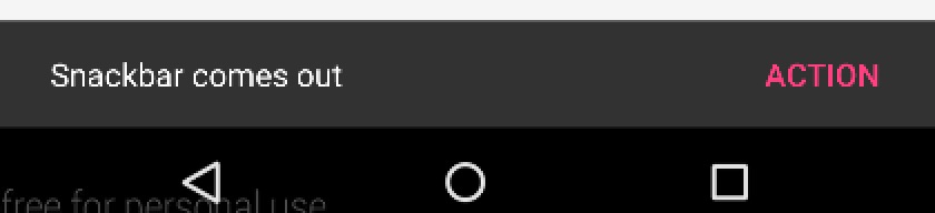
Snackbar在出现一定时间后,就会消失,这与Toast一模一样。
Google API Doc 官方说明:
http://developer.android.com/reference/android/support/design/widget/Snackbar.html
TextInputLayout
TextInputLayout作为一个父容器控件,包装了新的EditText。通常,单独的EditText会在用户输入第一个字母之后隐藏hint提示信息,但是现在你可以使用TextInputLayout 来将EditText封装起来,提示信息会变成一个显示在EditText之上的floating label,这样用户就始终知道他们现在输入的是什么。同时,如果给EditText增加监听,还可以给它增加更多的floating label。
下面我们来看这与一个TextInputLayout:
<code class="hljs avrasm has-numbering"><android<span class="hljs-preprocessor">.support</span><span class="hljs-preprocessor">.design</span><span class="hljs-preprocessor">.widget</span><span class="hljs-preprocessor">.TextInputLayout</span>
        android:id=<span class="hljs-string">"@+id/til_pwd"</span>
        android:layout_width=<span class="hljs-string">"match_parent"</span>
        android:layout_height=<span class="hljs-string">"wrap_content"</span>>

        <EditText
            android:layout_width=<span class="hljs-string">"match_parent"</span>
            android:layout_height=<span class="hljs-string">"wrap_content"</span>/>

</android<span class="hljs-preprocessor">.support</span><span class="hljs-preprocessor">.design</span><span class="hljs-preprocessor">.widget</span><span class="hljs-preprocessor">.TextInputLayout</span>></code><ul class="pre-numbering" style="display: block;"><li>1</li><li>2</li><li>3</li><li>4</li><li>5</li><li>6</li><li>7</li><li>8</li><li>9</li><li>10</li></ul>
一定要注意,他是把EditText包含起来的,不能单独使用。
在代码中,我们给它设置监听:
<code class="hljs java has-numbering">        <span class="hljs-keyword">final</span> TextInputLayout textInputLayout = (TextInputLayout) findViewById(R.id.til_pwd);

        EditText editText = textInputLayout.getEditText();
        textInputLayout.setHint(<span class="hljs-string">"Password"</span>);

        editText.addTextChangedListener(<span class="hljs-keyword">new</span> TextWatcher() {
            <span class="hljs-annotation">@Override</span>
            <span class="hljs-keyword">public</span> <span class="hljs-keyword">void</span> <span class="hljs-title">beforeTextChanged</span>(CharSequence s, <span class="hljs-keyword">int</span> start, <span class="hljs-keyword">int</span> count, <span class="hljs-keyword">int</span> after) {
                <span class="hljs-keyword">if</span> (s.length() > <span class="hljs-number">4</span>) {
                    textInputLayout.setError(<span class="hljs-string">"Password error"</span>);
                    textInputLayout.setErrorEnabled(<span class="hljs-keyword">true</span>);
                } <span class="hljs-keyword">else</span> {
                    textInputLayout.setErrorEnabled(<span class="hljs-keyword">false</span>);
                }
            }

            <span class="hljs-annotation">@Override</span>
            <span class="hljs-keyword">public</span> <span class="hljs-keyword">void</span> <span class="hljs-title">onTextChanged</span>(CharSequence s, <span class="hljs-keyword">int</span> start, <span class="hljs-keyword">int</span> before, <span class="hljs-keyword">int</span> count) {
            }

            <span class="hljs-annotation">@Override</span>
            <span class="hljs-keyword">public</span> <span class="hljs-keyword">void</span> <span class="hljs-title">afterTextChanged</span>(Editable s) {
            }
        });
    }</code><ul class="pre-numbering" style="display: block;"><li>1</li><li>2</li><li>3</li><li>4</li><li>5</li><li>6</li><li>7</li><li>8</li><li>9</li><li>10</li><li>11</li><li>12</li><li>13</li><li>14</li><li>15</li><li>16</li><li>17</li><li>18</li><li>19</li><li>20</li><li>21</li><li>22</li><li>23</li><li>24</li><li>25</li></ul>
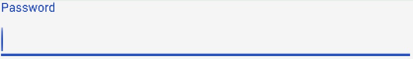
这样:显示效果如下:
当输入时:
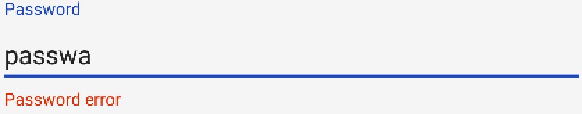
这里需要注意的是,TextInputLayout的颜色来自style中的colorAccent的颜色:
<code class="hljs applescript has-numbering"><<span class="hljs-property">item</span> <span class="hljs-property">name</span>=<span class="hljs-string">"colorAccent"</span>><span class="hljs-comment">#1743b7</item></span>
</code><ul class="pre-numbering" style="display: block;"><li>1</li><li>2</li></ul>
下面我们给出Google API Doc上的说明,了解TextInputLayout的详细使用方法:
http://developer.android.com/reference/android/support/design/widget/TextInputLayout.html
Floating Action Button
floating action button 是一个负责显示界面基本操作的圆形按钮。Design library中的FloatingActionButton 实现了一个默认颜色为主题中colorAccent的悬浮操作按钮,like this:
FloatingActionButton——FAB使用非常简单,你可以指定在加强型FrameLayout里面——CoordinatorLayout,这个我们后面再将。
关于FAB的使用,你可以把它当做一个button即可。
<code class="hljs avrasm has-numbering"><android<span class="hljs-preprocessor">.support</span><span class="hljs-preprocessor">.design</span><span class="hljs-preprocessor">.widget</span><span class="hljs-preprocessor">.FloatingActionButton</span>
        android:id=<span class="hljs-string">"@+id/fab"</span>
        android:layout_width=<span class="hljs-string">"wrap_content"</span>
        android:layout_height=<span class="hljs-string">"wrap_content"</span>
        android:layout_gravity=<span class="hljs-string">"end|bottom"</span>
        android:layout_margin=<span class="hljs-string">"@dimen/fab_margin"</span>
        android:src=<span class="hljs-string">"@drawable/ic_done"</span>/></code><ul class="pre-numbering" style="display: block;"><li>1</li><li>2</li><li>3</li><li>4</li><li>5</li><li>6</li><li>7</li></ul>
通过指定layout_gravity就可以指定它的位置。
同样,你可以通过指定anchor,即显示位置的锚点:
<code class="hljs avrasm has-numbering"><android<span class="hljs-preprocessor">.support</span><span class="hljs-preprocessor">.design</span><span class="hljs-preprocessor">.widget</span><span class="hljs-preprocessor">.FloatingActionButton</span>
        android:layout_height=<span class="hljs-string">"wrap_content"</span>
        android:layout_width=<span class="hljs-string">"wrap_content"</span>
        app:layout_anchor=<span class="hljs-string">"@id/app_bar"</span>
        app:layout_anchorGravity=<span class="hljs-string">"bottom|right|end"</span>
        android:src=<span class="hljs-string">"@android:drawable/ic_done"</span>
        android:layout_margin=<span class="hljs-string">"15dp"</span>
        android:clickable=<span class="hljs-string">"true"</span>/></code><ul class="pre-numbering" style="display: block;"><li>1</li><li>2</li><li>3</li><li>4</li><li>5</li><li>6</li><li>7</li><li>8</li></ul>
除了一般大小的悬浮操作按钮,它还支持mini size(fabSize=”mini”)。FloatingActionButton继承自ImageView,你可以使用android:src或者ImageView的任意方法,比如setImageDrawable()来设置FloatingActionButton里面的图标。
http://developer.android.com/reference/android/support/design/widget/FloatingActionButton.html
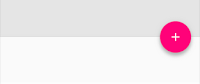
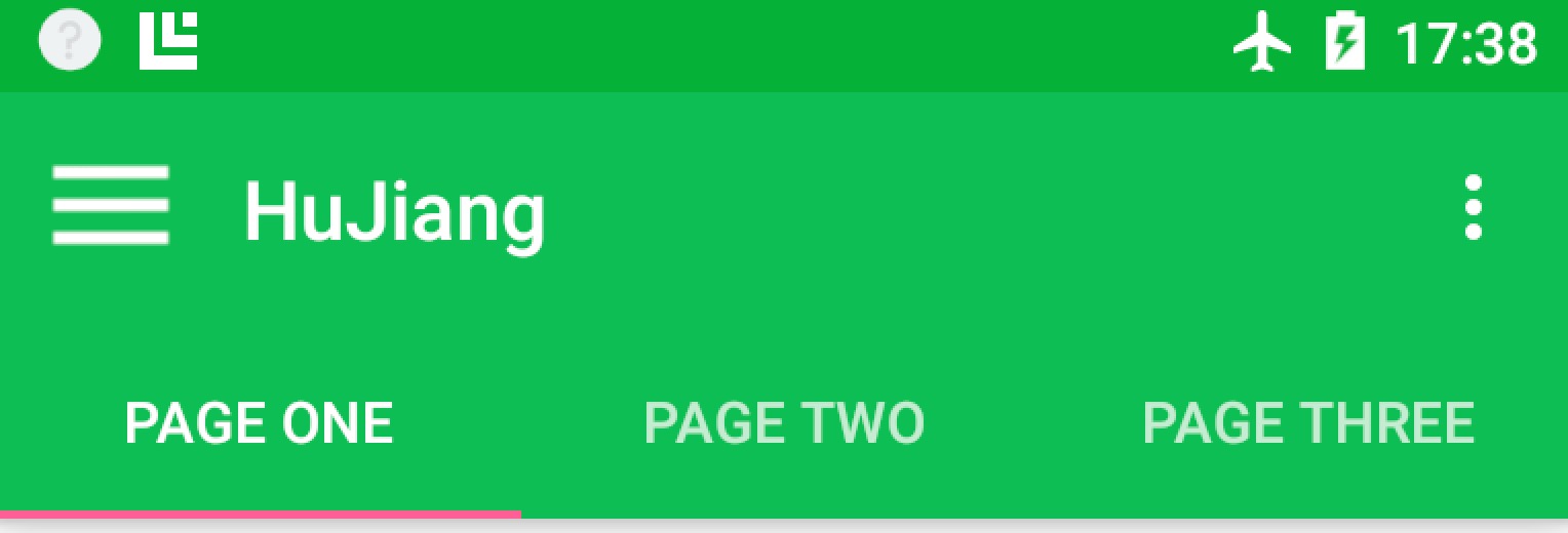
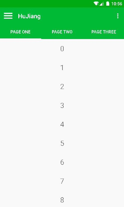
TabLayout
Tab滑动切换View并不是一个新的概念,但是Google却是第一次在support库中提供了完整的支持,而且,Design library的TabLayout 既实现了固定的选项卡 - view的宽度平均分配,也实现了可滚动的选项卡 - view宽度不固定同时可以横向滚动。选项卡可以在程序中动态添加:
<code class="hljs avrasm has-numbering">        TabLayout tabLayout = (TabLayout) findViewById(R<span class="hljs-preprocessor">.id</span><span class="hljs-preprocessor">.tabs</span>)<span class="hljs-comment">;</span>
        tabLayout<span class="hljs-preprocessor">.addTab</span>(tabLayout<span class="hljs-preprocessor">.newTab</span>()<span class="hljs-preprocessor">.setText</span>(<span class="hljs-string">"tab1"</span>))<span class="hljs-comment">;</span>
        tabLayout<span class="hljs-preprocessor">.addTab</span>(tabLayout<span class="hljs-preprocessor">.newTab</span>()<span class="hljs-preprocessor">.setText</span>(<span class="hljs-string">"tab2"</span>))<span class="hljs-comment">;</span>
        tabLayout<span class="hljs-preprocessor">.addTab</span>(tabLayout<span class="hljs-preprocessor">.newTab</span>()<span class="hljs-preprocessor">.setText</span>(<span class="hljs-string">"tab3"</span>))<span class="hljs-comment">;</span></code><ul class="pre-numbering" style="display: block;"><li>1</li><li>2</li><li>3</li><li>4</li></ul>
但大部分时间我们都不会这样用,通常滑动布局都会和ViewPager配合起来使用,所以,我们需要ViewPager来帮忙:
<code class="hljs avrasm has-numbering">        mViewPager = (ViewPager) findViewById(R<span class="hljs-preprocessor">.id</span><span class="hljs-preprocessor">.viewpager</span>)<span class="hljs-comment">;</span>
        // 设置ViewPager的数据等
        setupViewPager()<span class="hljs-comment">;</span>
        TabLayout tabLayout = (TabLayout) findViewById(R<span class="hljs-preprocessor">.id</span><span class="hljs-preprocessor">.tabs</span>)<span class="hljs-comment">;</span>
        tabLayout<span class="hljs-preprocessor">.setupWithViewPager</span>(mViewPager)<span class="hljs-comment">;</span></code><ul class="pre-numbering" style="display: block;"><li>1</li><li>2</li><li>3</li><li>4</li><li>5</li></ul>
通过一句话setupWithViewPager,我们就把ViewPager和TabLayout结合了起来。
http://developer.android.com/reference/android/support/design/widget/TabLayout.html
NavigationView
NavigationView在MD设计中非常重要,之前Google也提出了使用DrawerLayout来实现导航抽屉。这次,在support library中,Google提供了NavigationView来实现导航菜单界面,所以,新的导航界面可以这样写了:
<code class="hljs xml has-numbering"><span class="hljs-tag"><<span class="hljs-title">android.support.v4.widget.DrawerLayout
</span>    <span class="hljs-attribute">android:id</span>=<span class="hljs-value">"@+id/dl_main_drawer"</span>
    <span class="hljs-attribute">xmlns:android</span>=<span class="hljs-value">"http://schemas.android.com/apk/res/android"</span>
    <span class="hljs-attribute">xmlns:app</span>=<span class="hljs-value">"http://schemas.android.com/apk/res-auto"</span>
    <span class="hljs-attribute">android:layout_width</span>=<span class="hljs-value">"match_parent"</span>
    <span class="hljs-attribute">android:layout_height</span>=<span class="hljs-value">"match_parent"</span>
    <span class="hljs-attribute">android:fitsSystemWindows</span>=<span class="hljs-value">"true"</span>></span>

    <span class="hljs-comment"><!-- 你的内容布局--></span>
    <span class="hljs-tag"><<span class="hljs-title">include</span> <span class="hljs-attribute">layout</span>=<span class="hljs-value">"@layout/navigation_content"</span>/></span>

    <span class="hljs-tag"><<span class="hljs-title">android.support.design.widget.NavigationView
</span>        <span class="hljs-attribute">android:id</span>=<span class="hljs-value">"@+id/nv_main_navigation"</span>
        <span class="hljs-attribute">android:layout_width</span>=<span class="hljs-value">"wrap_content"</span>
        <span class="hljs-attribute">android:layout_height</span>=<span class="hljs-value">"match_parent"</span>
        <span class="hljs-attribute">android:layout_gravity</span>=<span class="hljs-value">"start"</span>
        <span class="hljs-attribute">app:headerLayout</span>=<span class="hljs-value">"@layout/navigation_header"</span>
        <span class="hljs-attribute">app:menu</span>=<span class="hljs-value">"@menu/drawer_view"</span>/></span>

<span class="hljs-tag"></<span class="hljs-title">android.support.v4.widget.DrawerLayout</span>></span></code><ul class="pre-numbering" style="display: block;"><li>1</li><li>2</li><li>3</li><li>4</li><li>5</li><li>6</li><li>7</li><li>8</li><li>9</li><li>10</li><li>11</li><li>12</li><li>13</li><li>14</li><li>15</li><li>16</li><li>17</li><li>18</li><li>19</li><li>20</li></ul>
其中最重要的就是这两个属性:
app:headerLayout
app:menu
通过这两个属性,我们可以非常方便的指定导航界面的头布局和菜单布局:
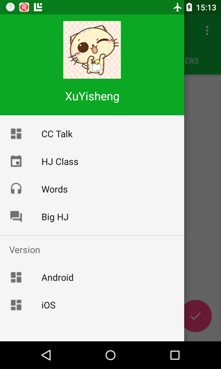
其中最上面的布局就是app:headerLayout所指定的头布局:
<code class="hljs xml has-numbering"><span class="hljs-pi"><?xml version="1.0" encoding="utf-8"?></span>
<span class="hljs-tag"><<span class="hljs-title">LinearLayout</span> <span class="hljs-attribute">xmlns:android</span>=<span class="hljs-value">"http://schemas.android.com/apk/res/android"</span>
              <span class="hljs-attribute">android:layout_width</span>=<span class="hljs-value">"match_parent"</span>
              <span class="hljs-attribute">android:layout_height</span>=<span class="hljs-value">"200dp"</span>
              <span class="hljs-attribute">android:background</span>=<span class="hljs-value">"?attr/colorPrimaryDark"</span>
              <span class="hljs-attribute">android:gravity</span>=<span class="hljs-value">"center"</span>
              <span class="hljs-attribute">android:orientation</span>=<span class="hljs-value">"vertical"</span>
              <span class="hljs-attribute">android:padding</span>=<span class="hljs-value">"16dp"</span>
              <span class="hljs-attribute">android:theme</span>=<span class="hljs-value">"@style/ThemeOverlay.AppCompat.Dark"</span>></span>

    <span class="hljs-tag"><<span class="hljs-title">ImageView
</span>        <span class="hljs-attribute">android:layout_width</span>=<span class="hljs-value">"100dp"</span>
        <span class="hljs-attribute">android:layout_height</span>=<span class="hljs-value">"100dp"</span>
        <span class="hljs-attribute">android:layout_marginTop</span>=<span class="hljs-value">"16dp"</span>
        <span class="hljs-attribute">android:background</span>=<span class="hljs-value">"@drawable/ic_user"</span>/></span>

    <span class="hljs-tag"><<span class="hljs-title">TextView
</span>        <span class="hljs-attribute">android:layout_width</span>=<span class="hljs-value">"match_parent"</span>
        <span class="hljs-attribute">android:layout_height</span>=<span class="hljs-value">"wrap_content"</span>
        <span class="hljs-attribute">android:layout_marginTop</span>=<span class="hljs-value">"16dp"</span>
        <span class="hljs-attribute">android:gravity</span>=<span class="hljs-value">"center"</span>
        <span class="hljs-attribute">android:text</span>=<span class="hljs-value">"XuYisheng"</span>
        <span class="hljs-attribute">android:textAppearance</span>=<span class="hljs-value">"@style/TextAppearance.AppCompat.Body1"</span>
        <span class="hljs-attribute">android:textSize</span>=<span class="hljs-value">"20sp"</span>/></span>

<span class="hljs-tag"></<span class="hljs-title">LinearLayout</span>></span></code><ul class="pre-numbering" style="display: block;"><li>1</li><li>2</li><li>3</li><li>4</li><li>5</li><li>6</li><li>7</li><li>8</li><li>9</li><li>10</li><li>11</li><li>12</li><li>13</li><li>14</li><li>15</li><li>16</li><li>17</li><li>18</li><li>19</li><li>20</li><li>21</li><li>22</li><li>23</li><li>24</li><li>25</li><li>26</li></ul>
而下面的菜单布局,我们可以直接通过menu内容自动生成,而不需要我们来指定布局:
<code class="hljs xml has-numbering"><span class="hljs-pi"><?xml version="1.0" encoding="utf-8"?></span>

<span class="hljs-tag"><<span class="hljs-title">menu</span> <span class="hljs-attribute">xmlns:android</span>=<span class="hljs-value">"http://schemas.android.com/apk/res/android"</span>></span>

    <span class="hljs-tag"><<span class="hljs-title">group</span> <span class="hljs-attribute">android:checkableBehavior</span>=<span class="hljs-value">"single"</span>></span>
        <span class="hljs-tag"><<span class="hljs-title">item
</span>            <span class="hljs-attribute">android:id</span>=<span class="hljs-value">"@+id/nav_home"</span>
            <span class="hljs-attribute">android:icon</span>=<span class="hljs-value">"@drawable/ic_dashboard"</span>
            <span class="hljs-attribute">android:title</span>=<span class="hljs-value">"CC Talk"</span>/></span>
        <span class="hljs-tag"><<span class="hljs-title">item
</span>            <span class="hljs-attribute">android:id</span>=<span class="hljs-value">"@+id/nav_messages"</span>
            <span class="hljs-attribute">android:icon</span>=<span class="hljs-value">"@drawable/ic_event"</span>
            <span class="hljs-attribute">android:title</span>=<span class="hljs-value">"HJ Class"</span>/></span>
        <span class="hljs-tag"><<span class="hljs-title">item
</span>            <span class="hljs-attribute">android:id</span>=<span class="hljs-value">"@+id/nav_friends"</span>
            <span class="hljs-attribute">android:icon</span>=<span class="hljs-value">"@drawable/ic_headset"</span>
            <span class="hljs-attribute">android:title</span>=<span class="hljs-value">"Words"</span>/></span>
        <span class="hljs-tag"><<span class="hljs-title">item
</span>            <span class="hljs-attribute">android:id</span>=<span class="hljs-value">"@+id/nav_discussion"</span>
            <span class="hljs-attribute">android:icon</span>=<span class="hljs-value">"@drawable/ic_forum"</span>
            <span class="hljs-attribute">android:title</span>=<span class="hljs-value">"Big HJ"</span>/></span>
    <span class="hljs-tag"></<span class="hljs-title">group</span>></span>

    <span class="hljs-tag"><<span class="hljs-title">item</span> <span class="hljs-attribute">android:title</span>=<span class="hljs-value">"Version"</span>></span>
        <span class="hljs-tag"><<span class="hljs-title">menu</span>></span>
            <span class="hljs-tag"><<span class="hljs-title">item
</span>                <span class="hljs-attribute">android:icon</span>=<span class="hljs-value">"@drawable/ic_dashboard"</span>
                <span class="hljs-attribute">android:title</span>=<span class="hljs-value">"Android"</span>/></span>
            <span class="hljs-tag"><<span class="hljs-title">item
</span>                <span class="hljs-attribute">android:icon</span>=<span class="hljs-value">"@drawable/ic_dashboard"</span>
                <span class="hljs-attribute">android:title</span>=<span class="hljs-value">"iOS"</span>/></span>
        <span class="hljs-tag"></<span class="hljs-title">menu</span>></span>
    <span class="hljs-tag"></<span class="hljs-title">item</span>></span>

<span class="hljs-tag"></<span class="hljs-title">menu</span>></span>
</code><ul class="pre-numbering" style="display: block;"><li>1</li><li>2</li><li>3</li><li>4</li><li>5</li><li>6</li><li>7</li><li>8</li><li>9</li><li>10</li><li>11</li><li>12</li><li>13</li><li>14</li><li>15</li><li>16</li><li>17</li><li>18</li><li>19</li><li>20</li><li>21</li><li>22</li><li>23</li><li>24</li><li>25</li><li>26</li><li>27</li><li>28</li><li>29</li><li>30</li><li>31</li><li>32</li><li>33</li><li>34</li><li>35</li><li>36</li></ul>
你可以通过设置一个OnNavigationItemSelectedListener,使用其setNavigationItemSelectedListener()来获得元素被选中的回调事件。它为你提供被点击的 菜单元素 ,让你可以处理选择事件,改变复选框状态,加载新内容,关闭导航菜单,以及其他任何你想做的操作。例如这样:
<code class="hljs java has-numbering"><span class="hljs-keyword">private</span> <span class="hljs-keyword">void</span> <span class="hljs-title">setupDrawerContent</span>(NavigationView navigationView) {
        navigationView.setNavigationItemSelectedListener(
                <span class="hljs-keyword">new</span> NavigationView.OnNavigationItemSelectedListener() {
                    <span class="hljs-annotation">@Override</span>
                    <span class="hljs-keyword">public</span> <span class="hljs-keyword">boolean</span> <span class="hljs-title">onNavigationItemSelected</span>(MenuItem menuItem) {
                        menuItem.setChecked(<span class="hljs-keyword">true</span>);
                        mDrawerLayout.closeDrawers();
                        <span class="hljs-keyword">return</span> <span class="hljs-keyword">true</span>;
                    }
                });
    }</code><ul class="pre-numbering" style="display: block;"><li>1</li><li>2</li><li>3</li><li>4</li><li>5</li><li>6</li><li>7</li><li>8</li><li>9</li><li>10</li><li>11</li></ul>
可见,Google将这些东西封装的非常易于使用了。
AppBarLayout
AppBarLayout跟它的名字一样,把容器类的组件全部作为AppBar。like this:
这里就是把Toolbar和TabLayout放到了AppBarLayout中,让他们当做一个整体作为AppBar。
<code class="hljs avrasm has-numbering">    <android<span class="hljs-preprocessor">.support</span><span class="hljs-preprocessor">.design</span><span class="hljs-preprocessor">.widget</span><span class="hljs-preprocessor">.AppBarLayout</span>
        android:id=<span class="hljs-string">"@+id/appbar"</span>
        android:layout_width=<span class="hljs-string">"match_parent"</span>
        android:layout_height=<span class="hljs-string">"wrap_content"</span>
        android:theme=<span class="hljs-string">"@style/ThemeOverlay.AppCompat.Dark.ActionBar"</span>>

        <android<span class="hljs-preprocessor">.support</span><span class="hljs-preprocessor">.v</span>7<span class="hljs-preprocessor">.widget</span><span class="hljs-preprocessor">.Toolbar</span>
            android:id=<span class="hljs-string">"@+id/toolbar"</span>
            android:layout_width=<span class="hljs-string">"match_parent"</span>
            android:layout_height=<span class="hljs-string">"?attr/actionBarSize"</span>
            android:background=<span class="hljs-string">"?attr/colorPrimary"</span>
            app:popupTheme=<span class="hljs-string">"@style/ThemeOverlay.AppCompat.Light"</span>/>

        <android<span class="hljs-preprocessor">.support</span><span class="hljs-preprocessor">.design</span><span class="hljs-preprocessor">.widget</span><span class="hljs-preprocessor">.TabLayout</span>
            android:id=<span class="hljs-string">"@+id/tabs"</span>
            android:layout_width=<span class="hljs-string">"match_parent"</span>
            android:layout_height=<span class="hljs-string">"wrap_content"</span>/>

    </android<span class="hljs-preprocessor">.support</span><span class="hljs-preprocessor">.design</span><span class="hljs-preprocessor">.widget</span><span class="hljs-preprocessor">.AppBarLayout</span>></code><ul class="pre-numbering" style="display: block;"><li>1</li><li>2</li><li>3</li><li>4</li><li>5</li><li>6</li><li>7</li><li>8</li><li>9</li><li>10</li><li>11</li><li>12</li><li>13</li><li>14</li><li>15</li><li>16</li><li>17</li><li>18</li><li>19</li></ul>
http://developer.android.com/reference/android/support/design/widget/AppBarLayout.html
CoordinatorLayout
CoordinatorLayout是这次新添加的一个增强型的FrameLayout。在CoordinatorLayout中,我们可以在FrameLayout的基础上完成很多新的操作。
Floating View
MD的一个新的特性就是增加了很多可悬浮的View,像我们前面说的Floating Action Button。我们可以把FAB放在任何地方,只需要通过:
<code class="hljs avrasm has-numbering"><span class="hljs-label">android:</span>layout_gravity=<span class="hljs-string">"end|bottom"</span></code><ul class="pre-numbering" style="display: block;"><li>1</li></ul>
来指定显示的位置。同时,它还提供了layout_anchor来供你设置显示坐标的锚点:
<code class="hljs perl has-numbering">app:layout_anchor=<span class="hljs-string">"<span class="hljs-variable">@id</span>/appbar"</span></code><ul class="pre-numbering" style="display: block;"><li>1</li></ul>
创建滚动
CoordinatorLayout可以说是这次support library更新的重中之重。它从另一层面去控制子view之间触摸事件的布局,Design library中的很多控件都利用了它。
一个很好的例子就是当你将FloatingActionButton作为一个子View添加进CoordinatorLayout并且将CoordinatorLayout传递给 Snackbar.make(),在3.0及其以上的设备上,Snackbar不会显示在悬浮按钮的上面,而是FloatingActionButton利用CoordinatorLayout提供的回调方法,在Snackbar以动画效果进入的时候自动向上移动让出位置,并且在Snackbar动画地消失的时候回到原来的位置,不需要额外的代码。
官方的例子很好的说明了这一点:
<code class="hljs avrasm has-numbering"><android<span class="hljs-preprocessor">.support</span><span class="hljs-preprocessor">.design</span><span class="hljs-preprocessor">.widget</span><span class="hljs-preprocessor">.CoordinatorLayout</span>
        xmlns:android=<span class="hljs-string">"http://schemas.android.com/apk/res/android"</span>
        xmlns:app=<span class="hljs-string">"http://schemas.android.com/apk/res-auto"</span>
        android:layout_width=<span class="hljs-string">"match_parent"</span>
        android:layout_height=<span class="hljs-string">"match_parent"</span>>

     <! -- Your Scrollable View -->
    <android<span class="hljs-preprocessor">.support</span><span class="hljs-preprocessor">.v</span>7<span class="hljs-preprocessor">.widget</span><span class="hljs-preprocessor">.RecyclerView</span>
            android:layout_width=<span class="hljs-string">"match_parent"</span>
            android:layout_height=<span class="hljs-string">"match_parent"</span>
            app:layout_behavior=<span class="hljs-string">"@string/appbar_scrolling_view_behavior"</span> />

    <android<span class="hljs-preprocessor">.support</span><span class="hljs-preprocessor">.design</span><span class="hljs-preprocessor">.widget</span><span class="hljs-preprocessor">.AppBarLayout</span>
            android:layout_width=<span class="hljs-string">"match_parent"</span>
            android:layout_height=<span class="hljs-string">"wrap_content"</span>>
            <android<span class="hljs-preprocessor">.support</span><span class="hljs-preprocessor">.v</span>7<span class="hljs-preprocessor">.widget</span><span class="hljs-preprocessor">.Toolbar</span>
                  ...
                  app:layout_scrollFlags=<span class="hljs-string">"scroll|enterAlways"</span>>

            <android<span class="hljs-preprocessor">.support</span><span class="hljs-preprocessor">.design</span><span class="hljs-preprocessor">.widget</span><span class="hljs-preprocessor">.TabLayout</span>
                  ...
                  app:layout_scrollFlags=<span class="hljs-string">"scroll|enterAlways"</span>>
     </android<span class="hljs-preprocessor">.support</span><span class="hljs-preprocessor">.design</span><span class="hljs-preprocessor">.widget</span><span class="hljs-preprocessor">.AppBarLayout</span>>
</android<span class="hljs-preprocessor">.support</span><span class="hljs-preprocessor">.design</span><span class="hljs-preprocessor">.widget</span><span class="hljs-preprocessor">.CoordinatorLayout</span>></code><ul class="pre-numbering" style="display: block;"><li>1</li><li>2</li><li>3</li><li>4</li><li>5</li><li>6</li><li>7</li><li>8</li><li>9</li><li>10</li><li>11</li><li>12</li><li>13</li><li>14</li><li>15</li><li>16</li><li>17</li><li>18</li><li>19</li><li>20</li><li>21</li><li>22</li><li>23</li><li>24</li></ul>
其中,一个可以滚动的组件,例如RecyclerView、ListView(这里需要注意的是,貌似只支持RecyclerView、ListView,如果你用一个ScrollView,是没有效果的)。如果:
1、给这个可滚动组件设置了layout_behavior
2、给另一个控件设置了layout_scrollFlags
那么,当设置了layout_behavior的控件滑动时,就会触发设置了layout_scrollFlags的控件发生状态的改变。
设置的layout_scrollFlags有如下几种选项:
- scroll: 所有想滚动出屏幕的view都需要设置这个flag- 没有设置这个flag的view将被固定在屏幕顶部。
- enterAlways: 这个flag让任意向下的滚动都会导致该view变为可见,启用快速“返回模式”。
- enterAlwaysCollapsed: 当你的视图已经设置minHeight属性又使用此标志时,你的视图只能已最小高度进入,只有当滚动视图到达顶部时才扩大到完整高度。
- exitUntilCollapsed: this flag causes the view to scroll off until it is ‘collapsed’ (its minHeight) before exiting。
需要注意的是,后面两种模式基本只有在CollapsingToolbarLayout才有用,而前面两种模式基本是需要一起使用的,也就是说,这些flag的使用场景,基本已经固定了。
例如我们前面例子中的,也就是这种模式:
<code class="hljs avrasm has-numbering"><span class="hljs-label">app:</span>layout_scrollFlags=<span class="hljs-string">"scroll|enterAlways"</span></code><ul class="pre-numbering" style="display: block;"><li>1</li></ul>
PS : 所有使用scroll flag的view都必须定义在没有使用scroll flag的view的前面,这样才能确保所有的view从顶部退出,留下固定的元素。
http://developer.android.com/reference/android/support/design/widget/CoordinatorLayout.html
CollapsingToolbarLayout
CollapsingToolbarLayout提供了一个可以折叠的Toolbar,这也是Google+、photos中的效果。Google把它做成了一个标准控件,更加方便大家使用。
这里先看一个例子:
<code class="hljs avrasm has-numbering">    <android<span class="hljs-preprocessor">.support</span><span class="hljs-preprocessor">.design</span><span class="hljs-preprocessor">.widget</span><span class="hljs-preprocessor">.AppBarLayout</span>
        android:id=<span class="hljs-string">"@+id/appbar"</span>
        android:layout_width=<span class="hljs-string">"match_parent"</span>
        android:layout_height=<span class="hljs-string">"@dimen/detail_backdrop_height"</span>
        android:fitsSystemWindows=<span class="hljs-string">"true"</span>
        android:theme=<span class="hljs-string">"@style/ThemeOverlay.AppCompat.Dark.ActionBar"</span>>

        <android<span class="hljs-preprocessor">.support</span><span class="hljs-preprocessor">.design</span><span class="hljs-preprocessor">.widget</span><span class="hljs-preprocessor">.CollapsingToolbarLayout</span>
            android:id=<span class="hljs-string">"@+id/collapsing_toolbar"</span>
            android:layout_width=<span class="hljs-string">"match_parent"</span>
            android:layout_height=<span class="hljs-string">"match_parent"</span>
            android:fitsSystemWindows=<span class="hljs-string">"true"</span>
            app:contentScrim=<span class="hljs-string">"?attr/colorPrimary"</span>
            app:expandedTitleMarginEnd=<span class="hljs-string">"64dp"</span>
            app:expandedTitleMarginStart=<span class="hljs-string">"48dp"</span>
            app:layout_scrollFlags=<span class="hljs-string">"scroll|exitUntilCollapsed"</span>>

            <ImageView
                android:id=<span class="hljs-string">"@+id/backdrop"</span>
                android:layout_width=<span class="hljs-string">"match_parent"</span>
                android:layout_height=<span class="hljs-string">"match_parent"</span>
                android:fitsSystemWindows=<span class="hljs-string">"true"</span>
                android:scaleType=<span class="hljs-string">"centerCrop"</span>
                android:src=<span class="hljs-string">"@drawable/ic_banner"</span>
                app:layout_collapseMode=<span class="hljs-string">"parallax"</span>/>

            <android<span class="hljs-preprocessor">.support</span><span class="hljs-preprocessor">.v</span>7<span class="hljs-preprocessor">.widget</span><span class="hljs-preprocessor">.Toolbar</span>
                android:id=<span class="hljs-string">"@+id/toolbar"</span>
                android:layout_width=<span class="hljs-string">"match_parent"</span>
                android:layout_height=<span class="hljs-string">"?attr/actionBarSize"</span>
                app:layout_collapseMode=<span class="hljs-string">"pin"</span>
                app:popupTheme=<span class="hljs-string">"@style/ThemeOverlay.AppCompat.Light"</span>/>

        </android<span class="hljs-preprocessor">.support</span><span class="hljs-preprocessor">.design</span><span class="hljs-preprocessor">.widget</span><span class="hljs-preprocessor">.CollapsingToolbarLayout</span>>

    </android<span class="hljs-preprocessor">.support</span><span class="hljs-preprocessor">.design</span><span class="hljs-preprocessor">.widget</span><span class="hljs-preprocessor">.AppBarLayout</span>></code><ul class="pre-numbering" style="display: block;"><li>1</li><li>2</li><li>3</li><li>4</li><li>5</li><li>6</li><li>7</li><li>8</li><li>9</li><li>10</li><li>11</li><li>12</li><li>13</li><li>14</li><li>15</li><li>16</li><li>17</li><li>18</li><li>19</li><li>20</li><li>21</li><li>22</li><li>23</li><li>24</li><li>25</li><li>26</li><li>27</li><li>28</li><li>29</li><li>30</li><li>31</li><li>32</li><li>33</li><li>34</li><li>35</li><li>36</li></ul>
我们在CollapsingToolbarLayout中放置了一个ImageView和一个Toolbar。并把这个CollapsingToolbarLayout放到AppBarLayout中作为一个整体。在CollapsingToolbarLayout中,我们分别设置了ImageView和一个Toolbar的layout_collapseMode。
这里使用了CollapsingToolbarLayout的app:layout_collapseMode=”pin”来确保Toolbar在view折叠的时候仍然被固定在屏幕的顶部。当你让CollapsingToolbarLayout和Toolbar在一起使用的时候,title会在展开的时候自动变得大些,而在折叠的时候让字体过渡到默认值。必须注意,在这种情况下你必须在CollapsingToolbarLayout上调用setTitle(),而不是在Toolbar上。
除了固定住view,你还可以使用app:layout_collapseMode=”parallax”(以及使用app:layout_collapseParallaxMultiplier=”0.7”来设置视差因子)来实现视差滚动效果(比如CollapsingToolbarLayout里面的一个ImageView),这中情况和CollapsingToolbarLayout的app:contentScrim=”?attr/colorPrimary”属性一起配合更完美。
在这个例子中,我们同样设置了:
<code class="hljs avrasm has-numbering"><span class="hljs-label">app:</span>layout_scrollFlags=<span class="hljs-string">"scroll|exitUntilCollapsed"</span>>
</code><ul class="pre-numbering" style="display: block;"><li>1</li><li>2</li></ul>
来接收一个:
<code class="hljs perl has-numbering">app:layout_behavior=<span class="hljs-string">"<span class="hljs-variable">@string</span>/appbar_scrolling_view_behavior"</span>></code><ul class="pre-numbering" style="display: block;"><li>1</li></ul>
这样才能产生滚动效果,而通过layout_collapseMode,我们就设置了滚动时内容的变化效果。

再来看一个官方的实例:
CoordinatorLayout与自定义view
有一件事情必须注意,那就是CoordinatorLayout并不知道FloatingActionButton或者AppBarLayout的内部工作原理 - 它只是以Coordinator.Behavior的形式提供了额外的API,该API可以使子View更好的控制触摸事件与手势以及声明它们之间的依赖,并通过onDependentViewChanged()接收回调。
可以使用CoordinatorLayout.DefaultBehavior(你的View.Behavior.class)注解或者在布局中使用app:layout_behavior=”com.example.app.你的View$Behavior”属性来定义view的默认行为。framework让任意view和CoordinatorLayout结合在一起成为了可能。
http://developer.android.com/reference/android/support/design/widget/CollapsingToolbarLayout.html
总结
经过几天的研究,Google这次提出的Android Design Support Library的意义其实并不在于给出了这些非常好的控件,其实这些控件在Github上基本都能找到相应的。它的目的在于Google给出了官方的设计指导,进一步完善了MD设计思想。这才是Android Design Support Library最重要的特性。当然,平心而论,这些控件的使用并不是非常的人性化,过多的封装导致整个效果不是非常的具有可定制性,但是,这毕竟是Google迈出的第一步,后面一定会更加牛逼。
Demo
最后,给出一个融合MD和Android Design Support Library的Demo供大家研究,相信结合文章和代码,大家一定能很快理解Android Design Support Library的使用方法。
https://github.com/xuyisheng/DesignSupportLibraryDemo 欢迎大家star、fork。
当前版本还未完善,很多画面还在处理中。后续会进一步丰富、完善,作为一个MD设计的Demo。


 4495
4495


 被折叠的 条评论
为什么被折叠?
被折叠的 条评论
为什么被折叠?
 到【灌水乐园】发言


