


 本文详细介绍了Android Design Support Library的使用,包括Snackbar、FloatingActionButton、TextInputLayout、TabLayout、AppBarLayout、CollapsingToolbarLayout和CoordinatorLayout的用法,并展示了如何实现Material Design设计规范。文中还给出了各种组件的属性设置、交互效果和示例代码,帮助开发者更好地理解和应用这些控件。
概述
Android Design Support Library 是Google在2015年的IO大会上,带来的全新适应Material Design设计规范的支持库。在这个支持库中,给我们提供了更加规范的MD设计风格控件。重要的是,Android Design Support Library中,支持所有的Android 2.1以上版本系统。在这个支持库中,主要包含下面几大控件:
Snackbar,FloatingActionButton,TextInputLayout,TabLayout,AppBarLayout,CollapsingToolbarLayout,NavigationView,CoordinatorLayout
在使用Android Design Support Library之前,我们只需要在AS中添加引用即可:
compile 'com.android.support:design:23.3.0'下面我们将分别介绍各个控件的使用。
1.Snackbar
Snackbar提供了关于操作的轻量级的反馈。它可以从屏幕底部展示一个简短的消息,与Toast相似,但是它更灵活和功能更加强大。
当它显示一段时间后或者用户与屏幕交互时,它会自动消失;
可以包含一个动作action;
Snackbar出现在屏幕所有其他元素之上,同一时间内只有一个Snackbar显示。
使用Snackbar
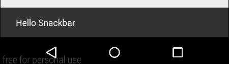
    Snackbar bar = Snackbar.make(view,"Hello Snackbar",Snackbar.LENGTH_SHORT);
    bar.show();
方法:
make (View view, CharSequence text, int duration) -生成Snackbar消息
show () -开始显示Snackbar消息
参数:
view,Snackbar会通过该view寻找一个父View来持有Snackbar的view。
text,显示的消息
duration,与Toast一样,控制Snackbar的显示时间。
显示的效果如下:
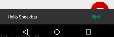
我们可以为Snackbar添加一个点击动作Action,如下:
    Snackbar bar = Snackbar.make(view,"Hello Snackbar",Snackbar.LENGTH_SHORT);
    bar.setAction("Action", new View.OnClickListener() {
        @Override
        public void onClick(View v) {
            Toast.makeText(context,"点击了!",Toast.LENGTH_SHORT).show();
        }
    });
    bar.show();
运行效果如下:
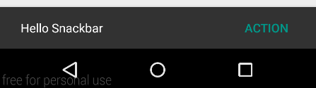
上面增加一个可点击的动作,点击“ACTION”时,弹出Toast框。
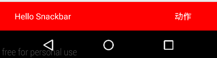
我们还可以修改Snackbar的样式
     Snackbar bar = Snackbar.make(view,"Hello Snackbar",Snackbar.LENGTH_SHORT);
     bar.setAction("动作", new View.OnClickListener() {
         @Override
         public void onClick(View v) {
             Toast.makeText(context,"点击了!",Toast.LENGTH_SHORT).show();
         }
     });
     bar.setActionTextColor(Color.WHITE); //设置Aciton的字体颜色值
     Snackbar.SnackbarLayout layout = (Snackbar.SnackbarLayout) bar.getView();
     layout.setBackgroundColor(Color.RED); //设置Snackbar的背景色
     TextView textView = (TextView) layout.findViewById(R.id.snackbar_text);
     textView.setTextColor(Color.WHITE);  //设置Snackbar文字的颜色
     bar.show();
运行效果如下:
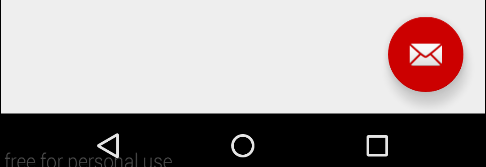
2.FloatingActionButton
FloatingActionButton是悬浮按钮,用来强调当前屏幕中最重要的动作,吸引用户的注意。FloatingActionButton现在是继承自控件ImageButton,所以它也会拥有该控件的所有属性。
使用FloatingActionButton
    <android.support.design.widget.FloatingActionButton
        android:id="@+id/fabutton"
        android:layout_width="wrap_content"
        android:layout_height="wrap_content"
        android:layout_margin="@dimen/fab_margin"
        android:src="@android:drawable/ic_dialog_email" />
使用它还是非常简单,当成普通控件来使用即可。
运行效果图:
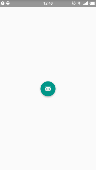
我们可以看到FAB有一个背景颜色,默认的背景颜色取的是theme中的colorAccent的值,可以在style中定义的colorAccent设置。
我们同样也可以自行单独设置其它的属性:
app:backgroundTint:设置FAB的背景颜色。
app:rippleColor:设置FAB点击时的背景颜色。
app:elevation:设置默认状态下FAB的阴影大小。
app:pressedTranslationZ:点击时候FAB的阴影大小。
app:fabSize:设置FAB的大小,该属性有两个值,分别为normal和mini,对应的FAB大小分别为56dp和40dp。
app:layout_anchor:设置FAB的锚点,即以哪个控件为参照点设置位置。 <—该属性需要在CoordinatorLayout布局中使用才生效—->
app:layout_anchorGravity:设置FAB相对锚点的位置,值有 bottom、center、right、left、top等。 <—该属性需要在CoordinatorLayout布局中使用才生效—->
对上面的属性进行设置后,可以看到:
继续给添加FAB的点击事件,与Snackbar配合使用时,会出现Snackbar遮住FAB的情况,如:
出现这样的情况,会让用户体验不友好,正确的应该让浮动操作按钮上下滑动,为Snackbar留出空间。
为了解决该问题,我们这里就用到了另一个控件CoordinatorLayout,关于这个控件之后在讲解。
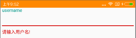
3.TextInputLayout
TextInputLayout继承自LinearLayout,用来把EditText包裹在该布局中,可以让hint文字变成一个在EditText上方的浮动标签,同时还包括一个漂亮的material动画。TextInputLayout只接受一个子元素。子元素需要是一个EditText元素。
使用TextInputLayout
    <android.support.design.widget.TextInputLayout
        android:id="@+id/textinput_username"
        android:layout_width="match_parent"
        android:layout_height="wrap_content">
        <EditText
            android:layout_width="match_parent"
            android:layout_height="wrap_content"
            android:hint="username" />
    </android.support.design.widget.TextInputLayout>
获取控件EditText对象
TextInputLayout和LinearLayout和ScrollView不同,你可以使用一个特殊的方法获得子元素EditText,getEditText,不需要使用findViewById。
如:
textinput_username = (TextInputLayout) findViewById(R.id.textinput_username);
EditText username = textinput_username.getEditText();
显示错误信息
TextInputLayout的错误处理简单快速。需要的方法是setErrorEnabled和setError。
使用setError时,错误信息会出现在EditText的下面。使用setErrorEnabled可以隐藏错误信息。
如:
    public void handleClick(View view) {
        String username = textinput_username.getEditText().getText().toString();
        if (TextUtils.isEmpty(username)) {
            textinput_username.setError("请输入用户名!");
        } else {
            textinput_username.setError(null); //必须添加,否则出现错误信息第二次不显示的问题
            textinput_username.setErrorEnabled(false);
        }
    }
4.TabLayout
TabLayout提供了一个水平布局来显示tabs。可以实现TabPageIndicator或PagerTabStrip相同的效果了。与ViewPager配合使用可发挥它的优势。
布局文件:
<?xml version="1.0" encoding="utf-8"?>
<LinearLayout xmlns:android="http://schemas.android.com/apk/res/android"
    xmlns:app="http://schemas.android.com/apk/res-auto"
    android:layout_width="match_parent"
    android:layout_height="mat
最低0.47元/天 解锁文章


 扫一扫
扫一扫
 1万+
1万+

 被折叠的 条评论
为什么被折叠?
被折叠的 条评论
为什么被折叠?
 到【灌水乐园】发言


