


自定义控件样式shape
1、描边stroke和填充solid介绍
①效果图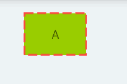
②代码详情:
<?xml version="1.0" encoding="utf-8"?>
<shape xmlns:android="http://schemas.android.com/apk/res/android">
    <!-- stroke描边
        width:描边的粗细
        color:描出的颜色
        dashGap:虚线的间距,如果不写或为0则为实线
        dashWidth:虚线的长度
    -->
    <stroke
        android:width="2dp"
        android:color="@android:color/holo_red_light"
        android:dashGap="3dp"
        android:dashWidth="10dp"/>
    <!-- solid填充
        color:中间填充的颜色-->
    <solid android:color="@android:color/holo_green_light"/>
</shape>
2、corners弧度
①效果图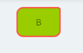
②代码详情:
<?xml version="1.0" encoding="utf-8"?>
<shape xmlns:android="http://schemas.android.com/apk/res/android">
    <stroke
        android:width="2dp"
        android:color="@android:color/holo_red_light" />
    <solid android:color="@android:color/holo_green_light" />
    <!-- corners弧度
        radius:设置四个角的弧度半径
        bottomLeftRadius:设置左下角弧度
        bottomRightRadius:设置右下角弧度
        topLeftRadius:设置左上角弧度
        topRightRadius:设置右上角弧度
        单独设置的角度会优先-->
    <corners
        android:bottomLeftRadius="10dp"
        android:bottomRightRadius="10dp"
        android:radius="4dp"
        android:topLeftRadius="10dp" />

</shape>
3、gradient渐变
①效果图:C1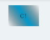
Cb1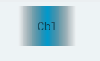
C3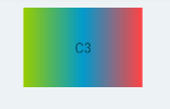
Cd1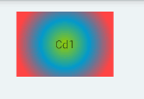
②代码详情
- C1样式:角度、渐变中间颜色
<?xml version="1.0" encoding="utf-8"?>
<shape xmlns:android="http://schemas.android.com/apk/res/android">
    <!-- gradient渐变
          angle:渐变的角度,只能是45的倍数,不然要报错。。。
          centerColor:渐变中间的颜色-->
    <gradient
        android:angle="45"
        android:centerColor="@android:color/holo_blue_dark" />
</shape>- Cb样式:渐变x轴和y轴的偏移
<?xml version="1.0" encoding="utf-8"?>
<shape xmlns:android="http://schemas.android.com/apk/res/android">
<!-- gradient渐变
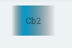
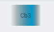
centerX:相对于渐变角度,x轴渐变中心点偏移,
默认为0.5如图Cb1,当为0.3时如图Cb2,当为0.7时如图Cb3
centerY:相对于渐变角度,y轴渐变中心点偏移
-->
<gradient
android:angle="0"
android:centerX="0.3"
android:centerY="0"
android:centerColor="@android:color/holo_blue_dark" />
</shape>- C3样式:渐变开始和结束的颜色
<?xml version="1.0" encoding="utf-8"?>
<shape xmlns:android="http://schemas.android.com/apk/res/android">
    <!-- gradient渐变
          startColor:渐变开始的颜色
          endColor:渐变结束的颜色
          -->
    <gradient
        android:angle="0"
        android:startColor="@android:color/holo_green_light"
        android:centerColor="@android:color/holo_blue_dark"
        android:endColor="@android:color/holo_red_light" />

</shape>- Cd样式:三种渐变的类型
<?xml version="1.0" encoding="utf-8"?>
<shape xmlns:android="http://schemas.android.com/apk/res/android">
<!-- gradient渐变
type:渐变的类型
1、linear线性上面的都是线性的
2、radial圆形渐变,必须加上gradientRadius(圆形半径),效果如图Cd1
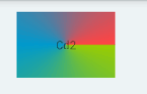
3、sweep扇形渐变,效果如图Cd2
useLevel(不了解)LevelListDrawable中使用,则为true
-->
<gradient
android:angle="0"
android:startColor="@android:color/holo_green_light"
android:centerColor="@android:color/holo_blue_dark"
android:endColor="@android:color/holo_red_light"
android:type="sweep"
android:gradientRadius="90"
android:useLevel="false"/>
</shape>4、padding
    <!-- 内边距(边框与内容之间的距离)-->
    <padding
        android:bottom="50dp"
        android:left="50dp"
        android:right="50dp"
        android:top="50dp" />
5、size大小
- 直接就能定义控件的大小为200x200
    <size android:height="200dp"
        android:width="200dp"/>
6、shap标签中的shape属性
- ring圆环、oval椭圆、line直线、rectangle矩形
- ring效果图
- ring代码详情
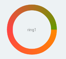
<?xml version="1.0" encoding="utf-8"?><!--
    ring圆环:useLevel需要是false才能显示
          当shap="ring"时,以下属性才有效
                innerRadius内部空心半径
                thickness圈框的厚度
                innerRadiusRatio="3"内部空心半径 = 圆的半径 / 3
                thicknessRatio="10"圈框半径 = 圆的半径 / 10
    oval椭圆:画出椭圆的图形
    line直线:画出的是直线的图形
    rectangle矩形:画出的是矩形(默认)-->
<shape xmlns:android="http://schemas.android.com/apk/res/android"
    android:shape="ring"
    android:innerRadiusRatio="3"
    android:thicknessRatio="10"
    android:useLevel="false">
    <gradient
        android:centerColor="@android:color/holo_red_light"
        android:endColor="@android:color/holo_green_dark"
        android:startColor="@android:color/holo_orange_dark"
        android:type="sweep" />
</shape>
额外了解
- shape样式还是需要用的多了,才更能调出符合的样式
- 渐变的内容最多,其实到现在用的还是挺少的
- ring可以实现自定义的圆环加载进度条(http://blog.csdn.net/jdsjlzx/article/details/39156291)
想说的话
- 博客坚持写,今后学习了新的东西就在这里记录一下,可回顾,可帮助大家何乐为不为
- 若内容有什么地方不对、不清楚、不足、更好的想法,还望吐槽,一起成长(^o^)/~
- 来一句:“笨”到极致就是“聪明”,“拙”到极点就成了“巧”


 扫一扫
扫一扫
 1万+
1万+

 被折叠的 条评论
为什么被折叠?
被折叠的 条评论
为什么被折叠?
 到【灌水乐园】发言


