


An imitation of the clock in Google I/O 2016 . Almost all of the animations and images in it are made by the SVG , so this library may be a wonderful material to learn the SVG's usage in Android . Chinese README is here .
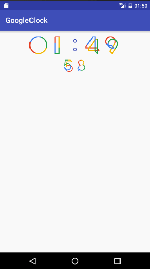
show
Installation
You can install GoogleClock by adding the following dependency to your build.gradle:
allprojects {
        repositories {
            ...
            maven { url "https://jitpack.io" }
        }
}
dependencies {
            compile 'com.github.lypeer:GoogleClock:1.0.0'
}
Usage
Simple Usage :
Just to add the GoogleClock to your activity's xml :
<com.lypeer.googleioclock.GoogleClock
        android:layout_width="wrap_content"
        android:layout_height="wrap_content"/>
And then the clock will appear .
Complex Usage
Of course , you can do some configuration in the xml :
<com.lypeer.googleioclock.GoogleClock
        android:layout_width="wrap_content"
        android:layout_height="wrap_content"
        app:lyClockWidth="32dp"
        app:lyHourWidth="32dp"
        app:lyMinWidth="32dp"
        app:lySecWidth="32dp"
        app:lyDividerHorizontal="32dp"
        app:lyDividerVertical="32dp"
        app:lyTheme="@style/LyTheme3"
        />
You can configure the following xml attributes for the clock :
| attribute | value type | defalut value | description |
|---|---|---|---|
| lyClockWidth | dimen | 0dp | The size of numbers in the clock . But it's priority is lower than the below three attributes . |
| lyHourWidth | dimen | 48dp | The size of the hour part in the clock . |
| lyMinWidth | dimen | 48dp | The size of the minutes part in the clock . |
| lySecWidth | dimen | 32dp | The size of the second part in the clock . |
| lyDividerHorizontal | dimen | 4dp | The divider's width between the two number in hour , minute and snecond . |
| lyDividerVertical | dimen | 16dp | The devider's width of the two lines (Hours and mintues are in the same line while seconds the other). |
| lyTheme | reference | LyTheme | The custom theme . |
Your can define a custom theme to change more in the clock , such as following :
<style name="LyTheme2" parent="LyTheme">
        <item name="lyColor0">@color/colorRed</item>
        <item name="lyColor1">@color/colorYellow</item>
        <item name="lyColor2">@color/colorGreen</item>
        <item name="lyColor3">@color/colorBlue</item>
        <item name="lyColorColon">@color/colorDarkBlue</item>
        <item name="lyThickness">@integer/lyThickness_4</item>
        <item name="lyColonThickness">@integer/lyThickness_1</item>
</style>
You should let The custom theme's parent be LyTheme so that you can only override the attributes you want to change . If not , your theme must contains all of the attributes in LyTheme , or some view may can't work . LyTheme contains following attributes :
| attributes | value type | default value | description |
|---|---|---|---|
| lyColor0 | color | @color/colorRed | The first color in the numbers . |
| lyColor1 | color | @color/colorYellow | The second color in the numbers . |
| lyColor2 | color | @color/colorGreen | The third color in the numbers . |
| lyColor3 | color | @color/colorBlue | The forth color in the numbers . |
| lyColorColon | color | @color/colorDarkBlue | The color of the colon . |
| lyThickness | integer | 4 | Number's thickness . |
| lyColonThickness | integer | 1 | Colon's thickness . |
Ok , that's all about usage . There is a demo in the library .
Dependencies
- org.greenrobot:eventbus:3.0.0


 585
585

 被折叠的 条评论
为什么被折叠?
被折叠的 条评论
为什么被折叠?
 到【灌水乐园】发言


