


Scaffold(
appBar:AppBar(
automaticallyImplyLeading: true,
title:const Text('TextButton属性'),
),
body: Column(
mainAxisSize: MainAxisSize.max,
children: [
//const MyBody(),
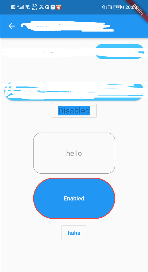
OutlinedButton(
onPressed: null,
child:const Text('Disabled'),
style:ButtonStyle(textStyle:MaterialStateProperty.all(
const TextStyle(fontSize: 20,color:Colors.white,backgroundColor: Colors.blue,
decoration: TextDecoration.underline,
),
)),
),
const SizedBox(height: 30,),
TextButton(
onPressed: (){},
child: const Text('hello'),
// textButtonTheme: TextButtonThemeData(
// style: ButtonStyle(
// backgroundColor:
// MaterialStateProperty.all<Color>(Colors.transparent),
// overlayColor:
// MaterialStateProperty.all<Color>(Colors.transparent),
// ),
style:ButtonStyle(
//定义文本的样式 这里设置的颜色是不起作用的
textStyle: MaterialStateProperty.all(const TextStyle(fontSize: 18, color: Colors.red)),
//设置按钮上字体与图标的颜色
//foregroundColor: MaterialStateProperty.all(Colors.deepPurple),
//更优美的方式来设置
foregroundColor: MaterialStateProperty.resolveWith(
(states) {
if (states.contains(MaterialState.focused) &&
!states.contains(MaterialState.pressed)) {
//获取焦点时的颜色
return Colors.blue;
} else if (states.contains(MaterialState.pressed)) {
//按下时的颜色
return Colors.deepPurple;
}
//默认状态使用灰色
return Colors.grey;
},
),
//背景颜色
backgroundColor: MaterialStateProperty.resolveWith((states) {
//设置按下时的背景颜色
if (states.contains(MaterialState.pressed)) {
return Colors.blue[200];
}
//默认不使用背景颜色
return null;
}),
//设置水波纹颜色
overlayColor: MaterialStateProperty.all(Colors.yellow),
//设置阴影 不适用于这里的TextButton
elevation: MaterialStateProperty.all(0),
//设置按钮内边距
padding: MaterialStateProperty.all(EdgeInsets.all(10)),
//设置按钮的大小
minimumSize: MaterialStateProperty.all(Size(200, 100)),
//设置边框
side: MaterialStateProperty.all(BorderSide(color: Colors.grey, width: 1)),
//外边框装饰 会覆盖 side 配置的样式
shape: MaterialStateProperty.all(RoundedRectangleBorder(borderRadius: BorderRadius.circular(20))),
),
),
const SizedBox(height: 10,),
TextButton(
onPressed: () {},
child:const Text('Enabled',style: TextStyle(color: Colors.white),),
//圆角
style:ButtonStyle(
//设置按钮内边距
padding: MaterialStateProperty.all(const EdgeInsets.fromLTRB(20, 5, 20, 5)),
// shape: MaterialStateProperty.all(RoundedRectangleBorder(borderRadius: BorderRadius.circular(20))),
//边框
side: MaterialStateProperty.all(const BorderSide(color: Colors.red, width: 2)),
//背景
backgroundColor:MaterialStateProperty.all(Colors.blue),
//设置按钮的大小
minimumSize: MaterialStateProperty.all(Size(200, 100)),
//外边框装饰 会覆盖 side 配置的样式
shape: MaterialStateProperty.all(const StadiumBorder()),
),
),
const SizedBox(height: 10,),
OutlinedButton(onPressed: (){}, child:const Text("haha"))
],
),
);
参考:flutter新版按钮常用设置_flutter-难得一见的博客
如有侵权:请联系删除


 扫一扫
扫一扫


 3156
3156

 被折叠的 条评论
为什么被折叠?
被折叠的 条评论
为什么被折叠?
 到【灌水乐园】发言


