


FLex布局优点:
1.是一种
浏览器提倡
的
布局模型
2.
布局网页
更简单、灵活
3.避免
浮动脱标
的问题
设置方式:
父元素添加
display: flex
,子元素可以自动的挤压或拉伸
主轴对齐方式:
使用
justify-content
调节元素在
主轴的对齐方式
| 属性值 | 作用 |
|---|---|
|
flex-start
|
默认值, 起点开始依次排列
|
|
flex-end
|
终点开始依次排列
|
|
center
|
沿主轴居中排列
|
|
space-around
|
弹性盒子沿主轴均匀排列, 空白间距均分在弹性盒子两侧
|
|
space-between
|
弹性盒子沿主轴均匀排列, 空白间距均分在相邻盒子之间
|
|
space-evenly
|
弹性盒子沿主轴均匀排列, 弹性盒子与容器之间间距相等
|
justify-content: space-between;
justify-content: space-around;
justify-content: space-evenly;
justify-content: center;
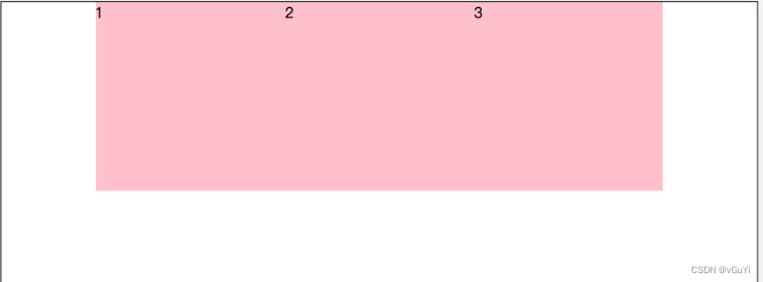
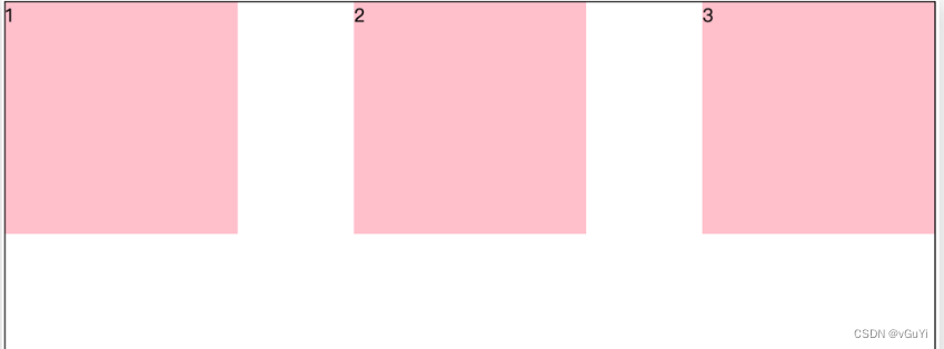
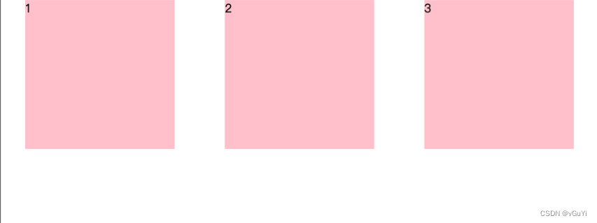
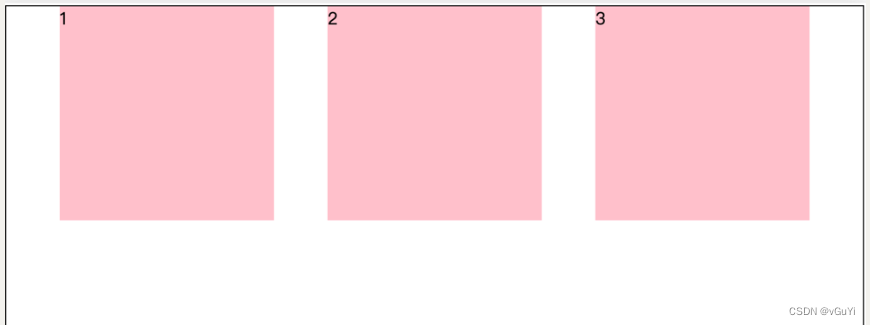
侧轴对齐方式 :
使用align-items调节元素在侧轴的对齐方式
修改侧轴对齐方式属性:
align-items(添加到弹性容器-父级,设置单行 )align-content(设置多行)
align-self: 控制某个弹性盒子在侧轴的对齐方式(
添加到弹性盒子-子级
)
|
属性值
| 作用 |
|---|---|
|
flex-start
|
起点开始依次排列
|
|
flex-end
|
终点开始依次排列
|
|
center
|
沿侧轴居中排列
|
|
stretch
|
默认效果
, 弹性盒子沿着侧轴线被
拉伸
至铺满容器
|
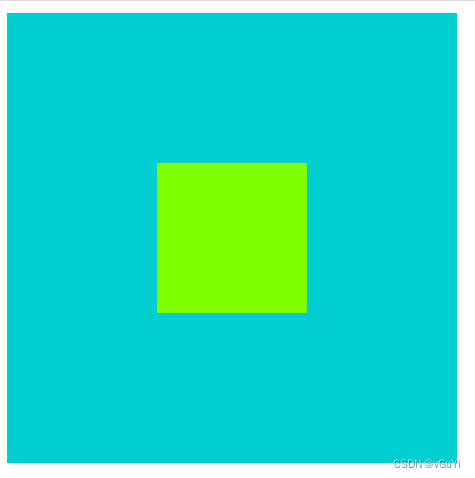
让盒子居中
<style>
        .box {
            width: 300px;
            height: 300px;
            background-color: darkturquoise;
            /* 主轴和侧轴都居中对齐 */
            display: flex;
            justify-content: center;
            align-items: center;
        }

        .box>div {
            height: 100px;
            width: 100px;
            background-color: chartreuse;
        }
    </style>
</head>

<body>
    <div class="box">
        <div></div>
    </div>
</body>
伸缩比:
使用flex属性修改弹性盒子伸缩比
属性
flex : 值;
取值分类
数值(整数)
注意:
1. 只占用父盒子剩余尺寸
2. 是给子盒子添加这个属性
主轴方向
使用
flex-direction
改变元素排列方向
主轴
默认是水平方向
, 侧轴默认是垂直方向
| 属性值 | 作用 |
|---|---|
|
row
|
行, 水平(默认值)
|
|
column
|
* 列, 垂直
|
|
row-reverse
|
行, 从右向左
|
|
column-reverse
|
列, 从下向上
|
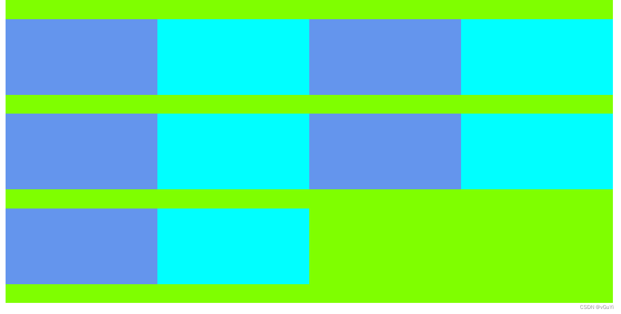
弹性盒子换行
使用
flex-wrap
实现弹性盒子
多行
排列效果
 <style>
        .box {
            width: 800px;
            height: 400px;
            background-color: chartreuse;
            display: flex;
            /* 使用换行 */
            flex-wrap: wrap;
            align-content: space-evenly;
        }

        .box>div {
            width: 200px;
            height: 100px;
            background-color: aqua;
        }

        .box>div:nth-child(2n+1) {
            background-color: cornflowerblue;
        }
    </style>
</head>

<body>
    <div class="box">
        <div></div>
        <div></div>
        <div></div>
        <div></div>
        <div></div>
        <div></div>
        <div></div>
        <div></div>
        <div></div>
        <div></div>
</body>


 169
169


 被折叠的 条评论
为什么被折叠?
被折叠的 条评论
为什么被折叠?
 到【灌水乐园】发言


