


5.文字的设置
#文字的设置
import matplotlib.pyplot as plt
import numpy as np
plt.rcParams['font.sans-serif'] = ['FangSong']
plt.rcParams['axes.unicode_minus'] = False
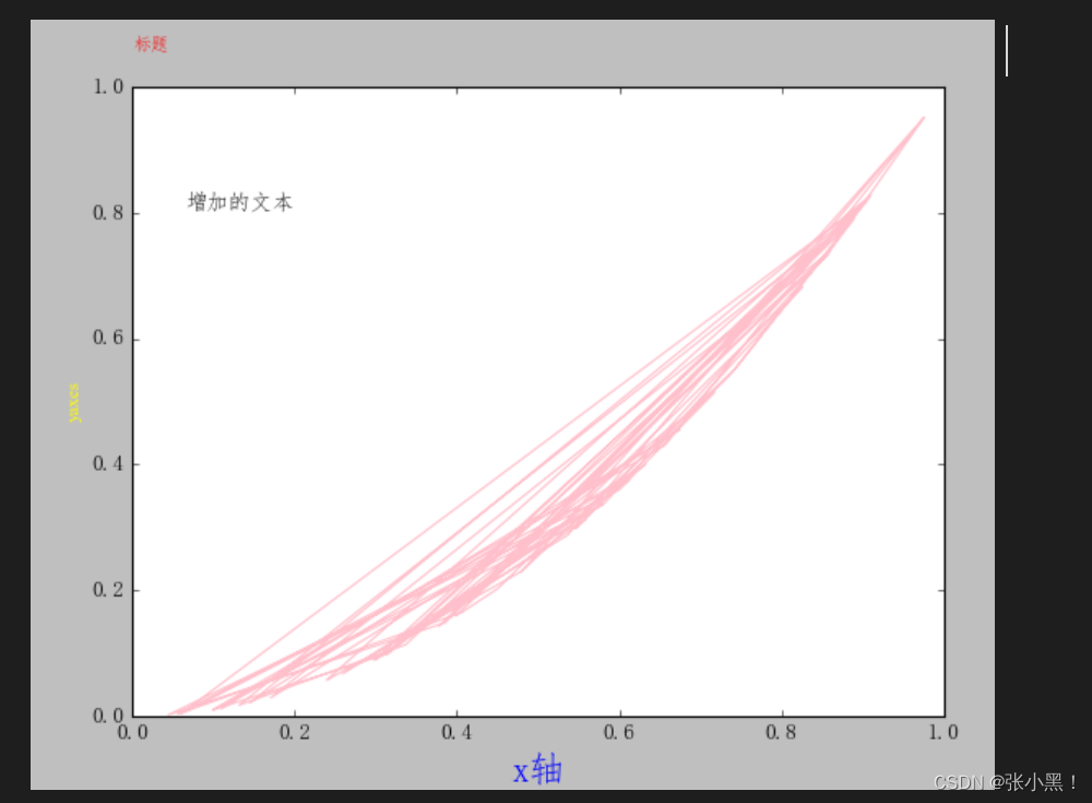
x = np.random.rand(50)
y = np.power(x,2)
plt.plot(x,y,color = 'pink')
#设置横纵坐标的文字
#第一个参数为输出的文字,family(字体),weight(可以加粗)
plt.xlabel('x轴',family = 'FangSong',color = 'blue',weight = 'bold',size = 20)
plt.ylabel('yaxes',family = 'Times New Roman',color = 'yellow',size = '10')
#设置标题
#loc为标题的位置,pad为距离上轴的距离
plt.title('标题',color = 'red',size='10',pad='20',loc='left')
#添加文本x,y,为文本放置的位置,s为增加的文本内容,ha为水平,va为竖直
plt.text(x=0.2,y = 0.8,s = '增加的文本',ha='right', va='bottom')
plt.show()
代码为E1_7
图为:
设置默认属性值
import matplotlib.pyplot as plt

plt.rcParams['fant.sans-serif'] = 'simhei'  # 设置字体
plt.rcParams['axes.unicode_minus'] = False  # 字符显示
plt.rcParams['ines.linestyle'] = '-'        # 线条的样式
plt.rcParams['lines.linewidth'] = 3         # 线条的宽度
plt.rcParams['lines.color'] = 'green'       # 默认颜色
plt.rcParams['line.maker'] = None           # 默认标记大小
plt.rcParams['line.makersize'] = 6          # 默认标记大小
plt.rcParams['xtick.labelsize'] = 6         # 默认横轴字体的大小
plt.rcParams['ytick.labelsize'] = 6         # 默认纵轴字体的大小

# 图片保存
plt.savefig('图片保存的路径', dpi='分辨率')    # 一定要在show之前调用
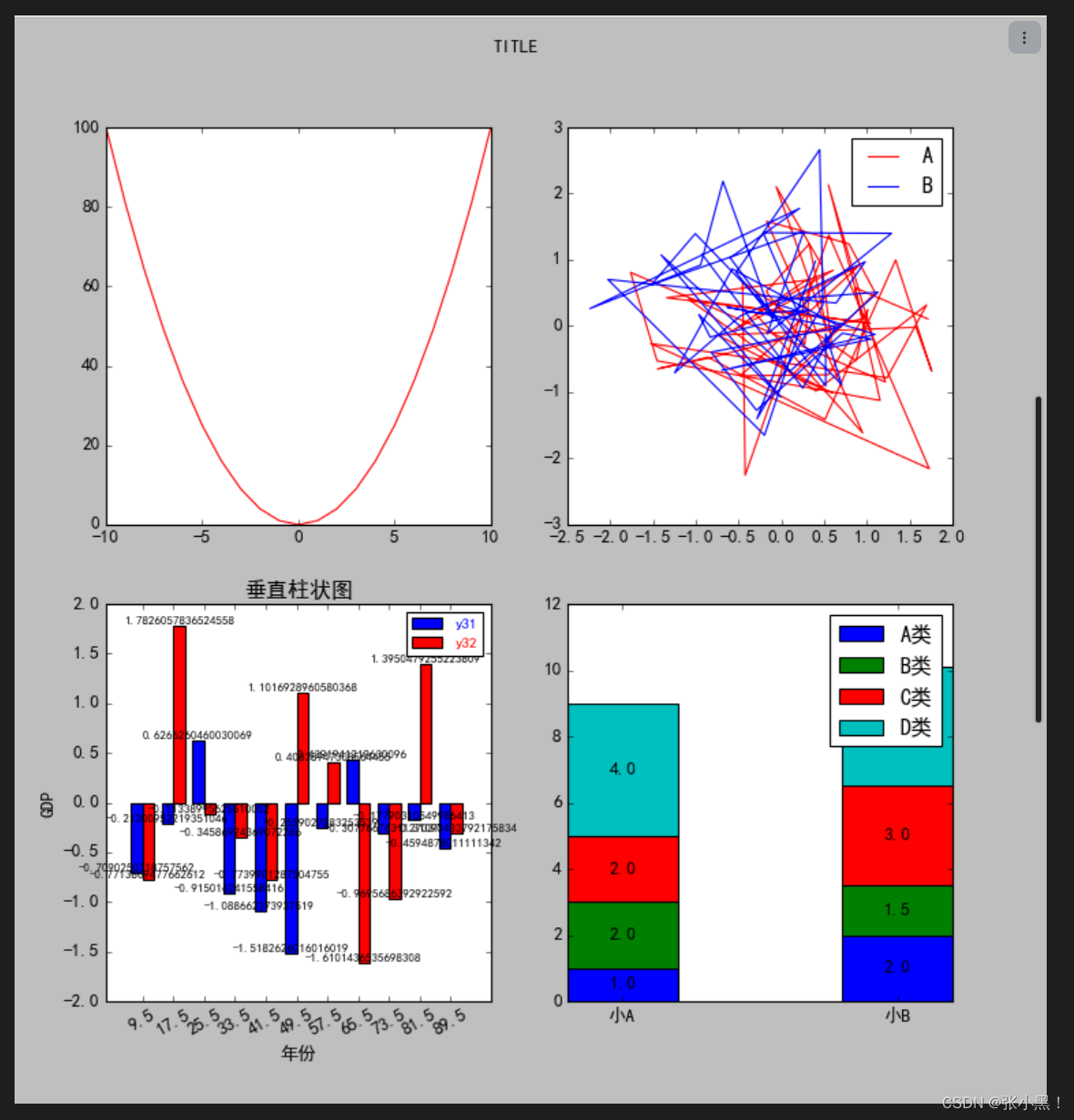
6.对比图以及多个子图
#多个子图
import matplotlib.pyplot as plt
import numpy as np
plt.rcParams['font.sans-serif'] = ['FangSong']
fig = plt.figure(figsize=(10,10))
fig.suptitle('TITLE')

#第一个子图,折线图
ax1 = plt.subplot(2,2,1)
x = []
y = []
for i in range(-10,11,1):
    x.append(i)
for i in range(21):
    y.append( x[i]*x[i])
# print(y)
ax1.plot(x,y,'red')

#第二个子图,对比折线图
ax2 = plt.subplot(2,2,2)
x21 = np.random.randn(50)
y21 =  np.random.randn(50)
x22 = np.random.randn(50)
y22 =  np.random.randn(50)
ax2.plot(x21,y21,'red',label = 'A')
ax2.plot(x22,y22,'blue',label = 'B')
ax2.legend()


#第三个子图,对比柱状图

ax3 = plt.subplot(2,2,3)
x3 = ['2010', '2011', '2012', '2013', '2014', '2015', '2016', '2017', '2018', '2019', '2020']
y31 =  np.random.randn(11)
y32 =  np.random.randn(11)
w = 3
b = 8

x1 = [(i + 1) * b for i in range(11)]
x2 = [(i + 1) * b+w for i in range(11)]
x3 = [(i + 1) * b + w / 2 for i in range(11)]

fontsize = 8
#显示数值文字
for i in range(11):
    plt.text(x = x1[i], y =y31[i],fontsize=fontsize,s=format(y31[i]),ha='center',va = 'bottom')
for i in range(11):
    plt.text(x = x2[i], y =y32[i],fontsize=fontsize,s=format(y32[i]),ha='center',va = 'bottom')

ax3.bar(x1, y31, width=w, color='blue',label = 'C')
ax3.bar(x2, y32, width=w, color='red',label = 'D')
ax3.set_xticks(x3)  # 设置一个刻度
# ration标签旋转角度逆时针
labels = ax3.set_xticklabels(x3, rotation=30)  # 替换数据

plt.title('垂直柱状图')
plt.xlabel('年份')
plt.ylabel('GDP')
ax3.legend(['y31', 'y32'], labelcolor=['blue', 'red'], fontsize='10')


#第四个子图
ax4 = plt.subplot(2,2,4)
total = np.asarray([1000, 1000])
base = np.asarray([0, 0])
x_tick_name = ['小A', '小B']
data = {
    'A类': [1000, 2000],
    'B类': [2000, 1500],
    'C类': [2000, 3000],
    'D类': [4000, 3600]
}
for v in list(data.keys()):
    item = data[v]
    item = np.asarray(item)

    i = item / total
    print(i)
    ax4.bar([0, 0.5], i, width=0.2, bottom=base,label = v)
    ax4.text(0, base[0] + i[0] / 2, s=format(i[0]), ha='center', va='center')
    ax4.text(0.5, base[1] + i[1] / 2, s=format(i[1]), ha='center', va='center')
    base = base + i

    plt.xticks([0, 0.5], x_tick_name)  # x轴的标题
    plt.legend()
plt.show()
图为


 1009
1009


 被折叠的 条评论
为什么被折叠?
被折叠的 条评论
为什么被折叠?
 到【灌水乐园】发言


