


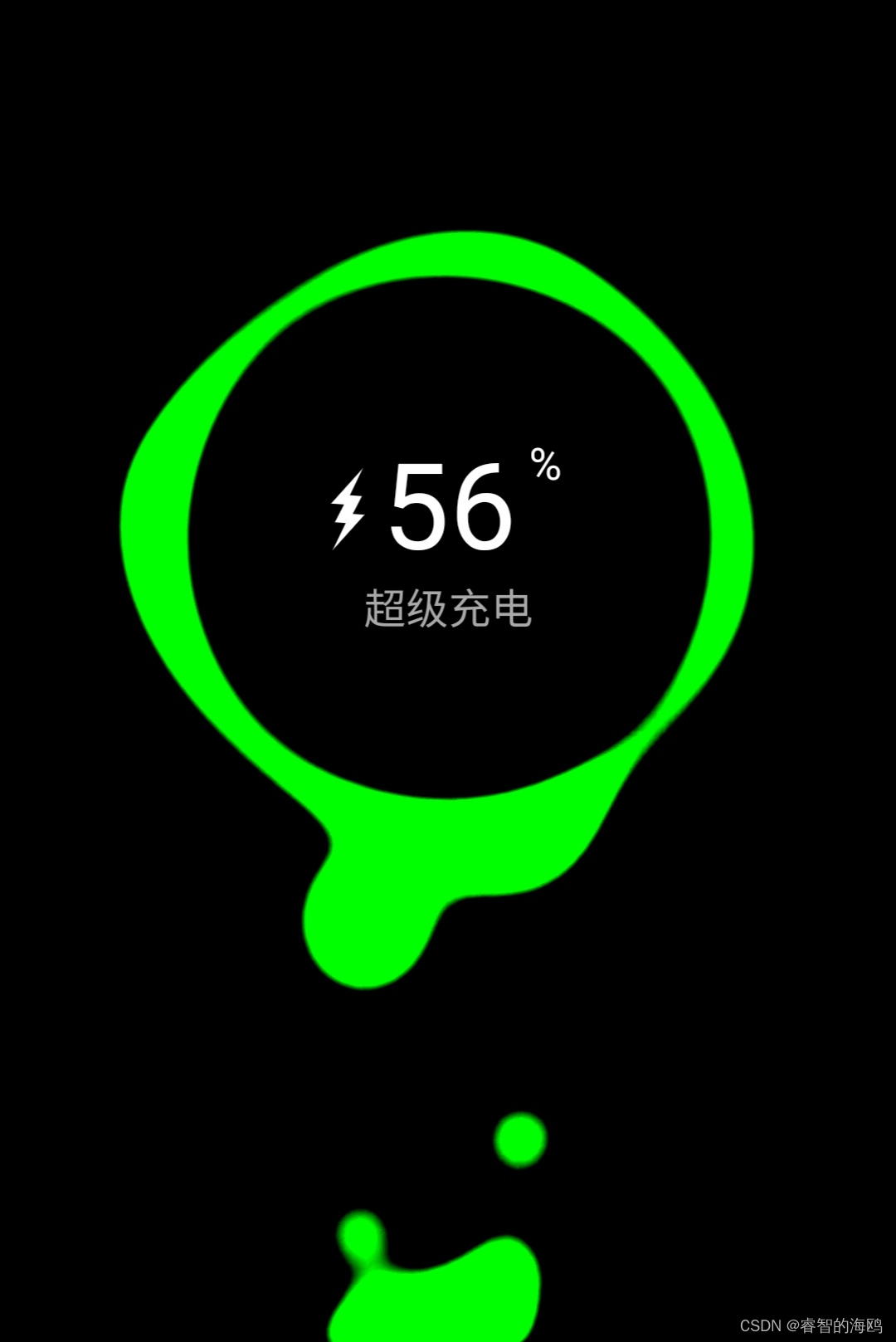
图例 源码在图片后面,有HTML和CSS个部分
源代码
HTML
<!doctype html>
<html>
<head>
<meta charset="utf-8">
<title>PureCSS超级充电器</title>
<link type="text/css" href="css/style.css" rel="stylesheet" />
</head>
<body>
<div class="phone">
<span class="text">超级充电</span>
<div class="status">
<div class="charging"></div>
<span class="progress"><small>%</small></span>
</div>
<div class="contrast">
<div class="blackhole">
</div>
<div class="lithium">
<i></i>
<i></i>
<i></i>
<i></i>
</div>
</div>
</div>
</body>
</html>
JS
@charset "utf-8";
*{
box-sizing: border-box;
}
body{
overflow: hidden;
display: flex;
height: 100vh;
margin: 0;
padding: 0;
background-color: black;
}
.phone {
--width: 320px;
--height: 490px;
margin: auto auto 0 auto;
width: var(--width);
height: var(--height);
position: relative;
}
.text {
font-family: sans-serif;
color: darkgray;
position: absolute;
z-index: 2;
left: 0;
right: 0;
text-align: center;
top: 180px;
font-size: 17px;
}
.status {
width: 190px;
justify-content: center;
display: flex;
align-items: center;
color: white;
position: absolute;
top: 125px;
left: 0;
right: 0;
margin: auto;
z-index: 3;
}
.progress {
font-size: 3em;
font-family: sans-serif;
margin-left: 8px;
display: flex;
color: transparent;
}
.progress > small {
font-size: 18px;
margin-left: 5px;
color: white;
}
.progress::before {
content: '99';
color: white;
animation: count 12s forwards;
}
.charging {
background-color: white;
width: 11px;
height: 11px;
transform: skew(0deg, -45deg) rotate(47deg) scale(0.7);
}
.charging::before {
content: '';
position: absolute;
border-width: 7px 5px 15px 7px;
border-style: solid;
top: -18px;
border-color: transparent transparent white transparent;
transform: rotate(5deg) skew(-10deg, -5deg);
left: -8px;
}
.charging::after {
content: '';
position: absolute;
border-width: 7px 5px 15px 7px;
border-style: solid;
bottom: -18px;
border-color: transparent transparent white transparent;
transform: rotate(-175deg) skew(-10deg, -5deg);
left: 6px;
}
.contrast {
width: 100%;
height: 100%;
background-color: black;
filter: contrast(20);
}
.blackhole {
width: 210px;
height: 210px;
filter: blur(10px);
margin: auto;
background-color: black;
border-radius: 50%;
position: absolute;
left: 0;
right: 0;
top: 60px;
}
.blackhole::before {
content: '';
position: absolute;
width: 100%;
height: 100%;
background-color: lime;
border-radius: 45% 55% 43% 57% / 41% 39% 61% 59%;
box-shadow: -3px -1px 0 15px lime, 0px 3px 0 18px lime;
transform: rotate(426deg);
animation: rotate 20s linear infinite, radius 20s linear infinite;
}
.blackhole::after {
content: '';
position: absolute;
background: black;
width: 100%;
height: 100%;
border-radius: 50%;
}
.lithium {
position: absolute;
z-index: -1;
bottom: -19px;
left: 0;
right: 0;
margin: auto;
background-color: lime;
width: 70px;
height: 50px;
border-radius: 45% 55% 48% 52% / 56% 43% 57% 44%;
filter: blur(10px);
animation: radius 8s linear infinite;
transform: rotate(-1deg);
}
.lithium::after {
content: '';
border-radius: 45% 55% 48% 52% / 56% 43% 57% 44%;
position: absolute;
background-color: lime;
width: 70px;
height: 50px;
bottom: -8px;
left: -25px;
animation: radius 7s linear infinite;
animation-delay: 2s;
}
.lithium::before {
content: '';
position: absolute;
width: 20px;
height: 20px;
border-radius: 50%;
filter: blur(10px);
bottom: 0;
left: 0;
animation: lithium 7s forwards infinite, radius 20s linear infinite;
}
.lithium i:nth-child(1)::before {
content: '';
position: absolute;
width: 20px;
height: 20px;
border-radius: 50%;
filter: blur(10px);
bottom: 0;
left: 10px;
animation: lithium 4s forwards infinite, radius 10s linear infinite;
}
.lithium i:nth-child(1)::after {
content: '';
position: absolute;
width: 20px;
height: 20px;
border-radius: 50%;
filter: blur(10px);
bottom: 0;
left: 30px;
transform: scale(0.8);
animation: lithium 5s forwards infinite, radius 10s linear infinite;
animation-delay: 1s;
}
.lithium i:nth-child(2)::before {
content: '';
position: absolute;
width: 20px;
height: 20px;
border-radius: 50%;
filter: blur(10px);
bottom: 0;
left: 20px;
animation: lithium 6s forwards infinite, radius 10s linear infinite;
animation-delay: 2s;
}
.lithium i:nth-child(2)::after {
content: '';
position: absolute;
width: 20px;
height: 20px;
border-radius: 50%;
filter: blur(10px);
bottom: 0;
left: -20px;
transform: scale(0.9);
animation: lithium2 7s forwards infinite, radius 10s linear infinite;
animation-delay: 3s;
}
.lithium i:nth-child(3)::before {
content: '';
position: absolute;
width: 20px;
height: 20px;
border-radius: 50%;
filter: blur(10px);
bottom: 0;
left: 35px;
animation: lithium3 3s forwards infinite, radius 10s linear infinite;
animation-delay: 4s;
}
.lithium i:nth-child(3)::after {
content: '';
position: absolute;
width: 20px;
height: 20px;
border-radius: 50%;
filter: blur(10px);
bottom: 0;
left: -20px;
transform: scale(1.1);
animation: lithium3 5s forwards infinite, radius 6s linear infinite;
animation-delay: 5s;
}
.lithium i:nth-child(4)::before {
content: '';
position: absolute;
width: 20px;
height: 20px;
border-radius: 50%;
filter: blur(10px);
bottom: 0;
left: 45px;
animation: lithium4 9s forwards infinite, radius 10s linear infinite;
animation-delay: 5s;
}
.lithium i:nth-child(4)::after {
content: '';
position: absolute;
width: 20px;
height: 20px;
border-radius: 50%;
filter: blur(10px);
bottom: 0;
left: -20px;
transform: scale(1.1);
animation: lithium4 9s forwards infinite, radius 6s linear infinite;
animation-delay: 6s;
}
@keyframes lithium {
0% {
box-shadow: 20px -3vh 0 10px lime;
}
100% {
border-radius: 45% 55% 48% 52% / 56% 43% 57% 44%;
box-shadow: 40px -43vh 0 20px lime;
transform: scale(1);
}
}
@keyframes lithium2 {
0% {
box-shadow: 10px -5vh 0 10px lime;
}
100% {
box-shadow: 20px -45vh 0 20px lime;
}
}
@keyframes lithium3 {
0% {
box-shadow: 9px -7vh 0 6px lime;
}
100% {
box-shadow: 14px -45vh 0 15px lime;
}
}
@keyframes lithium4 {
0% {
box-shadow: 9px -7vh 0 7px lime;
}
100% {
box-shadow: 14px -45vh 0 14px lime;
}
}
@keyframes rotate {
from {
transform: rotate(0deg);
}
to {
transform: rotate(360deg);
}
}
@keyframes radius {
0% {
border-radius: 45% 55% 43% 57% / 41% 39% 61% 59%;
}
15% {
border-radius: 50% 50% 48% 52% / 55% 39% 61% 45%;
}
25% {
border-radius: 45% 55% 39% 61% / 55% 30% 70% 45%;
}
50% {
border-radius: 45% 55% 28% 72%/56% 61% 39% 44%;
}
80% {
border-radius: 73% 27% 28% 72% / 74% 61% 39% 26%;
}
100% {
border-radius: 45% 55% 43% 57% / 41% 39% 61% 59%;
}
}
@keyframes count {
0% {
content: "0";
}
1% {
content: "1";
}
2% {
content: "2";
}
3% {
content: "3";
}
4% {
content: "4";
}
5% {
content: "5";
}
6% {
content: "6";
}
7% {
content: "7";
}
8% {
content: "8";
}
9% {
content: "9";
}
10% {
content: "10";
}
11% {
content: "11";
}
12% {
content: "12";
}
13% {
content: "13";
}
14% {
content: "14";
}
15% {
content: "15";
}
16% {
content: "16";
}
17% {
content: "17";
}
18% {
content: "18";
}
19% {
content: "19";
}
20% {
content: "20";
}
21% {
content: "21";
}
22% {
content: "22";
}
23% {
content: "23";
}
24% {
content: "24";
}
25% {
content: "25";
}
26% {
content: "26";
}
27% {
content: "27";
}
28% {
content: "28";
}
29% {
content: "29";
}
30% {
content: "30";
}
31% {
content: "31";
}
32% {
content: "32";
}
33% {
content: "33";
}
34% {
content: "34";
}
35% {
content: "35";
}
36% {
content: "36";
}
37% {
content: "37";
}
38% {
content: "38";
}
39% {
content: "39";
}
40% {
content: "40";
}
41% {
content: "41";
}
42% {
content: "42";
}
43% {
content: "43";
}
44% {
content: "44";
}
45% {
content: "45";
}
46% {
content: "46";
}
47% {
content: "47";
}
48% {
content: "48";
}
49% {
content: "49";
}
50% {
content: "50";
}51% {
content: "51";
}
52% {
content: "52";
}
53% {
content: "53";
}
54% {
content: "54";
}
55% {
content: "55";
}
56% {
content: "56";
}
57% {
content: "57";
}
58% {
content: "58";
}
59% {
content: "59";
}
60% {
content: "60";
}
61% {
content: "61";
}
62% {
content: "62";
}
63% {
content: "63";
}
64% {
content: "64";
}
65% {
content: "65";
}
66% {
content: "66";
}
67% {
content: "67";
}
68% {
content: "68";
}
69% {
content: "69";
}
70% {
content: "70";
}
71% {
content: "71";
}
72% {
content: "72";
}
73% {
content: "73";
}
74% {
content: "74";
}
75% {
content: "75";
}
76% {
content: "76";
}
77% {
content: "77";
}
78% {
content: "78";
}
79% {
content: "79";
}
80% {
content: "80";
}
81% {
content: "81";
}
82% {
content: "82";
}
83% {
content: "83";
}
84% {
content: "84";
}
85% {
content: "85";
}
86% {
content: "86";
}
87% {
content: "87";
}
88% {
content: "88";
}
89% {
content: "89";
}
90% {
content: "90";
}
91% {
content: "91";
}
92% {
content: "92";
}
93% {
content: "93";
}
94% {
content: "94";
}
95% {
content: "95";
}
96% {
content: "96";
}
97% {
content: "97";
}
98% {
content: "98";
}
99% {
content: "99";
}
}
@keyframes reset {
99% {
opacity: 0;
z-index: -1;
pointer-events: none;
}
to {
opacity: 1;
z-index: 1;
pointer-events: inherit;
}
}


 259
259


 被折叠的 条评论
为什么被折叠?
被折叠的 条评论
为什么被折叠?
 到【灌水乐园】发言


