


div+css入门与实战演练
韩顺平PHP课程之Lesson2
参考站点:蝉翼花园 开源之祖 php开源大全
参考书籍:别具光芒
参考资料:css2.0.chm
本节要点:div+css基本特点、css使用的必要性、选择器使用与探讨、块元素和行内元素、css中的盒子模型、浮动float、定位
详细内容:
传统页面采用table来布局,有一些缺点,表现在:
a.显示样式和数据绑定在一起
b.布局的时候,灵活度不高.
c.一个页面可能有大量的table元素,本来很简单的工作,可能很费劲,出现代码冗余。
d.增加带宽,比如减少新浪网一个页面的200字节,1个月可以减少200字节*2000000(访问量)*30(时间)带宽.
e.搜索引擎不喜欢表格布局
优点:
a.理解比较简单
b.不同的浏览器看到的效果一般是相同
c.显示数据还是很好的
为了解决table的以上缺点,引入了div+css.
div+css的基本思想:数据和样式分离。div用来存放需要显示的数据(文字、图表),css用来指定怎样显示,从而做到数据和显示相互的效果.css可以使用在各种文件如php、jsp、aps.
div+css页面布局体验用例代码及效果如下:
//my.css
.style1
{
      width:300px;/*指定宽度*/
      height:400px;/*要写分号*/
      background-color:silver;
      border:1px solid red;
      margin-left:200px;
      margin-top:100px;
      padding-left:20px;
      padding-top:10px;
}
.style1 table
{

    border:1px solid blue;
    background-color:pink;
}
<!DOCTYPE HTML PUBLIC "-//W3C//DTD HTML 4.01 Transitional//EN" "http://www.w3.org/TR/html4/loose.dtd">
<html>
 <head>
  <title> css体验 </title>
 </head>
 <!--引入css 可以使用url指定css-->
<link rel=stylesheet href="my.css" type="text/css"/>
 <body>
 <div class="style1"><!--class指定关联的css文件-->
  <img src="images/cartoon.gif"/>
  <table>
  <tr>
  <td>div中表格</td>
  <td>div中表格</td>
  </tr>
  <tr>
  <td>div中表格</td>
  <td>div中表格</td>
  </tr>
  </table>
  </div>
 </body>
</html>

要深刻理解div+css的优越性,不得不提网页设计的三个时期table(内容和样式),table+css(table布局,css指定外观),div+css(div放内容,css指定样式).
3.css使用的必要性
(1)css使用的基本语法
选择器{
属性1:属性值;
属性2:属性值;
...
}
(2)滤镜技术 filter
滤镜技术应用实例的代码及效果如下:
//demo3.html
<!DOCTYPE HTML PUBLIC "-//W3C//DTD HTML 4.01 Transitional//EN" "http://www.w3.org/TR/html4/loose.dtd">
<html>
 <head>
 <!--直接嵌入css文件(内联css文件)-->
 <style type="text/css">
   a:link img{
   filter:gray;//
   }
   a:hover img{
   filter:"";
   }
 </style>
  <title> 滤镜技术</title>
 </head>
 <body>
<a href="#"> <img src="images/cartoon2.gif" /></a>
<a href="#"><img src="images/cartoon3.gif"/></a>
<a href="#"><img src="images/cartoon4.gif"/></a>
<a href="#"><img src="images/cartoon5.gif"/></a>
 </body>
</html>
运行效果如下图所示:

a.类选择器 class
.类选择器{ /*注意前面的这个点 不可少*/
属性1:属性值;
属性2:属性值;
...
}
b.id选择器
#id选择器{
属性1:属性值;
属性2:属性值;
...
}
c.html元素选择器
某个html元素{
属性1:属性值;
属性2:属性值;
...
}
只要是html元素的一种即可以。
css解决p段落两种样式:
p.cls1{
color:blue;
font-size:30px;
}
p.cls2{
color:green;
font-size:20px;
}
其他的元素应用两种样式也可以此类推。
d.通配符选择器
*{
/*margin-top:0px;
margin-left:0px;*/
margin:10px 30px 40px 1px;
}
margin提供四个值,则将按上右下左的顺时针赋值。
margin提供一个值代表上右下左;如果是两个值(上下、左右)
四个选择器的优先级:id选择器>class选择器>html选择器>通配符选择器
ID选择器和class选择器的使用:ID选择器的复用性较低而优先级高,所以如果某个样式只是给某个指定html元素使用,则选择id选择器。如果一个样式是给多个html元素使用,则应当class选择器.
选择器理解对应用例的代码及效果如下:
//selector.html
<!DOCTYPE HTML PUBLIC "-//W3C//DTD HTML 4.01 Transitional//EN" "http://www.w3.org/TR/html4/loose.dtd">
<html>
 <head>
  <title>选择器使用</title>
 </head>
<link rel="stylesheet" type="text/css" href="selector.css">
 <body>选择器的使用
  <span class="s1" id="news_special">新闻一</span>
  <span class="s1">新闻二</span>
  <span class="s1 cls1">新闻三</span>
  <span class="s1">新闻四</span>
  <span class="s1">新闻五</span><br/><br/>
  <span id="id1">这是一则<span>非常<span><a href="http://www.baidu.com">连接到百度</a>重要</span></span>的新闻</span><br/>
  <!--超链接控制-->
  <a href="http://www.baidu.com">连接到百度</a>
  <p class="cls1">Hello world!</p>
  <p class="cls2">Hello world!</p>
 </body>
</html>
/*class类选择器*/
.s1{
  background-color:pink;
  font-weight:bold;
  font-size:16px;
  color:black;
}
/*id 选择器使用*/
#id1{
   background-color:silver;
  font-size:40px;
  color:black;
}
/*html选择器使用 优先级低*/
body{
   color:orange;
}
/*通配符选择器使用*/
/*
margin提供四个值,则将按上右下左的顺时针赋值。
margin提供一个值代表上右下左;如果是两个值(上下、左右)*/
*{
   /*margin-top:0px;
   margin-left:0px;*/
   margin:0px;
   padding:opx;
   color:red;
}
a:link
{
   color:black;
   text-decoration:none;
   font-size:20px;
}
a:hover{
   color:blue;
   text-decoration:underline;
   font-size:30px;
}
a:visited{
  color:red;
}
p.cls1{
color:blue;
font-size:30px;
}
p.cls2{
color:green;
font-size:20px;
}
/*父子选择器*/
#id1 span{
  color:red;
  text-decoration:italic;
}
#id1 span span{
  color:green;
}
#id1 span span a{
  color:blue;
}
#news_special{
 color:red;
 font-style:italic;
}
/*给新闻三再配置一个选择器*/
.cls1{
font-style:italic;
text-decoration:underline;
color:purple;
background-color:gray;
}
(1)父子选择器:
a.父子选择器可以有多级,但是在实际开发中不要超过三层。
b.负责选择器有严格的层级要求。
c.选择器中用于分级的标记,必须使用已有的html元素标记.
d.父子选择器不局限于什么类型的选择器。可以形如#id1 span span,也可以是其他形式的组合,但要注意层级关系.
(2)一个元素可以同时拥有ID选择器和class选择器
(3)一个元素最多有一个id选择器,但是可以有多个类选择器。
多个class选择器用法:
<元素 class="类选择器1,类选择器2">
多个class选择器以在css文件中出现的顺序为准,应用样式时总是应用后出现的class选择器。
(4) 合并css文件 将多个css文件的公共部分单独写一份。css文件在用户浏览网页时也会由客户端向服务器请求css文件。例如:
.ad_stu,.ad_house,.ad_2{
height:196px;
float:left;
margin:5px 0px 0px 6px;
}
6.块元素和行内元素
行内元素它只占据能显示自身内容的宽度,而且他不会占据整行,而块元素不管自己的内容多少,会占据整行,会换行显示。
常见的行内元素有 <a><span><input type="XXX">
常见的块元素有 <div><p>
块元素和行内元素的区别:
a.行内元素只占据内容的的宽度,块元素不管内容多少要占全行。
b.行内元素只能容纳文本和其他行内元素,块元素可以容纳文本,行内元素和块元素。(和浏览器版本有关)
c.一些css属性对行内元素不生效,比如margin.left,right,width.建议尽可能使用块元素定位.(和浏览器版本有关)
注意:行内元素和块元素可以互换。使用dispaly:block/inline.
行内元素和块级元素对应用例的代码及效果如下:
//element.html
<!DOCTYPE HTML PUBLIC "-//W3C//DTD HTML 4.01 Transitional//EN" "http://www.w3.org/TR/html4/loose.dtd">
<html>
 <head>
  <title> New Document </title>
 </head>
<link rel="stylesheet" type="text/css" href="element.css">
 <body>
  <span class="s1">span1</span>
  <span class="s1">span2</span><input type="text"/>
  <div class="s2">div1</div>
  <div class="s2">div2</div><input type="text"/>
  <p style="background-color:green">这是一个人段落</p>
 </body>
</html>
.s1{
background-color:pink;
display:block;/*希望使用s1的样式的当成块来显示*/
}
.s2{
background-color:gray;
width:100px;
display:inline;/*希望使用s1的样式的当成行来显示*/
}
运行效果如下图所示:

流:html元素在网页中显示的顺序;
标准流:在html文件中,写在前面的元素在前面显示,写在后面的元素后面显示.
非标准流:在html文件中,当某个元素脱离标准流,就处于非标准流.
8.css中的盒子模型
盒子模型的效果如下图优酷盒子模型所示:

盒子模型解剖图:

盒子模型对应的用例1及效果如下:
//box1.html
<!DOCTYPE HTML PUBLIC "-//W3C//DTD HTML 4.01 Transitional//EN" "http://www.w3.org/TR/html4/loose.dtd">
<html>
 <head>
  <title> 盒子模型</title>
<link rel="stylesheet" type="text/css" href="box1.css">
 <body>
  <div class="div1">
  <img src="images/singer.jpg"/>
  <a href="#">孟庭苇</a>
  </div>
 </body>
</html>
body{
 border:1px solid red;
 width:300px;
 height:200px;
 /*自动居中 auto表示自动居中 不随浏览器大小而压缩*/
 margin:30px auto;
}
.div1{
font-size:12px;
text-align:center;
border:1px solid blue;
width:70px;
height:80px;
/*margin-left:5px;
margin-top:5px;*/
margin:5px 0px 0px 5px;
/*padding:5px 0px 0px 5px;*/
/*padding-top:35px;*//*会破坏盒子大小*/
}
/*img 本身可以作为盒子  margin太大会偏离div*/
.div1 img{
width:60px;
height:60px;
margin-top:5px;
margin-left:5px;
margin-bottom:1px;
}
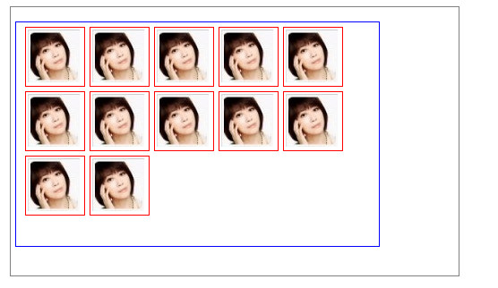
盒子模型示例2对应的代码及效果如下:
//box2.html

<!DOCTYPE HTML PUBLIC "-//W3C//DTD HTML 4.01 Transitional//EN" "http://www.w3.org/TR/html4/loose.dtd">
<html>
 <head>
  <title> New Document </title>
 </head>
<link rel="stylesheet" type="text/css" href="box2.css">
 <body>
  <div class="div1">
  <!--ul可以控制显示内容的多少-->
  <ul class="faceul"><li><img src="images/singer.jpg"/></li><li><img src="images/singer.jpg"/></li><li><img src="images/singer.jpg"/></li>
  <li><img src="images/singer.jpg"/></li><li><img src="images/singer.jpg"/></li><li><img src="images/singer.jpg"/></li><li><img src="images/singer.jpg"/></li><li><img src="images/singer.jpg"/></li><li><img src="images/singer.jpg"/></li><li><img src="images/singer.jpg"/></li><li><img src="images/singer.jpg"/></li><li><img src="images/singer.jpg"/></li></ul>
  </div>
 </body>
</html>

//box2.cs

.div1{
   width:500px;
   height:300px;
   border:1px solid gray;
   margin:5px auto;
}
.faceul{
   width:400px;
   height:250px;
   border:1px solid blue;
   margin-left:5px;
   padding-left:5px;
}
.faceul li
{
list-style-type:none;
float:left;
width:65px;
height:65px;
border:1px solid red;
margin-left:5px;
margin-top:5px;
}
.faceul li img
{
	width:60px;
	height:60px;
	margin-top:2px;
	margin-left:2px;
}
运行效果如下图所示:
9.html与css书写思路
1.先写html,做好页面内容2.再写css文件来控制样式css书写思路:先控制html整个页面使用html选择器-->父选择器--->子选择器注意父子选择器的支持需要 Doctype指定文档遵循的类型。
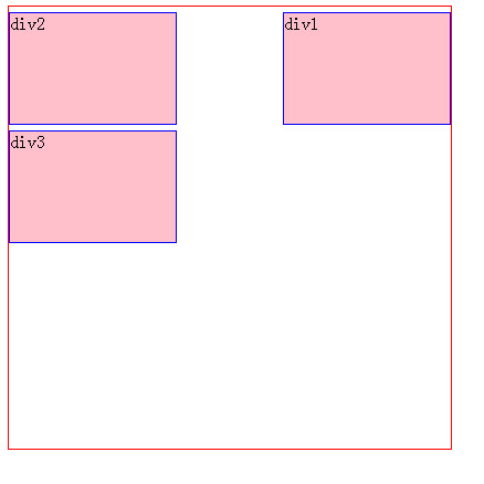
10.浮动float浮动涉及到左浮动、右浮动、清除浮动.浮动:如果要实现图形定位,可以使用浮动,使用浮动时块元素将脱离标准流并且向某个方向移动,直到它的边缘碰到包含框(父元素)的边缘。
(1)右浮动:一个块元素向右浮动,知道碰到包含它的父元素的最右边框为止。
右浮动测试用例代码及效果如下:

//float1.html

<!DOCTYPE HTML PUBLIC "-//W3C//DTD HTML 4.01 Transitional//EN" "http://www.w3.org/TR/html4/loose.dtd">
<html>
 <head>
  <title> 浮动float练习 </title>
 </head>
<link rel="stylesheet" type="text/css" href="float1.css">
 <body>
 <div class="div2">
  <div class="div1" id="sepecial">div1</div>
  <div class="div1">div2</div>
  <div class="div1">div3</div>
  </div>
 </body>
</html>

//float1.css

.div1{
width:150px;
height:100px;
border:1px solid blue;
background-color:pink;
margin-top:5px;
}
/*ID选择器 右浮动*/
#sepecial{
float:right;
}
.div2{
width:400px;
height:400px;
border:1px solid red;
}
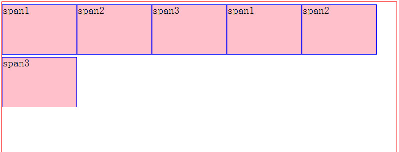
(2)左浮动:某个块元素尽量向左边移动,这样就让出它右面的空间。
特点:
a.左浮动,如果横排空间不够,则会自动向下移动,继续横排。
b.左浮动,如果浮动元素的高度不够,那么当它向下移动时可能被其他浮动元素"卡住",效果如下图所示:
浮动可以这样理解:如果一个元素右/左浮动则,
a.它本身会尽可能向右/左移动,直到碰到边框或者别的浮动元素,特别强调浮动对块元素和行内元素都生效。
b.元素向右/左浮动,就相当于让出自己的左/右边,别的元素就会在它的左/右边排列.
左浮动测试用例代码及效果
<!DOCTYPE HTML PUBLIC "-//W3C//DTD HTML 4.01 Transitional//EN" "http://www.w3.org/TR/html4/loose.dtd">
<html>
 <head>
  <title>浮动float演示2</title>
 </head>
  <link rel="stylesheet" type="text/css" href="float2.css">
 <body>
 <div class="div4">
  <!--
  <div  class="div1" >div1</div>
  <div class="div1">div2</div>
  <div class="div1">div3</div>
  <div class="div1" >div1</div>
  <div style="height:110px" class="div1">div2</div>
  <div class="div1">div3</div>
   -->
  <!--使用float时 则行元素span则以块元素使用 -->
  <span  class="div1" >span1</span>
  <span class="div1">span2</span>
  <span class="div1">span3</span>
  <span class="div1" >span1</span>
  <span class="div1">span2</span>
  <span class="div1">span3</span>
  </span>
 </body>
</html>

//float2.css

.div1{
width:150px;
height:100px;
border:1px solid blue;
background-color:pink;
margin-top:5px;
/*display:block;*//*span元素默认为行元素 float时则会解析为块元素  此时宽度和高度才生效*/
float:left;/*左浮动  以display:block来显示*/
}
.div2{
width:150px;
height:100px;
border:1px solid blue;
background-color:pink;
margin-top:5px;
float:left;/*左浮动*/
}
.div3{
width:150px;
height:100px;
border:1px solid blue;
background-color:pink;
margin-top:5px;
float:left;/*左浮动*/
}
/*ID选择器 右浮动*/
#sepecial{
float:right;
}
.div4{
width:800px;
height:400px;
border:1px solid red;
}
运行效果如下图所示:
(3)清除浮动:如果不希望别的元素在某个元素的左边或者右边,可以使用清除浮动的方法clear:right clear:left clear:both
(4)浮动提示
title对IE兼容性较好,而且不仅对图片提示,其他表单元素也提示。
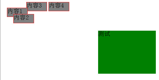
11.定位
css定位属性允许你对元素进行定位.position属性值:
static(默认值):元素框正常生成。快级元素生成一个矩形框,作为文档流/标准流的一部分,行内元素则会创建一个或者多个行框,置于其父元素中。
relative(相对定位):元素框偏移某个距离。元素仍保持其未定位前的形状,它原本所占的空间仍然保留。从这一个角度看,好像该元素仍然在文档流/标准流中一样。
absolute(绝对定位):元素框从文档流完全删除,并相对于其包含块定位。包含块肯能是文档中的另一个元素或者是初始包含块。元素原先在正常文档流中所占的空间会关闭,就像元素原来不存在一样。元素定位后生成一个块级框,而不论原来它在正常流中生成何种类型的框。
fixed(固定定位):元素框的表现类似于将position设置为absolute,不过其包含块是视窗本身。
案例说明:
relative:相对于原先应该定位的位置。虽然它脱离了标准流,但是它的空间,不能被占用。
absolute:绝对定位,对该元素最近的那个脱离了标准流的元素定位,如果没有父元素(或者有父元素但是父元素没有脱离标准流),则相对body定位。
fixed:总是以视窗的左上角定位。
left、top对static定位是无效的,static定位需使用margin.
z-index:用于设置对象(div)显示的时候层叠的顺序,值越小越在下面。
定位测试用例的代码及效果如下:
//positon1.html

<!DOCTYPE HTML PUBLIC "-//W3C//DTD HTML 4.01 Transitional//EN" "http://www.w3.org/TR/html4/loose.dtd">
<html>
 <head>
  <title>定位练习 </title>
 </head>
<link rel="stylesheet" type="text/css" href="position1.css">
 <body>
  <div id="sep2" class="div1">内容1</div>
  <div class="div1">内容3</div>
  <div class="div1">内容4</div>
  <div class="div2">测试<div id="sep" class="div1">内容2</div></div>
 </body>
</html>

//position1.css

.div1{
width:70px;
height:30px;
background-color:gray;
border:1px solid red;
float:left;
margin-left:5px;
}
#sep{
 /*position:relative ;*/
 /*position:absolute;*//*绝对对谁 对最近的那个脱离了标准流的元素定位*/
 position:fixed;
 left:40px;/*left为正值则向右移动*/
 top:50px;/*top为正值则向下移动*/
}
#sep2{
position:relative;/*注意left top对static没效果  */
 left:10px;
 top:20px;
}
.div2{
position:relative ;
left:100px;
top:100px;
width:200px;
height:150px;
background-color:green;
float:left;
}
运行效果如下图所示:
更多实例,请参见div+css实战演练---优酷盒子模型和搜狐首页面布局效果.


 379
379

 被折叠的 条评论
为什么被折叠?
被折叠的 条评论
为什么被折叠?
 到【灌水乐园】发言


