


最近鸿蒙HarmonyOS开发相关的消息非常的火,传言华为系手机后续将不再支持原生Android应用,所以对于原Android应用开发对应的Harmony版本也被一系列大厂提上了日程。作为一个名义上的移动端开发工程师((⊙o⊙)…,最近写python多过Android),当人不让要来学习一波。本次的学习计划是实现一个类微信app效果,计划将常规的app效果都实现一下,以便后续如果需要写Harmony应用,可以直接上手。
由于我本人有多年的开发经验和多种语言的开发经验,对于Javascript和TypeScript也写得比较多,所以对于TypeScript语法部分将不再过多说明,想快速了解到的同学可以直接查看我的快速入门TypeScript系列文章。同时,文章中设计到的我认为比较重要的知识点,会在文章中作说明。
- TypeScript快速入门教程(一)、基础类型和变量声明
- TypeScript快速入门教程(二)、面向对象知识(接口、类、抽象类)
- TypeScript快速入门教程(三)、函数、范型使用
- TypeScript快速入门教程(四)、联合类型 & 交叉类型 & 类型保护
功能拆分
上面只是一个简单的拆分示例,当我们拿到一个功能的时候,一定要先将页面进行拆分,当我们要实现的功能通过一个个子模块实现后,最终通过子模块的拼接,就可以得到一个完整的功能。
细节实现
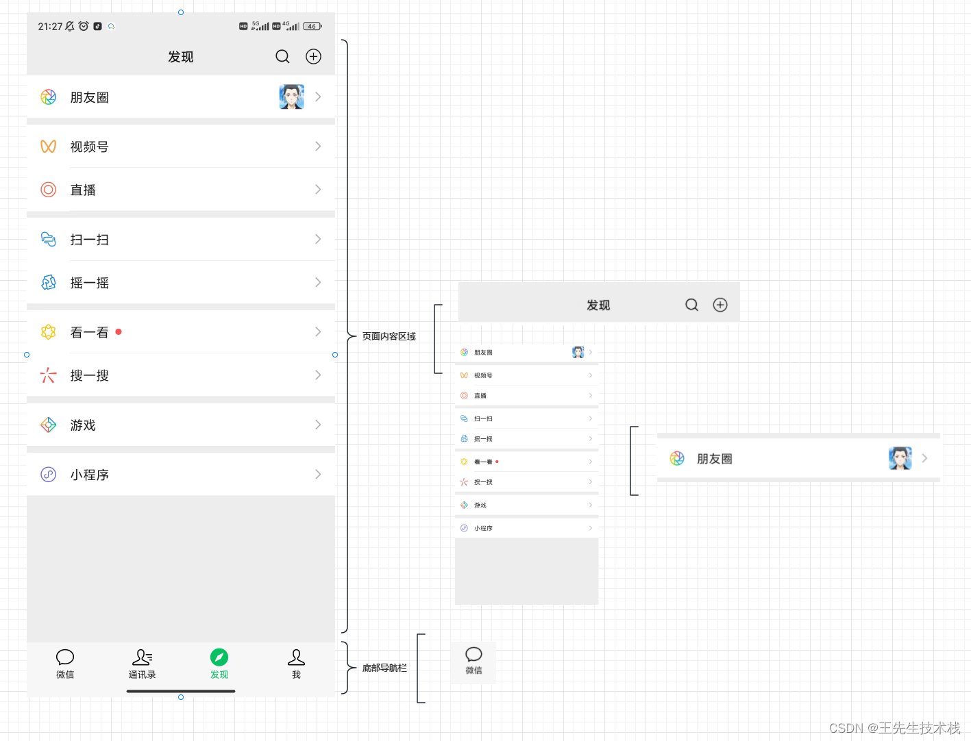
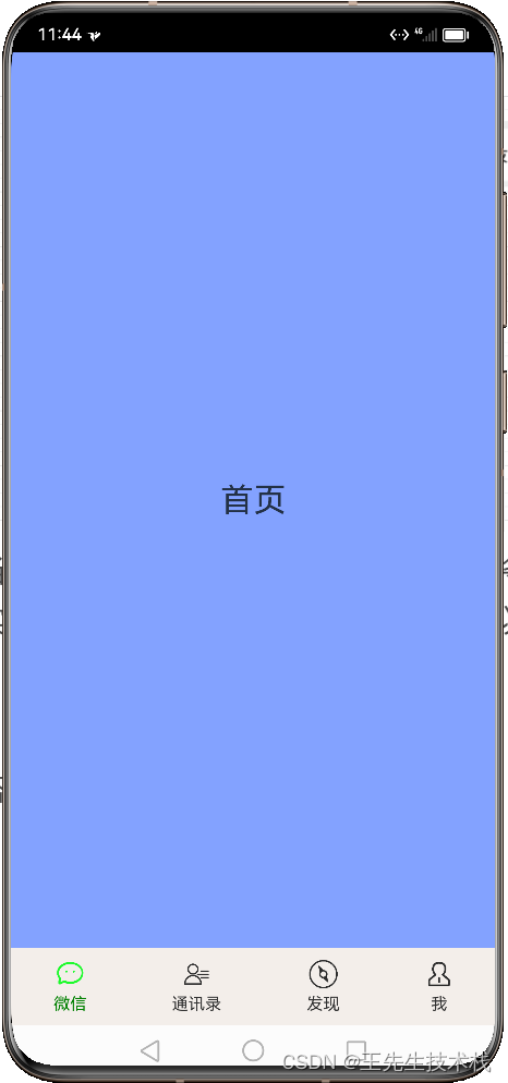
今天第一课,先实现整体的界面搭建,最终的实现效果如下图。
当我们点击之后,可以切换上面的tab内容界面。
Harmony提供了很多种方式可以实现底部导航栏,真实项目使用的话,大家可以直接使用系统提供的方式即可。这里我采用的方式是自己用最基础的代码实现,这样也能联系到一些想要学习的功能,开箱即用是好的,但是也很容易让我们错过很多关键知识。
实现BottomNavigationItem
我们这里整体的底部是一个BottomNavigation,他是由四个BottomNavigationItem组合实现。首先定义一个实体类,用于存贮底部导航栏对象信息。
export class BottomNavigationEntity {
  /**
   * 底部导航tab标题
   */
  title: Resource;

  /**
   * 底部导航tab图片
   */
  image: Resource;

  /**
   * 底部导航tab图片,未选中
   */
  unCheckImage: Resource;

  /**
   * tab类型标志位
   */
  tag: number;

  constructor(tag: number, title: Resource, image: Resource, unCheckImage: Resource) {
    this.tag = tag;
    this.title = title;
    this.image = image;
    this.unCheckImage = unCheckImage;
  }
}
接下来的 
组成是一个图标+一个文字组合而成,第一反应我们应该行到Column组件。
Column组件中,用于处理组件内容对其方式使用的话flex方式。
alignItems(value: HorizontalAlign): ColumnAttribute; # 水平方向
justifyContent(value: FlexAlign): ColumnAttribute; # 垂直方向
了解了这些之后,接下来看具体BottomNavigationItem的封装代码。
@Preview  # 方便单个view直接预览
@Component  # 标记是一个组件,可供其他组件引用
export default struct BottomNavigationItem {
  private navigationItem: BottomNavigationEntity;

  # 这里的Link是用于父组件和子组件进行通信
  @Link currentIndex: number;

  build() {
    Column({ space: 5 }) {
    # 这里判断如果当前选中的item是当前的这个,则使用选中状态图片
      Image(this.currentIndex === this.navigationItem.tag ? this.navigationItem.image : this.navigationItem.unCheckImage)
        .width(24)
        .height(24)
      Text(this.navigationItem.title)
        .fontSize(14)
        .fontColor(this.currentIndex === this.navigationItem.tag ? Color.Green : 0x333333)
    }
  }
}
代码是不是非常简单。对于@Link你如果现在不太清楚,也没有关系,我最终会专门进行一个讲解。
实现BottomNavigation
@Preview
@Component
export default struct BottomNavigation {
  @Link currentItemIndex: number;

  build() {
    Row({ space: 5 }) {
      //  这里通过对结合遍历,生成BottomNavigationItem进行填充BottomNavigation
      ForEach(navigationViewModel.getNavigationList(), (item: BottomNavigationEntity, index: number) => {
        # 对于这里的$currentItemIndex写法可以先将疑问留着,后续结合Link一并说明
        BottomNavigationItem({ navigationItem: item, currentIndex: $currentItemIndex })
          .onClick(() => {
          	#  点击后更新选中的item,以实现刷新界面的效果
            this.currentItemIndex = index
          })
      })
    }
    .width('100%')
    .height(65)
    .padding({
      top: 5,
      bottom: 5
    })
    .justifyContent(FlexAlign.SpaceAround)
    .backgroundColor(0xF3EEEA)
  }
}
实现WechatMainFrame
整体的界面组合使用RelativeContainer进行组合,将BottomNavigation固定于屏幕的底部,内容区域底部在BottomNavigation之上,顶部和屏幕顶部对其,使其填充满BottomNavigation之上的部分。内容区域使用Stack将所有的内容层叠展示,切换到哪个展示,则使用visibility方法设置该页面展示即可。
@Entry
@Component
struct WechatMainFrame {
  @State currentCheckIndex: number = 0;

  build() {
    RelativeContainer() {
      BottomNavigation({ currentItemIndex: $currentCheckIndex })
        .alignRules({
          bottom: { anchor: "__container__", align: VerticalAlign.Bottom },
          left: { anchor: "__container__", align: HorizontalAlign.Start }
        })
        .id("bottomNavigation")

      Stack() {
        HomeFragment().visibility(this.currentCheckIndex == 0 ? Visibility.Visible : Visibility.Hidden)
        ContactFragment().visibility(this.currentCheckIndex == 1 ? Visibility.Visible : Visibility.Hidden)
        DiscoverFragment().visibility(this.currentCheckIndex == 2 ? Visibility.Visible : Visibility.Hidden)
        MeFragment().visibility(this.currentCheckIndex == 3 ? Visibility.Visible : Visibility.Hidden)
      }
      .width('100%')
      .height('100%')
      .alignRules({
        left: { anchor: "__container__", align: HorizontalAlign.Start },
        right: { anchor: "__container__", align: HorizontalAlign.End },
        bottom: { anchor: "bottomNavigation", align: VerticalAlign.Top },
        top: { anchor: "__container__", align: VerticalAlign.Top }
      })
      .id("contentPanel")
    }
    .width('100%').height('100%')
  }
}
入口页面EntryAbility
export default class EntryAbility extends UIAbility {
  ...
  onWindowStageCreate(windowStage: window.WindowStage) {
    // Main window is created, set main page for this ability
    hilog.info(0x0000, 'testTag', '%{public}s', 'Ability onWindowStageCreate');

    windowStage.loadContent('pages/WechatMainFrame', (err, data) => {
      if (err.code) {
        hilog.error(0x0000, 'testTag', 'Failed to load the content. Cause: %{public}s', JSON.stringify(err) ?? '');
        return;
      }
      hilog.info(0x0000, 'testTag', 'Succeeded in loading the content. Data: %{public}s', JSON.stringify(data) ?? '');
    });
  }
  ...
至此整个页面的框架结构完成了。
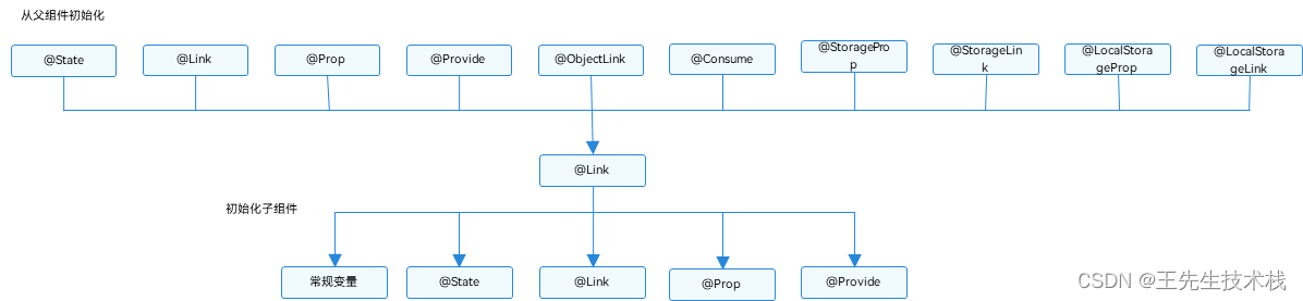
关于@Link相关的说明
关于更详细的内容,可以看官方文章说明。@Link装饰器:父子双向同步
我们对于视图更新,可以使用@State 标记变量,但是@State不能进行跨文件使用。这个时候@Link的实现就弥补了@State的不足。使用@Link的话。子组件中被@Link装饰的变量与其父组件中对应的数据源建立双向数据绑定。
- @Link装饰的变量与其父组件中的数据源共享相同的值。
- @Link装饰器不能在@Entry装饰的自定义组件中使用。
- @Link子组件从父组件初始化@State的语法为Comp({ aLink: this.aState })。同样Comp({aLink: $aState})也支持。
下面我们回到上面的代码中。结合代码进行分析。
当我们在BottomNavigation中.onClick(() => { this.currentItemIndex = index })在点击之后,会更改@Link currentItemIndex: number;触发界面ui的更改。而BottomNavigationItem({ navigationItem: item, currentIndex: $currentItemIndex })中,我们需要把选中的item的index值传递给BottomNavigationItem本身。而作为传递的值,则需要使用$标记。这样点击之后会将BottomNavigationItem的值也触发更改,以达到更改布局效果。BottomNavigationItem的判断也会根据这个值变化而变化。
点击之后,除了对BottomNavigation的状态更新之外,还需要对内容区域进行判断展示不同的界面。因此BottomNavigation的@Link currentItemIndex: number;又要和WechatMainFrame的 @State currentCheckIndex: number = 0;进行双向绑定BottomNavigation({ currentItemIndex: $currentCheckIndex })。最终当我们点击BottomNavigation的onclick的时候,就会向上和WechatMainFrame双向绑定更改内容区域,也会和BottomNavigationItem双向绑定更改底部导航展示。
由于我自己也是在边学边实现功能逻辑,既要写文章,还要实现代码功能,所以更新大体上控制在2~3天更新一篇,文章中尽可能会将我觉得比较重要的知识点拎出来说明。对于看完还不太清楚的,可以私信或者查阅其他文章了解,知识的获取不应该被局限,希望我的文章给你带来帮助。谢谢阅读。


 扫一扫
扫一扫


 1260
1260

 被折叠的 条评论
为什么被折叠?
被折叠的 条评论
为什么被折叠?
 到【灌水乐园】发言


