


前言
在现代应用程序开发中,数据可视化是一个至关重要的环节。它不仅能够帮助用户更直观地理解数据,还能提升用户体验。ArkUI 作为华为推出的一个强大的 UI 框架,提供了丰富的组件来满足开发者的各种需求。其中,Gauge 组件是一个非常实用的数据量规图表组件,用于将数据展示为环形图表。本文将详细介绍 ArkUI 中的 Gauge 组件,包括其基本用法、属性、接口、子组件以及一些实际应用示例。
Gauge 组件简介
Gauge 组件是一个数据量规图表组件,用于将数据展示为环形图表。它支持多种自定义选项,如颜色、起始角度、终止角度等。从 API Version 8 开始支持,后续版本不断添加新特性,如隐私敏感模式和定制内容区。
基本用法
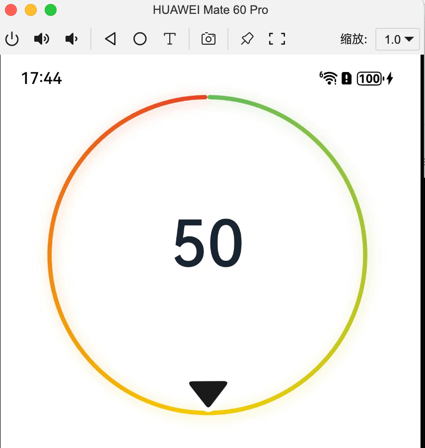
Gauge 组件的基本用法非常简单。通过创建一个 Gauge 实例并传入相应的参数来使用它。以下是一个基本的示例:
@Entry
@Component
struct GaugeExample {
  build() {
    Column() {
      Gauge({ value: 50, min: 0, max: 100 }) {
        Column() {
          Text('50')
            .fontWeight(FontWeight.Medium)
            .width('62%')
            .fontColor("#ff182431")
            .maxFontSize("60.0vp")
            .minFontSize("30.0vp")
            .textAlign(TextAlign.Center)
            .margin({ top: '35%' })
            .textOverflow({ overflow: TextOverflow.Ellipsis })
            .maxLines(1)
        }.width('100%').height('100%')
      }
    }.width('100%').height('100%')
  }
}
在这个示例中,我们创建了一个 Gauge 实例,并设置了当前值为 50,最小值为 0,最大值为 100。Gauge 组件内部包含一个 Text 组件,用于显示当前值。
Gauge 组件的属性
Gauge 组件支持多种属性,以满足不同的自定义需求。以下是一些常用的属性:
value
value 属性用于设置量规图的数据值。它是必填参数,用于组件创建时量规图初始值的预置。如果 value 不在 min 和 max 范围内,将使用 min 作为默认值。
Gauge({ value: 50, min: 0, max: 100 }) startAngle
startAngle 属性用于设置起始角度位置。时钟 0 点为 0 度,顺时针方向为正角度。默认值为 0。
Gauge({ value: 50, min: 0, max: 100 }).startAngle(210) 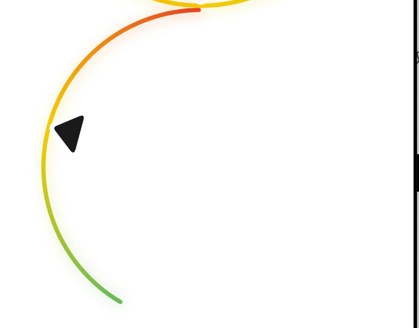
endAngle
endAngle 属性用于设置终止角度位置。起始角度位置和终止角度位置差过小时,会绘制出异常图像,请取合理的起始角度位置和终止角度位置。默认值为 360。
Gauge({ value: 50, min: 0, max: 100 }).endAngle(150) colors
colors 属性用于设置量规图的颜色。它支持多种类型,包括单色环、渐变环和分段渐变环。
Gauge({ value: 50, min: 0, max: 100 }).colors('#cca5d61d') strokeWidth
strokeWidth 属性用于设置环形量规图的环形厚度。默认值为 4,单位为 vp。
Gauge({ value: 50, min: 0, max: 100 }).strokeWidth(18) description
description 属性用于设置说明内容。它支持自定义文本内容或图片。
Gauge({ value: 50, min: 0, max: 100 }).description(this.descriptionBuilderImage) trackShadow
trackShadow 属性用于设置阴影样式。阴影颜色与圆环颜色一致。设置 null 为不开启投影。
Gauge({ value: 50, min: 0, max: 100 }).trackShadow({ radius: 7, offsetX: 7, offsetY: 7 }) indicator
indicator 属性用于设置指针样式。它可以设置指针的图标和间距。
Gauge({ value: 50, min: 0, max: 100 }).indicator({ space: 10, icon: $r('app.media.indicator') }) privacySensitive
privacySensitive 属性用于设置隐私敏感模式。在隐私模式下,Gauge 指针指向 0 位置,最大值最小值文本将被遮罩,量程显示灰色或者底色。
Gauge({ value: 50, min: 0, max: 100 }).privacySensitive(true) contentModifier
contentModifier 属性用于定制 Slider 内容区的方法。开发者需要自定义 class 实现 ContentModifier 接口。
Gauge({ value: 50, min: 0, max: 100 }).contentModifier(new MyGaugeStyle(30, 10, 100)) Gauge 组件的接口
Gauge 组件提供了一系列接口,用于创建和配置 Gauge 实例。以下是一些常用的接口:
Gauge(options)
Gauge(options) 接口用于创建一个 Gauge 实例。它接受一个包含 value、min 和 max 等参数的对象。
Gauge({ value: 50, min: 0, max: 100 }) value(value)
value(value) 接口用于设置量规图的数据值。它是必填参数,用于动态修改量规图的数据值。
Gauge({ value: 50, min: 0, max: 100 }).value(60) startAngle(angle)
startAngle(angle) 接口用于设置起始角度位置。
Gauge({ value: 50, min: 0, max: 100 }).startAngle(210) endAngle(angle)
endAngle(angle) 接口用于设置终止角度位置。
Gauge({ value: 50, min: 0, max: 100 }).endAngle(150) colors(colors)
colors(colors) 接口用于设置量规图的颜色。
Gauge({ value: 50, min: 0, max: 100 }).colors('#cca5d61d') strokeWidth(length)
strokeWidth(length) 接口用于设置环形量规图的环形厚度。
Gauge({ value: 50, min: 0, max: 100 }).strokeWidth(18) description(value)
description(value) 接口用于设置说明内容。
Gauge({ value: 50, min: 0, max: 100 }).description(this.descriptionBuilderImage) trackShadow(value)
trackShadow(value) 接口用于设置阴影样式。
Gauge({ value: 50, min: 0, max: 100 }).trackShadow({ radius: 7, offsetX: 7, offsetY: 7 }) indicator(value)
indicator(value) 接口用于设置指针样式。
Gauge({ value: 50, min: 0, max: 100 }).indicator({ space: 10, icon: $r('app.media.indicator') }) privacySensitive(isPrivacySensitiveMode)
privacySensitive(isPrivacySensitiveMode) 接口用于设置隐私敏感模式。
Gauge({ value: 50, min: 0, max: 100 }).privacySensitive(true) contentModifier(modifier)
contentModifier(modifier) 接口用于定制 Slider 内容区的方法。
Gauge({ value: 50, min: 0, max: 100 }).contentModifier(new MyGaugeStyle(30, 10, 100)) Gauge 组件的子组件
Gauge 组件可以包含单个子组件。建议使用文本组件构建当前数值文本和辅助文本。若子组件宽高为百分比形式,则基准范围为以外圆环做为内切圆的矩形。
@Entry
@Component
struct GaugeExample {
  build() {
    Column() {
      Gauge({ value: 50, min: 0, max: 100 }) {
        Column() {
          Text('50')
            .fontWeight(FontWeight.Medium)
            .width('62%')
            .fontColor("#ff182431")
            .maxFontSize("60.0vp")
            .minFontSize("30.0vp")
            .textAlign(TextAlign.Center)
            .margin({ top: '35%' })
            .textOverflow({ overflow: TextOverflow.Ellipsis })
            .maxLines(1)
        }.width('100%').height('100%')
      }
    }.width('100%').height('100%')
  }
}
实际应用示例
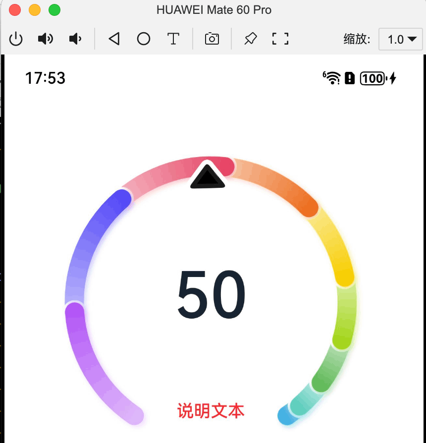
示例 1:设置多色量规图
该示例通过 colors 接口,实现了多色量规图效果。
@Entry
@Component
struct Gauge1 {
  @Builder
  descriptionBuilder() {
    Text('说明文本')
      .maxFontSize('30sp')
      .minFontSize("10.0vp")
      .fontColor("#fffa2a2d")
      .fontWeight(FontWeight.Medium)
      .width('100%')
      .height("100%")
      .textAlign(TextAlign.Center)
  }

  build() {
    Column() {
      Gauge({ value: 50, min: 1, max: 100 }) {
        Column() {
          Text('50')
            .fontWeight(FontWeight.Medium)
            .width('62%')
            .fontColor("#ff182431")
            .maxFontSize("60.0vp")
            .minFontSize("30.0vp")
            .textAlign(TextAlign.Center)
            .margin({ top: '35%' })
            .textOverflow({ overflow: TextOverflow.Ellipsis })
            .maxLines(1)
        }.width('100%').height('100%')
      } .colors([[new LinearGradient([{ color: "#deb6fb", offset: 0 }, { color: "#ac49f5", offset: 1 }]), 9],
        [new LinearGradient([{ color: "#bbb7fc", offset: 0 }, { color: "#564af7", offset: 1 }]), 8],
        [new LinearGradient([{ color: "#f5b5c2", offset: 0 }, { color: "#e64566", offset: 1 }]), 7],
        [new LinearGradient([{ color: "#f8c5a6", offset: 0 }, { color: "#ed6f21", offset: 1 }]), 6],
        [new LinearGradient([{ color: "#fceb99", offset: 0 }, { color: "#f7ce00", offset: 1 }]), 5],
        [new LinearGradient([{ color: "#dbefa5", offset: 0 }, { color: "#a5d61d", offset: 1 }]), 4],
        [new LinearGradient([{ color: "#c1e4be", offset: 0 }, { color: "#64bb5c", offset: 1 }]), 3],
        [new LinearGradient([{ color: "#c0ece5", offset: 0 }, { color: "#61cfbe", offset: 1 }]), 2],
        [new LinearGradient([{ color: "#b5e0f4", offset: 0 }, { color: "#46b1e3", offset: 1 }]), 1]])
    }.width('100%').height('100%')
  }
}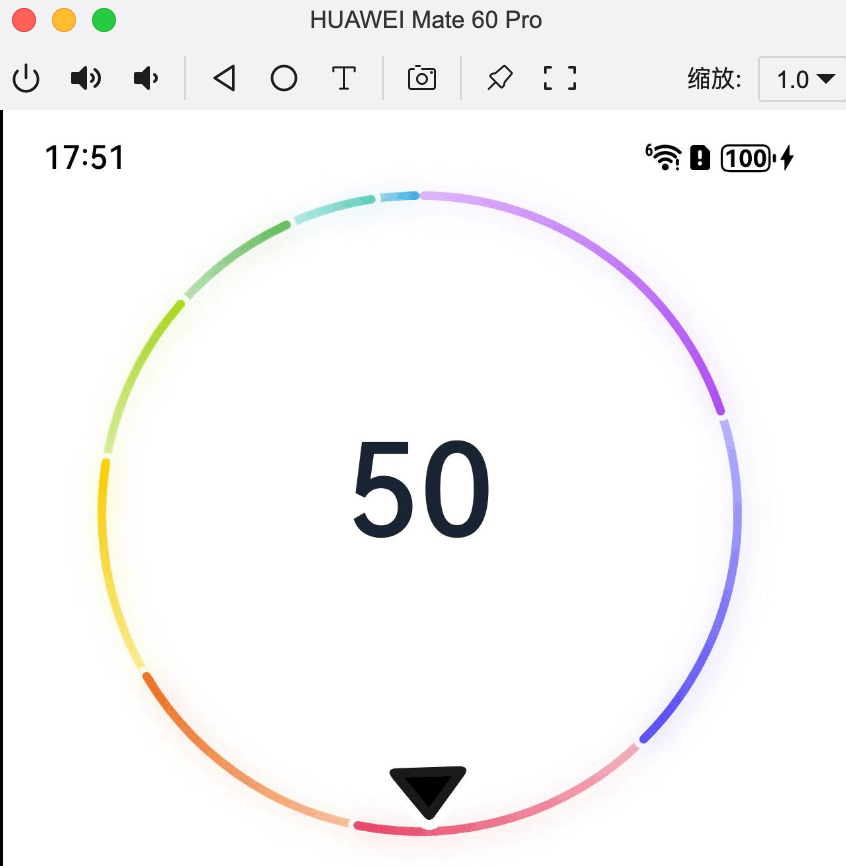
示例 2:设置单色量规图
该示例通过 colors 接口,实现了单色量规图效果。
@Entry
@Component
struct Gauge2 {
  @Builder
  descriptionBuilderImage() {
    Image($r('sys.media.ohos_ic_public_clock')).width(72).height(72)
  }

  build() {
    Column() {
      Gauge({ value: 50, min: 1, max: 100 }) {
        Column() {
          Text('50')
            .fontWeight(FontWeight.Medium)
            .width('62%')
            .fontColor("#ff182431")
            .maxFontSize("60.0vp")
            .minFontSize("30.0vp")
            .textAlign(TextAlign.Center)
            .margin({ top: '35%' })
            .textOverflow({ overflow: TextOverflow.Ellipsis })
            .maxLines(1)
        }.width('100%').height('100%')
      }
      .startAngle(210)
      .endAngle(150)
      .colors('#cca5d61d')
      .width('80%')
      .height('80%')
      .strokeWidth(18)
      .description(this.descriptionBuilderImage)
      .padding(18)
    }.margin({ top: 40 }).width('100%').height('100%')
  }
} 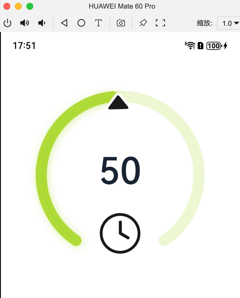
示例 3:设置定制说明区
该示例通过 description 接口,实现了说明区的设置功能。
@Entry
@Component
struct Gauge3 {
  @Builder
  descriptionBuilder() {
    Text('说明文本')
      .maxFontSize('30sp')
      .minFontSize("10.0vp")
      .fontColor("#fffa2a2d")
      .fontWeight(FontWeight.Medium)
      .width('100%')
      .height("100%")
      .textAlign(TextAlign.Center)
  }

  build() {
    Column() {
      Column() {
        Gauge({ value: 50, min: 1, max: 100 }) {
          Column() {
            Text('50')
              .fontWeight(FontWeight.Medium)
              .width('62%')
              .fontColor("#ff182431")
              .maxFontSize("60.0vp")
              .minFontSize("30.0vp")
              .textAlign(TextAlign.Center)
              .margin({ top: '35%' })
              .textOverflow({ overflow: TextOverflow.Ellipsis })
              .maxLines(1)
          }.width('100%').height('100%')
        }
        .startAngle(210)
        .endAngle(150)
        .colors([[new LinearGradient([{ color: "#deb6fb", offset: 0 }, { color: "#ac49f5", offset: 1 }]), 9],
          [new LinearGradient([{ color: "#bbb7fc", offset: 0 }, { color: "#564af7", offset: 1 }]), 8],
          [new LinearGradient([{ color: "#f5b5c2", offset: 0 }, { color: "#e64566", offset: 1 }]), 7],
          [new LinearGradient([{ color: "#f8c5a6", offset: 0 }, { color: "#ed6f21", offset: 1 }]), 6],
          [new LinearGradient([{ color: "#fceb99", offset: 0 }, { color: "#f7ce00", offset: 1 }]), 5],
          [new LinearGradient([{ color: "#dbefa5", offset: 0 }, { color: "#a5d61d", offset: 1 }]), 4],
          [new LinearGradient([{ color: "#c1e4be", offset: 0 }, { color: "#64bb5c", offset: 1 }]), 3],
          [new LinearGradient([{ color: "#c0ece5", offset: 0 }, { color: "#61cfbe", offset: 1 }]), 2],
          [new LinearGradient([{ color: "#b5e0f4", offset: 0 }, { color: "#46b1e3", offset: 1 }]), 1]])
        .width('80%')
        .height('80%')
        .strokeWidth(18)
        .description(this.descriptionBuilder)
        .trackShadow({ radius: 7, offsetX: 7, offsetY: 7 })
        .padding(18)
      }.margin({ top: 40 }).width('100%').height('100%')
    }
  }
}
结论
ArkUI 中的 Gauge 组件是一个功能强大且灵活的数据量规图表组件。它支持多种自定义选项,如颜色、起始角度、终止角度等,能够满足开发者在不同场景下的需求。通过本文的介绍,相信读者对 Gauge 组件有了更深入的了解。希望本文能够帮助开发者在实际项目中更好地使用 ArkUI 的 Gauge 组件,提升应用的用户体验和数据展示效果。
----
以上


 扫一扫
扫一扫


 664
664

 被折叠的 条评论
为什么被折叠?
被折叠的 条评论
为什么被折叠?
 到【灌水乐园】发言


